Ckeditor5: Drop-down looks misaligned
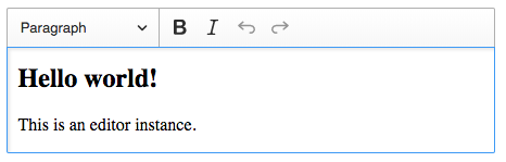
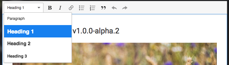
When there is a separator after (and before) the dropdown it looks like a border around the paragraph menu:
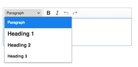
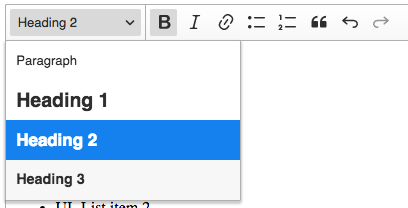
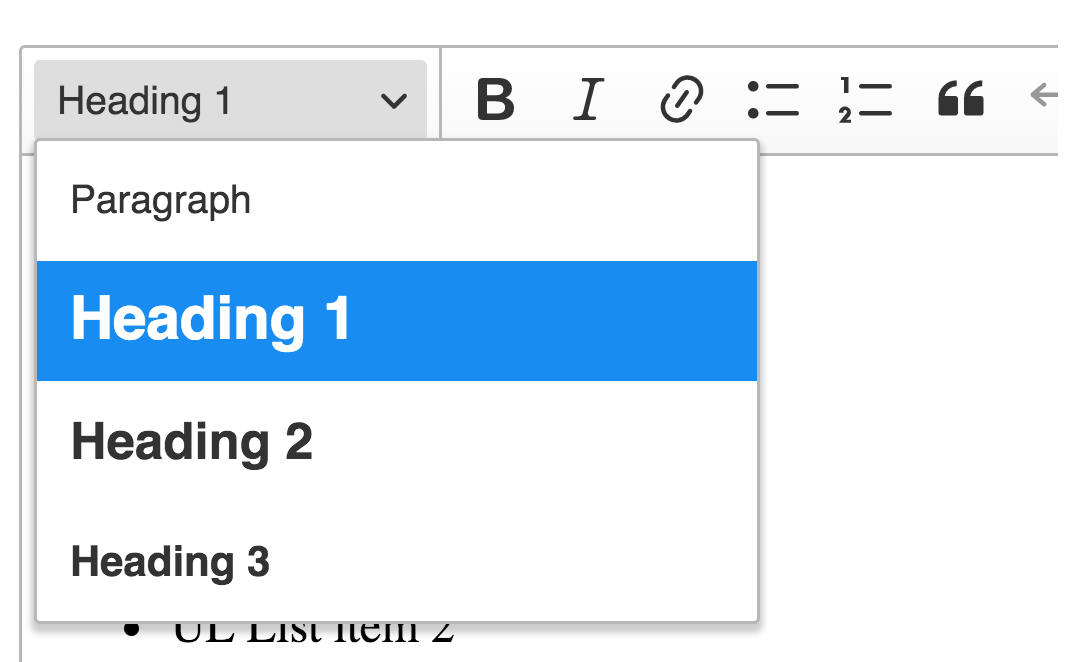
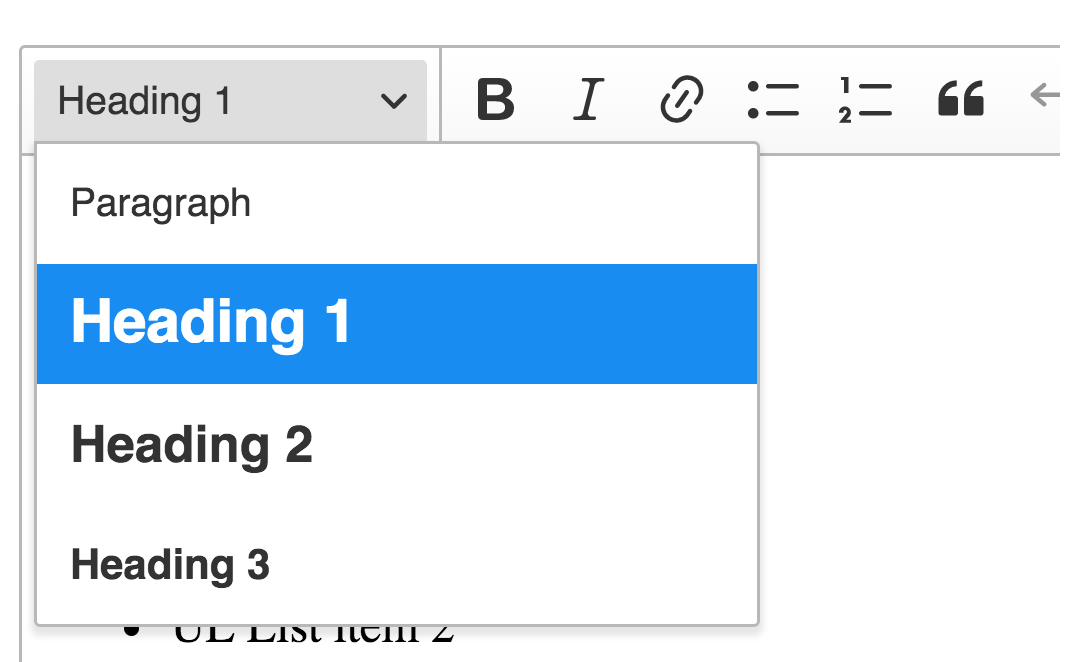
Then, when I click on the drop-down, I expect that the panel will be aligned to that menu. The panel looks misaligned:
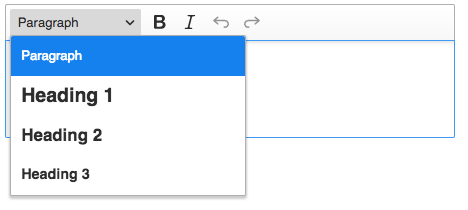
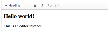
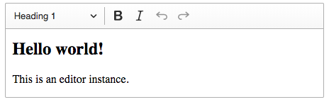
There is no such effect when I disable separator after the headings menu because then there is no "border effect":
But then the arrow is more connected to the "B" icon than "paragraph".
My proposals are:
align it to the padding, and always add the separator after and before drop-down menus to have the border effect:
Put the arrow on the left and don't use a separator to avoid "border effect":
Create the border the way we had it before, do the drop-down is align to it:
Disconnect separator form the top and bottom, so there is no border around the menu (see https://github.com/ckeditor/ckeditor5/issues/817):
I'm for option 1 or 4.
 pjasiun
All 3 comments
I didn't have this feeling about the dropdown. The separator's placement is indeed a bit funky, but I'm cool with that. I didn't notice it, even.
What I didn't like so far, though, is the style of the active button when the dropdown is opened. It's in different style than the dropdown's panel (dark bg vs light panel). The old styling (light button and light button) worked better, but back then the dropdown's button always had a border so it was a bit different situation.
 Reinmar
on 5 Feb 2018
Reinmar
on 5 Feb 2018
I have a feeling that dropdown options are floating above the dropdown button. It always looked so weird to me (didn't native Safari dropdowns looked a bit like this?). Anyway, it would be more natural if both dropdown options and button were on the same level: either add shadow to the button or "flatten" options (I am for this one).
BTW. It seems that the dropdown options box is too high (it seems like it overlays on a button a bit).
 scofalik
on 5 Feb 2018
scofalik
on 5 Feb 2018
I agree that dropdown panel looks higher than dropdown button.
Current dropdown (border-radius and position bottom: 1px)
Proposal
If we will try to change position of dropdown panel to bottom: 0px, and disable border-bottom-left-radius of button and border-top-left-radius of panel it looks flat and like real "panel" instead of "popup". Additionally, we can change a little bit visibility of shadow.
 dkonopka
on 13 Feb 2018
dkonopka
on 13 Feb 2018
Related issues
 devaptas
·
3Comments
devaptas
·
3Comments
 hybridpicker
·
3Comments
hybridpicker
·
3Comments
 msamsel
·
3Comments
msamsel
·
3Comments
 pomek
·
3Comments
pomek
·
3Comments
 oleq
·
3Comments
oleq
·
3Comments
Most helpful comment
I have a feeling that dropdown options are floating above the dropdown button. It always looked so weird to me (didn't native Safari dropdowns looked a bit like this?). Anyway, it would be more natural if both dropdown options and button were on the same level: either add shadow to the button or "flatten" options (I am for this one).
BTW. It seems that the dropdown options box is too high (it seems like it overlays on a button a bit).