This is the follow-up of the discussion in https://github.com/ckeditor/ckeditor5/issues/610. The features that need to be implemented to make the plugin(s) working are described as Milestone 1 (MVP).
There are various factors to consider in the design:
- The table insertion should happen using the visual "grid" in the main editor toolbar.
- There should be a way to insert a huge table too, e.g. 120x300, using some inputs. The inputs could be the UI elements used as current grid dimension labels (requires research) or a separate UI.
- The UI manipulating table cells/rows/styles should be in the context of the table. Probably a balloon attached to the cell in which the user selection is anchored.
- Note that attaching a balloon to the entire table will cause issues when the table is very long (see next point) or when other editor balloons (like global toolbar) are in use.
- The UI must work when the table has 100+ rows and neither its first or last row is visible in the viewport.
- The UI should probably disappear as the user types to uncover other cells and their content and show up again as the user stops typing.
- Table editing tools should not use balloons to avoid a situation when a balloon is attached to another balloon. It becomes a problem when the balloon "arrows" overlap for certain arrangements. We should use dropdowns instead.
- The table header feature should allow conversion of first N-rows of the table into a header. Users usually create content and leave the formatting as the last step.
- The cross–selection between the cells should be blocked in MVP.
 oleq
oleq
All 55 comments
Proposals below. Icons still in progress, but would be great if you say your opinion about them (especially merge icon).

 dkonopka
on 2 Nov 2017
dkonopka
on 2 Nov 2017
The designs look good.
I'm just wondering about the drop-down button. Shouldn't we have icons there? After all, these toolbars are, in theory, configurable, so one could include any of the drop-down buttons into the toolbar itself. Just like described in https://github.com/ckeditor/ckeditor5-ui/issues/333.
In the other hand, we can also agree that this is yet another kind of button, which simply shows the list of options as text, "period". For the specific case of row/column tools, I'm more than fine about that.
 fredck
on 3 Nov 2017
fredck
on 3 Nov 2017
As for the merge icons, I like both options, especially the arrows because they look different than the rest (otherwise all icons look the same and you get confused).
If we go with the other option instead (the mini table), it would be better to make the top and bottom rows in the icon split in the same position (middle) because the idea is showing that the merged cell breaks the continuity of the table.
fredck
on 3 Nov 2017
A final detail for future implementation... both the table creation panel and the dropdowns must work if the button is placed very close to the right end of the viewport, opening the panels to the other side.
This is a bigger problem for the table creation panel because it grows as the user moves the mouse on it, but I would not go crazy with it for now. Users will have to figure out a way to open the panel in another place if they want to create such a big table that makes the panel grow out of the viewport.
fredck
on 3 Nov 2017
I'm just wondering about the drop-down button. Shouldn't we have icons there?
I'm not sure that I understand it correctly. For example: brush icon and dropdown arrow in my intention it's not the one <svg> (arrow can be :after pseudoelement or additional <span>).
Creating table: as we talked we need to provide a solution to create 100x30 grid. One of the ideas is to change label under grid to input type or show button "Create bigger table" (than 10x10) and let the user fill up inputs with column&row number.
dkonopka
on 6 Nov 2017
Creating table: as we talked we need to provide a solution to create 100x30 grid. One of the ideas is to change label under grid to input type or show button "Create bigger table" (than 10x10) and let the user fill up inputs with column&row number.
Are you sure this is really needed? I can't find anything like that in Google Docs. And I suspect that the reason is that if you are manually creating such a huge table, then it's so long & time consuming that having to press tab at the end to create a new row is not an issue. I doubt than when working with so huge tables one will even know the exact number of rows in some cases.
Personally, I cannot remember any situation where I had to create a table with more than ~10 columns. So I just wonder, if to make edge cases a little bit less cumbersome, we are not making the UI more complex than it needs to be for the rest of users.
Why not KISS and wait for users feedback?
 wwalc
on 10 Nov 2017
wwalc
on 10 Nov 2017
I was researching a lot of editors and talked with @oleq that no one is providing such big tables and for sure it's not milestone 1. Anyway, we can easily enable creating bigger grids => just transform labels with row & column number to inputs (with some pencil icon?).
That was just an idea. If it is really necessary and it doesn't require a lot of time it can be a nice feature of CK5 Tables. But it's true @wwalc we should wait for user feedback and then think about it again.
dkonopka
on 10 Nov 2017
I agree that this is not milestone 1.
I see a nice way to handle this with just dragging though. As it is difficult to put that in words, I'll be happy to share it when the time comes.
fredck
on 10 Nov 2017
Fully agree on your last remarks regarding initial column size. Anything >> 100 cells is hard to handle for the user upfront. All solutions that I know of provide a limit around that number and provide easy methods to insert columns/rows later on.
What I'm lacking from the visual @dkonopka is the entry point into that first toolbar. It seems to be anchored to the headling, but where would a user trigger it?
For the ClassicEditor its clear that it could be part of the main toolbar. However, for the balloon editor I envision to have a marker on all potential insertion points (e.g., around paragraphs) for block elements such as a table, image, custom block widget etc. I've recently seen this popping up in several editors, most notably Dropbox Paper (cf. Gif below) . It provides immediate feedback where you can position block elements and would be the anchor for your upmost toolbar visual.

 oliverguenther
on 1 Dec 2017
oliverguenther
on 1 Dec 2017
Interesting concept: tables inside MacOS High Sierra Notes
oleq
on 15 Dec 2017
@oleq & @dkonopka Slowly we're getting to a phase were some decisions should be made. For now I'm focusing on the widget & selection handling before implementing the UI itself.
But taking that this feature is huge as it's UI/UX requirements I'd like to ask you guys to start thinking on this.
Short note: We're focusing on MVP form as described earlier. We need at least:
- inserting table UI (this is probably already well defined - as simple 10x10 insertion grid)
- inserting row(s?) and column(s?)
- deleting row/column
- defining table headers (heading rows & heading columns) - the editing part can handle any number of heading rows/columns
- merging cells (theres note about possibility to move this requirement after MVP)
- split cells (as with merging cells)
As the widget/selection will be implemented first - this might go as first - mostly how to show selected cells, rows/columns.
 jodator
on 10 Apr 2018
jodator
on 10 Apr 2018
Could we have something posted here? I know that you created some designs @oleq and @dkonopka :)
 Reinmar
on 4 May 2018
Reinmar
on 4 May 2018
The inline balloon for text is acceptable, since it only appears once you've selected a text region, but having an inline balloon always overlapping table contents below the cell you're focused on could be a frustrating UX pattern. How about having the balloon for table operations persist above the top row of the table (or the top of the editor view, once the first row of the table scrolls out of view)?
 dtwist
on 4 May 2018
dtwist
on 4 May 2018
Note: This issue was created before we switched to the new theme. The basic requirements of the tables feature have also slightly changed.
Note: Click the image to enlarge.
The current draft compatible with the current standards looks as follows:
Table insertion
- Clicking the button in the toolbar opens a dropdown with a grid,
- The grid is 10x10 by default, static,
- The grid is highlighted as the cursor moves over it, determining the geometry of a table to be inserted.
- The label below the grid reflects the geometry live to make the insertion easier

Beyond MVP (ideas)
- Expandable grid which grows as the cursor moves,
- The label could also work as 2 inputs, to specify a custom size of the table (e.g. 12x17)
Default styles of the table
Even if this is not a final design, I think we're pretty close. Here is what I suggest:
- grayscale palette for out-of-the-box integrations,
- background of the cells compatible with the editable (since each cell is an editable),
- slight borders around cells; borderless looks great but it's a poor UX for editing because sometimes it's hard to understand the boundaries of the cells/rows, especially when merged or empty
- slight background for the header cells to make them distinguishable,
- (?) borders separating headers and the body: I'm not sure it is possible to implement them like this and keep the implementation sane; it could be that it requires some complex, rigid CSS rules that won't apply to all kinds of tables. If so, we'll need to simplify this.


Problems to solve
- (CRIT) Default table with headers or not? Should the header be "included" in the desired geometry, or be an "extra"?
- What to do with a 1x1 table when the header should be by default? 2x1 (header + cell)?
- Borders separating headers and the body (see above).
- To center the content or not?
- The content centered by default looks great but how to integrate it with the Alignment feature?
- Could we have the Alignment feature set to center by default?
- What consequences would it have since in MVP there's no multi-cell selection and the user cannot select multiple cells and change their alignment? They have to do that cell-by-cell, which is definitely annoying so the defaults must be perfect.
- Which option is the best for text data and which one for the numerical data?
- Default table geometry: 100% width by default? Or maybe some min/max width for cells?
Table selection and the toolbar

- Because each table is a widget, when selected (including descendants), it gets an outline.
- When a cell (editable) gets focus, the outline of the table remains and the cell is also outlined to express the particular focus.
- As the cell is focused, the toolbar shows up, pinned to the center of the cell.
Why not pinned to the entire table?
- because the tools it offers work in the context of the cell (insert before, merge down, etc.),
- because it would disappear or cover the content, if the table is bigger than the available viewport
- The toolbar could move to the bottom of the cell if there's not enough space above it, similar to the link balloon, image widget toolbar, etc.
Problems to solve
- (CRIT) How to select the entire table without selecting a cell (content)? E.g. to cut it and paste it somewhere else? We probably need some UI similar to the widget drag&drop handler in v4.
- (CRIT) How to handle the balloon toolbar and the table toolbar at the same time? The balloon toolbar shows up when there's a non-collapsed selection. We may need to hide the table toolbar in this situation (general editing should have a precedence over table editing). We can't have both as they would be too close to each other or even overlapping.
- (CRIT) There must be a way to hide the toolbar on-demand (e.g. Esc). In some cases, it may be bigger than the cells around and it could completely cover some of them and leave the user with no way to reach them (maybe except "blur the table, re-focus the right cell").
In–toolbar features
We are supposed to have the following sub-features in the toolbar:
- Row
- Insert row above
- Insert row below
- Delete row
- Column
- Insert column before
- Insert column after
- Delete column
- Merge cell (no multi-cell/row selection in the MVP)
- Merge top
- Merge right
- Merge bottom
- Merge left
- Split cell
- Split horizontally
- Split vertically
- Header
Note: The "merge cell" will become a sole button as the multi-cell selection is implemented, simplifying the UI.

Header feature
There are 2 approaches we could use:
- Create a complex dropdown with options to set row/column-headers and unset them. It doesn't look to me like the best UX we could do, though. Especially if we decide that each new table comes with a header by default, the users must be able to deal with them, if only to get rid of a header.
- Setting a header == all columns/rows "before" the current selection become headers,
- What to do when there's just one column/row?
Since both columns and rows can become a header, I came up with an idea to make the process a little bit easier for the users. Pressing the "Header" button enters the "header mode" which allows the user to make the right subset of the table a header:
- 50% of width/height is a boundary for the cursor
- the "header mode" selection expands as the cursor moves
- one can select as many columns/rows as they want
- clicking freezes the headers and leaves the "header mode"

Note: the header button could be a split button with an option "Remove headers" to clean all the headers up instead of entering the "mode" and moving the cursor to the upper left 50% of the first cell. Useful, if all tables come with a header by default.
Problems to solve
- (CRIT) Which sub-features should (not) be available in the toolbar, when a cell in the header has focus?
- Should "insert column after" or "insert row below" insert headers or regular rows/columns? Or maybe managing headers should be possible only using the "Header" UI?
oleq
on 8 May 2018
Table insertion - no comments - LGTM
Default styles of the table
borders separating headers and the body
I think that some sort of this is achievable since we have different parents of rows in header then in body (<thead> vs <tbody>). I see two problems: the white cell in the top left corner might be tough to achieve (?) and the line separating heading columns from other cells (vertical one) inside the header - I don't see it working without additional CSS classes.
The rest of design looks cool and I think that is easy to achieve without additional styles for table cells or so (which should be a goal for us I think - I mean only adding some class to a table: <table class="ck-table"> should do the trick.
- default table without headers for me
- geometry - I've started with some padding and it actually looks OK for me
- we might go with centering in MVP

- Table selection and the toolbar
Those CRIT issues looks like needing separate issue to solve. IE. the widget selection might be also handy for an image (if I recall correctly it also doesn't have any D&D support).
Baloon toolbar over a cell looks OK.
In–toolbar features
The only confusing icon is the last one that I think is to set table headers.Header feature
The second option looks cool. I was wondering how to select only column headers without row headers but probably moving cursor to the bottom-left quadrant of the cell would do this (select row - without column as a header).
The second thought is - how to deal with a keyboard in such case? Do we plan to make this feature a bit mousless friendly?
The other option I see is to create a row/column selection with proper options for setting/unsetting row or a column as a header.
jodator
on 8 May 2018
The overall proposal is very nice. The only negative observation I may have is about attaching the toolbar to the cell, hiding other cells in the table. This will be extremely annoying and even worse when one is moving through cells, with the ballon moving all the time. I don't see a good reason to not attach the toolbar to the table top with some solution for the top overflow.
fredck
on 8 May 2018
+1 for @fredck.
I don't have time to make a detailed comment now. Most proposals look okay. However, I don't like the cell tooltip. I also think that it will get annoying quickly and it should be anchored to a table border (top, bottom, maybe even left/right?). A big table should not be a problem, then, we will show the tooltip where we can and we will cover some data (but not directly next to the cell).
BTW. A thought I just had now: how about having multiple balloon toolbars - one on the side, for "row tools" (for example remove row, add row before, add row after, switch row to/from heading) and then one toolbar above/below the table (for table tools, column tools and cell tools).
As much as I'd like some dedicated UI for columns and rows tools, I think that this might be a decent intermediate step. WDYT?
 scofalik
on 8 May 2018
scofalik
on 8 May 2018
I think a single toolbar can easily contain all actions needed for table, rows, cols and cells.
Btw, when it comes to alignment (or actually styles), while this is not a welcome feature in paragraphs, headers, lists, etc, in tables it is very welcome. The most common case is currency numbers, which are usually aligned right. In our case, the best we could do is introduce the concept of styles, so one set a cell (or a column) to "number" or "currency" and then things get aligned right.
Then, back to alignment, I doubt that centered alignment inside the cells by default would work well. It is nice in the screenshot you created but there are so many use cases that it's better to kiss and leave de default alignment (left) in place.
fredck
on 8 May 2018
@jodator
the white cell in the top left corner might be tough to achieve (?) and the line separating heading columns from other cells (vertical one) inside the header - I don't see it working without additional CSS classes.
Let's drop it then and stick to the design as in the GIF.
Those CRIT issues looks like needing separate issue to solve. IE. the widget selection might be also handy for an image (if I recall correctly it also doesn't have any D&D support).
Yes and no. The other two can be follow-ups but we can't ship the feature without:
(CRIT) How to select the entire table without selecting a cell (content)? E.g. to cut it and paste it somewhere else? We probably need some UI similar to the widget drag&drop handler in v4.
It makes the feature useless. We don't have this issue in images because there's a lot of space there you can click to select the widget; in tables we don't have this luxury. I agree that this is a generic widget issue but we must come up with something for tables now.
The only confusing icon is the last one that I think is to set table headers.
Let's say it's WIP ;-)
The second option looks cool. I was wondering how to select only column headers without row headers but probably moving cursor to the bottom-left quadrant of the cell would do this (select row - without column as a header).
We'll set some boundary which, when passed by the cursor, results in selecting a row/column. The areas could be like this

The second thought is - how to deal with a keyboard in such case? Do we plan to make this feature a bit mousless friendly?
Entering the "header" mode coul mean pressing arrow keys selects table cells just like the mouse. Arrow right selects another column and Arrow down another row; starting with none used as headers. The opposite arrows would reduce the selection. It's not MVP, IMO.
The other option I see is to create a row/column selection with proper options for setting/unsetting row or a column as a header.
Since we don't have multi-cell selection, it does not feel like an option for us. At least, not in the MVP.
@fredck @scofalik
I don't see a good reason to not attach the toolbar to the table top with some solution for the top overflow.
I remember that we talked with @Reinmar the other day and we came to the conclusion that this toolbar attached to the table is even more annoying but I cannot recall all of them ;-)
But what I know is that what you proposed could be very out of context. If one wants to split a cell or add a column to the right, they want to do that in the exact spot. The toolbar attached to the table, which could be big (stretching beyond the viewport/editable), might not make much sense because the context is a cell, not a table. The problem is more evident, when there's no visible table boundary the toolbar can be attached to.
Let's say this one is OK

but in this case

- where to position the toolbar? To the center of the table? Center of the viewport? Center of the focused cell?
- if to the center of the table, then it obviously is totally out of context, a toolbar of... nothing,
then more complexity arrives

we need to implement logic which
- attaches the toolbar to the table,
- attaches is somewhere visible when there's no table boundary available to attach it,
- attaches is so it does not cover the selected cell in the above case.
I know we don't have utils for that because I created them. It becomes very complex from the perspective of the code and problably forces us to do a big refactoring/feature extension around the BalloonPanelView and its helpers. Compared to the toolbar attached to the table cell, it is a very time-consuming approach. Do we have that much time to spend?
BTW. A thought I just had now: how about having multiple balloon toolbars - one on the side, for "row tools" (for example remove row, add row before, add row after, switch row to/from heading) and then one toolbar above/below the table (for table tools, column tools and cell tools).
As much as I'd like some dedicated UI for columns and rows tools, I think that this might be a decent intermediate step. WDYT?
We need 3 toolbars in such situation. For rows, columns, and for the table as a whole. Soon, we have a clash

It would make sense if we
- put everything in the col/row toolbars (removing the global one), which is not possible I guess,
- move the global tools somewhere else (where?)
So it's a no go for me. Besides, to make it look right we should use something that does not look like balloons, a dedicated smart controls next to the edge of the table. Then comes the question how to deal with cases when the table is not visible

how to render the (dedicated, because balloons make even less sense now) UI over the table, etc., etc.?
oleq
on 8 May 2018
where to position the toolbar? To the center of the table? Center of the viewport? Center of the focused cell?
Center of the viewport sounds like the most reasonable option.
That's an uncommon case though, so I think it should be acceptable for version 1 to have the UI still not perfect if the table is wider than the viewport.
But what I know is that what you proposed could be very out of context. If one wants to split a cell or add a column to the right, they want to do that in the exact spot.
I would not be so sure about that, because this is a solution already in use by other editors, MS Word (I mean, as one of the ways for it) and even by some with CKEditor itself.
But that's not the main point. The thing is that we can be focused on the toolbar tools and just talk about them when thinking about the UI, but the great-great majority of the time, users will be focused on creating, reading and editing the content of the table, not playing with its layout. Therefore, I believe that our UI decisions must be focused on that, first of all.
fredck
on 8 May 2018
put everything in the col/row toolbars (removing the global one), which is not possible I guess,
That was what I meant. Just stick with two toolbars.
Center of the viewport sounds like the most reasonable option.
But that's not the main point. The thing is that we can be focused on the toolbar tools and just talk about them when thinking about the UI, but the great-great majority of the time, users will be focused on creating, reading and editing the content of the table, not playing with its layout. Therefore, I believe that our UI decisions must be focused on that, first of all.
I second that.
- attaches the toolbar to the table,
- attaches is somewhere visible when there's no table boundary available to attach it,
- attaches is so it does not cover the selected cell in the above case.
The third point is an edge case, we could live with that.
By no means I think that what me and Fred propose is the ultimate solution. I just point out that it will get annoying if there's always toolbar attached to the table cell. People will think why we didn't design it in a better way (hopefully, there's one ;)).
scofalik
on 8 May 2018
When it comes to the header feature, please remember that it should be not only usable with keyboard only (as @jodator already mentioned), but it should be possible to apply headers also on mobile (touch) devices, like tablets.
Which means that most likely a dropdown will fit better, unless I missed a way how the "header mode" could work on tablets.
At some point in the future when we support multiple cells selection we could also detect if someone selects the whole row/column and apply "Bold" style and in such case prompt the user if he wants to make a table header instead.
wwalc
on 9 May 2018
@oleq Thanks for clarification.
As for global toolbar (@scofalik & @fredck) I kinda feel that putting this away from selection would be weird. I think that if the toolbar will be close to the cell will be better.
Second thought - wouldn't be better to make this toolbar appear only on table cell selection and not always. Maybe I've missed when such toolbar should be open? Ie always or only when someone selects whole cell?
jodator
on 9 May 2018
We could differentiate between selecting table cell and selecting table cell content. However, how? Clicking on the cell background? It might be difficult to discover, cause sometimes there's no much place between text and borders. What when there's no text? You'd always select a cell. Any ideas?
scofalik
on 9 May 2018
Maybe it's just me, but balloon toolbar over the cell sounds more handy and useful for the user (especially in cases with big tables) versus your arguments about annoying UX (note that it will be disabled when typing so I'm not worried about that).
Let's imagine the situation with a long table and actions like adding a new row, then merge, then something other, a user will make a huge distance with his mouse comparing to cell toolbar.
"Playing" with tables in the long run with toolbar pinned to the table will be exhausting.

Our toolbar is light, it's not annoying and icons provided by @oleq are lightweight too, so I'm giving 👍 for balloon toolbar over a cell.
dkonopka
on 9 May 2018
That was what I meant. Just stick with two toolbars.
@scofalik Where to place tools like split or merge cell then? Or some global tools like Table Styles in the future?
People will think why we didn't design it in a better way (hopefully, there's one ;)).
I'm sorry but this is not a point in any sort of discussion based on facts.
When it comes to the header feature, please remember that it should be not only usable with keyboard only (as @jodator already mentioned), but it should be possible to apply headers also on mobile (touch) devices, like tablets.
@wwalc That's a good point. OTOH I think the solution I proposed would work but not perfectly because there would be no preview of the headers area as there's no cursor to move. Since we've already sacrificed the touch device UX in many places (in a hope of dedicated UI in the future), couldn't we do the same here too?
oleq
on 9 May 2018
I'm chiming in here, just because I’ve put a lot of energy into table UI/UX in the past; hopefully I add something to the discussion. 😄
Using a popup balloon for editing rows/cols/cells
I jumped into this thread earlier to vote against using a balloon, and I still lean strongly that way. @fredck nailed the reasoning—people spend more time entering text and scanning the contents of a table than adjusting styling. Having a balloon jumping around as you click from cell to cell and covering content below your selection would be obtrusive.
@dkonopka You're absolutely right that the mouse traversal is a chore when you want to style cells. I still maintain this is a better trade off than covering table contents when editing contents.
multi-mode table editor
@jodator @scofalik I see a couple approaches to doing this:
1) Single click selects a cell, and double click edits content. But I foresee some awkwardness and frustration with this approach.
2) With multi-cell selection in place, clicking and dragging in a cell would select text in the cell to begin with, but once you drag past a cell border it would switch to selecting cells directly. By click-dragging out of the cell and reversing the mouse direction to bring the cursor back within the bounds of the first cell, you'd now have a single cell selected.
In such a case, an in-place balloon would work well, since it would only appear once cells are explicitly selected.
Default styles of the table
@oleq @jodator I mocked up a prototype to apply @oleq’s design. On playing around with this, I determined you would need one extra class (on colgroups) to avoid
edge cases with colspan and rowspan for tables with multiple header columns.
Requires:
- six CSS rules (browser-compatible with all but IE6)
- header rows be wrapped in a
<thead> - one or two
<colgroup>s always be included, with classes to differentiate between header and data columns scope="auto"(or just omit the scope attribute) on the corner cells
Code here:
https://codepen.io/anon/pen/wjyGpo?editors=1100
Setting columns/rows as headings
@oleq’s idea is interesting, but might be over-reaching. I think using the column and header dropdowns suffices. Apple's Pages app does a good job with menu items that are contextual to the cell you have selected.
_[edit]_ Forgot to point out that by using contextual menu items, you can prevent users from adding headers (or giving the impression they can) anywhere but at the top or left of tables. This is part of what I think Pages gets right. (This assumes of course, you don't want to let users add headers in the middle of a table)
Aligning text
Since one goal of this feature is to prevent people mis-using tables, I think @fredck has the right idea of applying alignment to whole columns—I’d keep it simple and just add an align»left/right/center to the column’s drop-down and align»top/bottom/middle to the row’s.
Merging/Splitting cells
Forgive me if I've missed the discussion on why this made it into the MVP, but I might just wait until you have cell selection available before implementing, since it is a much more natural UX to select the cells you want to merge or split directly. (merge|split)(left|right|up|down) feels clunky.
The look of a toolbar attached relative to a table (instead of following cells)
@oleq wrote:
Besides, to make it look right we should use something that does not look like balloons, a dedicated smart controls next to the edge of the table. Then comes the question how to deal with cases when the table is not visible
I had a similar idea; doing so could also solve the problems of selecting a whole table (or other editable), and allowing for drag and drop. I've started a mockup in sketch, just need to get to bed tonight—will try to flesh that out and post a new issue tomorrow, since it could apply to more than just tables.
dtwist
on 9 May 2018
I like very much what Google Docs did when it comes to cell selectio. They made separete text in table selection and cell selection and it is pretty naturall.

people spend more time entering text and scanning the contents of a table than adjusting styling.
I totally agree with that. Maybe we should implement similar selection to what Google did and show toolbar only if a cell is selection (do not show the toolbar when only the content is selected).
 pjasiun
on 10 May 2018
pjasiun
on 10 May 2018
I totally agree with that. Maybe we should implement similar selection to what Google did and show toolbar only if a cell is selection (do not show the toolbar when only the content is selected).
@pjasiun There's no cell selection in the MVP.
oleq
on 10 May 2018
@dtwist Huge thanks for your thorough research and contribution! I'm so glad to know we're no the only one struggling with these problems.
Forgive me if I've missed the discussion on why this made it into the MVP, but I might just wait until you have cell selection available before implementing, since it is a much more natural UX to select the cells you want to merge or split directly. (merge|split)(left|right|up|down) feels clunky.
We know this is not the best UX. But these features are essential for creating tables and we must give our users something to do that. We're developing the tables using the progressive enhancement strategy because tables are the most looked forward to feature ATM and the longer we postpone it (to make it better, shinier, etc.) the more users perceive our editor as incomplete.
Once we implement the cell/row selection, many table tools will simplify. However, because everything in the editor is about the model, implementing it will take time. So what we can do now is use the existing tools/UI components and make best of them to bootstrap the tables.
Table selection and the toolbar
I'm inclining to your reasoning @fredck (well, everyone except @dkonopka :P) so let's take a look at the global table toolbar and see if it feels right.
Similarly to the image toolbar, the balloon will re-attach to the bottom of the widget when space is scarce.
And when there's no space to display the balloon, it will become a sticky toolbar at the top of the editable (or the viewport). If we decide to enhance the positioning algorithm, we may glue it to the top/bottom if it covers the cell the selection is anchored to. But as @scofalik mentioned, it's kind of an edge case.
Note: In this MVP implementation there will be no dedicated table row/column UI because it's time-consuming to implement and most likely we don't have ready-to-use tools and components to create it properly.
Header feature
I agree with @wwalc and @dtwist that it might be too complex and inaccessible in touch devices.
Let's make the header button a real dropdown with the following options then:
- Create row header _(all prior rows also become headers)_,
- Create column header _(all prior columns also become headers)_
- Remove header _(removes both row- and column-headers)_
Have I missed anything?
oleq
on 10 May 2018
This really looks outstanding, and I agree with the decisions/compromises getting up to this point. The sticky is particularly nice but with regard to complex handling of limited screen space - IMHO its the responsibility of the implementer to provide generous vertical pixels for the whole editor window if they expect the user to be playing with tables.
 csgord
on 10 May 2018
csgord
on 10 May 2018
The best table editing UI I've seen is the one used by Dropbox paper.
The docs say:
Formatting your table:
- Resize columns: Click the column border and drag to the desired width
- Remove individual rows or columns: Click the - (minus button) near the edge of the column or row you want to delete
- Add or remove multiple rows or columns: Click-and-drag on the + (plus) or - (minus) buttons at the edge of a column or row
- Make a full-width table: Click-and-drag on the icon at the bottom right corner of the table
- Reorder columns: Click-and-drag the left of a row or top of a column to reorder.
There is an animated gif here: Formatting Tables https://aem.dropbox.com/cms/content/dam/dropbox/www/en-us/help/paper/formatting7.gif
 xkahn
on 16 May 2018
xkahn
on 16 May 2018
Finally had the time to wrap up my experiments…
@oleq I'm happy to be able to contribute. The work you guys are doing is epic. 😄 A couple further responses…
Balloon positioning
At least for the MVP, all the mockups for attaching a balloon look great to me.
Column/Row headers
@oleq wrote:
Let's make the header button a real dropdown with the following options then:
Create row header (all prior rows also become headers),
Create column header (all prior columns also become headers)
Remove header (removes both row- and column-headers)
Have I missed anything?
Create/remove in the above commands sound like things will be added/removed, not converted. I think it would be better to just use contextual menu items under the row and column dropdowns; this is the approach Apple Pages uses, and I think it works well in practice.
Taking columns as an example:
When in a _left-most data cell_ or a _data-cell adjacent to a header cell_:
- Convert to header column
- Add header column before
- Add column before
- Add column after
- Delete column
When in a _data cell to the right of another data cell_:
- Add column before
- Add column after
- Delete column
When in a _right-most header cell_:
- Convert to data column
- Add header column before
- Add header column after
- Add column after
- Delete header column
When in a _header cell with another header cell to its right_:
- Add header column before
- Add header column after
- Delete header column
Merging cells
For the MVP. I think a single dropdown button with commands to merge in any direction is cleaner:
- Merge with cell to right
- Merge with cell to left
- Merge with cell above
- Merge with cell below
Icons
I created some alternate icons to consider with the above ideas in mind. The idea behind these is to highlight a row, column and cell distinctly. I omitted the header at the top to help remove any ambiguity as to the focus of each icon. A fourth icon that highlights the whole table could be added too if you want a place for whole-table commands/options.
_The blue "tab" is a separate idea for handling the selection and drag-n-drop of widgets generally. I'll create a new ticket momentarily for that._
If you like, I can provide my source sketch files. I was careful to conform to a pixel grid and use 1.5px strokes for the highlighted rows, as—IIRC—that's what you had landed on as the best compromise for working across hdpi and low-dpi screens.
dtwist
on 16 May 2018
@xkahn Paper has changed their interface so that it no longer appears as in the screencast you linked too.
Either way, I agree they do have an innovative interface. They do have the luxury of some assumptions that can't be made in CKEditor though.
Most importantly I don't think its safe to assume there will be screen real-estate to the left or right of a table, and so placing UI elements outside the table could break in some use-cases. Two examples:
1) In a full page CMS where the editable area fills the screen-width and a table's borders come within pixels of the edge of the screen.
2) On mobile devices, the same condition will apply regularly
dtwist
on 16 May 2018
Headers sound more like a property of the table itself, not a configuration of the rows/cols. Maybe setting the number of row headers (not which) and similarly the number col headers would be the right-right approach?
fredck
on 17 May 2018
@fredck I can understand that logic, and it does sound elegant enough. Consider though that sometimes people will want to make existing content a header, and sometimes want to insert a new row/column header. That's why I personally like the explicit, descriptive approach I described above—it covers each scenario (create/convert) in a discoverable way.
dtwist
on 19 May 2018
OK, to sum up @dtwist's idea:
- we have 10 different cases,
- we have 3 buttons (menus): column, row, cell
- in each position of the selection, the menus look different (or maybe they don't, just inactive items are marked inactive? See the "Pros" and "Cons" below)
The structure of the menus could be as follows:
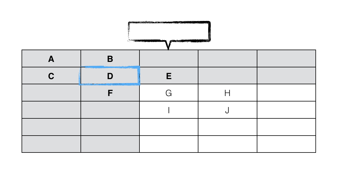
| Case | Column menu | Row menu | Cell menu |
| A |
* Add header column before |
* Add header row above |
* Merge right * Merge left * Merge above * Merge bellow * Split horizontally * Split vertically |
| B |
* Convert to data column |
A | |
| C | A |
* Convert to data row |
|
| D | B | C | |
| E |
* Add column before |
C | |
| F | B |
* Add row above |
|
| G | E | F | |
| H |
* Add column before |
F | |
| I | E |
* Add row above |
|
| J | H | I |
Pros
- The UI is very compact; less buttons, less (possibly) confusing icons,
- It's quite easy to figure what is what and which is which, at least to me.
Cons
- What do we do when the multiple cell selection is implemented? (I'm talking about the "Cell menu"). It will make no longer sense and will likely be split into "Merge cells" button and "Split cell" dropdown.
Regarding headers incorporated into column and row menus:
- (If the menus change to adapt to the selection) Discoverability is the biggest issue, I think. Users may be confused when suddenly some items are gone and some appear "out of nowhere". Adapting to this mindset might take time. Also, I guess users depending on screen readers would also welcome some stability in the UI; they should be able to automate the navigation by rembering the structure of the "tree".
- (If the menus are always the same, but items are inactive) The menus may become cluttered and hard to navigate.
Which approach you think is better? The compressed one (as above) or more conservative?
oleq
on 23 May 2018
@oleq Do not forget the cell menu might change also due to rowspan/colspan of adjacent cells so there will also be either disabled options or removed:
But OTOH this cell merging is going to be temporary (few months max?) before we do cell selection, right?
jodator
on 23 May 2018
@oleq wrote:
Discoverability is the biggest issue, I think. Users may be confused when suddenly some items are gone and some appear "out of nowhere".
and…
(If the menus are always the same, but items are inactive) The menus may become cluttered and hard to navigate.
I'm so familiar with Page's approach, that I find it intuitive, but you're right that it could confuse most users, who are used to other editors. And I agree that having all the options visible at all times would be a lot to parse, especially once the available settings for table elements expand in the future.
Another option—taking your comments above into account—would be to have a toggle menu item, "header row/column" that is greyed out in cases H, I, and J above; then only include the insert row/column before/after, which would insert a data or header row/column depending on context. I'd also use a single "Un-merge cells" command, which would avoid a lot of logic around when you can/can't split vertically/horizontally, etc. So you'd have:
| Case | Column menu | Row menu | Cell menu |
|---|---|---|---|
| A |
✓ Header column * Add column before * Add column after * Delete column |
✓ Header row * Add row above * Add row below * Delete row |
* Merge right * Merge left * Merge above * Merge bellow * Un-merge cells |
| B |
A |
A |
|
| C |
A |
A |
|
| D |
A |
A |
|
| E |
Header column * Add column before * Add column after * Delete column |
A |
|
| F |
A |
Header row * Add row above * Add row below * Delete row |
|
| G | E | F | |
| H |
* Add column before * Add column after * Delete column |
F | |
| I | E |
* Add row above * Add row below * Delete row |
|
| J | H | I |
This approach wouldn't allow for converting and inserting as I've been a proponent for, but it does simplify the UX quite a bit.
On merging
@jodator good points
@oleq wrote:
What do we do when the multiple cell selection is implemented? (I'm talking about the "Cell menu"). It will make no longer sense and will likely be split into "Merge cells" button and "Split cell" dropdown.
I imagine you'll have more options that relate to cells down the road. Leave "Merge cells" and "Un-merge cells" in the cell menu and add whatever else needed. It does create an extra click/tap over merge/unmerge buttons. But then again, how frequently is merge/unmerge used? Does it warrant two extra buttons present at all times?
dtwist
on 23 May 2018
Another option—taking your comments above into account—would be to have a toggle menu item, "header row/column" that is greyed out in cases H, I, and J above; then only include the insert row/column before/after, which would insert a data or header row/column depending on context.
+1 I was thinking about the same but couldn't find how to propose this. The issue that I saw in the previous proposal was that while table header is something that regular users may/should understand, the concept of "data columns" was so low-level/technical that I found it too complex.
Besides, as you pointed out, most of the times using a simple logic should let us "guess" what kind of row/column should be inserted. Most of the time it will be a "data column/row" unless you add a column before a header column or a row before a header row.
Regarding headers incorporated into column and row menus:
(If the menus change to adapt to the selection) Discoverability is the biggest issue, I think. Users may be confused when suddenly some items are gone and some appear "out of nowhere". Adapting to this mindset might take time. Also, I guess users depending on screen readers would also welcome some stability in the UI; they should be able to automate the navigation by rembering the structure of the "tree".
+1 I also find the argument about screen readers quite important. Also If the menus are always the same, but items are inactive, that would be consistent with the current behavior of the toolbar, where the buttons are disabled if they cannot be used.
wwalc
on 24 May 2018
I imagine you'll have more options that relate to cells down the road. Leave "Merge cells" and "Un-merge cells"...
This topic comes and go - unmerge cells vs split cell. Both have their cons and pros and how they are useful depends on how you'd like to interact with a table and currently I'm leaning towards dropping the split cell command (previously I was for keeping them).
I was trying to interact with a table in a way that one would like to use such feature. I think that it would be mostly used for grouping column/row headers like here:

It can be created using both approaches - either by merging cells or by splitting some cells.
Here I found that adding rows & columns and then merging some cells requires less work to create such structure while using split cell feature is actually less productive as you'd have to split every cell in a row...
The more I think about that split cell command the less I find it useful and the unmerge command makes more sense by now. But again maybe I'm missing something here? Right now I don't see why one would like to split a table cell in the middle of a table to create a useful (well structured) data table.
jodator
on 24 May 2018
@jodator Thanks for pointing out the discussion. Interesting—it hadn't occurred to me that "split cell" would be available on cells that hadn't already been merged. FWIW, I agree with your conclusions here; I can't think of why I'd want to split a single cell and make all others in the row/column spans. As a user, I'd just want a way to undo a merge I'd previously created between a set of cells. I too could be missing something though. 😄
dtwist
on 24 May 2018
Menus and dropdowns
Column and row menus
After certain consideration, we decided to go with @dtwist's proposal in https://github.com/ckeditor/ckeditor5-table/issues/1#issuecomment-391508499, which is both simple yet powerful for our purposes.
The column and row menus are constant (almost the same) and work as presented on the mockups below.


Note: If time allows, we're using the switch toggle. Otherwise, we will use a generic menu item for that purpose.

Merge/split menu
MVP1
In the MVP1, merge and split tools are in the same dropdown. The menu structure looks as follows:
- Merge right
- Merge left
- Merge above
- Merge bellow
- Split horizontally
- Split vertically
MVP2
In the MVP2, when the multi-cell selection is implemented in the editor, the menu becomes a split button (like in the highlight feature). The main button works as merge and the drop-down contains split buttons.

Beyond MVP2 (unsplit)
We may want to offer the "Unsplit" button in the split dropdown, which restores the selected area of the table to its simplest structure, removing all vertical and horizontal splits. This should be discussed as a follow-up.
New icons
@dtwist did a great job proposing the new icons. Can I ask you to create a PR with SVGs in this repository so we can legally use your work?
Selection handler
We need a basic selection handler for 2 crucial purposes:
- deleting the table,
- cutting the table (and pasting it later on, until D&D is not available).
MVP1
In https://github.com/ckeditor/ckeditor5/issues/1023 several ideas have been proposed and I followed them to create a more compact selection handler.

Note: Depending on how much time do we have, we might move this selection handler to MVP2 and use figure's padding to allow the selection of the table.
MVP2
In MVP2, when the D&D becomes possible, the icon will change to reflect the new functionality.
Default table styles
WIP. Researching with @dkonopka.
oleq
on 25 May 2018
@oleq I really like the select widget icon. I think that is clear enough for both table widget and for image widget.
ps.: I'm working now on the table insertion UI as the toolbar with buttons is almost ready. I've used the minimal approach with generic menu item so in the first PR for UI there will be now toggle.
jodator
on 25 May 2018
@oleq wrote
Can I ask you to create a PR with SVGs in this repository so we can legally use your work?
Done; just waiting on the email to fill out your CLA. I included a matching alternate table icon and a couple icons that I had worked on before settling on the cell drop-down for the MVP that may be of use as a merge/unmerge toggle button once you get multi-cell selection working.

Can I contribute my sketch file as well somehow, so you can have the source to work with?
I too like the selection icon you came up with for MVP1. Smart. I'll be curious to see how that click-target size feels in practice.
dtwist
on 26 May 2018
Should also say I really like the toggle indicator; I hope that makes it in to the MVP. It should be useful for numerous other features down the road too. 😄
dtwist
on 26 May 2018
In the MVP1, merge and split tools are in the same dropdown.
A follow up on @jodator's suggestion... I love the idea of not having "split" at all and instead just have merge options, added by "Unmerge". That's how spreadsheet applications work, in fact. WDYT?
fredck
on 28 May 2018
I am +1 for Merge + unmerge.
scofalik
on 28 May 2018
Leaving aside whether we should go with merge&unmerge or split&merge(&unmerge) – @jodator, please go ahead with what you have so far because, IIRC, you have a part of it ready. Let's not delay the MVP because it's not a crucial thing at this stage. Let's have MVP ready to ship ASAP.
Reinmar
on 28 May 2018
Perhaps this is outside of scope for this but are there any plans to implement table border colouring and/or styles? I could see it living in a "cell menu". I guess cell background colour might be popular too (although my team doesn't need this one)
 tbredin
on 26 Aug 2019
tbredin
on 26 Aug 2019
@tbredin Yes, we consider this. Leave 👍 in the issue if you want it.
oleq
on 12 Sep 2019
Anyone know how to fix overflow issue on responsive?
Maybe exists settings for bounding container?

 7iomka
on 7 Oct 2019
7iomka
on 7 Oct 2019
@7iomka I could reproduce it on Chrome dev tools but I couldn't using a physical mobile device (iPhone). Did you experience this issue on a smartphone?
P.S. UI elements will be cropped by the viewport when you pinch-zoom. There's no way to avoid this.
oleq
on 7 Oct 2019
pinch
yes, of course:

I have<meta name="viewport" content="width=device-width, initial-scale=1, shrink-to-fit=no">
And, if body or root element has oveflow hidden, this cause weird behaviour, or if you have absolute positioned visually hidden sidebar (with left: -${sidebarWidth}) - sidebar will be visible on a segment equal to the width which does not fit in vieport.
My question is - how to manipulate with settings of position of this dropdown items?
For example Popper.js used by most popular dropdown menus (bootstrap, tippy, etc..) has settings like preventOverflow.boundariesElement
Boundaries can be scrollParent, window, viewport or any DOM element.
In another plugins i just changed boundaries settings to root container element to fix this kind of problem.
Thanks for any ideas!
7iomka
on 7 Oct 2019
@7iomka I confirm the problem. More details can be found in a separate issue.
My question is - how to manipulate with settings of position of this dropdown items?
For example Popper.js used by most popular dropdown menus (bootstrap, tippy, etc..) has settings like preventOverflow.boundariesElement
Boundaries can be scrollParent, window, viewport or any DOM element.
I'm afraid there's no easy way to do that ATM. Most dropdowns have panelPosition set to 'auto' and that means the positions are optimized so that the panel fits into the viewport.
In theory, you could override defaultPanelPositions (see the definitions) with your own functions that consider your extra restrictions. I guess this should work but I didn't try. Let me know if it helps.
oleq
on 9 Oct 2019
Related issues
 PaulParker
·
3Comments
Reinmar
·
3Comments
wwalc
·
3Comments
PaulParker
·
3Comments
Reinmar
·
3Comments
wwalc
·
3Comments
 pomek
·
3Comments
oleq
·
3Comments
pomek
·
3Comments
oleq
·
3Comments
Most helpful comment
I'm chiming in here, just because I’ve put a lot of energy into table UI/UX in the past; hopefully I add something to the discussion. 😄
Using a popup balloon for editing rows/cols/cells
I jumped into this thread earlier to vote against using a balloon, and I still lean strongly that way. @fredck nailed the reasoning—people spend more time entering text and scanning the contents of a table than adjusting styling. Having a balloon jumping around as you click from cell to cell and covering content below your selection would be obtrusive.
@dkonopka You're absolutely right that the mouse traversal is a chore when you want to style cells. I still maintain this is a better trade off than covering table contents when editing contents.
multi-mode table editor
@jodator @scofalik I see a couple approaches to doing this:
1) Single click selects a cell, and double click edits content. But I foresee some awkwardness and frustration with this approach.
2) With multi-cell selection in place, clicking and dragging in a cell would select text in the cell to begin with, but once you drag past a cell border it would switch to selecting cells directly. By click-dragging out of the cell and reversing the mouse direction to bring the cursor back within the bounds of the first cell, you'd now have a single cell selected.
In such a case, an in-place balloon would work well, since it would only appear once cells are explicitly selected.
Default styles of the table
@oleq @jodator I mocked up a prototype to apply @oleq’s design. On playing around with this, I determined you would need one extra class (on colgroups) to avoid
edge cases with colspan and rowspan for tables with multiple header columns.
Requires:
<thead><colgroup>s always be included, with classes to differentiate between header and data columnsscope="auto"(or just omit the scope attribute) on the corner cellsCode here:
https://codepen.io/anon/pen/wjyGpo?editors=1100
Setting columns/rows as headings
@oleq’s idea is interesting, but might be over-reaching. I think using the column and header dropdowns suffices. Apple's Pages app does a good job with menu items that are contextual to the cell you have selected.
_[edit]_ Forgot to point out that by using contextual menu items, you can prevent users from adding headers (or giving the impression they can) anywhere but at the top or left of tables. This is part of what I think Pages gets right. (This assumes of course, you don't want to let users add headers in the middle of a table)
Aligning text
Since one goal of this feature is to prevent people mis-using tables, I think @fredck has the right idea of applying alignment to whole columns—I’d keep it simple and just add an align»left/right/center to the column’s drop-down and align»top/bottom/middle to the row’s.
Merging/Splitting cells
Forgive me if I've missed the discussion on why this made it into the MVP, but I might just wait until you have cell selection available before implementing, since it is a much more natural UX to select the cells you want to merge or split directly. (merge|split)(left|right|up|down) feels clunky.
The look of a toolbar attached relative to a table (instead of following cells)
@oleq wrote:
I had a similar idea; doing so could also solve the problems of selecting a whole table (or other editable), and allowing for drag and drop. I've started a mockup in sketch, just need to get to bed tonight—will try to flesh that out and post a new issue tomorrow, since it could apply to more than just tables.