Ckeditor5: The block quote icon stands out (is too heavy)
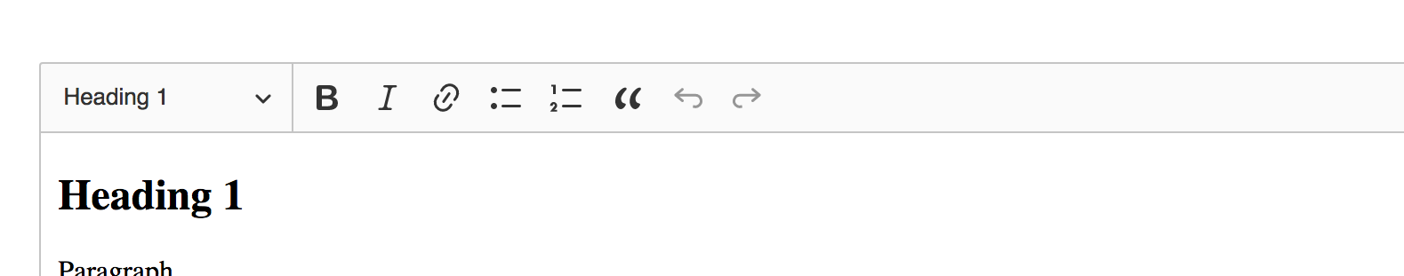
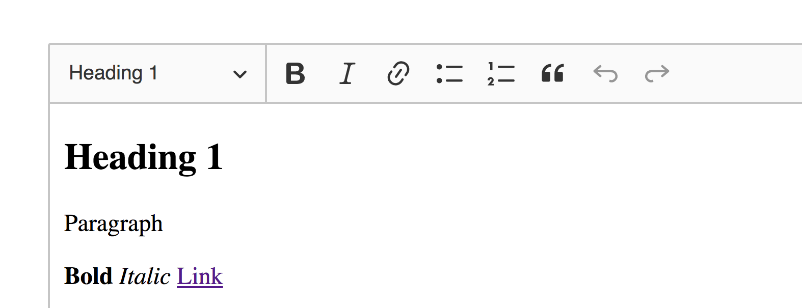
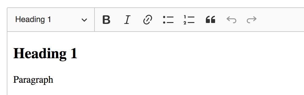
Take a look at this zoomed out screenshot:

It's heavier than any other icon in the toolbar.
I'd also add that IMO it's kinda edgy (not rounded enough). That also stands out a bit.
 Reinmar
All 19 comments
What do you think about a little bit different shape?

 dkonopka
on 13 Feb 2018
dkonopka
on 13 Feb 2018
Interesting direction. I think it's too small (comparing to other icons), but after you'd make it bigger it would be heavy again. Can we use a thinner style for it?
Reinmar
on 13 Feb 2018
It's tricky to show the quote (as you said if I'm making it bigger it's getting bold), but this is something that looks much better than the current icon. Or we are trying with another shape of a quote?
current blockquote icon

bold version

big bold version

thin version

I'm for "big bold version" and you?
dkonopka
on 14 Feb 2018
I prefered the first proposal.
 pjasiun
on 14 Feb 2018
pjasiun
on 14 Feb 2018
I like the "big bold version" proposal :) Although thin version is okay too. I don't like current icon either. It is quite heavy.
 scofalik
on 14 Feb 2018
scofalik
on 14 Feb 2018
Next proposals after call. It's worth noting that there is a small disparity between list icon (number "2" is outside grid).
1.

2.
3.
4.

I would go with 4th option.
dkonopka
on 22 Feb 2018
Some more ideas (the original is the first one):

 oleq
on 22 Feb 2018
oleq
on 22 Feb 2018
Two more:

oleq
on 22 Feb 2018
Slightly more refined:
oleq
on 22 Feb 2018
I liked the idea of "hollow icon" at first sight, but it looks a bit like two six numbers: 66. Someone might think this is something connected with inserting numbers or something. I think that idea fits the theme most and is best-looking, but a bit confusing :(.
scofalik
on 22 Feb 2018
I do my best to lose this "6" feel. We can either go with a solid icon (first approach) and make it lighter by reducing the size or try to play with hollow ones. Two more:
I think the first one looks more like a quote than "6".
oleq
on 22 Feb 2018
Shorter "tail" (as in first example) helps for sure.
scofalik
on 22 Feb 2018
TBH, none of the proposals convince me :D Damian's went into too "droplet" shapes. Olek's 6-ish into "66". So far, I'm starting to like the current icon more and more with time and the only one I also liked was the smaller version of the original one:

Olek – is it possible to stretch this one a bit? I think that something with little radius, filled "head" and slightly longer tail might work. This will differentiate it well from "66" while keeping the right size. And to prevent it from being too heavy, the head should stay proportionally small which means that the tail must become a little longer so the overall size isn't too small... I wish I could into SVG.
Reinmar
on 22 Feb 2018
After 3 more minutes of looking at this, we both (I and Maja) came to the same conclusion that from all the proposed icons we like the smaller version of the original icon the most. However, there may be still options to improve it:
- make the tail slightly longer (to enlarge the icon),
- make the head slightly more narrow (to reduce the weight of the icon).
Reinmar
on 22 Feb 2018
Narrow head
Narrow head & thin tail

Narrow head & long, thin tail
dkonopka
on 23 Feb 2018
I think there's too much tail in Damian's mockups. So I re-adjusted my first mockup
oleq
on 23 Feb 2018
Some more adjustments.
Before:
After:


oleq
on 23 Feb 2018
TBH, I can't get anything better than this
in this concept. We can either merge it or try another approach.
oleq
on 23 Feb 2018
For sure it looks better than the old version. Since a lot of variations has been proposed here I think that we can settle on something final. The last one and the one where I added a thumbs-up are looking good.
scofalik
on 23 Feb 2018
Related issues
 msamsel
·
3Comments
oleq
·
3Comments
msamsel
·
3Comments
oleq
·
3Comments
 pandora-iuz
·
3Comments
pandora-iuz
·
3Comments
 hybridpicker
·
3Comments
pjasiun
·
3Comments
hybridpicker
·
3Comments
pjasiun
·
3Comments
Most helpful comment
TBH, I can't get anything better than this

in this concept. We can either merge it or try another approach.