Circuitverse: Sign-in/Login page layout
Describe the bug
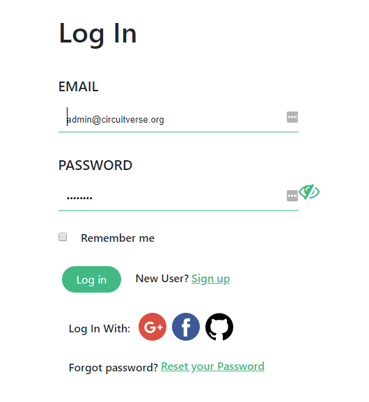
Login and sing-in page needs layout changes
Remember me checkbox is not styled at all(fixed in #1259)- Social login buttons look odd when they are aligned that way if we want to stick to circles the best way to fix that will be something like that:

- Elements are not aligned with each other

Show password icon (eye) should be inside a textbox
Main action buttons (Log-in/Sign-in) are definitely too small and don't stand out when they should be the main button on the page they look very "little"
The whole section below text boxes looks like an overloaded mess. The big part in that issue also points
2but, the important issue is thatNew User? Sign upandForgot password? Reset your Passwordare basically the same font size and shape like normal page elements or titles when those elements are rarely used by end-user. They should be grey and don't stand out that muchI described login page mostly here but the sign-in page has exactly same problems
Desktop (please complete the following information):
- OS: Windows 10
- Browser: Vivaldi (chromium)
Are you working on this issue? (Yes/No)
No
 MrBartusek
All 22 comments
1) Yes true I didn't make it during design therefore it was copied as it is from previous design.
2) There is a reason the button is left aligned. This might help you. https://www.interaction-design.org/literature/topics/fitts-law
3) There are no hard and fast rules for button styling. It should follow just some few basic guidelines: It must appear clickable and should clearly depict what'll happen on clicking. So, no need.
4) Yes there are aligment issues in the developed version. Correction is needed. You might refer to the XD prototype I've made.
5) Forgot password has similar styling and size like New User? Sign up and Login with elements. So that doesn't really stand out.
6) Yes it should be inside.
 nitin10s
on 23 Dec 2019
nitin10s
on 23 Dec 2019
Can I work on this, I already have experience with work like this and am quite good with it.
 AyanChoudhary
on 22 Jan 2020
AyanChoudhary
on 22 Jan 2020
Yes, go ahead @AyanChoudhary
MrBartusek
on 22 Jan 2020
I am a UI/UX designer and can make a better Log-in/Sign-in page.
I am planning to make a Figma file with the design of the new Log-in page, before starting to code.
Can I take this issue? (The PR linked to this issue is inactive for a long period of time.)
 angrycharas
on 21 Feb 2020
angrycharas
on 21 Feb 2020
It's already completed and has a pr linked to it.
AyanChoudhary
on 21 Feb 2020
@angrycharas Nitin is coordinating UX remake, We already have prortotype. If you would like to work on new UX please ask on #UX on Slack
MrBartusek
on 21 Feb 2020
Hi i am Harshal Goyal
I am an undergraduate student and i am willing to participate in gsoc 2020
 HarshalGoyal
on 24 Feb 2020
HarshalGoyal
on 24 Feb 2020
Can you please help me out by guiding me about project
HarshalGoyal
on 24 Feb 2020
Hello @HarshalGoyal The best place for asking such things is our Slack
MrBartusek
on 24 Feb 2020
Still relevant
MrBartusek
on 7 Mar 2020
What is still relevant? Also, we'll be styling all checkbox uniformly soon.
nitin10s
on 9 Mar 2020
@nitin10s
Login in with a forgot password is not aligned with other elements
Show password icon (eye) should be inside a textbox
MrBartusek
on 9 Mar 2020
I can work on the login-page for whatever seems off if all the claimers aren't working on it anymore, It's the second page all user's sees while visiting, I did a styling of the checkbox #1259 (awaiting reviews)
@MrBartusek @nitin10s
 abstrekt
on 20 Mar 2020
abstrekt
on 20 Mar 2020
@nitin10s @abstrekt I completely re-elaborate the whole issue, now it should be cleaner
MrBartusek
on 21 Mar 2020
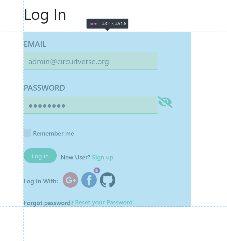
Removing some padding & margin will fix point 3
abstrekt
on 21 Mar 2020
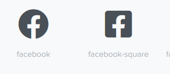
CV uses fontawesome, so we can use their social icons, should look good for point 2.
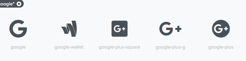
abstrekt
on 21 Mar 2020
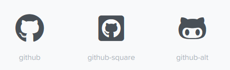
maybe for 4

abstrekt
on 21 Mar 2020
Shall I start working on it now? @nitin10s @MrBartusek
abstrekt
on 21 Mar 2020
We've tweaked the input boxes actually, I'll send the new design soon.
nitin10s
on 21 Mar 2020
was it Sign-in/Sign-up page layout ..
abstrekt
on 21 Mar 2020
No activity on this issue for a prolonged duration, will be closed if no further activities in next 7 days
![github-actions[bot] picture](https://avatars.githubusercontent.com/in/15368?v=4&s=40) github-actions[bot]
on 21 May 2020
MrBartusek
on 24 May 2020
github-actions[bot]
on 21 May 2020
MrBartusek
on 24 May 2020
Related issues
 fpintos
·
9Comments
fpintos
·
9Comments
 tachyons
·
6Comments
tachyons
·
6Comments
 jbox144
·
7Comments
jbox144
·
7Comments
 ryuk156
·
4Comments
ryuk156
·
4Comments
 satu0king
·
5Comments
satu0king
·
5Comments