Cherrytree: Icon theme: going 16px?
This is something that I was thinking about it when I started to replace some icons of the theme.
Nowadays, CT uses svg on all icons, and mostly on a dimension of 48x48 px.
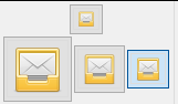
48 px is a good dimension for good detailed icons, but regrettably they have a problem when they are downscalated: the icon start to look blurry.
Example, this is a "48 px" drawing downscalated:
And this is the same icon but redrawed to look good on 16 px:
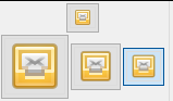
The 16 px one, upscaled look simpler but in the original size for what intended (the little top box, the 16 px one) looks more sharp and clear.
That's the reason that mostly of the programs even if they work with svg icons they use a icon for each specific size.
Now I'm not suggesting here to have multiple icons for each size, but that maybe is better to "downscale" the icons that CT manages to match his default, that is, 16 px.
I search the equivalents and re-draw the missing. Here I show a comparison between the actual icon set, and one on 16px:



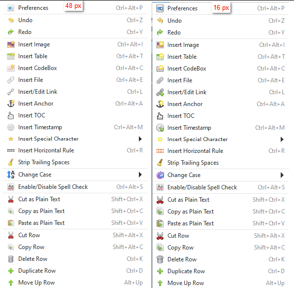
As you can see, it's true that some level of detail is lost, but the icons on their default size looks more defined and colorful.
Here I attach the icons (as always, I didn't edit the original cherries, except the finders) if you want to test and compare.
Of course, this is an opinion, no problem if you consider that could be a problem or don't adjust to a future implementation.
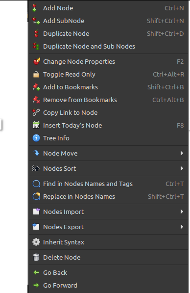
They also work on dark themes, example:

Cheers
 userfav
All 19 comments
Thanks @userfav I want to see how they look when upscaled and in hidpi monitor before deciding
 giuspen
on 13 Dec 2020
giuspen
on 13 Dec 2020
@giuspen Yes, the icons are still svg and scalable as always, but that's something to consider. I could only test them on a 2k monitor.
userfav
on 13 Dec 2020
I merged your work, thanks.
Some feedback from me about what I like less/have some doubts:
- the icon bold/italic/strikethrough/underlined, they all look bold and not as detailed as other icons with letters
- the s icon for small is quite big, bigger than the h just before and the following a, maybe could be the same size if not slightly smaller
- (this less important) the magnifier is not so clear that it's a magnifier because the stick is maybe too small
giuspen
on 13 Dec 2020
Thanks, feedback is needed and appreciated! They are all good points.
About the bold/italic/strikethrough/underlined: I have also have the sense that they all looked "bold". The elementary folks made a symbolic thinner alternative to them but the letters were "B" for bold, "U" for underlined, "S" for strikethrough, etc. and I prefer the current by them not having the first letter on english. I attach below a variant using the same "a" used on the superscript icon. Also I changed the "small" icon using the same "s" that was used on the superscript/subscripts icons. Here's a preview, tell me what you think.

About the magnifiers, yes, I understand what you mean, I made them bigger to gain clarity when inside have a lot of objects. This recourse is used on other programs as well, a near example can be Inkscape, when they also have many objects inside the magnifier:

I guess that when you use a light theme the stick look thin, that's because of the lighter border added to make them pop-up with darker themes:

If you want I can make the stick more wider but I think that if the circle is smaller the things inside will be look too cramped.
userfav
on 13 Dec 2020
I like your changes thanks!
giuspen
on 14 Dec 2020
@giuspen Good to know! I take the opportunity to comment you that I noticed that I misspelled the name of an icon in the "icons_16px_2020-12-13.zip" pack. It says "ct_fmt-txt-lastest.svg" when should be "ct_fmt-txt-latest.svg".
Cheers
userfav
on 14 Dec 2020
thanks @userfav I spotted the typo and also I found an additional icon of an open lock which was not part of the theme, I simply have ignored it
giuspen
on 14 Dec 2020
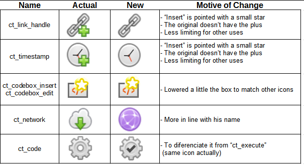
@giuspen I attach a pack of little adjustments, I explain why in the table below. Don't worry, I think I won't bother you about the icons for a while now ;)
userfav
on 14 Dec 2020
@userfav no bothering at all, I like your work and I'm sure the cherrytree users will like it too, thanks!
giuspen
on 14 Dec 2020
@userfav no bothering at all
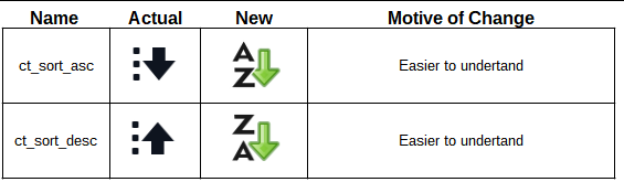
@giuspen Good, because I forgot the sorting ones :pray:
userfav
on 15 Dec 2020
😄 thanks I'll update shortly
giuspen
on 15 Dec 2020
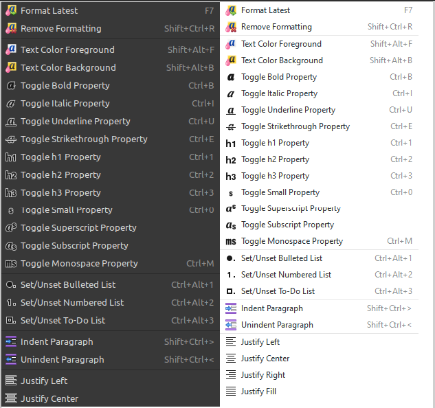
@giuspen Giuspen, with the feedback from others users I adjust the icons so the same can be seen acceptable with lighter or darker themes, I use some transparency so the white borders will not to be too jarring also I unified the colors of all icons that can have problems with the contrast. Also I made some tweaks on the icons with the "insert" characteristic (added a "plus") so now they are more easy to interpret.
Preview of the same icons on light and dark themes:


userfav
on 16 Dec 2020
Super, thanks @userfav I'll update later
giuspen
on 16 Dec 2020
Do you have a set that isn't this small? I use them quite large on my toolbar.
Old eyes, ya know... :smiley:
 rogue-ronin
on 16 Dec 2020
rogue-ronin
on 16 Dec 2020
@rogue-ronin Sure!, this is the previous 48px mixed with the latest fixes for the darker themes. If something if seeing off let me know.
userfav
on 17 Dec 2020
This is a mix of 48px and 16px... :smiley:
Do you have a full set at 48px?
Aloha!
rogue-ronin
on 17 Dec 2020
There are some 16px svgs but mostly are the "symbolic" ones who are scalable, for example:

Witch ones look bad? can you show me a screenshot?
userfav
on 17 Dec 2020
No worries, my friend. I may have overstated, implying appearance issues.
Looking pretty good here, thanks again!
On Wed, Dec 16, 2020 at 2:00 PM userfav notifications@github.com wrote:
There are some 16px svgs but mostly are the "symbolic" ones who are
scalable, for example:[image: imagen]
https://user-images.githubusercontent.com/46328784/102420502-0dffee00-3fe1-11eb-9443-6faca8ad0785.pngWitch ones look bad? can you show me a screenshot?
—
You are receiving this because you were mentioned.
Reply to this email directly, view it on GitHub
https://github.com/giuspen/cherrytree/issues/1426#issuecomment-747112726,
or unsubscribe
https://github.com/notifications/unsubscribe-auth/ADL7PUQFLPX53BNT5L6FIFDSVFC2LANCNFSM4UZUXISQ
.
rogue-ronin
on 17 Dec 2020
Closing because it was done on version 0.99.26
userfav
on 20 Dec 2020
Related issues
 HEDGHOK
·
6Comments
HEDGHOK
·
6Comments
 JC-paavo
·
3Comments
JC-paavo
·
3Comments
 codingo
·
7Comments
codingo
·
7Comments
 zauberparacelsus
·
7Comments
zauberparacelsus
·
7Comments
 mamsiir
·
8Comments
mamsiir
·
8Comments