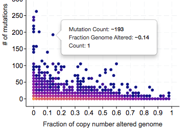
Cbioportal: study view density plot: can we remove the ~ sign when there is only 1 sample
requested by @schultzn https://github.com/cBioPortal/cbioportal/issues/4835
@adamabeshouse @zhx828 I guess it may not be that easy since we are not loading sample level data for the plot. (do we even have the sample IDs in this plot or do we have to query?)
 jjgao
jjgao
All 23 comments
Wouldn’t it be as simple as: IF COUNT = 1, do not display “~”?
On Nov 6, 2018, at 10:23 AM, JianJiong Gao notifications@github.com wrote:
requested by @schultzn https://github.com/schultzn #4835 https://github.com/cBioPortal/cbioportal/issues/4835
@adamabeshouse https://github.com/adamabeshouse @zhx828 https://github.com/zhx828 I guess it may not be that easy since we are not loading sample level data for the plot. (do we even have the sample IDs in this plot or do we have to query?)https://user-images.githubusercontent.com/840895/48073903-b4942680-e1ad-11e8-80ba-2b1729d0ab1b.png
—
You are receiving this because you were mentioned.
Reply to this email directly, view it on GitHub https://github.com/cBioPortal/cbioportal/issues/5194, or mute the thread https://github.com/notifications/unsubscribe-auth/ALV34IEl5sJkpNwUqq8_vF-04FnCDi0xks5usal3gaJpZM4YQqi2.
 schultzn
on 6 Nov 2018
schultzn
on 6 Nov 2018
@schultzn The number would not be correct by just removing ~ b/c this is a binned plot. For example, the actually values for the sample above are 198 mutations and 0.145 FGA.
jjgao
on 6 Nov 2018
This can be confusing. Maybe we should display the range too? We can ask the backend API to return the max and min (of all values of samples in the bin) and display them. If a dot has only one sample, then max=min and we can display the exact value.
jjgao
on 6 Nov 2018
What would happen in studies with just a few samples? Shouldn’t we be able to show the exact values there?
On Nov 6, 2018, at 11:49 AM, JianJiong Gao notifications@github.com wrote:
This can be confusing. Maybe we should display the range too? We can ask the backend API to return the max and min and display them. If a dot has only one sample, then max=min and we can display the exact value.
—
You are receiving this because you were mentioned.
Reply to this email directly, view it on GitHub https://github.com/cBioPortal/cbioportal/issues/5194#issuecomment-436324157, or mute the thread https://github.com/notifications/unsubscribe-auth/ALV34Kz0Zl8Udkv1I1dPfr2Tssv3bLEIks5usb2ZgaJpZM4YQqi2.
schultzn
on 6 Nov 2018
@schultzn we still need the additional info @jjgao mentioned - the API sends back the bin coordinates (i.e. the coordinates of each dot in the grid), which are not determined by the contents of the bin
 adamabeshouse
on 6 Nov 2018
adamabeshouse
on 6 Nov 2018
Ok, I understand. I didn’t anticipate that this would be a problem.
Ok to leave as is then.
Two other quick suggestions on fixes:
1 - tooltip cut off if a point is too far to the right
2 - after selecting samples, can the other ones still be shown but greyed out?
On Nov 6, 2018, at 2:09 PM, Adam Abeshouse notifications@github.com wrote:
@schultzn https://github.com/schultzn we still need the additional info @jjgao https://github.com/jjgao mentioned - the API sends back the bin coordinates, which are related to the endpoints of the data range, not related to the contents of the bin.
—
You are receiving this because you were mentioned.
Reply to this email directly, view it on GitHub https://github.com/cBioPortal/cbioportal/issues/5194#issuecomment-436372088, or mute the thread https://github.com/notifications/unsubscribe-auth/ALV34JMwB3hSiGITXUxelE5pKpc77bofks5usd6CgaJpZM4YQqi2.
schultzn
on 6 Nov 2018
@schultzn remember that the dots in the plot are bins, not individual samples. so what do you mean by still having them there - have grayed out bins where any dots are? also, we are zooming the y axis (mutation count) according to the new domain - would we not zoom in this case?
adamabeshouse
on 6 Nov 2018
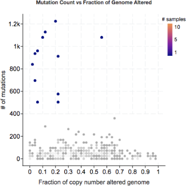
Something like this? In this example, the samples near the top are selected, the rest are not.
On Nov 6, 2018, at 2:31 PM, Adam Abeshouse notifications@github.com wrote:
@schultzn https://github.com/schultzn remember that the dots in the plot are bins, not individual samples. so what do you mean by still having them there - have grayed out bins where any dots are? also, we are zooming the y axis (mutation count) according to the new domain - would we not zoom in this case?
—
You are receiving this because you were mentioned.
Reply to this email directly, view it on GitHub https://github.com/cBioPortal/cbioportal/issues/5194#issuecomment-436379311, or mute the thread https://github.com/notifications/unsubscribe-auth/ALV34OKlL7s7ObVysj5X1JECI7X5FpRVks5useOVgaJpZM4YQqi2.
schultzn
on 6 Nov 2018
@schultzn image wasnt attached
adamabeshouse
on 6 Nov 2018
schultzn
on 7 Nov 2018
did you do that by hand??? yeah that looks nice. I spoke to @jjgao and it'll mainly take some API changes
adamabeshouse
on 7 Nov 2018
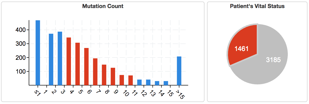
@adamabeshouse We only need to display the gray ones if we are using the density plot for selection, similar to barchart.
@ersinciftci would you please modify the API to support features above?
- [ ] add unselected dots to the output
- [ ] add min and max values (the actual values in sample) to the output
jjgao
on 7 Nov 2018
Photoshop… not all that well done - as you can see I also made the grid disappear.
On Nov 6, 2018, at 6:17 PM, Adam Abeshouse notifications@github.com wrote:
did you do that by hand??? yeah that looks nice. I spoke to @jjgao https://github.com/jjgao and it'll mainly take some API changes
—
You are receiving this because you were mentioned.
Reply to this email directly, view it on GitHub https://github.com/cBioPortal/cbioportal/issues/5194#issuecomment-436444800, or mute the thread https://github.com/notifications/unsubscribe-auth/ALV34Pl2XQRj6Q9BTFMJQd34NxaX8anKks5ushh0gaJpZM4YQqi2.
schultzn
on 7 Nov 2018
@jjgao if we are going to keep the unselecred dots, it means the frontend will call the API just once at the first load, then no need to call the API again, since we are not zooming in based on selection anymore. Basically just like the old Mutation Count vs FGA plot. So no need to change the API for the first one (right @adamabeshouse ?)
I can add min and max to every bin but it sounds like a bit overkill since they will be only useful when min = max. Let's see if we can find a better way after I come back.
 ersinciftci
on 7 Nov 2018
ersinciftci
on 7 Nov 2018
@ersinciftci if we use another chart to select samples, we are still going to hide unselected samples. We only show the gray dots that are not selected directly through the density plot. This is very similar to bar charts.
jjgao
on 7 Nov 2018
@jjgao @adamabeshouse If the frontend doesn't send mutationCountVsCNASelection field in the filter when calling /clinical-data-density-plot/fetch, the unselected bins would still be visible, so I think still no need to change the API for that one.
ersinciftci
on 12 Nov 2018
@ersinciftci no, bc the filter will still influence which bins come back, and what their counts are. and wont send back unselected. we need that info with respect to all filters, not just area selection
adamabeshouse
on 12 Nov 2018
Just for the record, we discussed this during the planning meeting, there was some confusion about how the filter applies to bins, but now we are on the same page that no API change is needed for showing the unselected bins.
ersinciftci
on 12 Nov 2018
@jjgao I just realized that you wanted min and max values to be displayed for every bin, not only 1-sample bins. So we will use the bin coordinates only for drawing the chart, and will use min-max values in the tooltip. That sounds good to me, let me see how it affects the performance of the API, shouldn't affect much in terms of big O notation.
ersinciftci
on 14 Nov 2018
Merged the PR, so the new bin object looks like:
[
  {
    "binX": 0,
    "binY": 0,
    "count": 0,
    "maxX": 0,
    "maxY": 0,
    "minX": 0,
    "minY": 0
  }
]
max-min fields won't be present if the count is 0.
ersinciftci
on 14 Nov 2018
issue with the grayscale for unselected: typically i think of darker representing higher density in grayscale. but in the case of our color scheme the colors get lighter with higher density. so in which direction should our grayscale go... should we modify our color scheme?
adamabeshouse
on 15 Nov 2018
@adamabeshouse let's use one color for gray.
jjgao
on 16 Nov 2018
@jjgao ah okay
adamabeshouse
on 16 Nov 2018
Related issues
 sandertan
·
5Comments
sandertan
·
5Comments
 oplantalech
·
5Comments
oplantalech
·
5Comments
 ecerami
·
8Comments
ecerami
·
8Comments
 tmazor
·
12Comments
tmazor
·
12Comments
 alisman
·
5Comments
alisman
·
5Comments