Caseflow: Remove Pending Action tab
The current implementation of the Pending Action column is complex. Cases move to Pending Action if there are new documents, or if a case put on hold has finished their hold.
Proposed changes
For cases with new documents
- Change implementation to only show icon if new documents have been added since the date the case status changed to
in-progress- https://github.com/department-of-veterans-affairs/caseflow/issues/7777 - Keep cases with new documents in the On Hold tab
- If cases have new documents in the On Hold tab, show new documents icon in the tab itself
- Continue showing new documents icon next to Reader link, per case with .new documents (as is currently implemented today)
- Change implementation to only show icon if new documents have been added since the date the case status changed to
For cases that have finished their holds
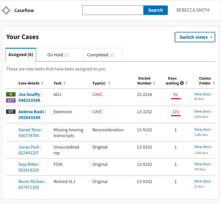
- Change "New" tab to read "Assigned". Move cases to the Assigned tab
- When cases come back from "on-hold" to "assigned" tab, their aggregate days waiting should be displayed (total days consecutively in this user's queue (including hold time). This can act as a quick cue to help users understand that these aren't freshly assigned cases.
Mocks for cases that have finished their holds ( in assigned tab)
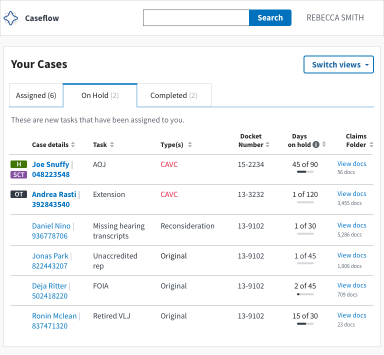
Optional mocks for slider-style indicator of proportion of hold (in on-hold)
 laurjpeterson
All 9 comments
For both Option 1 and Option 2, I think we should have an idea of what it looks like when the hold is over and what it looks like in either of those two columns. Right now I could imagine both options working, but there might be a preference based on how it would work in either of the two columns.
Also, testing of those two options might be good -- because users might prefer the first tab to be -- all things I need to do. Or they might prefer it to stay in on holds. (I think for me, I'm leaning towards keeping things in an Assigned Column).
 MeredithStewart
on 13 Dec 2018
MeredithStewart
on 13 Dec 2018
Second @MeredithStewart on all of the above. Leaning towards option 2, but think it'd be good to get some user feedback on this as well (maybe we could interview folks after we've released option 2 just to get something out the door quicker?).
As for the rest of the plan, I think that looks great!
 lowellrex
on 13 Dec 2018
lowellrex
on 13 Dec 2018
I don' think I know enough about the new documents case to give a good opinion, but for cases that have finished their holds, I like option 2 because it clearly divides the tasks into two categories:
- tasks you can and should do something about now
- tasks you can't do anything about now
 joeyyang
on 13 Dec 2018
joeyyang
on 13 Dec 2018
Seems like we're all in agreement, so going to remove "discussion" from the title of this ticket. Ready to implement!
laurjpeterson
on 17 Dec 2018
Fix for the issue mentioned in this comment will relate to the solution here.
lowellrex
on 21 Dec 2018
If it is easy to take steps to improve the task table at the same time as per this tech spec then we should do that as part of this work as well.
lowellrex
on 24 Jan 2019
Do we think users will need a visual cue to indicate that a task has finished its hold or will a 60+ days waiting value be good enough?
 hschallhorn
on 28 Jan 2019
hschallhorn
on 28 Jan 2019
Ooh good q. Tagging @sneha-pai for her input. A while ago we toyed with an icon that kinda looked like a clock.
laurjpeterson
on 28 Jan 2019
Closed in #8908
hschallhorn
on 15 Feb 2019
Related issues
 lomky
·
4Comments
lomky
·
4Comments
 nikitarockz
·
3Comments
hschallhorn
·
4Comments
nikitarockz
·
3Comments
hschallhorn
·
4Comments
 araposo-tistatech
·
5Comments
laurjpeterson
·
5Comments
araposo-tistatech
·
5Comments
laurjpeterson
·
5Comments
Most helpful comment
I don' think I know enough about the new documents case to give a good opinion, but for cases that have finished their holds, I like option 2 because it clearly divides the tasks into two categories: