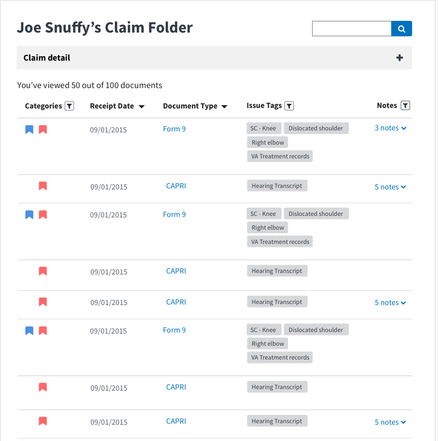
Caseflow: Documents List | Comments filter
When viewing the documents list, I want to quickly filter to show/expand only those documents with comments, so I can read through all my comments at once.
AC
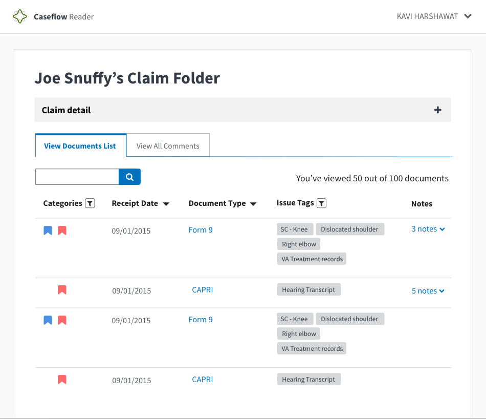
- Add new toggle feature that allows users to toggle between all documents and all comments
- Documents: Should show everything within filtered view.
- Comments: Should show all comments expanded and filtered only.
- The
ToggleButtoncomponent should be used, as listed in the Style Guide - The length of each toggle button should be the same
- There should be 20px of space between Show all: and toggle
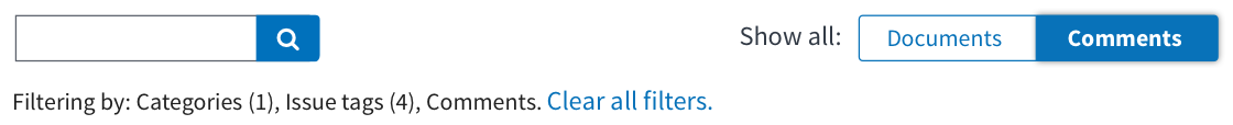
- Toggling between documents and comments works as a filter. It works as an AND with the categories and issue tags filters.
- Filters should apply to both views
- Search should apply to both views
- When toggling back to all documents after have been on comments view, we should collapse the comments.
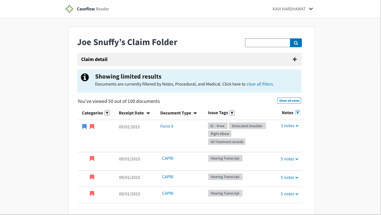
- When comments = empty state, filtering by message should mention comments. Related: https://github.com/department-of-veterans-affairs/caseflow/issues/2496
Example:
Mockups
Related
- Style guide ticket for new toggle button #2478
- #2496
 abbyraskinUSDS
All 23 comments
@gnakm it seems like we should combine the expand all with comment filtering, rather than having them disjointed; I don't see a use case for using one but not the other (and i think the expand all will be more useful if it's limiting the view) - thoughts?
abbyraskinUSDS
on 5 Jun 2017
this also gives us an opportunity to clarify the label of the button, since i think there's some confusion
abbyraskinUSDS
on 5 Jun 2017
@abbyraskin I totally agree with this. The button is too detached and missing a function. I think we should decide on design end of this week as we synthesize findings and define our product more this week.
 gnakm
on 5 Jun 2017
gnakm
on 5 Jun 2017
@abbyraskin For our discussion later
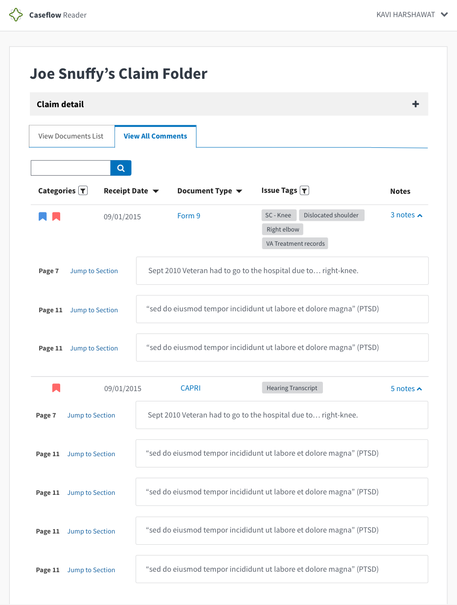
- View all comments tab
I added a header (no ticket for it yet but if things start getting very gnarly at the top, how about we use the accordion as header? I'm going to discuss this with Lara right before our meeting because I know she wants to add a global Veteran name and ID button at the top.
We also need to talk about how search will work for both filters. I'm inclined to say might be different for each section after this pilot. Would love to know your thoughts.
- Expand all button turns into a filter-esque button
Note for both:
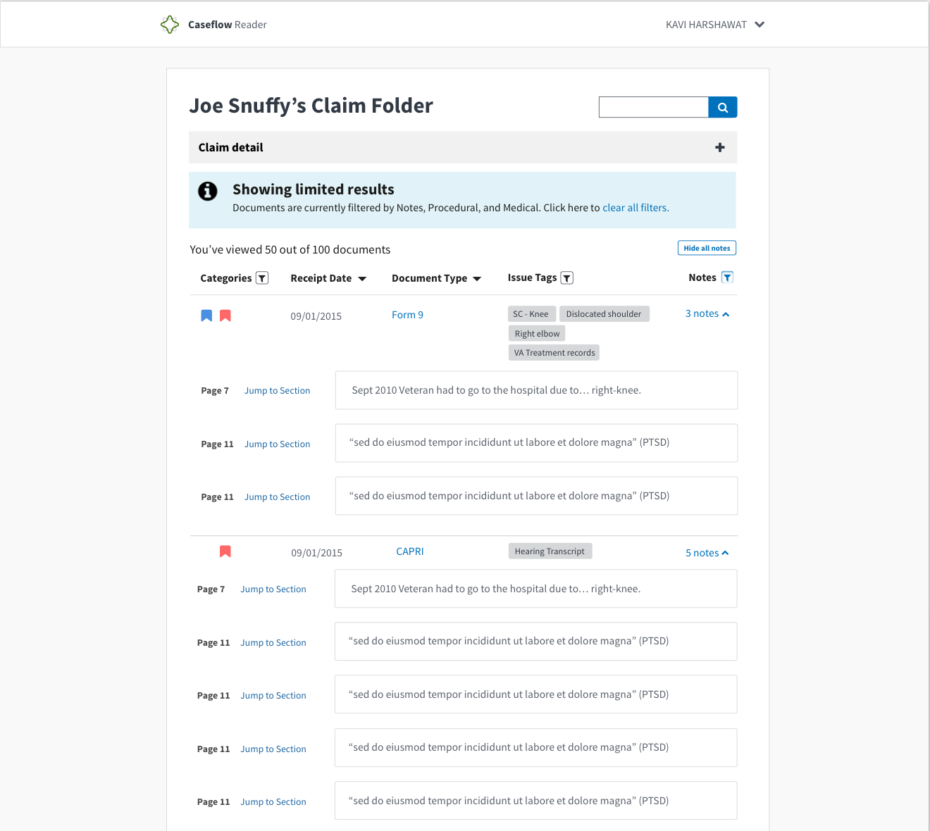
We talked about maybe calling comments notes instead. I added it in the mocks but we can talk about this. Also, added back # of comments and the word notes to bring a little more visibility to the feature to expand individual comments.
gnakm
on 16 Jun 2017
@abbyraskin This is combo of what we played with a little before and your suggestions:
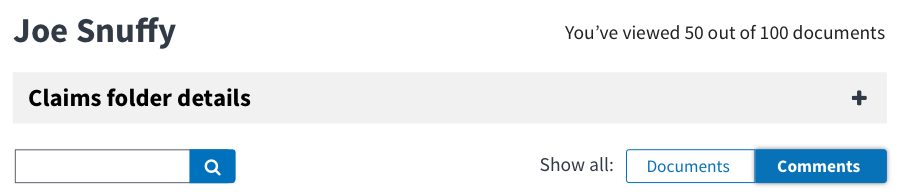
- Moved search to top right corner
- Put process # of documents where search used to be
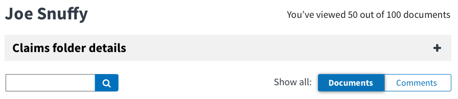
- Put show all buttons on top
Question for us -- do we want to give users the option to expand all AND filter in any order? The invision link has it so that you can only expand all when you filter comments only.
Invision Link to help visualize this interaction
Mockups
No filter
With notes filter on
With note filters on and expanded
gnakm
on 22 Jun 2017
In Nick's Voice, "meEeegaa filter."
Abby/ Gina convo:
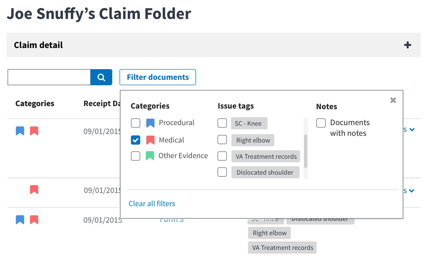
With the filter alert coming up each time, we thought it was jarring and redundant. It gave us a space to explore what a mega filter would look like.
- allows the combination of seeing all filter-able options including
- It might be a better alternative to the filter + expand all situation
- It helps separate from the search box yet easily show users the relationship between what's being searched and what was filtered.
gnakm
on 23 Jun 2017
@gnakm we should probably call out in the AC how the filters and search interact with the toggle. The "note" toggle essentially acts as an additional filter. If a user is on the documents view and selects a category filter, then toggles to notes view, they are viewing docs that contain notes _and_ the selected category filter?
(Do we want the filters to apply to both toggles, or do they live in their own little independent worlds?)
abbyraskinUSDS
on 27 Jun 2017
We also probably need an empty state if there are no documents with notes (or no documents with note AND ___ if we go with above implementation)
abbyraskinUSDS
on 27 Jun 2017
@abbyraskin Agreed on explicitly calling it out.
Toggling between documents and notes works as a filter. It works as an AND with the categories and issue tags filters.
- Filters should apply to both toggle views
- ex. The common super user use case we saw was those who filtered categories first and then clicked the expand all buttons.
- If you search, it should be applicable to both toggle views
- Empty state issue here: #2490
gnakm
on 28 Jun 2017
need a story that accounts for changing everywhere we say "comment", unless we change this toggle to comments for now
abbyraskinUSDS
on 29 Jun 2017
^ For anybody reading this thread, we've decided to stick to comment because it's a bigger scrub to change everything and wasn't hi-priority or urgent enough to change on UX side.
gnakm
on 3 Jul 2017
@gnakm I'm confused about last AC: "When comments = empty state, show all documents and make sure that filtering by text mentions comments."
abbyraskinUSDS
on 3 Jul 2017
@abbyraskin I updated the AC. Basically even if there aren't any comments, we should still have in the filtered text message that it is being filtered by comments.
gnakm
on 5 Jul 2017
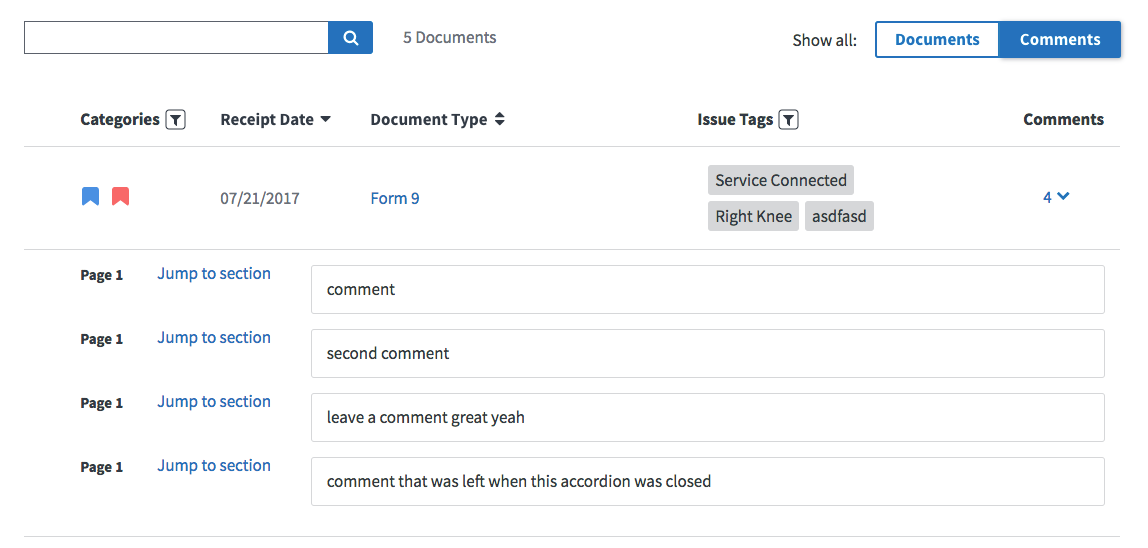
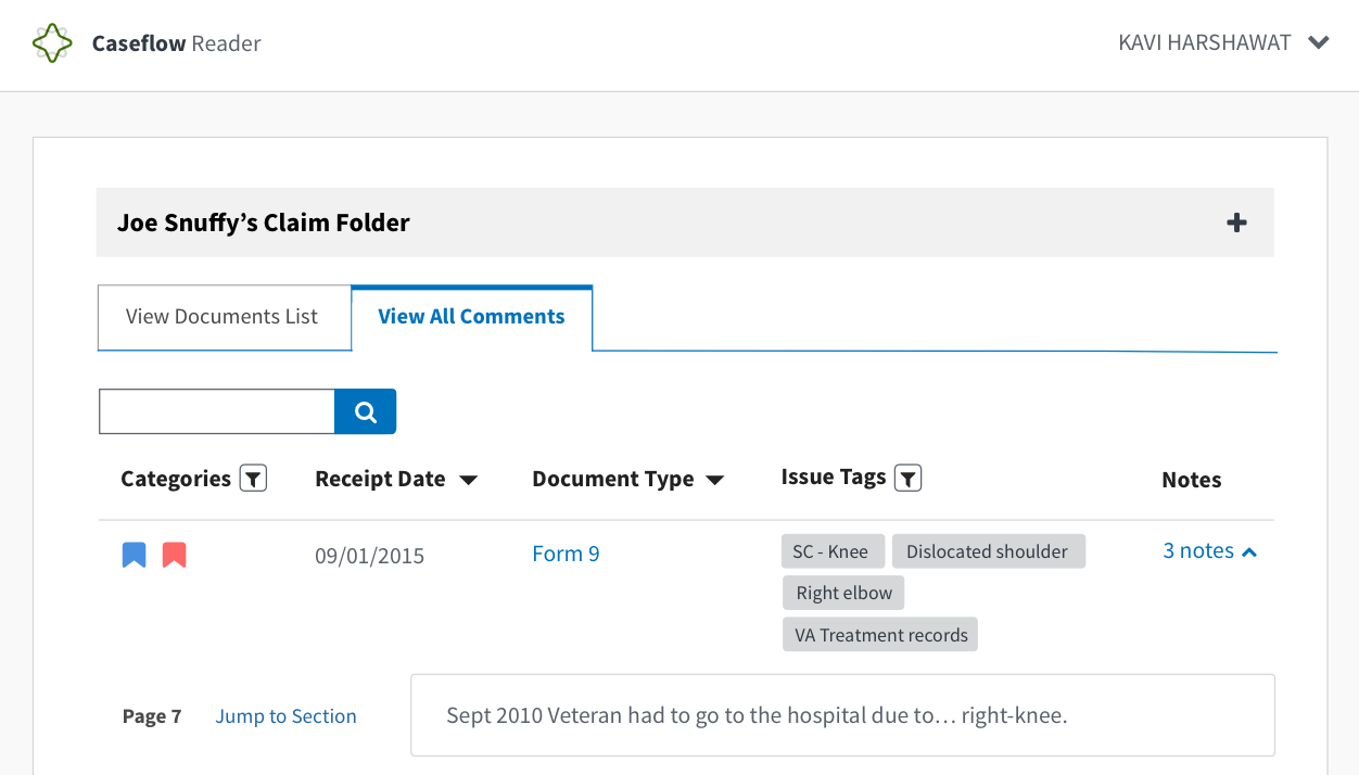
@gnakm when you're in the Comments view, should the user still be able to click on the comments indicator (the 4 v in this screenshot) to expand / collapse comments for an individual document?
 NickHeiner
on 25 Jul 2017
NickHeiner
on 25 Jul 2017
If a user has comments expanded for a doc when in the Documents view, and then they switch to the Comments view, then back to the Documents view, do we want the comments for that doc to still be expanded?
NickHeiner
on 25 Jul 2017
If #2496 is not done by the time I'm ready to merge this, then that ticket can include updating the filtered-by message based on whether the user is on Documents or Comments.
NickHeiner
on 25 Jul 2017
There should be 20px of space between Show all: and toggle
For some reason, 18px is very easy to make look good, but 20px will require more effort. Can I just make it 18px? :smile:
NickHeiner
on 25 Jul 2017
When comments = empty state
I am not sure what this means.
NickHeiner
on 25 Jul 2017
@NickHeiner
- 18px is fine.
- When there are 0 comments but the toggle is on comments, the little filter message below the search bar should still list comments.
gnakm
on 25 Jul 2017
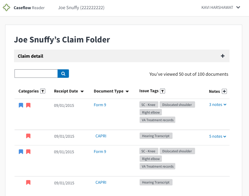
I don't see the "{count} documents" message in the mocks. Is that going away?
NickHeiner
on 25 Jul 2017
@NickHeiner
The count message is being moved to the top on the right side of
h1
The format has also changed so that it shows x out of y documents viewed (currently being worked on here: https://github.com/department-of-veterans-affairs/caseflow/issues/2498)
If a user has comments expanded for a doc when in the Documents view, and then they switch to the Comments view, then back to the Documents view, do we want the comments for that doc to still be expanded?
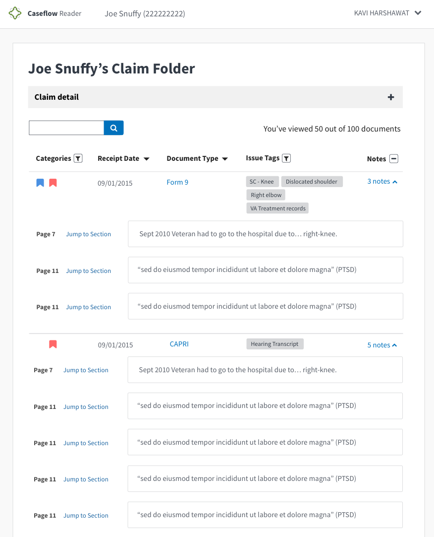
When toggling back to all documents after have been on comments view, we should collapse the comments.
gnakm
on 25 Jul 2017
PASSED I don't know if this has made it passed @gnakm 's eyes for the UI but tagging her in here as reference
Env: UAT
Browsers: FF and Chrome
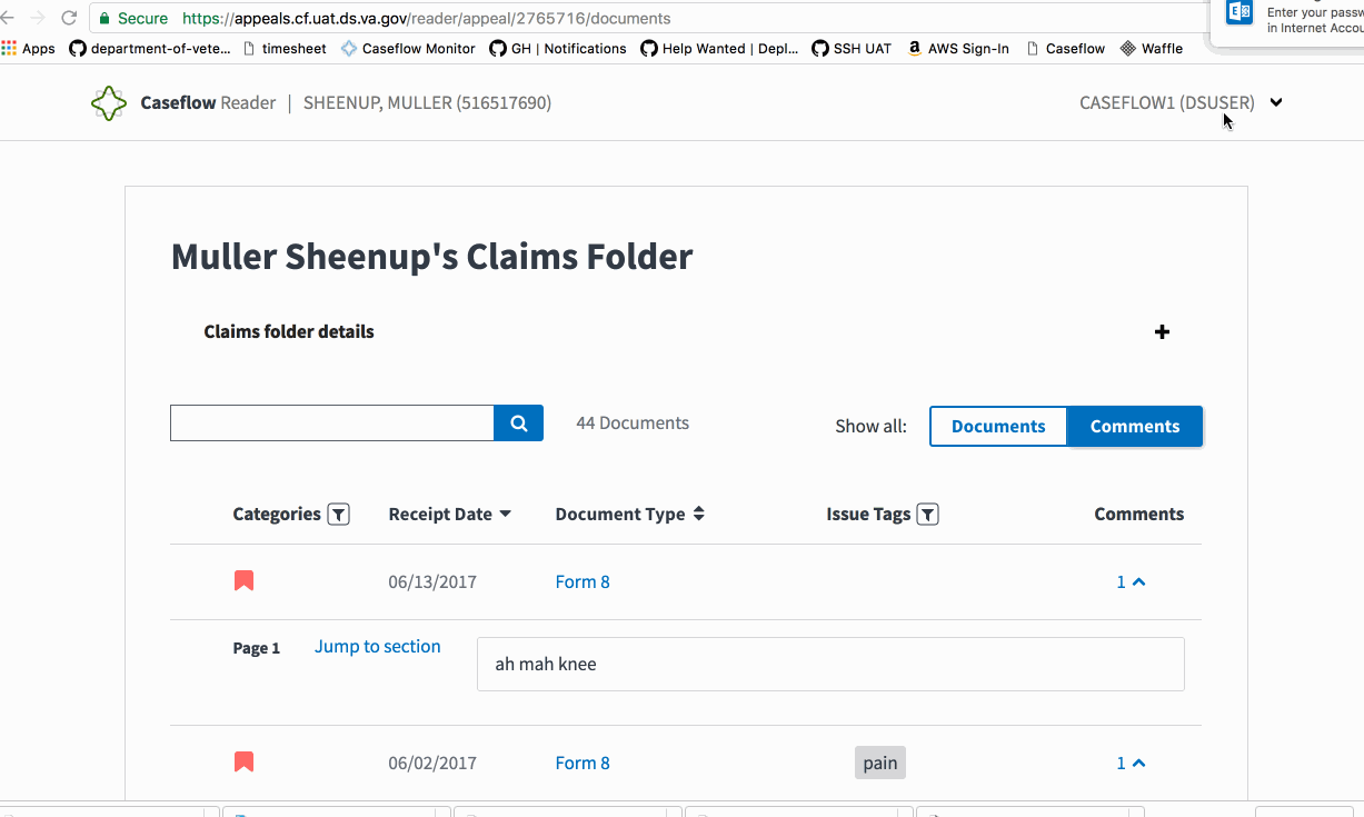
Steps to Validate:
- Access Reader for a test veteran
- Toggle the "Documents | Comments" button
- Verify that the results filter out based on comments or shows all documents if "Documents" is toggled on.
Screenshots:
 astewarttistatech
on 31 Jul 2017
astewarttistatech
on 31 Jul 2017
@astewarttistatech yup! I've been checking and looks good!
gnakm
on 31 Jul 2017
Related issues
 pkarman
·
5Comments
pkarman
·
5Comments
 hschallhorn
·
4Comments
hschallhorn
·
5Comments
hschallhorn
·
4Comments
hschallhorn
·
5Comments
 lomaxap
·
3Comments
lomaxap
·
3Comments
 lomky
·
3Comments
lomky
·
3Comments