Caseflow: Document Viewer | Annotation menu redesign
Description
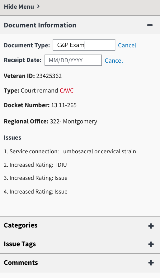
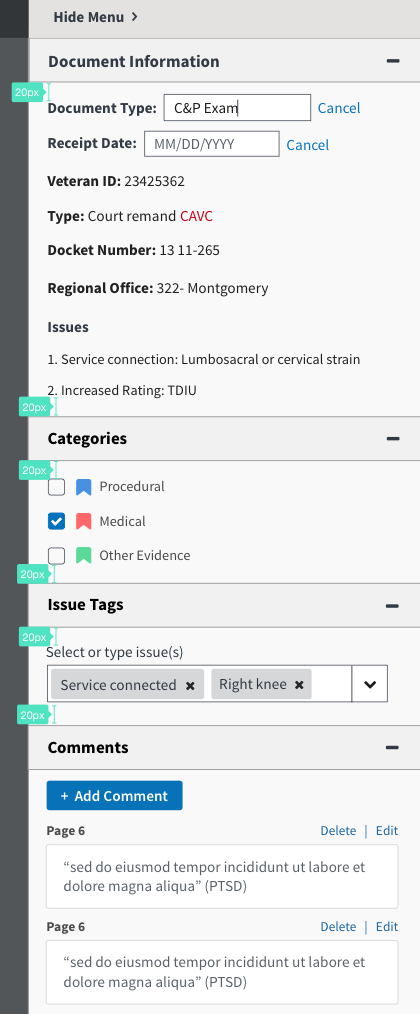
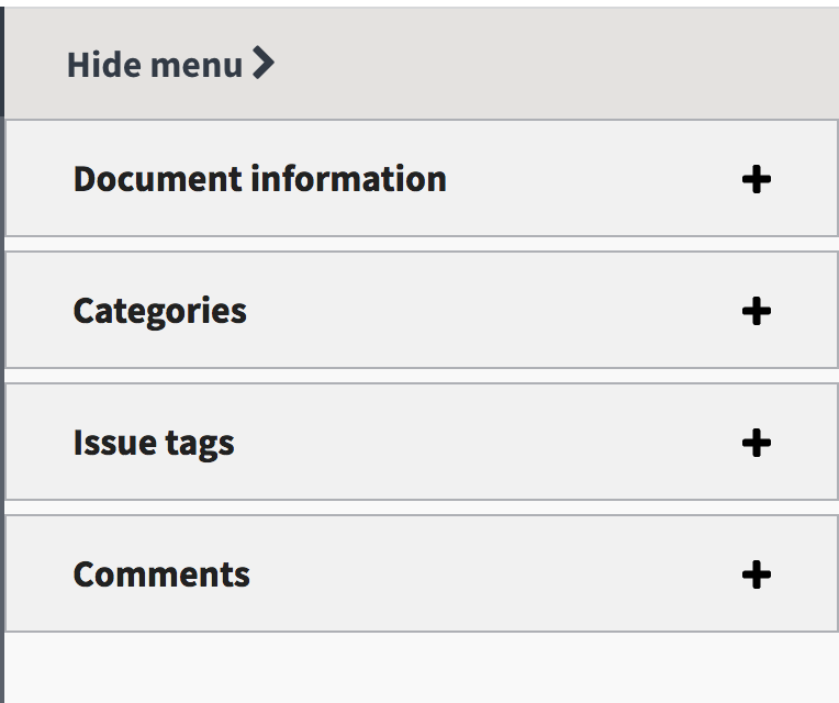
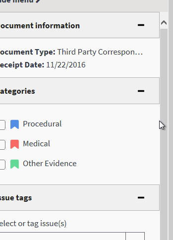
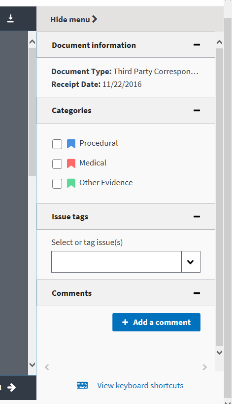
A major feedback we've received from users is that on a smaller screen, the comments are hard to reach. We added accordions to each section.
AC
- [ ] Verify that Document Information, Categories, Issue Tags and Comments are now accordions and should be expand and collapsable. Note: We don't have it in our Style Guide yet but we have a ticket #1482 and it follows the pattern from USWDS
- [ ] Each accordion section should now have a 1px border of gray-light
- [ ] The height of "hide menu" bar and accordion bars should match the height of top toolbar.
- [ ] New Hide Menu bar color should be
$color-gray-warm-lightSee style guide colors - [ ] By default, the sections should be expanded
- [ ] No space between hide menu bar and document info accordion
- [ ] There should be 14px spacing between edge accordion and content inside (i can provide mock)
- [ ] Remove
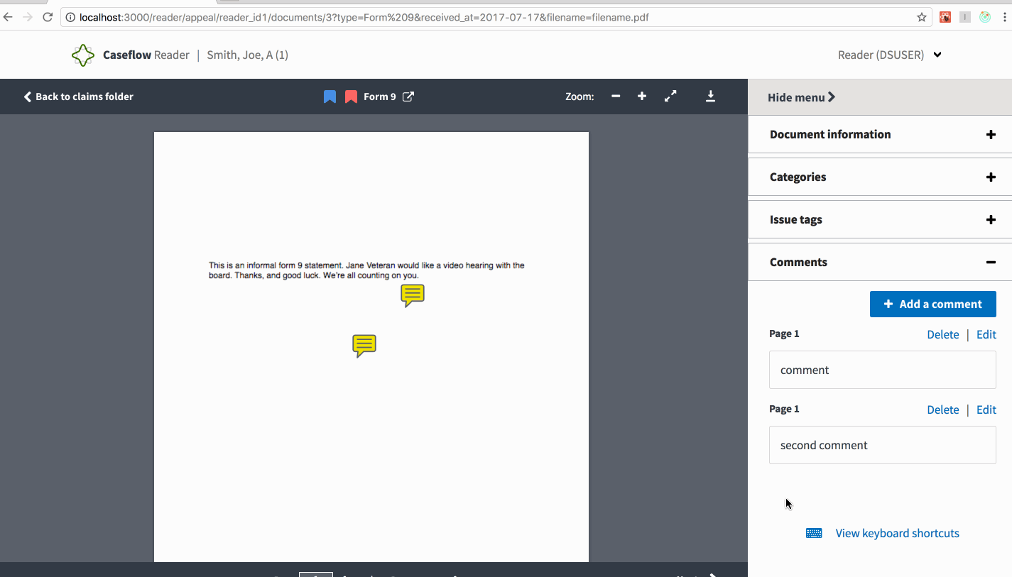
h5Related issue with horizontal line and Comments with horizontal line - [ ] When scrolled to the comments section, the accordion and add a comment button should be fixed and a double scroll bar should scroll all the comments below it
- [ ] When a user hits
alt+enter, the comment accordion should expand and show the appropriate comment box highlighted.
Mock up
Related
1853 #2359 #1998 #2375
 gnakm
gnakm
All 15 comments
@gnakm we should start finalizing designs for this -- receipt date edit will come later, but if we want to include any issues info from VACOLS, I think we should show that here.
 abbyraskinUSDS
on 15 Jun 2017
abbyraskinUSDS
on 15 Jun 2017
@abbyraskin Yup! Updated the mock. There are still pressing questions related to #1998 we should talk about it. Afterwards, I'll update this AC with new DAS stuff.
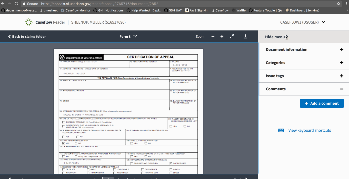
Note: This was the previous mock.

gnakm
on 16 Jun 2017
@gnakm For the 4th AC you mention using $color-gray-light but the ticket you reference uses $color-gray-warm-light. Which color am I using for the Hide Menu bar?
Also for 3rd AC do you mean width of the "Hide menu" bar, or do you want the whole section to take up the height of the navigation bar?
 mmlumba
on 5 Jul 2017
mmlumba
on 5 Jul 2017
@gnakm when the accordions are all collapsed, we don't want this vertical spacing between them, right?
 NickHeiner
on 20 Jul 2017
NickHeiner
on 20 Jul 2017
@gnakm If I hit alt+c to start placing a comment from the keyboard when the comment UI is in a closed accordion, we enter a weird state. The user hits alt+enter to place a comment, but there's no feedback that anything happened:
(I can explain over videochat if the gif does not make it clear enough.)
NickHeiner
on 20 Jul 2017
@mmlumba @NickHeiner No please. Every space we can save will be helpful!
gnakm
on 20 Jul 2017
@NickHeiner +1 for being a thorough human being.
Yeah I didn't think about that. When a user hitsalt+enter, the comment accordion should expand and show the appropriate comment box highlighted. Adding that to the AC.
gnakm
on 20 Jul 2017
The spacing is not going to be pixel-perfect to what is in the mocks. @gnakm is it ok if that's a follow-up ticket?
NickHeiner
on 20 Jul 2017
Using IE/Chrome in Windows 7
because we can
Do we need that extra scrollbar?
- Windows 7
- IE and Chrome
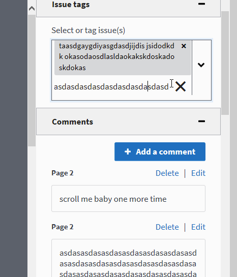
There's some weird interaction between issue tag - clicking - accordion
- Start entering issue tag text (if the text is long enough it starts glitching out too)
- also you get a bonus scrollbar...
- Click X to cancel(???) the creation
- Click to expand another accordion
- See the text come back?
Hide Menu button is glitchy af if you scroll down
 ghost
on 21 Jul 2017
ghost
on 21 Jul 2017
Looks like the spacing is off. @NickHeiner
Env: UAT
Browsers: FF, Chrome, and IE
Steps to Validate:
- Access a document in Reader
- Access the left side menu
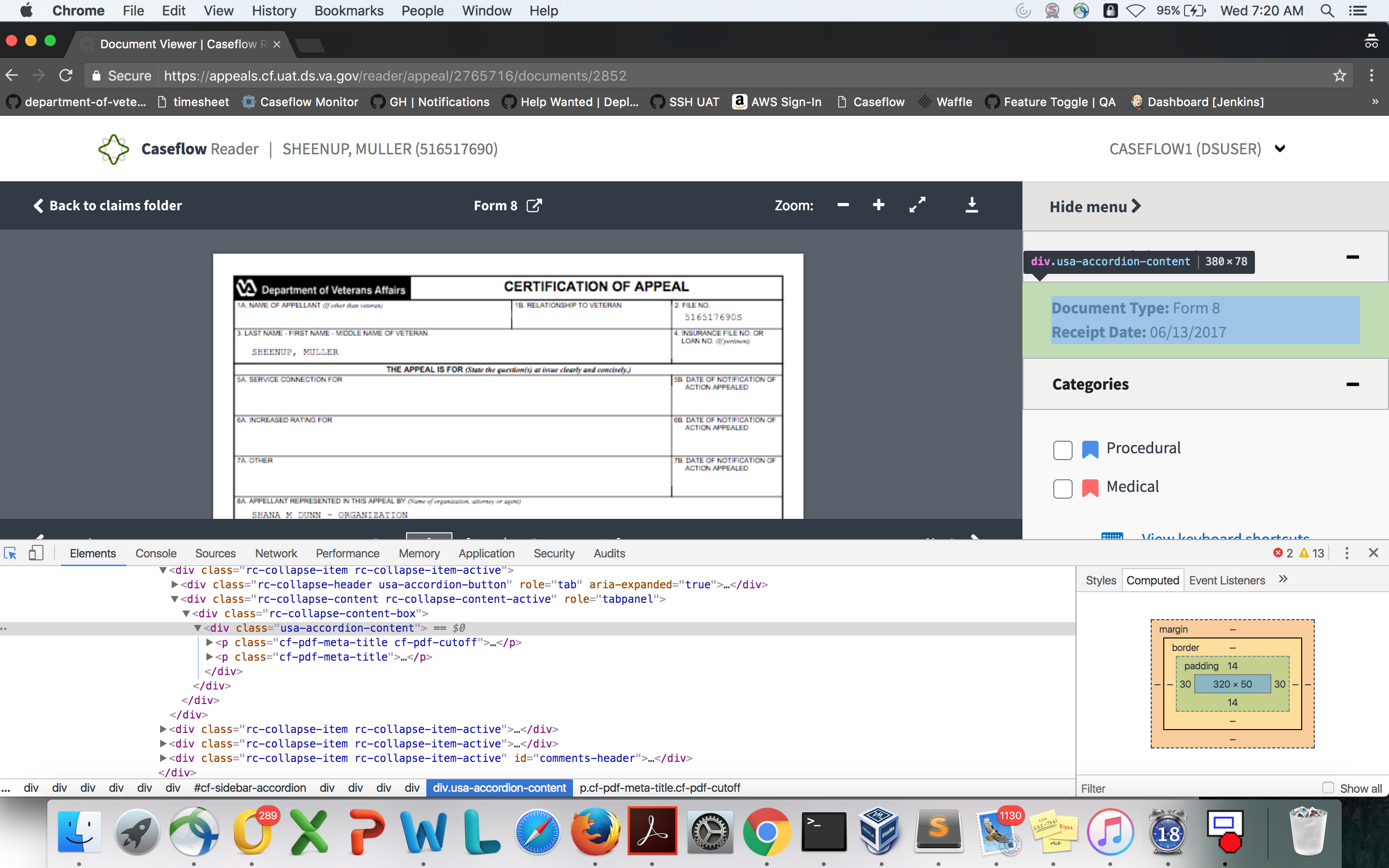
- Validate the accordions, their spacing to the start/end of content, as well as their color.
Screenshots:
 astewarttistatech
on 26 Jul 2017
astewarttistatech
on 26 Jul 2017
@astewarttistatech, can you be more specific about what's wrong with the spacing?
@gnakm, do you think it's worth spending dev time to change the spacing from how it looks now?
NickHeiner
on 27 Jul 2017
Sorry, I thought the top screenshot made it clear. The top and bottom spacing of the content from the inside of the accordions are 14px instead of 20px. @NickHeiner
astewarttistatech
on 27 Jul 2017
@NickHeiner @astewarttistatech The 14px spacing is NBD. Let's go with it. Changing AC now.
gnakm
on 27 Jul 2017
Thanks @gnakm.
@astewarttistatech, it was unclear to me. I saw the 14px measurement in your screenshot. But that measurement was measuring a different stretch than what Gina had measured in the AC. The 14px is the yellow section in this screenshot:

But the 14px does not include the blue section. The AC was:

Your measurement did not extend as far as Gina's measurement. And when I did a measurement that tried to extend as far as Gina's, I did get 20px.
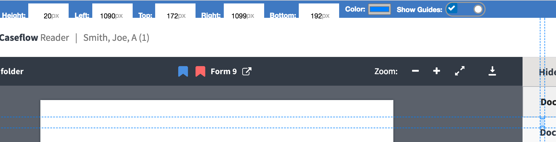
So, that's why I was unsure what the problem was. :smile:
NickHeiner
on 27 Jul 2017
Due to the change in AC, this issue is now considered...
PASSED
Please see above comment for credentials used to verify this issue.
astewarttistatech
on 27 Jul 2017
Related issues
 araposo-tistatech
·
5Comments
araposo-tistatech
·
5Comments
 lowellrex
·
5Comments
lowellrex
·
5Comments
 yoomlam
·
5Comments
yoomlam
·
5Comments
 laurjpeterson
·
4Comments
laurjpeterson
·
4Comments
 hschallhorn
·
4Comments
hschallhorn
·
4Comments