Caseflow: Styleguide component | Horizontal Rule, Borders, Dividing Lines
Story
As a developer or designer, I want to know the specs for the dividers for all of our products.
AC
- [x] Make a subsection called "Horizontal Rule" under Layout section
- [x] Color:
grey-lighter - [x] 30px
margin-bottom - [ ] Verify that the copy is above UI component in style guide
Mockup

Copy
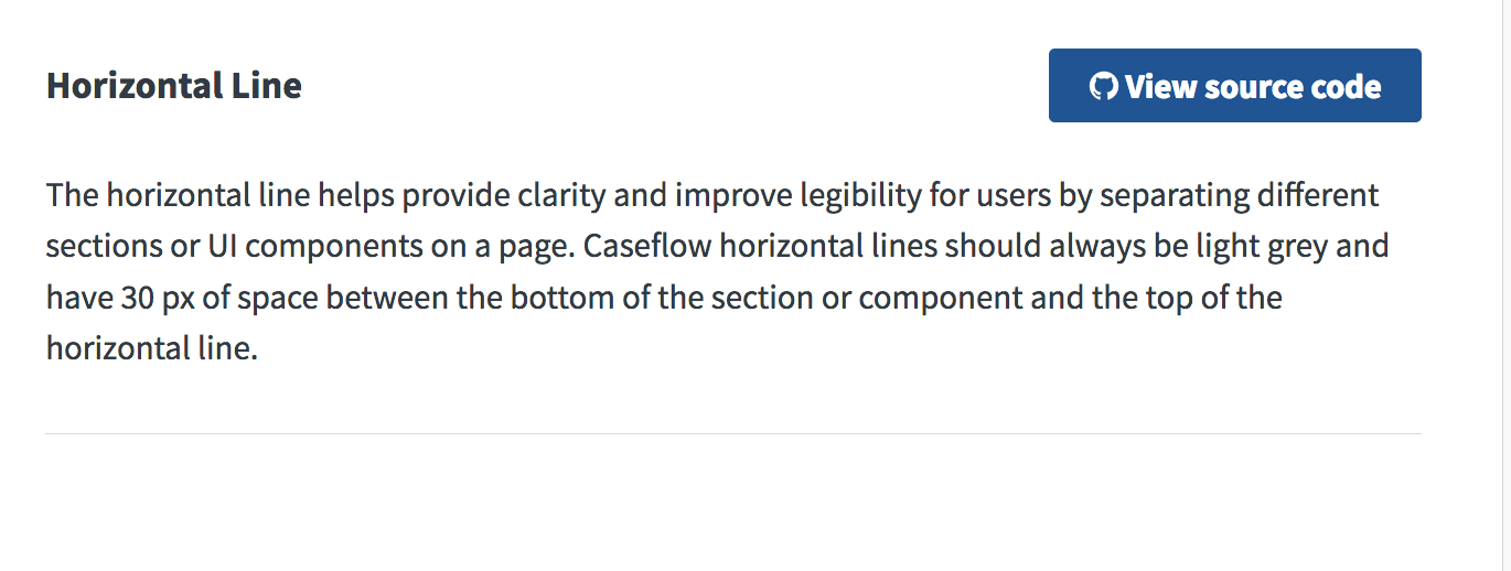
The horizontal line can be used in multiple ways across Caseflow apps. It can be used to separate different sections and UI components and provide space for balance and legibility. There should always be a 30px space between the bottom of the component or text to the top of the horizontal line.
 gnakm
gnakm
All 14 comments
For design meeting:
Horizontal line: When is it used? What are the specs?
Things we've discussed:
- 40px above and below horizontal line? Case by case?
- Is it used to separate sections? What are the use cases?
- Does this affect margins of a canvas?
gnakm
on 10 Apr 2017
@shellicious Could you help us put together a story for this, related to certification for style guide?
gnakm
on 20 Apr 2017
@gnakm yes!
 msknee
on 20 Apr 2017
msknee
on 20 Apr 2017
 lakohl
on 15 May 2017
lakohl
on 15 May 2017
@avrildavid Can you take a pass at this?
The horizontal line can be used in multiple ways across Caseflow apps. It can be used to separate different sections and UI components and provide space for balance and legibility. There should always be a 40px space between the bottom of the component or text to the top of the horizontal line.
gnakm
on 18 May 2017
Already looks good, @gnakm. One suggestion:
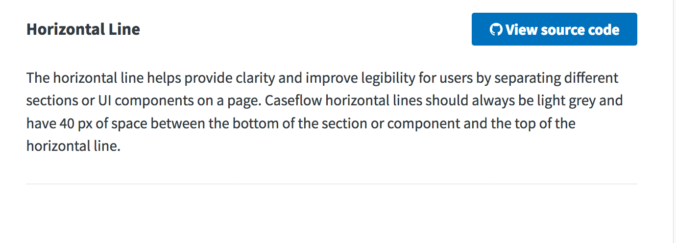
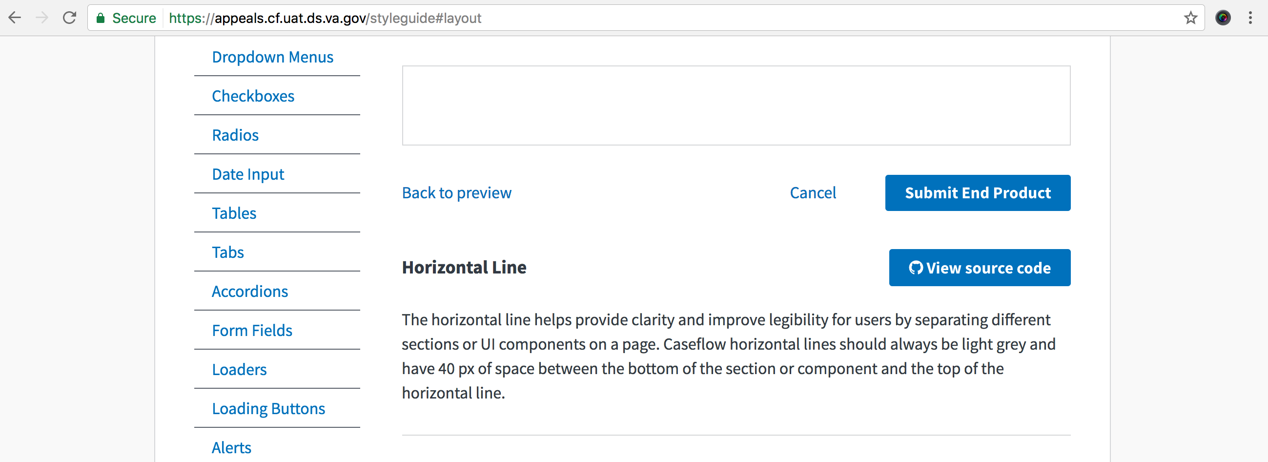
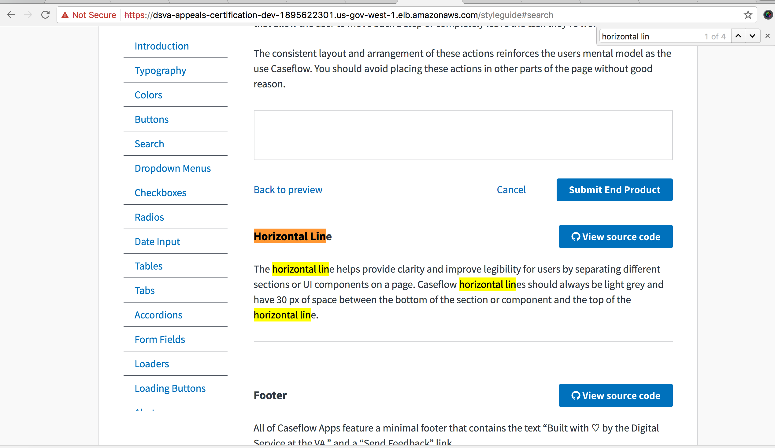
The horizontal line helps provide clarity and improve legibility for users by separating different sections or UI components on a page. Caseflow horizontal lines should always be light grey and have 40 px of space between the bottom of the section or component and the top of the horizontal line.
 avrildavid
on 19 May 2017
avrildavid
on 19 May 2017
@gnakm should add this component in the layout section?
 Sjones352
on 5 Jun 2017
Sjones352
on 5 Jun 2017
@Sjones352 Added instruction in AC!
gnakm
on 5 Jun 2017
Sjones352
on 8 Jun 2017
@Sjones352 Could you change the content to say ...have 30 px of space between the bottom...
gnakm
on 8 Jun 2017
Current view:
pushing back because the copy is wrong based on gina's comment
 astewarttistatech
on 8 Jun 2017
astewarttistatech
on 8 Jun 2017
Sjones352
on 8 Jun 2017
@Sjones352 So sleek and elegant. LGTM!
gnakm
on 8 Jun 2017
PASSED
Validated in: UAT
Browsers: FF and Chrome
Steps to Validate:
- Access the living style guide
- Navigate to the Horizontal Line section
- Verify the copy based on AC
Screenshots:
astewarttistatech
on 12 Jun 2017
Related issues
 yoomlam
·
5Comments
gnakm
·
5Comments
yoomlam
·
5Comments
gnakm
·
5Comments
 lowellrex
·
5Comments
lowellrex
·
5Comments
 marvokdolor-gov
·
3Comments
marvokdolor-gov
·
3Comments
 hschallhorn
·
4Comments
hschallhorn
·
4Comments