Design issue: https://github.com/CartoDB/design/issues/808
On the STYLE tab we want to make the following changes:
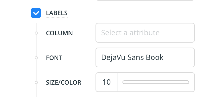
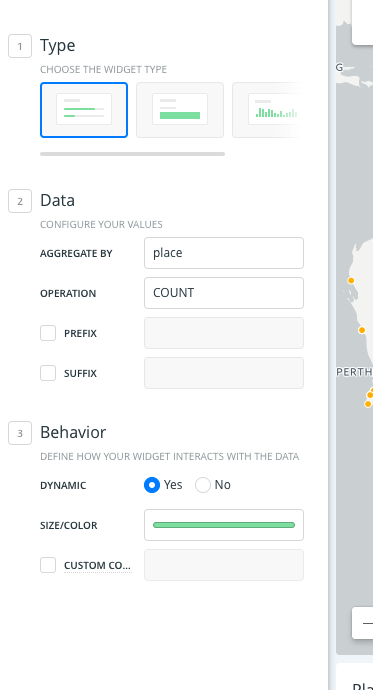
- [x] The FILL input label should now be called SIZE/COLOR
This change should be applied in every aggregation method. In the cases where the input only asks for the fill color and not the size, we'll change the label to just COLOR.
That change from FILL to COLOR should be present everywhere on the tool for consistency.
cc @csobier for awareness
Thank you!
_Edit: removed the task of changing the HALO label for STROKE_
 arianaescobar
All 24 comments
Whoah, this is a biggie. Thanks for the notification. Tagging @makella because we worked really hard to establish all the color terminology guidelines.
Is there an estimated release for this? Could we hide this feature behind a feature flag before release until I get a chance to update all the docs/Wiki from a staging environment? (I'll need at least one Sprint).
 csobier
on 8 Aug 2017
csobier
on 8 Aug 2017
one thing that i am wondering is if STROKE is the right word for HALO on labels... especially because in CartoCSS we use text-halo-radius and other text-halo properties. keeping consistent with CartoCSS properties makes sense because a user would go from the forms to the CartoCSS panel. Another example is marker-fill, polygon-fill the only property that uses COLOR are line properties like line-color, marker-line-color
For example, to style markers, you would see the styling below for marker fill and line properties:
  marker-line-width: 1;
  marker-line-color: #FFFFFF;
  marker-line-opacity: 1;
  marker-width: 4;
  marker-allow-overlap: true;
  marker-fill-opacity: 0.4;
  marker-fill: #fff;
cc @arianaescobar @csobier @urbanphes
 makella
on 8 Aug 2017
makella
on 8 Aug 2017
Makes sense.
 noguerol
on 8 Aug 2017
noguerol
on 8 Aug 2017
Very good point @makella. We considered it when we discussed this and our reasoning was that we are currently giving more importance to respecting CartoCSS syntaxis (which only more advanced users will know and use) than to the consistency of naming for non-dev folks in our UI.
It seems wrong having two controls: "STROKE" (for polygons) and "HALO" (for labels) which do the same thing (add a border) with different names.
Regarding color, the same two points as above: trying to prioritize clarity for every user and consistency throughout our interface (since we already use the nomenclature SIZE/COLOR in the label options)
IMO we shouldn't let CartoCSS syntaxis (or any other programming language for that matter) dictate the clarity of our product, especially on the UI side which is not specifically dev-oriented.
arianaescobar
on 9 Aug 2017
Makes sense too and I prefer it.
noguerol
on 9 Aug 2017
😂
arianaescobar
on 9 Aug 2017
ok great to know this was all discussed (sorry I'm obviously late to the party!)...
i guess the biggest issue for me is STROKE replacing HALO I understand consistency for sure.. but text-halo is more similar to what you would see in Sketch or Photoshop or CSS that mimics more of the shadow effect vs. the stroke/outline effect from what I can tell.
I will do some testing to make sure but I don't think we get the nice centered outline directly on the text.
makella
on 9 Aug 2017
for other features, polygons, points, we do get the outline and therefore stroke makes more sense for those 2 contexts!
makella
on 9 Aug 2017
@makella @noguerol let's continue the conversation on the design issue to not add more noise here for the devs and so we can give them a unified solution :)
arianaescobar
on 9 Aug 2017
The solution for the 2nd item had been solved thanks to @makella in the other ticket: https://github.com/CartoDB/design/issues/808#event-1199097664 We shouldn't change Halo by Stroke.
 urbanphes
on 10 Aug 2017
urbanphes
on 10 Aug 2017
After talking it through, we've decided to only change the FILL label for now. Updating the initial comment to remove the Halo item.
arianaescobar
on 17 Aug 2017
Taking it, it is gonna be big :joy:
 xavijam
on 6 Sep 2017
xavijam
on 6 Sep 2017
Hey, I've checked that in widget form we will have a problem:
Shouldn't we change the "custom colors" label to "autostyle colors"?
xavijam
on 6 Sep 2017
Thanks for taking this! <3
Two things there:
We shouldn't rename that label in the widget form to SIZE/COLOR since you can only modify the color. So, in that case, it has to be just COLOR. This also applies to any other scenario where this happens.
Regarding your question, we considered that initially but ended up going with Custom instead of Autostyle because it's generally easier to understand what it does. We know exactly what autostyle is, most of our users might not. Also, we don't really call out "autostyle" anywhere in the tool, we use the drop icon and that's about it... so it could be hard for a regular user to relate one thing to the other. But if you feel strongly about this, please open a ticket in design and we can give it a bit more thought :)
arianaescobar
on 7 Sep 2017
Disagree and commit! ^^^
xavijam
on 7 Sep 2017
Blocked until we change all learn guides -> https://github.com/CartoDB/learn/issues/455#issuecomment-327807988
xavijam
on 7 Sep 2017
Guys, shipping is a priority: let's deploy these changes. Guides update are small this time and will come soon.
noguerol
on 8 Sep 2017
Taking it!
 rubenmoya
on 8 Sep 2017
rubenmoya
on 8 Sep 2017
In production! :rocket:
rubenmoya
on 8 Sep 2017
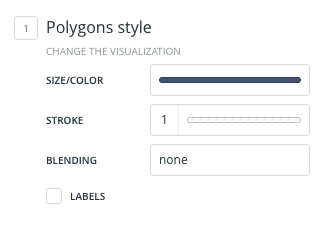
I noticed that polygon symbology has SIZE/COLOR is this intentional?
makella
on 8 Sep 2017
Oops! That's not right. It should only say COLOR there.
cc @noguerol @rubenmoya
arianaescobar
on 11 Sep 2017
I opened a new issue for it: #12768
rubenmoya
on 11 Sep 2017
thank you!
arianaescobar
on 11 Sep 2017
thank you!
makella
on 11 Sep 2017
Related issues
 atlefren
·
3Comments
atlefren
·
3Comments
 nygeog
·
5Comments
nygeog
·
5Comments
 piensaenpixel
·
4Comments
noguerol
·
5Comments
xavijam
·
5Comments
piensaenpixel
·
4Comments
noguerol
·
5Comments
xavijam
·
5Comments
Most helpful comment
Oops! That's not right. It should only say COLOR there.
cc @noguerol @rubenmoya