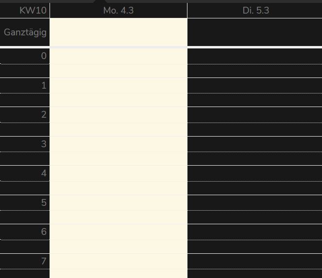
Calendar: Improve grid/table in dark mode

Maybe the same color for the lines as the color for other borders (e.g. Button). Maybe gray and not that thick.
Currently this looks terrible if you select week or day.
Want to back this issue? Post a bounty on it! We accept bounties via Bountysource.
 BornToBeRoot
👍5
All 3 comments
I would like to add that the today indicator looks quite bright in dark mode as well:
 raimund-schluessler
on 4 Mar 2019
raimund-schluessler
on 4 Mar 2019
I close #1262 which duplicate this issue.
Here are my screen capture:
https://mycore.core-cloud.net/index.php/apps/gallery/s/G77KskCwum9deUR#
 bcag2
on 14 Jun 2019
bcag2
on 14 Jun 2019
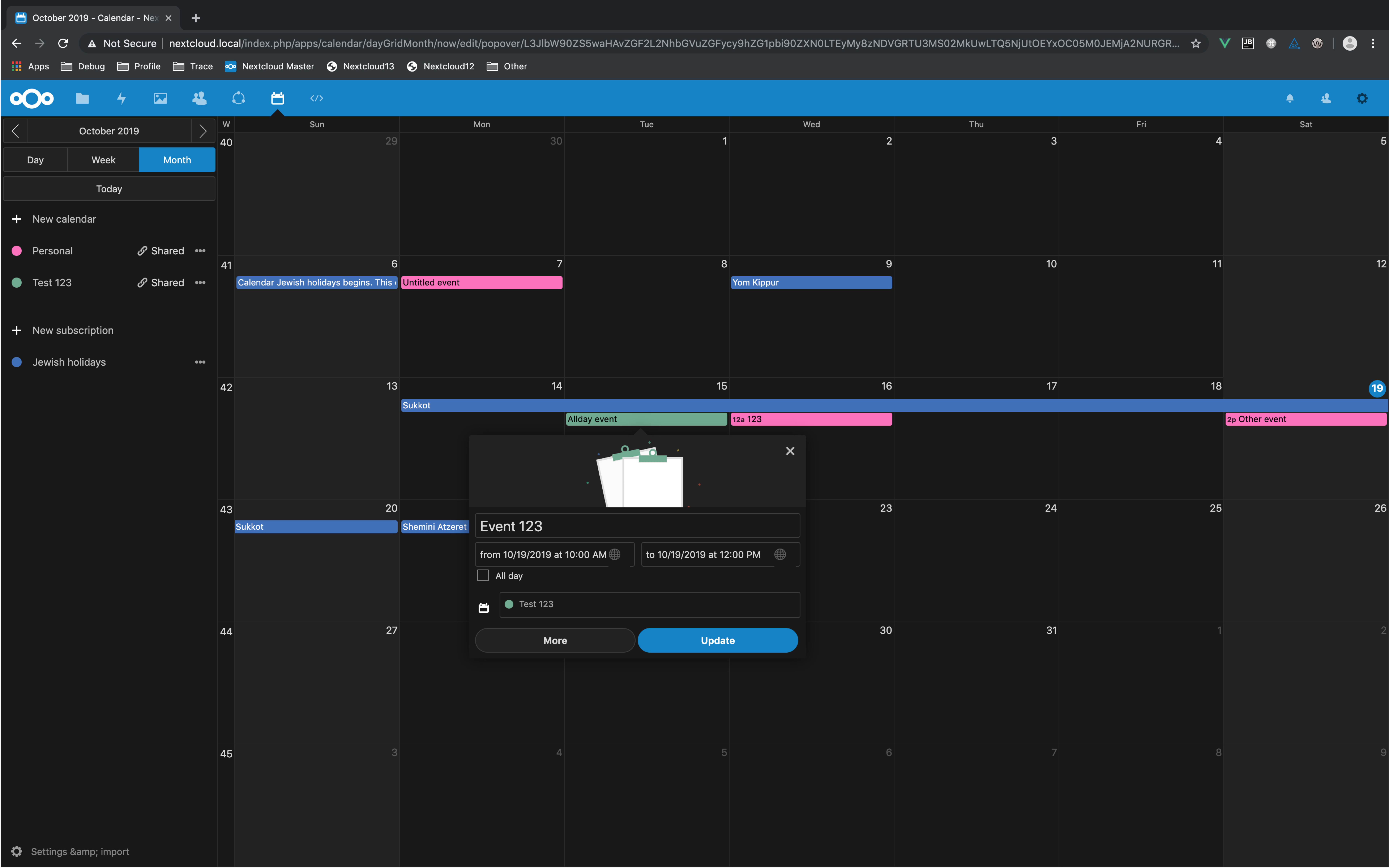
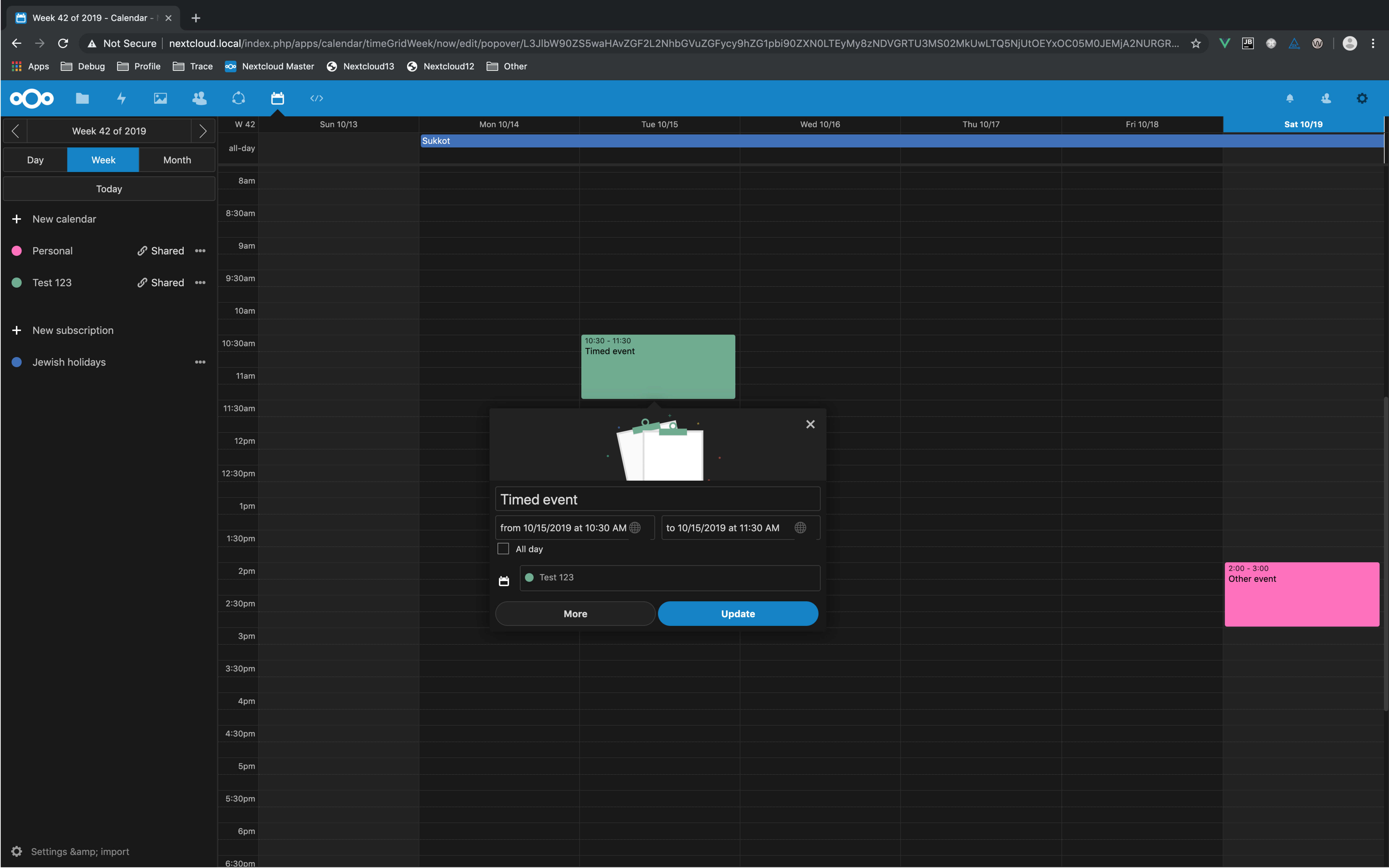
Dark mode has been vastly improved in #926
 georgehrke
on 19 Oct 2019
georgehrke
on 19 Oct 2019
🎉2
🚀1
Was this page helpful?
0 / 5 - 0 ratings
Related issues
 jancborchardt
·
3Comments
jancborchardt
·
3Comments
 cappuMUC
·
4Comments
raimund-schluessler
·
3Comments
bcag2
·
4Comments
cappuMUC
·
4Comments
raimund-schluessler
·
3Comments
bcag2
·
4Comments
 archont00
·
4Comments
archont00
·
4Comments
Most helpful comment
Dark mode has been vastly improved in #926