Calculator: Need help picking icon to represent "Bit Shifts"
We are working on updating the keyboard for improved consistency and extensibility (#428). This includes refreshing iconography to support new functionality, and we need your help picking a good icon to represent the general concept of "Bit Shifts".
Here are a couple options we came up with that we would like to hear your feedback on. We do not need to limit our options to just these, though, so if you have a design idea (even if it is just a quick sketch), we would love to see those too!
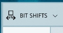
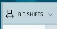
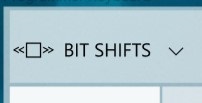
| Option A | Option B | Option C |
|:-:|:-:|:-:|
| |
|  |
|  |
|
A couple notes:
- We are planning to use
<<and>>to represent left shift and right shift, respectively, though we are open to alternative suggestions with these as well - Icons should have 1px stroke and need to be legible at small sizes (generally, that means 16x16, though we have some wiggle room; the mocks above show 24x24)
Thoughts?
 grochocki
All 12 comments
This is your friendly Microsoft Issue Bot. I've seen this issue come in and have gone to tell a human about it.
 MicrosoftIssueBot
on 22 May 2019
MicrosoftIssueBot
on 22 May 2019
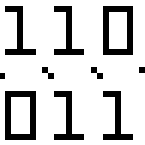
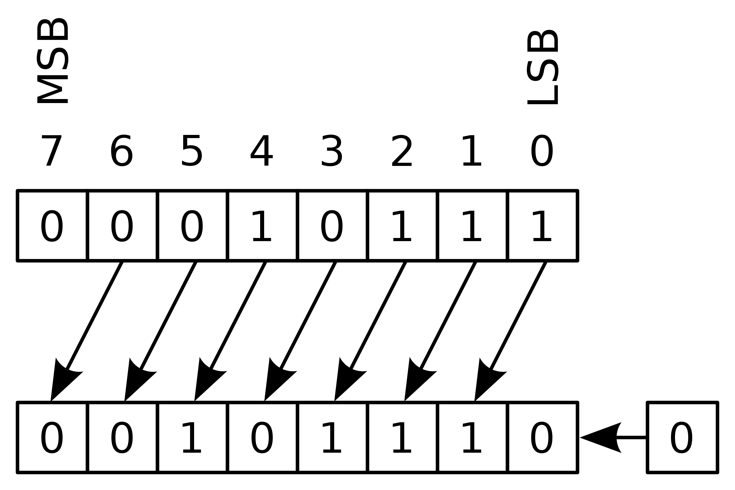
How about something like this?
16x16

24x24 (varying slash lengths, and surprisingly horizontally tileable)


Each Enlarged a bit for tiny resolution screen viewing:
 michael-hawker
on 22 May 2019
michael-hawker
on 22 May 2019
Thanks for the idea! I like the concept, though I think it feels a bit busy at small sizes. Maybe something like:

grochocki
on 22 May 2019
Could also use the canonical operator too:

michael-hawker
on 22 May 2019
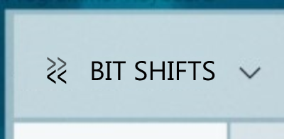
Option A: it looks more like extracting a sub-part of a number than a shift.
Option B: it looks like an icon to represent a function measuring the size of a number
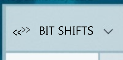
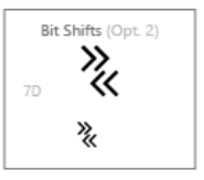
Option C: In my opinion the best of the 3. Bit shifts will only be used by power users, already familiar with >> or << symbols, so we should use them for the icon.
Proposals
Constraints:
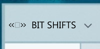
- must include both directions to show that it's a category, not a specific action.
- must use << and >>.
_(variant of Option C)_
 rudyhuyn
on 22 May 2019
rudyhuyn
on 22 May 2019
Thanks, for the suggestions, @rudyhuyn! Really liking this one:

The other variant is good too. There is a preference for icons to be more square than rectangular, so the first one might feel more balanced against others.

Option A: it looks more like extracting a sub-part of a number than a shift.
Option B: it looks like an icon to represent a function measuring the size of a number
These were intended to be abstractions on how bit shifts might typically be taught/represented in documents, but it sounds like they might be _too_ abstract if that does not come across.
grochocki
on 22 May 2019
Yeah, I was going for the learning aspect abstraction that @grochocki called out. 😊
I like the first more square one from @rudyhuyn as well.
michael-hawker
on 22 May 2019
I prefer Option C.
It's very recognizable as the shift operator there.
Maybe <<= and =>> (technically the right shift syntax is incorrect, but it's proportional which is obviously more important)?
 MarcusJohnson91
on 8 Jun 2019
MarcusJohnson91
on 8 Jun 2019
I am assuming these will be done as icon font characters, and not bitmaps
 mdtauk
on 8 Jun 2019
mdtauk
on 8 Jun 2019
I am assuming these will be done as icon font characters, and not bitmaps
Yep, our icon designers will generate the final icon asset based on the conversation here and add it to the Calculator font.
grochocki
on 10 Jun 2019
I am assuming these will be done as icon font characters, and not bitmaps
Yep, our icon designers will generate the final icon asset based on the conversation here and add it to the Calculator font.
It's good to know those responsible for managing the MDL2 font assets, will be involved - and not just devs adding PNGs :)
mdtauk
on 10 Jun 2019
Thanks for all the ideas! I brought these options back to our icon designers, and we landed on a slight variation to one of @rudyhuyn's suggestions:
^ sorry for the poor resolution here
grochocki
on 13 Jul 2019
Related issues
 ialhashim
·
14Comments
ialhashim
·
14Comments
 patrick-compass
·
22Comments
grochocki
·
25Comments
MicrosoftIssueBot
·
19Comments
patrick-compass
·
22Comments
grochocki
·
25Comments
MicrosoftIssueBot
·
19Comments
 MarcAnt01
·
14Comments
MarcAnt01
·
14Comments
Most helpful comment
Option A: it looks more like extracting a sub-part of a number than a shift.
Option B: it looks like an icon to represent a function measuring the size of a number
Option C: In my opinion the best of the 3. Bit shifts will only be used by power users, already familiar with
>>or<<symbols, so we should use them for the icon.Proposals
Constraints:
- must include both directions to show that it's a category, not a specific action.
- must use
<<and>>._(variant of Option C)_
