Calcite-components: Bug: Single-select combobox height does not match other form controls
Actual Behavior
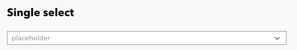
In the beta.57 build, the single select combobox is a much shorter height / has less internal padding than inputs.
Expected Behavior
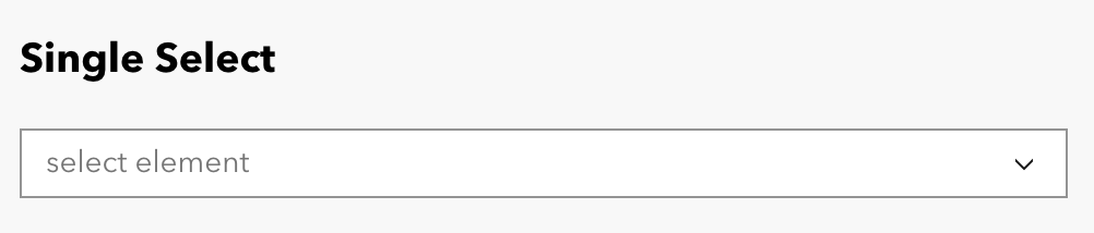
The styling of the height/padding should match inputs to create a consistent form experience. Here's what the same design looked like in the previous build:
Relevant Info
_Version_: @esri/[email protected]
cc @paulcpederson, @julio8a, @mitc7862
 capeoples
All 17 comments
Related: #1874
calcite-input hasn't been refactored yet which is why the heights don't match right now (it's not a bug, it's expected).
Here is the follow up issue to address: #2139
 caripizza
on 22 Jun 2021
caripizza
on 22 Jun 2021
Looking at this again, I'm not sure it's due to calcite-input not having its new heights yet. It'll certainly help, but the combobox heights themselves are different depending on selection-mode.
In Figma, combobox with selection-mode set to "single" doesn't match the other combobox input heights (multi and ancestors). @bstifle was that intentional?
@capeoples in the interim, you can use the CSS Custom Property to fine-tune the height with other form controls. Example:
calcite-combobox[selection-mode="single"] {
    --calcite-combobox-input-height: 3rem;
}
@caripizza yep! Intentional.
Combobox single select is input-sized. and Combobox with multi select needs to support calcite-chips within, hence the bigger height
 bstifle
on 30 Jun 2021
bstifle
on 30 Jun 2021
@capeoples These heights are currently correct and in master, maybe there needs to be a release
bstifle
on 30 Jun 2021
going to close this one out as it is already verified and in master via bpatterson's work
bstifle
on 30 Jun 2021
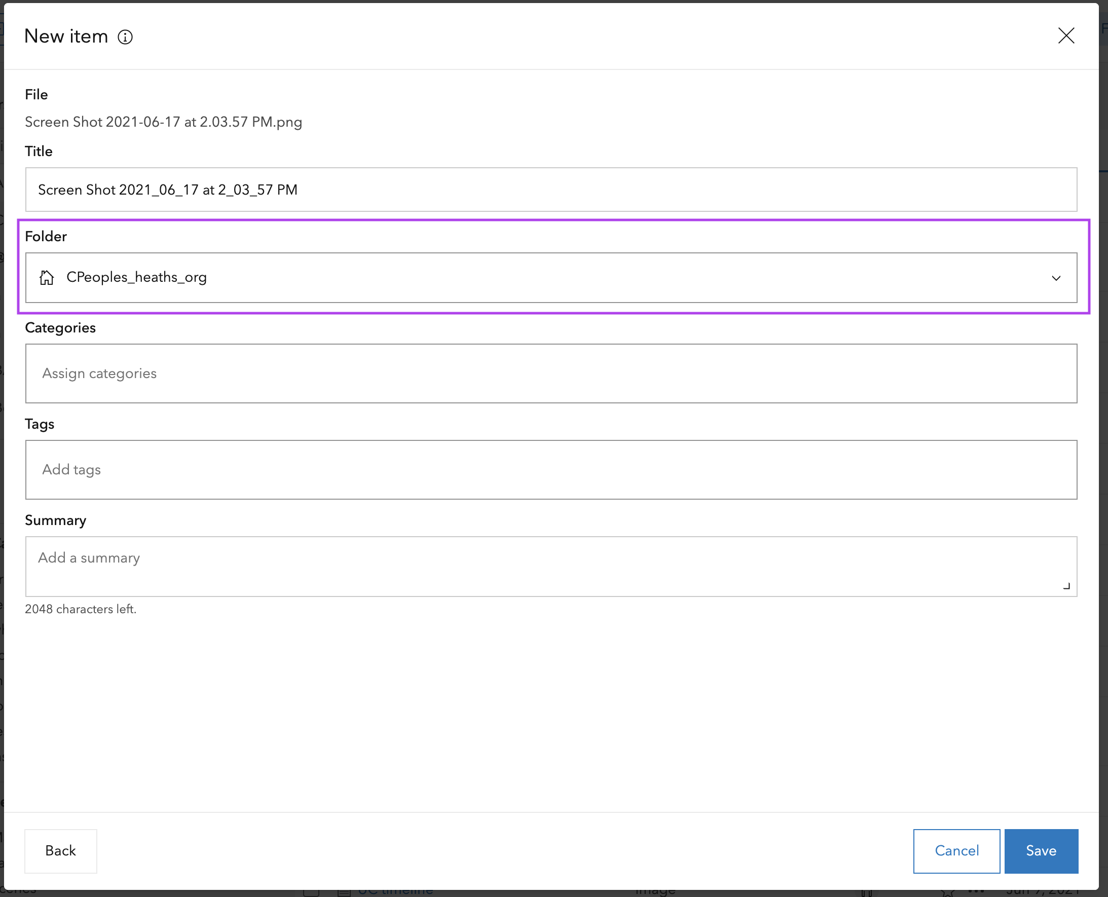
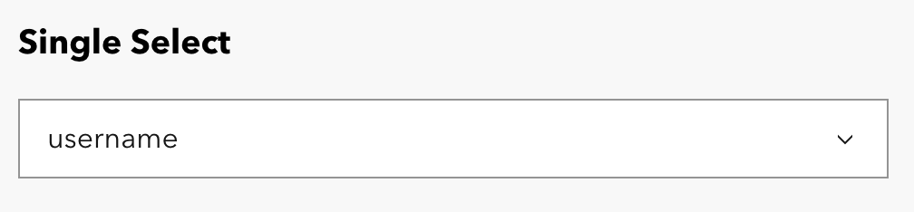
@bstifle single select + input next to each other on master look like this:
This is intentional?
 paulcpederson
on 1 Jul 2021
paulcpederson
on 1 Jul 2021
@paulcpederson yep input still needs refactor work #2139
Combobox is good to go 👌🏻
bstifle
on 1 Jul 2021
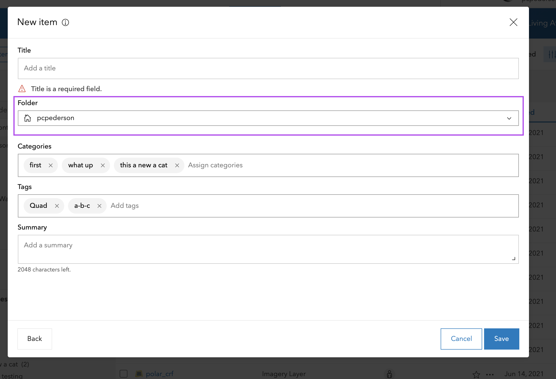
@bstifle, this is probably a larger conversation, but there are 2 considerations that would make the out of the box components work better for us in the home app:
It would be great to have padding/heights of all components match. The screen posted above is a very common use case, and having multi-select comboboxs be taller/have different padding than inputs and single-select comboboxs gives it more visual prominence in a UX where those inputs are optional. Folder and title are required but looks less important.
The new padding of the single select combobox looks really scrunched in our UI. It would be great to have a more spacious padding variable to choose in cases where the whole UI is just a form, which is a lot of places in the home app.
cc @julio8a, @mitc7862
capeoples
on 1 Jul 2021
@capeoples I understand the idea, but multi select comboboxes hold chips in them, so they compensate. Some options to consider:
- We could make M scale combobox use S chips (doesn't solve for Small scale combobox though)
- Make chips smaller across the board, but.... Small chips are already uber tight.
- Make the inputs be default 24,32,44.... and then when a chip is entered the input grows
- Not use chips in combobox
To your second bullet, The new padding scale was something put in motion and agreed upon by the larger design group. If we want to tackle that initiative again that is fine, but please consider the cost globally as we are well underway with implementing these scales in code, figma, and sketch.
bstifle
on 1 Jul 2021
An idea I talked about with Mitch and Colleen was a potential prop for padding on components or a variable change. Initial ideas, but something to further discuss with the Calcite team from both technical and design standpoint. I was out the last few days, but I will follow up with you guys on this.
 julio8a
on 1 Jul 2021
julio8a
on 1 Jul 2021
I would be a fan of that idea if we did away with the S M L scales. Seems overly complicated to maintain 3 scales + padding variables, when the scales are prescribing padding
bstifle
on 1 Jul 2021
The matching in heights, padding, font size, etc. will 100% be there and something we are working in our refactor project. I think next sprint, the major form elements will be a priority (input).
You can see the state of refactoring and matching Figma here:
https://github.com/Esri/calcite-components/projects/14
julio8a
on 1 Jul 2021
Also, for this issue, Combobox has the correct height. It's the other form elements that don't match. You can see this in the project URL posted above in my previous comment based on the refactor.
julio8a
on 1 Jul 2021
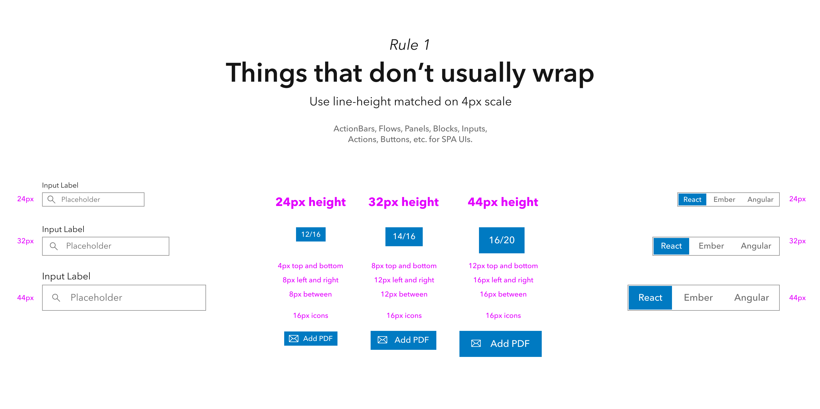
Correct, this issue is more in regards to the fact that several versions now have had mismatches in height as different components are are rolling out as "correct" at different times. These updates need to be prioritized so the ui feels cohesive again, because at the moment it's a bit crazy:

That's 5 separate heights, two of which don't fall on the scale. Assuming these are all in progress and the figma designs are all the same vertical dimensions and correct, but that's reality right now.
I think it was just an unfortunate timing situation of the combobox update getting merged right as critical bug fixes we needed for release were also updated. This means we had to update and get the mismatched components to get the other fixes. The height change caused issues that we then had to deal with "live" (ie overwrite calcite styles by hand).
paulcpederson
on 1 Jul 2021
Agreed. This refactor is coming along, just.... slowly.
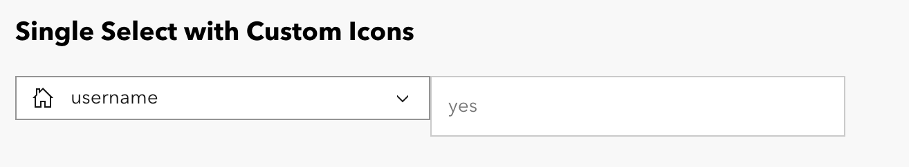
Tile doesn't quite count, but here are those components in figma:
bstifle
on 1 Jul 2021
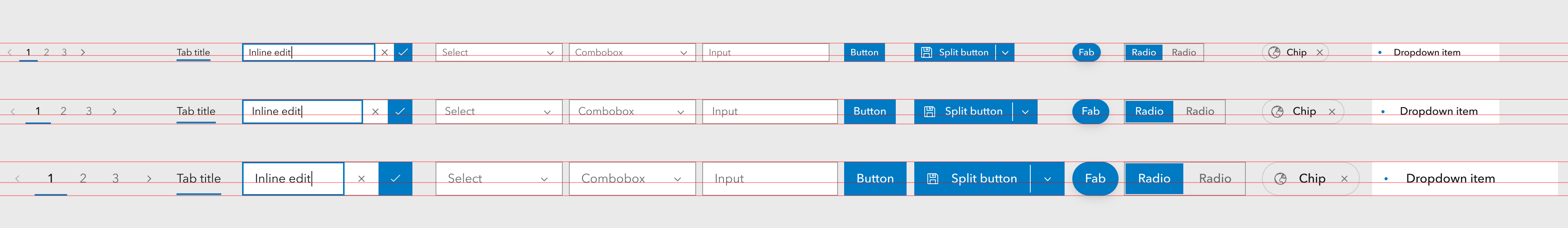
This screenshot makes my heart soar like a mighty eagle.
paulcpederson
on 2 Jul 2021

bstifle
on 2 Jul 2021
Related issues
 asangma
·
4Comments
asangma
·
4Comments
 nwhittaker
·
5Comments
nwhittaker
·
5Comments
 ethanbdev
·
4Comments
ethanbdev
·
4Comments
 AdelheidF
·
4Comments
bstifle
·
5Comments
AdelheidF
·
4Comments
bstifle
·
5Comments
Most helpful comment
This screenshot makes my heart soar like a mighty eagle.