Calcite-components: calcite-pick-list - single selection with 2 change event options
Description
Read https://github.com/Esri/calcite-components/issues/1734 first...
But as soon as I use the arrow key once the calciteListChange event fires
I do think this change here we made is correct and we need it (e.g for selecting a unique value in the filter component), but it seems that in some scenarios it is useful that a move with the arrow buttons also selects the new row and fires the change event (e.g. when trying out the different layer blending modes).
Would it be possible to keep the current behavior as the default and then add a new property for the behavior to have move and selection together? Jeremy thinks it's a step backward for the blending scenario.
Could we possibly squeeze this in for the 9.2 release of Map Viewer?
test case:
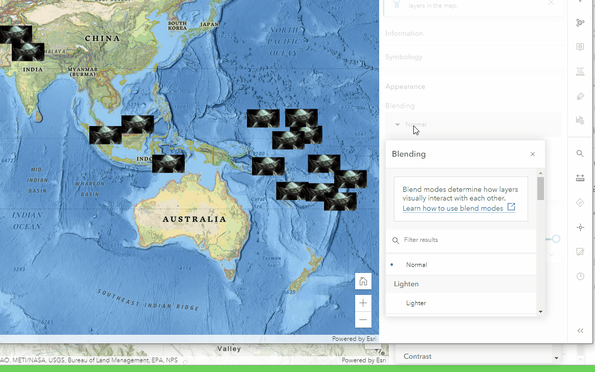
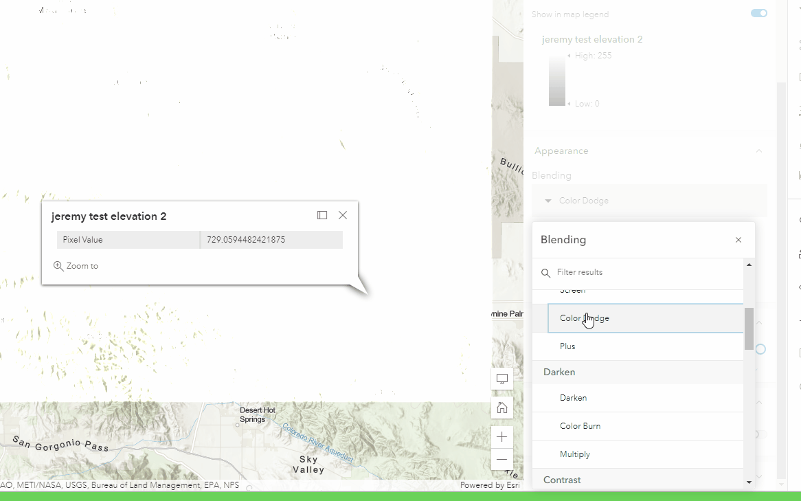
Click layer to select it, go to Properties panel and look for Blending and open dropdown.
requires arrow + space key
https://devext.arcgis.com/apps/mapviewer/index.html?url=https://services1.arcgis.com/4yjifSiIG17X0gW4/arcgis/rest/services/FatalAccidents2017/FeatureServer/0
only requires arrow key
https://www.arcgis.com/apps/mapviewer/index.html?url=https://services1.arcgis.com/4yjifSiIG17X0gW4/arcgis/rest/services/FatalAccidents2017/FeatureServer/0
Acceptance Criteria
Relevant Info
Which Component
Example Use Case
 AdelheidF
All 17 comments
@jcfranco @asangma @julio8a can you comment on this request? It is a change in behavior for how the new map viewer allows users to arrow down through different blend modes.
Here is how it works on production:
Here is how it works on dev:
I have a feeling people will complain on this as it was quite handy to cycle through the list with arrow keys. Now it is arrow + spacebar or explicit mouse clicks.
I understand that multi-select requires this combination of arrow keys + space bar to be accessible. For single selection maybe we can have the arrow key also trigger a selection?
 jbartley
on 24 Jun 2021
jbartley
on 24 Jun 2021
From an implementation-perspective, totally doable. I think an opt-in prop would work well. The name would just have to indicate that it only applies for single-select.
From the UX-side of things, it makes sense to me to have these two modes, but I'll defer to @asangma's UXpertise™.
 jcfranco
on 24 Jun 2021
jcfranco
on 24 Jun 2021
This make sense to me too.
I agree that we should have made it an opt-in change.
@jcfranco Because the current behavior (on dev) is similar to how radio buttons work, maybe be call it something like "radio-select"?
 asangma
on 24 Jun 2021
asangma
on 24 Jun 2021
Sorry...to be clear.
We'd add that property and set it to true by default.
asangma
on 24 Jun 2021
If we do have two different modes, we should probably swap the roles for the elements as well. Since the keyboard UX is actually defined by W3 depending on the role and we need to follow that to meet a11y guidelines. I believe this is a listbox role right? Its a 'menu' role.
I think the role for this component should be listbox and not menu. https://developer.mozilla.org/en-US/docs/Web/Accessibility/ARIA/Roles/listbox_role#keyboard_interactions
Listbox defines selection as optional so it should be good with an option here.
 driskull
on 24 Jun 2021
driskull
on 24 Jun 2021
Sorry...to be clear. We'd add that property and set it to true by default.
No true bools by default :) It would need to be disabled
driskull
on 24 Jun 2021
re: true bools.
Oh yeah...I forgot.
re: roles
Seems like it'd be a listbox regardless of the mode.
This doc says that selection on focus is optional.
asangma
on 24 Jun 2021
It seems like in a lot of our other use cases (i.e. selecting one or multiple fields), the arrow-only-changes-focus approach is good.
The blend mode case would benefit from arrow-also-changes-selection.
Perhaps we add a radio-select or select-on-focus property that would be need to be turned on for blend modes.
radio-select might be good because it includes "single select" in the meaning...?
Aligning with what @AdelheidF said.
asangma
on 24 Jun 2021
driskull
on 24 Jun 2021
@driskull 👍🏾
asangma
on 24 Jun 2021
@driskull Excellent points.
To recap, the pick list component would use a role of listbox regardless of selection mode, correct?
WRT naming, the spec uses the phrase selection follows focus to describe the move-and-select behavior, so the prop name could be based on this (single-selection-follows-focus or selection-follows-focus).
jcfranco
on 24 Jun 2021
To recap, the pick list component would use a role of listbox regardless of selection mode, correct?
Yes. its wrong now.
driskull
on 24 Jun 2021
selection-follows-focus seems sufficient. :)
asangma
on 24 Jun 2021
One more thing, should this also apply to the value list? They are similar and share the same logic.
jcfranco
on 25 Jun 2021
I think so.
asangma
on 25 Jun 2021
Installed.
jcfranco
on 25 Jun 2021
Tested on local build. Looks good.
AdelheidF
on 25 Jun 2021
Related issues
 joeyHarig
·
4Comments
AdelheidF
·
4Comments
AdelheidF
·
4Comments
jcfranco
·
3Comments
joeyHarig
·
4Comments
AdelheidF
·
4Comments
AdelheidF
·
4Comments
jcfranco
·
3Comments
 kevindoshier
·
4Comments
kevindoshier
·
4Comments