Calcite-components: Enhancement: Block (and maybe BlockSection) - add status property and appropriate icon to header
Description
Add a property to Block that aligns with the Notice and Input status states.
Use the icon property/slot to show appropriate icons for states.
Acceptance Criteria
- use existing statuses
- use existing same icons
Relevant Info
Which Component
Block and BlockSection
Example Use Case
An input or something inside a Block is in an error or warning state...it needs attention otherwise the workflow is obstructed. The thing needing attention is inside a Block that is collapsed and there's not clear way to route the user to the error.
Designs
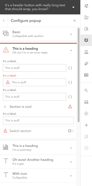
These design show something like status="danger".
Would also have "warning".
I'm not sure if we need "success", but it wouldn't hurt.
I don't think we need "info".
Also, this could also just be status="invalid" to be more like Label and Input, but having "warning" and "success" might be nice. I'm open to suggestions on that.
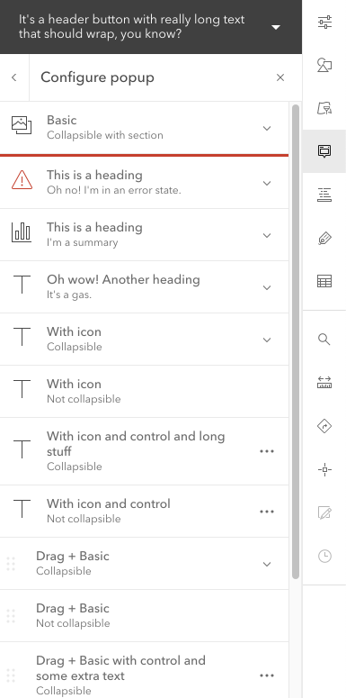
Collapsed.
I'm not sure how I feel about the border, but it matches Alert.
Expanded
This shows error states for Block section.
Note: the input error state is not part of this issue.
Bubbling status?
Possibly a v2.
Might be nice if Block could inspect its contents for Calcite Components that are in invalid/danger/warning states and bubble that status up to the header. Based on that, it could update its status to the most severe status.
 asangma
All 10 comments
Could use this in time for 9.3.
cc @CodeBarker
asangma
on 4 Jun 2021
@asangma suggest making the red line 2px to be cohesive with notice and alert
 bstifle
on 16 Jun 2021
bstifle
on 16 Jun 2021
Updated UI.
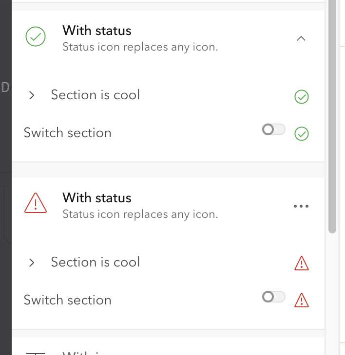
Note: I don't foresee the "valid" status being used much. It is there to have parody with Input.
asangma
on 17 Jun 2021
the red line 2px to be cohesive with notice and alert
Hmmm...I had the impression we were nixing the border.
asangma
on 17 Jun 2021
YEAH kill it. that comment was from last night
bstifle
on 17 Jun 2021
@caripizza Would you mind assigning this one to someone to verify? :)
asangma
on 17 Jun 2021
@asangma yep I'll verify it
 caripizza
on 17 Jun 2021
caripizza
on 17 Jun 2021
🙏🏾
asangma
on 17 Jun 2021
See demos/shell/block-configurations.html
asangma
on 17 Jun 2021
Verified the new UI and behavior on master: now block and block-section can each have their own unique status properties. And when status is set to valid or invalid, the elements render with a status icon which matches the valid/invalid input-message status icons.
caripizza
on 17 Jun 2021
Related issues
bstifle
·
3Comments
bstifle
·
5Comments
 AdelheidF
·
4Comments
AdelheidF
·
4Comments
 jcfranco
·
4Comments
jcfranco
·
4Comments
 ethanbdev
·
4Comments
ethanbdev
·
4Comments