Calcite-components: Bug: calcite-alert with yellow color doesn't meet WCAG color contrast requirements with light theme
Summary
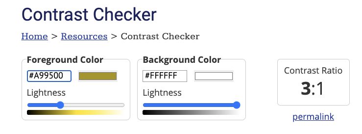
The calcite-alert provides 4 options for alert colors (blue, green, red and yellow). The yellow option doesn't meet color contrast requirements.
https://webaim.org/resources/contrastchecker/?fcolor=EDD317&bcolor=FFFFFF
 kellyhutchins
All 12 comments
cc @bstifle re: our yellow color.
@kellyhutchins - does the accent color need to pass? The text content itself should really convey the severity / status of the message and we won't be able to tell what the color of whatever element the alert is positioned over is.
I tried to look for other examples - IBM Carbon's alert "warning" yellow similarly doesn't pass on its own against the white background of the alert, but in the demo it's presented on a dark background (https://www.carbondesignsystem.com/components/notification/usage/), which seems unrealistic since the alert would "floating" be over any number of page elements.
 macandcheese
on 15 Sep 2020
macandcheese
on 15 Sep 2020
The accent color doesn't need to pass on its own since as you noted the text should convey the warning. But visually impaired users will have difficulty seeing the warning icon but not the other alert icons (error, light bulb etc).
Reading the spec it says that meaningful graphics need to meet the contrast requirements. I think the warning icon on the alert component is meaningful but if the message text is well defined and notes that its a warning then I guess the icon can be considered supplementary.
https://www.w3.org/WAI/WCAG21/Understanding/non-text-contrast.html
kellyhutchins
on 15 Sep 2020
OK, yeah that's fair, we don't necessarily want to have dev users need to prepend the text with "warning:
macandcheese
on 15 Sep 2020
@macandcheese I took a look at the recommendation from the company doing a11y testing for config apps and they recommend providing a screen reader only text equivalent. So based on their notes it sounds like the yellow is ok as long as we add the text equivalent.
Here's the recommendation from their report:
Text equivalents should be concise and meaningful replacements for images. The yellow warning icons should have text associated with them using visually hidden text.
<svg role="img" focusable="no" aria-label="Warning" class="svg"></svg>
<span class="sr-only">Warning</span>

.sr-only{
   position: absolute !important;
  height: 1px;
  width: 1px;
  overflow: hidden;
  padding: 0 !important;
  border: 0! important;
  white-space: nowrap !important;
  clip: rect(1px 1px 1px 1px) !important; /* IE6, IE7 */
  clip: rect(1px, 1px, 1px, 1px) !important;
  clip-path: inset(50%) !important;
}
This issue has been automatically marked as stale because it has not had recent activity. It will be closed if no further activity occurs. Thank you for your contributions.
![github-actions[bot] picture](https://avatars.githubusercontent.com/in/15368?v=4&s=40) github-actions[bot]
on 23 Nov 2020
github-actions[bot]
on 23 Nov 2020
This issue is still valid.
 julio8a
on 26 Jan 2021
julio8a
on 26 Jan 2021
This is interesting because icons are not always displayed (and can be a custom supplied icon). Perhaps an icon-label prop could be provided? But because the accent bar is supplementary to the text (which should alone describe the intent / severity of the alert) , is this needed (since the icon isn’t there by default)?
macandcheese
on 26 Jan 2021
agreed. there's no real way to make yellow 3:1 on white backgrounds. The text is primary for alerts, so the icon and bar are more flourish and supportive
 bstifle
on 26 Jan 2021
bstifle
on 26 Jan 2021
@bstifle, this is something we should document in the alert page on the doc site. The yellow is more decorative and users should not rely on it to convey their message.
julio8a
on 26 Jan 2021
@bstifle @julio8a - not sure if this is still actionable, feel free to follow up if so.
macandcheese
on 14 May 2021
The way i see it, we either remove yellow, or go with this gold-brackish color:
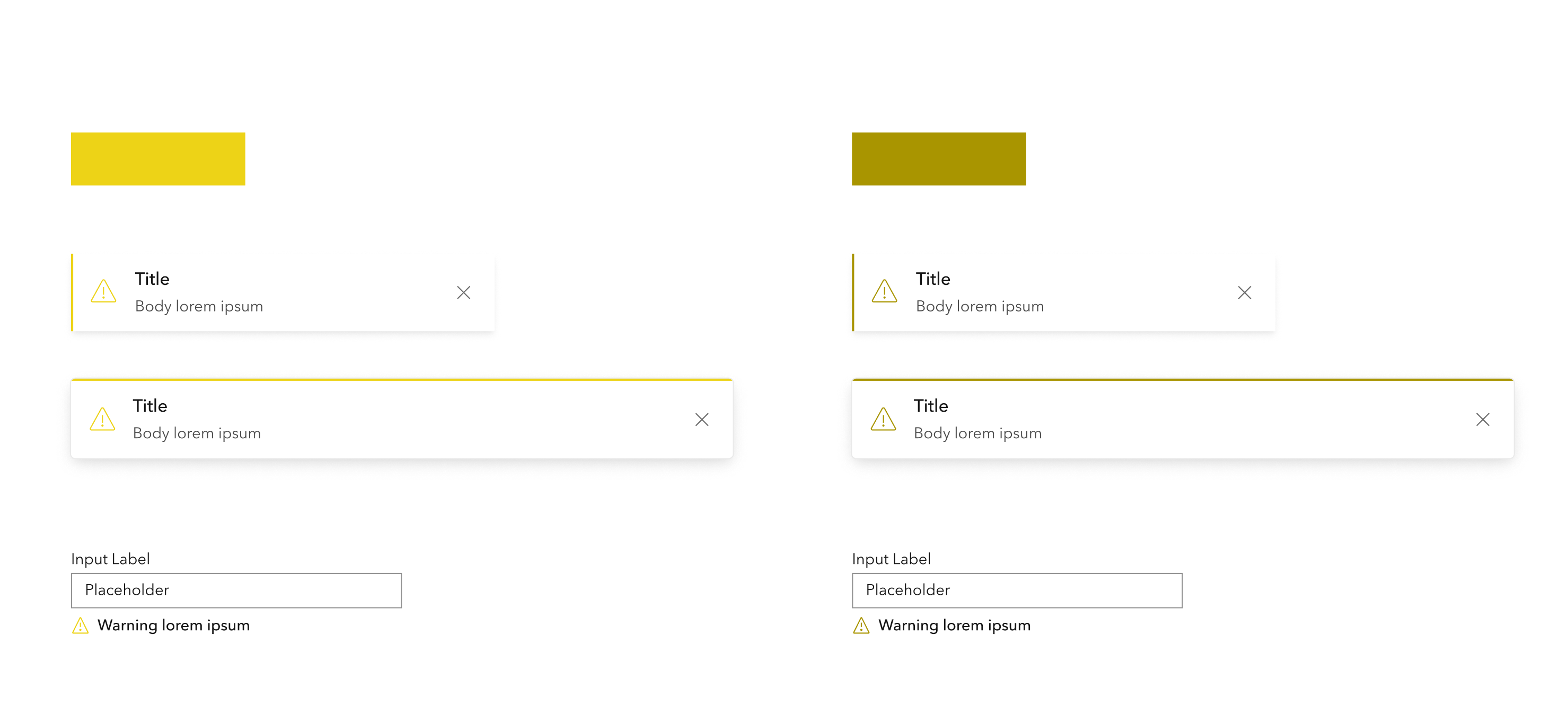
keep in mind that only hits 3:1 on white. It would fail on f8f8f8, f3f3f3. and eaeaea.
orrrr, we can just bite the bullet and stick with a true yellow, and not rely on it to convey critical info
bstifle
on 17 May 2021
I don't think there's anything actionable here. We don't want to change it as this is more of a decorative element and should not be relied on for notifying the user.
julio8a
on 17 May 2021
Related issues
 joeyHarig
·
5Comments
joeyHarig
·
5Comments
 kevindoshier
·
4Comments
kevindoshier
·
4Comments
 nwhittaker
·
5Comments
bstifle
·
3Comments
nwhittaker
·
5Comments
bstifle
·
3Comments
 ethanbdev
·
4Comments
ethanbdev
·
4Comments