Calcite-components: Enhancement: calcite-button with text align options
Description
For Map Viewer Beta 9 (September)
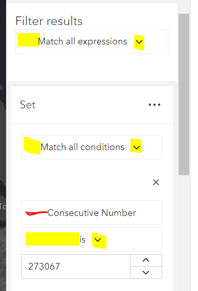
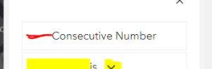
The yellow marked components are calcite-dropdown with a calcite-button. The red marked component is just a calcite-button. I would like to have all text left (leading) aligned and if there is an icon, the icon to be on the very end of the button (trailing).
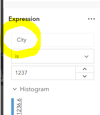
This is how it looks with HTML <select>
cc @asangma
Acceptance Criteria
Relevant Info
Which Component
Example Use Case
 AdelheidF
All 16 comments
I think we may need to just bite the bullet on this one : https://github.com/Esri/calcite-components/issues/302
 macandcheese
on 31 Aug 2020
macandcheese
on 31 Aug 2020
Note: I'm running into issues with the dropdown width if I use calcite-dropdown/calcite-button. width=s doesn't solve it.

AdelheidF
on 1 Sep 2020
Looks like https://github.com/Esri/calcite-components/issues/404 would have taken care of that. That's a place where a select would probably work as well. You could do alignment=end on dropdown but that's just a stopgap until the "width as narrow as trigger" is done.
macandcheese
on 1 Sep 2020
Thanks @macandcheese.
I do think it's still valid to get the Button to have a space-between layout so that in either LTR or RTL
- the text is aligned start
- end icon is aligned end
- start icon is aligned start
 asangma
on 1 Sep 2020
asangma
on 1 Sep 2020
Alternatively, we could enhance and use Action for these use cases.
Keep Button for the higher level functions like Save, Cancel, Done, etc.
asangma
on 1 Sep 2020
OK, I do think calcite-select will solve for the presented use case, but I could see wanting to launch a dropdown / popover / kitten image from a button that had the styles as described.
A consideration is that we'd need a good bit of spacing from the "space-betweened" icon and text so that if this wasn't in a full-width button situation, there would be enough space so that it didn't look like a regular button. Would a "layout" prop that defaulted to current centered ("default"), and accepted a "space-between", "start", and "end" value work?
macandcheese
on 1 Sep 2020
Would a "layout" prop that defaulted to current centered ("default"), and accepted a "space-between", "start", and "end" value work
Probably. But the more I think of it, the centered text works really nicely for things like Cancel, Save, Submit, OK, etc.
I think we should start looking at enhancing Action for these inline use cases.
asangma
on 1 Sep 2020
I really think that will just add confusion for users. When do I use an action vs. button? A button is a more standard UI element.
I wasn't suggesting changing the default behavior of buttons at all - that would remain centered as folks might expect a button to be - just adding an optional prop to address this issue's use case.
macandcheese
on 1 Sep 2020
I think we can learn if it'd cause confusion.
We've seen use from distinguishing things like value-list and pick-list. And if there are distinct UI differences between say a button and an input, that's cool and makes sense. But we have use cases where we need a control that is inline with inputs, switches, etc. in a panel and shouldn't be too distinct.
The Button on the other hand benefits from being distinct.
I think it's not a difficult thing to make it easy to distinguish the two components. Buttons would generally be primary actions and live at the bottom of interfaces. Actions are non-primary and inline.
asangma
on 1 Sep 2020
I don't know... an actionable element inline with an input is a button. I think that's a way more common nomenclature that requires no learning curve or documentation. I'm up for enhancing the button to satisfy more use cases outside the default, but I'm not sure fragmenting "things that look and feel like buttons to users" is necessary. Of course just IMHO :)
macandcheese
on 1 Sep 2020
[calcite-button] the text is aligned start
Could we get this enhancement for map viewer beta 10 (end of October)?
Getting rid of the red space...
AdelheidF
on 2 Oct 2020
Alignment would only work on width="full" due to how buttons are spaced... is this a stop gap until calcite-select is here?
macandcheese
on 2 Oct 2020
@kat10140 Mind helping verfee?
asangma
on 20 Nov 2020
Great, could you let me know once it's part of a next or full release? Thanks.
AdelheidF
on 20 Nov 2020
@AdelheidF
Next builds are being done manually right now.
There are some tests that need to get fixed before the next @next release.
asangma
on 20 Nov 2020
Cool, alignment=start works well.
RTL
AdelheidF
on 24 Nov 2020
Related issues
 ethanbdev
·
4Comments
ethanbdev
·
4Comments
 driskull
·
3Comments
driskull
·
3Comments
 kMcPherson1
·
4Comments
kMcPherson1
·
4Comments
 joeyHarig
·
4Comments
joeyHarig
·
4Comments
 jcfranco
·
4Comments
jcfranco
·
4Comments