Calcite-components: Enhancement: Block "list"
Description
A container component for Blocks that assist accordion type behavior.
It would also maybe be a version of draggable-list.
Acceptance Criteria
Relevant Info
Which Component
Example Use Case
 asangma
All 34 comments
cc @driskull @jcfranco We discussed this kinna thing at one point.
asangma
on 5 Aug 2020
Asking for a friend.... Is there any we could leverage the existing accordion component or add enhancements to that to make it viable here?
 macandcheese
on 5 Aug 2020
macandcheese
on 5 Aug 2020
LOL.
I think the use cases are a bit different.
Also, Blocks are already used extensively in MVB.
That being said, Accordion could be refactored to be a simple version of Blocks.
asangma
on 5 Aug 2020
Yeah.. Just seems like now that everything is in one repository it'd be nice to enhance existing components to solve needs vs. building something new that does "accordion type behavior" when we have an accordion already.
I'd probably be against refactoring accordion to be a simple version of "block" since accordion is a widely understood and commonly named UI element, and can be used anywhere without a strict container philosophy.
macandcheese
on 6 Aug 2020
I agree. The accordion is a ui standard whereas a ui block isn't a generic ui term.
We should probably refactor blocks to be an extension of an accordion or just build the functionality into the accordion
 driskull
on 6 Aug 2020
driskull
on 6 Aug 2020
I think it's a matter of delineating responsibilities for each component. I agree that we shouldn't have one-off versions, but we also have to mindful to not bloat components. For example, the draggable-list behavior doesn't seem common to the accordion UX, at least to me.
 jcfranco
on 6 Aug 2020
jcfranco
on 6 Aug 2020
I agree with that.
I'm not sure a draggable accordion/block makes sense either. That sounds like complicated UX where you're trying to allow someone to expand content but also be able to drag that whole expanded content. Seems a little too complex.
driskull
on 6 Aug 2020
My main goal here is make it easier for users to
- make a set of Blocks draggable like we do with ValueList.
- e.g.
draggableprop
- e.g.
- have a consistent and accessible UX/UI for drag-n-drop
- The way SortableList lets users identify a
handleand adds all the keyboard listeners and stuff.
- The way SortableList lets users identify a
- tell a group of Blocks to behave like accordions, e.g. where each Block contains a lot of interface and the design is to only have one Block open at a time.
- e.g.
selection-mode
- e.g.
asangma
on 6 Aug 2020
The behavior of clicking on a header kinna thing to toggle its content is accordion behavior.
But it's helpful for design, development, PEs, and end users for these to be different things.
- Accordions are nice and clean and fit for displaying content.
- Blocks are a bit more chunky and suited for complex configurations.
asangma
on 6 Aug 2020
Doesn't mean that under the hood, they can't share code though.
asangma
on 6 Aug 2020
make a set of Blocks draggable like we do with ValueList.
What happens when you try to drag an open block with a lot of content in it? I don't think that would be a good UX. Seems like dragging accordion items wouldn't be ideal, using a simple list when reordering becomes enabled might be better.
tell a group of Blocks to behave like accordions, e.g. where each Block contains a lot of interface and the design is to only have one Block open at a time.
Accordion already has a mode for this right? Seems like the same functionality.
Accordions are nice and clean and fit for displaying content.
It seems like they are both accordions but one is designed for more content. Maybe just a prop to handle that would be better?
driskull
on 6 Aug 2020
What happens when you try to drag an open block with a lot of content in it?
I think we can work that out. You can see examples of that in production in Popup config.
asangma
on 6 Aug 2020
This what we have implemented in MVB.
It's using Sortable.
DND works all right nicely even with large-ish Blocks.
But the Sortable is being implemented at the app level and there is no keyboard accessibility, i.e. there's not explicit drag handle that the user can tab into (like we have with ValueList).
Also, this is the use-case where a Block is being used as components that the end-user can add, remove, and rearrange in order to "design" the Popup.
asangma
on 6 Aug 2020
Unsolicited feedback... Seems like maybe a more visible dropzone "bucket" might make that a little easier to see what was going on?
Or even collapsing the item while it's dragged and then making full again on drop? There doesn't seem to be a lot of feedback that the items have switched places, maybe the flicker just exacerbates it? That's neither here nor there for this issue I suppose 😅
macandcheese
on 6 Aug 2020
Totes @macandcheese.
That's one of the issues with having an app developer wire up Sortable at the app level for these kind of interfaces.
I think that's one of the potential features of a "block list"...or something...is that all those refinements would be there by default.
asangma
on 6 Aug 2020
I don't wanna be the UX police every time this kind of UX is needed.
I'd rather have a component available to our dev users that does all that.
asangma
on 6 Aug 2020
Yes I agree! Just wondering if we can update Accordion to do that (I know Field Apps has a similar drag and drop accordion-thing in a main content area in the works, not in a panel) :
Obviously this could display an explicit drag handle when sort was enabled if needed / configured. I believe the only other difference is then an "overflow menu slot" ?
macandcheese
on 6 Aug 2020
That could be cool.
I think if we updated Accordion to do this, we'd wanna make Block a wrapper component.
We also have the BlockSection which is essentially a nested accordion, but with a slightly different UI and a different option that combines the "header" with a switch. This is for use-cases when a section of content is only displayed if a parent option is turned on.
I don't think it'd be a good idea to offer more than one level of Block nesting.
asangma
on 6 Aug 2020
Not sure if it's worth adding complexity to Accordion and Block though.
asangma
on 6 Aug 2020
Yeah, the block being a wrapper makes sense. Currently there are some examples of nested accordions (transparent as nested instance's appearance type matches block), and dragging works well, but we don't limit the number of times nesting can occur.
I do think draggable accordion could be useful for other use cases - I know @TheBlueDog has a main-content area that combines accordions and dragging UX - maybe he can chime in with screenshots of that.
macandcheese
on 6 Aug 2020
Werd.
As a note, DraggableList could do the dnd job here. It has the nice convention of identifying the drag handle to look for in each child component.
We're just missing the mutually-exclusive-open functionality, i.e. the accordion behavior.
asangma
on 7 Aug 2020
What would the markup for that look like? I think each component that would be draggable could just have a 'sortable' prop that would then add a custom drag handle and Sortable config. I'd be worried that wrapping each calcite-accordion-item (or whatever nested child component) in more markup might interfere with some keyboard handling. Of course the logic could be shared but that would alleviate the need to pass custom handle class names, ie <calcite-accordion draggable>...</calcite-accordion> would give you that functionality with events namespaced to the component (obviously accordion is just an example because of @TheBlueDog 's use case, but could apply to anything that would possibly be sortable...)
macandcheese
on 18 Aug 2020
I think it'd look something like demos/sortable-list/sortable-blocks.html.
Note: Block is using a drag-handle prop to turn on its calcite-handle. We might change that to be more like sortable or draggable.
asangma
on 20 Aug 2020
Correct me if I'm wrong, but @TheBlueDog, seems like you could use Blocks for your use case.
asangma
on 20 Aug 2020
The UX shown here: https://github.com/Esri/calcite-components/issues/817#issuecomment-669976858 seems a little weird - not having a distinct drag handle, or collapsing the dragged item combined the flicker / as you drag past, and there's no real distinct landing / drop zone affordance.
Wherever Sortable is used I'd want to make sure the experience is really good and simple - having each component control their own UX means that, for example in my gif above, accordion could decide to collapse its content on drag...
macandcheese
on 20 Aug 2020
asangma
on 20 Aug 2020
I agree that each component should control its own UX, e.g. collapsing when begin dragged.
But have a look at how straight-forward and flexible SortableList is.
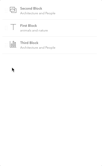
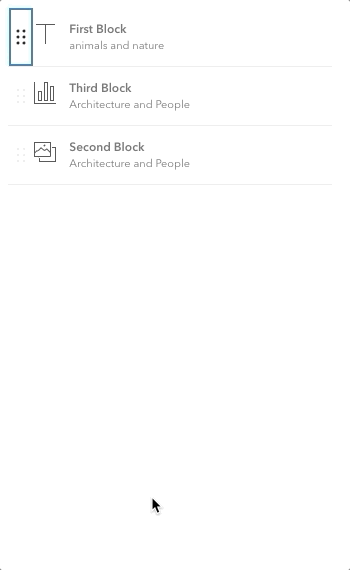
But! All I'm asking is for in this issue is to make it easy for users to have a bunch of Blocks and only have one of them open at a time. Otherwise, users will have to write that up themselves.
We already have SortableList to help with the sortable stuff, and it seems like some version of that could do the job for this request since a list of Blocks can also benefit from being sortable.
asangma
on 20 Aug 2020
Also SortableList includes all the keyboard navigability stuff.
asangma
on 20 Aug 2020
Sorry Disney. No mouse.
asangma
on 20 Aug 2020
@driskull Do you think a BlockList (or its like) would be an extension of SortableList that listens for onHeaderClick from its children Blocks and then toggles their open props?
asangma
on 20 Aug 2020
@asangma That sounds correct. Since we can't extend components it would have to be internal.
driskull
on 20 Aug 2020
Cool. Sorry...shouldn't have said "extend".
Would be a wrapper, yeah?
asangma
on 21 Aug 2020
Great discussion here all. What's the status of this issue?
 julio8a
on 1 Feb 2021
julio8a
on 1 Feb 2021
I would still like to update the design and functionality of the drag and drop to what was shown in above gif but it's probably a separate enhancement issue than what this originally was for.
macandcheese
on 1 Feb 2021
Related issues
 ethanbdev
·
4Comments
asangma
·
4Comments
jcfranco
·
3Comments
jcfranco
·
4Comments
ethanbdev
·
4Comments
asangma
·
4Comments
jcfranco
·
3Comments
jcfranco
·
4Comments
 kMcPherson1
·
4Comments
kMcPherson1
·
4Comments
Most helpful comment
I don't wanna be the UX police every time this kind of UX is needed.
I'd rather have a component available to our dev users that does all that.