Buildinggadgets: Gadget settings gui
With an increasing number of features, it get's less easy to keep track of what the Gadgets are capable of and how to toggle them. The current approach of adding buttons to the RadialMenu, works well, but if we continue adding mode features, then it might get overpopulated. Therefore an extra Settings Gui (toggeled by it's own button) may be useful.
Should we add this only in 1.13?
 MajorTuvok
All 15 comments
Are we talking about per-gadget features or cross-level features?
I think common features (such as fuzzy, range) should be kept in the radial menu and others like ability to replace fluids, connected surface should be in a separate GUI.
 hnOsmium0001
on 26 Feb 2019
hnOsmium0001
on 26 Feb 2019
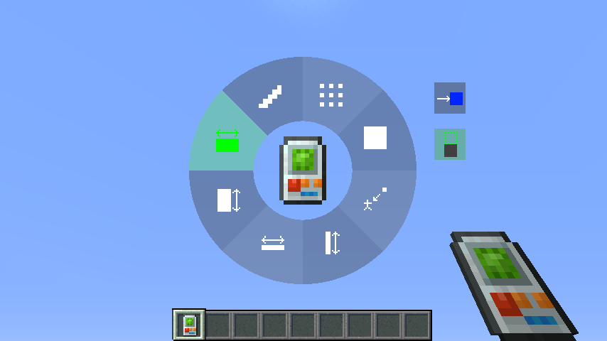
I'm leaning towards doing what Algo does in C&B; Putting all non-radial controls in the same screen as the radial wheel by:
- Only rendering a slice's name string when it's hovered.
- Making them buttons with icons that also render name strings when hovered.
 Phylogeny
on 26 Feb 2019
Phylogeny
on 26 Feb 2019
Could you maybe put an image of how it might look here, as I don't like what I think it looks like, but I also think that I I can't imagine it properly...
MajorTuvok
on 26 Feb 2019
Grr, third time I accedently i hit the close and comment instead of comment on my phone! Why are these 2 buttons Next to each other?!?
MajorTuvok
on 26 Feb 2019
Here's how it looks now:
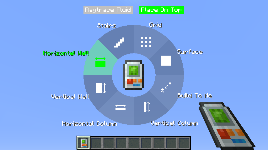
Here's a rough idea of how it could look (with hovering text for all controls/slices):
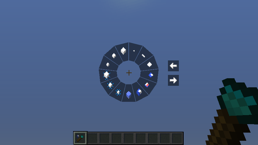
Here's how Chiseles & Bits looks (also has hovering text for all controls/slices):
Phylogeny
on 28 Feb 2019
Ahh, okey... And then once one mouses over a specific mode it displays the name right?
That sounds nice, we could also very easily add <- and -> buttons for more pages...
MajorTuvok
on 28 Feb 2019
Right, they would all have hover text. And there could be buttons to navigate to other pages, if need be, but there should be plenty of room as-is.
Phylogeny
on 28 Feb 2019
I think we could scale the gadget down a bit in the middle and maybe the whole selector wheel as a whole as it is a bit big :P
 MichaelHillcox
on 28 Feb 2019
MichaelHillcox
on 28 Feb 2019
We also need to take MC's Scaled Resolution into account... But In my opinion this size looks actually pretty nice - I'm of the opposite opinion, that Chisels one is too small
MajorTuvok
on 28 Feb 2019
I was thinking a middle point between the too :)
MichaelHillcox
on 28 Feb 2019
Yes, if it were slightly smaller, there would be room for controls on the bottom as well as the sides and top. Then it would be very likely that everything would fit on the screen, even if many more controls were added in the future.
Phylogeny
on 28 Feb 2019
Thing is, I'm not so sure whether we truly want all the controls to be on the same screen, as it might get overpopulated and therefore difficult to read...
But we can decide that once we get close to that point though
MajorTuvok
on 28 Feb 2019
Having everything on the same screen is significantly more convenient. And it helps that the controls are icons, rather than text. In any case, it's always possible to add config option(s) for whether given controls are in the radial menu, or on a separate page, if things ever get that crowded.
Phylogeny
on 28 Feb 2019
Added in 9ea0f4804687f23c00f641a79a133ebc487ae048.
Phylogeny
on 16 Mar 2019
Implemented in v2.6.7
Phylogeny
on 18 Mar 2019
Related issues
 sunsparkda
·
4Comments
sunsparkda
·
4Comments
 Nerdpie
·
3Comments
Nerdpie
·
3Comments
 Azutte
·
7Comments
MichaelHillcox
·
4Comments
Azutte
·
7Comments
MichaelHillcox
·
4Comments
 WenXin20
·
4Comments
WenXin20
·
4Comments
Most helpful comment
Yes, if it were slightly smaller, there would be room for controls on the bottom as well as the sides and top. Then it would be very likely that everything would fit on the screen, even if many more controls were added in the future.