Botframework-webchat: Carousel option is unclickable for option with short name
Screenshots

Version
npm package v: "4.10.0"
Describe the bug
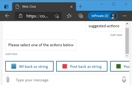
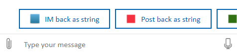
Carousel option is unclickable for option with short name
Steps to reproduce
Need to add as much option for the user to see the carousel (provide name as short as you can, one letter for ex), then there is arrows on both sides which comes on hover, and DIV with className='slider' is hovering almost first element , and if you scroll to the end right arrow div hovers last element as it is hard to click it
added colors to the div so it easier to see what I mean

Expected behavior
div should be smaller, perfectly the size as the arrow and do not block user to choose the option
Additional context
[Bug]
 dantist1122
All 12 comments
We will prioritize this in our upcoming release.
 johnataylor
on 19 Nov 2020
johnataylor
on 19 Nov 2020
Thanks for filing this issue. This is a fix that would need to happen in the react-film package, which is managed by @compulim and @spyip. Please feel free to file an issue above and include the link in this thread. This will remain open as a tracking ticket.
I will assign this to compulim. @cwhitten FYI.
 corinagum
on 19 Nov 2020
corinagum
on 19 Nov 2020
Few things you could try:
- Use idiosyncratic styling to make the flipper smaller
- Use flow layout for suggested actions, https://github.com/microsoft/BotFramework-WebChat/pull/3641 (it's currently in dev build)
Even though the flipper is smaller by 50%, it's still blocking 50% of the button.
Need design team input on how to size the flipper. It seems inevitable to have a big portion of the flipper blocking the element.
 compulim
on 11 Jan 2021
compulim
on 11 Jan 2021
Adding @Kaiqb to assignees for tracking purposes.
corinagum
on 13 Jan 2021
Background:
- User can use mousewheel/flick to scroll
- But the flippers will show up as long as mouse hover (including flick)
- So the flippers always blocking part of the first action button
Actions:
- Let's draw some designs in PPTX/PNG and let the design team pick which one is good
compulim
on 21 Jan 2021
@compulim when you start drafting these ideas, it might be worthwhile to give the carrousel chevron (<) & (>) a dedicated place in the margins at both ends. We can play around with positioning, maybe just like 50% placement and 50% overlap. Or we make the icons a lot smaller in those margins & when a user hovers over the flipper's height does match the top to bottom but width is thinner than current version.
 Quirinevwm
on 25 Jan 2021
Quirinevwm
on 25 Jan 2021
@Quirinevwm do you like this one?
The flipper buttons are placed in padded space outside of the first and last element:

Alignments:

The flipper buttons will be hidden if they are no longer needed:

For a closer look, the highlighted parts are the bounding box of the flipper button, both yellow and blue. As soon as the user clicks on either yellow or blue part, it activates the flipper button.


compulim
on 4 Feb 2021
@compulim, I like it! The natural way of giving the click a padded space on it's own makes sense, with enough space for a click with the 50x padding. Plus, good it will not appear when the canvas is wide enough to show all the SA's.
For the back and forth:
- start view: can we make sure the left chevron is not present, so when a user sees the right chevron on their screen they will click (or swipe), then the left chevron will appear.
- after that, giving both chevrons a set space at the ends makes sense
ps. the grey color transparency of the chevron circle seems strong enough, a bit lighter might be even nicer but let's just go with what you have since that stands out.
Quirinevwm
on 4 Feb 2021
This is what we have today. The left chevron is not shown until the user move to the right.
So the existing design fulfill your point 1: if the view is at far left (i.e. initially), the left chevron should be hidden, because there is nothing on the left side.
In your point 2, you mentioned we should provide exclusive space to both chevrons.
Combining your point 1 + 2, we provide exclusive space, but we still want to hide the left chevron (initially). That means, at initial, the left side will looks empty like this:
Could you draw up some keyframes to help me understand the animation you want to achieve?
compulim
on 4 Feb 2021
@compulim from the capture shots I did not realize that is what you've intended to do (as before) - so when the user decides to move to the right the left chevron appears ; )

Then this all makes sense what you've shared, looks good with new padding and it will be visible once a user starts scrolling!
(ps just to explain what I meant) :
- start: hover appears right & by scroll/click the left chevron appears
- if a user then goes back to the left:
a. _what you have is that is goes back to "start" positioning - let's go for this!_
b. other option would be that after the user has started scrolling, we just stick to having both chevrons present both ends so there will never be a start positioning again (not the best for this cramped space I agree with you).
Quirinevwm
on 4 Feb 2021
Based on discussion above, I think it's good to go with @compulim's solution since it will fix the original problem. In terms of fine-tuning the UX, maybe after this change has been implemented we could all meet again for design tweaking. Thoughts?
corinagum
on 4 Feb 2021
Yes but to be honest the UX was fine since the initial state was already great, it was only a padding and spacing problem, so what @compulim has is oke!
Quirinevwm
on 5 Feb 2021
Related issues
 Kellym-Kainos
·
4Comments
compulim
·
3Comments
Kellym-Kainos
·
4Comments
compulim
·
3Comments
 naveen-vijay
·
4Comments
naveen-vijay
·
4Comments
 filipjakov
·
4Comments
filipjakov
·
4Comments
 felixhauserch
·
3Comments
felixhauserch
·
3Comments
Most helpful comment
@Quirinevwm do you like this one?
The flipper buttons are placed in padded space outside of the first and last element:
Alignments:
The flipper buttons will be hidden if they are no longer needed:
For a closer look, the highlighted parts are the bounding box of the flipper button, both yellow and blue. As soon as the user clicks on either yellow or blue part, it activates the flipper button.