Boostnote.next: Design overhaul of the shortcut suggestion on the landing page
Current design
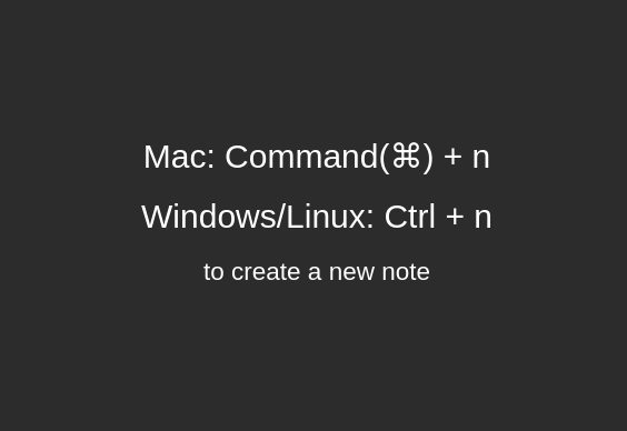
The current landing page doesn't look that visually pleasing to me, compared to other editors like Visual Studio Code. In particular, I mean this section:
My idea
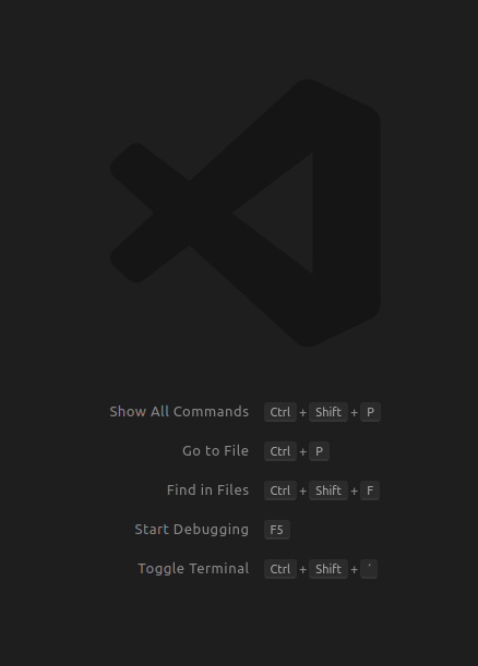
Visual Studio Code has this sleek design:
I created a sketch in Figma that I would suggest as a replacement for the current design, which is meant to be an improvement of the design, not necessarily the functionality. This is the current version:
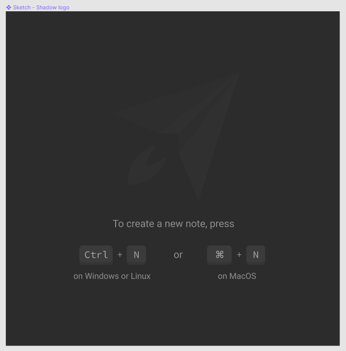
You can check out my Figma project and leave comments here.
I wasn't able to find this particular section of code in repository, but if someone could point me to it, I'd also be willing to do the changes myself and create a pull request.
Environment
Desktop
- Boost Note.next version 0.4.1
- OS version and name: Ubuntu 18.04
 tim-kt
All 8 comments
I wasn't able to find this particular section of code in repository, but if someone could point me to it, I'd also be willing to do the changes myself and create a pull request.
If I'm not wrong, it is located in: src/pages/NotePage.tsx in line 310-316.
currentNote == null ? (
  <StyledNoteDetailNoNote>
    <div>
      <h1>{t('note.createKeyMac')}</h1>
      <h1>{t('note.createKeyWinLin')}</h1>
      <h2>{t('note.createkeymessage1')}</h2>
    </div>
  </StyledNoteDetailNoNote>
The styling for the component is located in line 27:
export const StyledNoteDetailNoNote = styled.div`
  text-align: center;
  margin-top: 300px;
`
The text/strings are located in: src/locales/enUS.ts
export default {
    translation: {
      ...
      'note.createKeyMac': 'Mac: Command(⌘) + n',
      'note.createKeyWinLin': 'Windows/Linux: Ctrl + n',
      'note.createkeymessage1': 'to create a new note',
      ...
    }
}
I guess that's it. I really like your landing page though. I'll root for it. 👍
 jhdcruz
on 28 Apr 2020
jhdcruz
on 28 Apr 2020
All right, so I adjusted the colors to match the application and now I can't decide between dark and light buttons... I asked a few friends and they said that the light ones are better but I really like the dark ones, so I'll let the people here decide.
Here are the designs side by side:
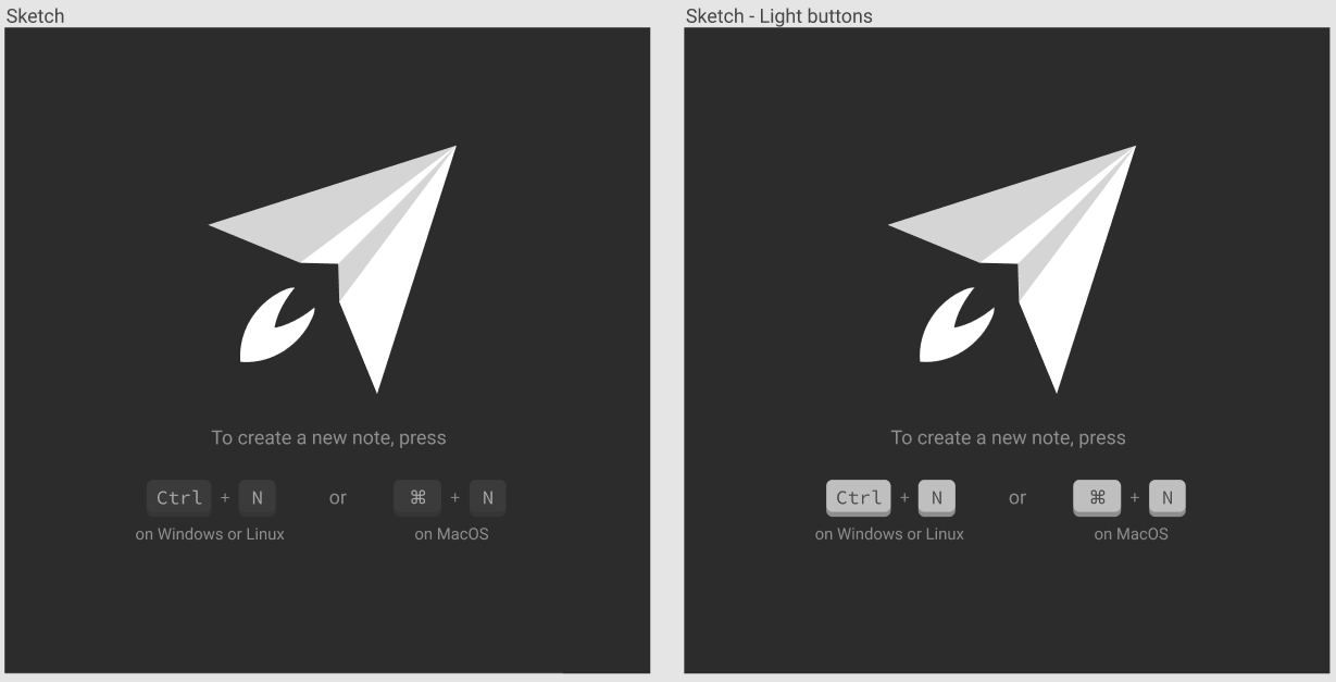
I guess you can react with :rocket: for the dark buttons and with :tada: for the light buttons.
Also, thanks @jhdcruz! I'll look into it.
tim-kt
on 28 Apr 2020
Okay, I thought about my goal for the buttons and I think the user's focus should be on them rather than on the logo and since everything else in the application is pretty dark without white contrasts, I think I'll go with this version:
tim-kt
on 28 Apr 2020
Loving this suggestion!
 Flexo013
on 1 May 2020
Flexo013
on 1 May 2020
I moved this to the old app, so I'm closing this issue here.
tim-kt
on 1 May 2020
I've been quite interested in this particular improvement since this was closed. So I decided to continue this myself, if it's ok with the original author/idea @tim-kt.
I'm very eager to see this implemented.
jhdcruz
on 5 May 2020
Sure thing, that's great to hear @jhdcruz!
I did a mockup in CSS and ended up with the following code for the different buttons:
.physical-button {
    /* Displays a rounded button with adjustable width and height... */
    display: inline-block;
    border-radius: 4px;
    background-color: #333333;
    /* ... with a "shadow" as its side. */
    box-shadow: 0 4px 0 #2B2B2B;

    /* Centers the text and makes the buttons equally high even though
    the fonts differ. */
    text-align: center;
    line-height: 25px;
}

.physical-button-ctrl {
    /* Pretty, monospaced font */
    font-family: 'Source Code Pro', monospace;

    /* Puts some space between the text and the button's edges.*/
    padding-left: 8px;
    padding-right: 8px;
}

.physical-button-cmd {
    /* Monospaced fonts are cool, but symbols are not particularly big
    and the ⌘ was really small. */
    font-family: 'Arial', sans-serif;

    /* More padding than on the Ctrl button because the overall width
    should only be a little bit smaller */
    padding-left: 12px;
    padding-right: 12px;
}

.physical-button-n {
    /* Pretty, monospaced font */
    font-family: 'Source Code Pro', monospace;

    /* About the right amount of padding to create a nice square */
    padding-left: 10px;
    padding-right: 10px;
}
And to display the buttons:
<div class="physical-button physical-button-ctrl">
    Ctrl
</div>

<div class="physical-button physical-button-cmd">
    ⌘
</div>

<div class="physical-button physical-button-n">
    N
</div>
I also adjusted the color of the buttons' sides and they are now darker than the background (which is how it looks like in real life, if you look down at your keyboard).
tim-kt
on 5 May 2020
Resolved in #458. I might add more modification but I like the suggestion! Thanks for contributing!
 Rokt33r
on 10 May 2020
Rokt33r
on 10 May 2020
Related issues
 Meiryo7743
·
5Comments
Meiryo7743
·
5Comments
 Username77177
·
4Comments
Username77177
·
4Comments
 triet-truong
·
5Comments
triet-truong
·
5Comments
 derekantrican
·
4Comments
Rokt33r
·
5Comments
derekantrican
·
4Comments
Rokt33r
·
5Comments
Most helpful comment
Okay, I thought about my goal for the buttons and I think the user's focus should be on them rather than on the logo and since everything else in the application is pretty dark without white contrasts, I think I'll go with this version: