Blueprint: MenuItem should truncate before `label`
If you have a max width set on a menu and also a label set, the text for that MenuItem gets truncated underneath the label, causing an ugly mess.

I'm not sure the best way around this, but I'll definitely update this issue with any solutions I find. I would suggest simply adding a larger right padding on the menu items, but that doesn't account for items without the label included. Maybe it should detect when a label is present and automatically add a larger right padding? I guess the issue there is that a plain jsx component can be passed in the label attribute, so the actual padding required is mostly unknown.
 garetmckinley
All 5 comments
We do logic for this in InputGroup, what do you think about supporting it in menus too @giladgray?
 llorca
on 13 Apr 2017
llorca
on 13 Apr 2017
another option is to refactor styles to use flexbox: left and right elements would be fixed size and the text would grow to fill all space.
 giladgray
on 13 Apr 2017
giladgray
on 13 Apr 2017
I think the flexbox refactor is a real solid solution :+1:
garetmckinley
on 14 Apr 2017
Agree. Quite low priority for us at the moment as we're not constrained by max-widths and long labels -- we'd happily accept a contribution!
llorca
on 14 Apr 2017
I'm also hitting this but I don't believe I've included any special css to set max-width:
It appears that this is not an issue for me on the 1st level, but on the 2nd level or beyond things look bad:
In my case I would rather not truncate but instead have the context menu to expand as necessary. Should I make a new issue for that?
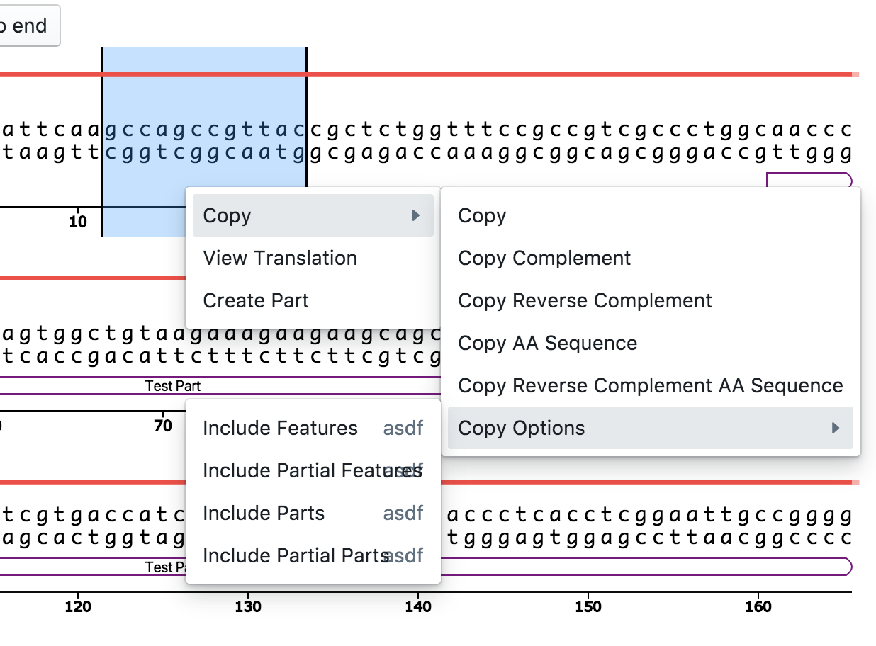
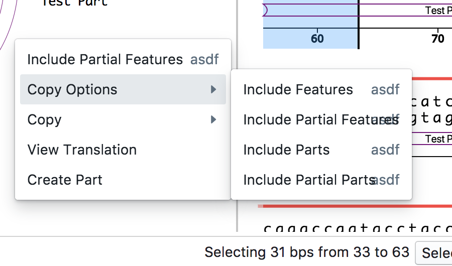
 tnrich
on 8 Jan 2018
tnrich
on 8 Jan 2018
Related issues
 nagylzs
·
34Comments
nagylzs
·
34Comments
 vladeck
·
32Comments
vladeck
·
32Comments
 basarat
·
17Comments
basarat
·
17Comments
 ripitrust
·
19Comments
ripitrust
·
19Comments
 zhaoyi0113
·
21Comments
zhaoyi0113
·
21Comments
Most helpful comment
another option is to refactor styles to use flexbox: left and right elements would be fixed size and the text would grow to fill all space.