Blueprint: Support for client-side routing on href props
Many components (such as Menu) can take an href prop. This prop maps to the href value of an <a> tag. For many react projects that use client-side routing, anchor tags are replaced by <Link> (e.g. in react-router) components that ensure the routing happens client-side.
If the <Link> component is placed inside the text prop, everything behaves as expected, but React throws a warning for having nested <a> tags.
Perhaps we could supply our own component to be used in place of the <a> tag in these situations.
 isTravis
All 43 comments
Good call @isTravis, I agree it would be nice to make components like MenuItem and AnchorButton work better with react-router (although tbh I don't really like react-router's API since it forces you to do this; I greatly prefer routing solutions that work with standard <a> tags). This isn't an immediate priority for us, but feel free to write up / iterate on a proposal for a solution here.
 adidahiya
on 16 Nov 2016
adidahiya
on 16 Nov 2016
@adidahiya Is there a specific routing solution you prefer that works better with standard <a> tags?
@isTravis Putting inside the text prop worked, but it remains active when I'm navigated to the link. Have you figured out how to disable the button when the route is active?
 natemartinsf
on 27 Nov 2016
natemartinsf
on 27 Nov 2016
After reading about about how other people are using React-Router, and looking at https://github.com/insin/react-router-active-component which almost did what I wanted, I put together a simple wrapper around Button that navigates to routes using the "to" property, and disables itself when the route is active. Hopefully this can help out some other people. I'm new to working with React, so criticism is welcome.
https://gist.github.com/natemartinsf/b9d4ea7995d0009522b49c474b2cf613
natemartinsf
on 27 Nov 2016
@natemartinsf, I haven't had any clever workarounds with the
An example of how I'm using the <Menu> component now:
<Menu>
  <li><Link to={'/link1'} className="pt-menu-item pt-popover-dismiss">Link 1</Link></li>
  <MenuDivider />
  <li><Link to={'/link2'} className="pt-menu-item pt-popover-dismiss">Link 2</Link></li>
  <li><Link to={'/link3'} className="pt-menu-item pt-popover-dismiss">Link 3</Link></li>
  <MenuDivider />
  <li><Link to={'/link4'} className="pt-menu-item pt-popover-dismiss">Link 4</Link></li>
  <MenuItem text={'Logout'} onClick={this.props.logoutHandler} />
</Menu>
This should work with React Router v4:
<Menu>
  <Link to={'/link1'}>
    {({ isActive, onClick }) => <MenuItem disabled={isActive} onClick={onClick} text="Link 1" />}
  </Link>
</Menu>
 nerdstep
on 19 Jan 2017
nerdstep
on 19 Jan 2017
This needs a better solution. In semantic-ui they handle this sort of thing very elegantly by providing an as property on most classes that you can use to pass your own target component. I use this, for example, to render Lists of items using a ReactFlipMove like so:
<sem.Card.Group itemsPerRow={cards && cards.length < itemsPerRow ? 2 : itemsPerRow} as={ReactFlipMove}>
I suggest providing the same sort of thing here. We would then be able to do <MenuItem to={href} as={Link} />
 noah79
on 30 Jun 2017
noah79
on 30 Jun 2017
As another example, and as a way to contribute to a proposal for this, In material-ui, they use containerElement as a way to be able to use as different elements:
https://github.com/callemall/material-ui/blob/master/src/FlatButton/FlatButton.js#L45
How it is handled is the following:
https://github.com/callemall/material-ui/blob/master/src/internal/EnhancedButton.js#L328, and the combined props are passed along to the component that had container element.
I guess the only problem here is that for TypeScript users, adding in extra properties like to (e.g. Link from react-router) would cause an issue as to is not a property of the element.
For scenarios like that I tend to gravitate having a more generic interface that accepts any kind of prop, like so:
interface GenericReactComponentProps {
  [propName: string]: any
}
Each element that does support extra properties can extend such an interface if needed.
 hrgui
on 13 Sep 2017
hrgui
on 13 Sep 2017
Hello, any news on this?
 lednhatkhanh
on 10 Apr 2018
lednhatkhanh
on 10 Apr 2018
+1
 ghost
on 20 Apr 2018
ghost
on 20 Apr 2018
@lednhatkhanh @johnunclesam Status: needs proposal we're waiting for a proposal on how to support this reliably. suggestions (and/or PRs) greatly appreciated.
 giladgray
on 23 Apr 2018
giladgray
on 23 Apr 2018
Is there any upadates on this.
 hari5004
on 27 Sep 2018
hari5004
on 27 Sep 2018
waiting for someone to offer a nice way of solving this. I cannot investigate.
giladgray
on 27 Sep 2018
The easiest way to get this working is don't use an <a> Tag for the MenuItem let the developer supply the <a> through whatever handler they want by using a <span> so you're not interfering in links leave it to the developer.
This means you leave the content under the control of the developer.
While currently this works in Chrome it raises Warnings and will produce unexpected results in other browsers
<MenuItem text={<NavLink to="/applications/add">Add</NavLink>} />
this is because the above MenuItem renders to HTML as
<li class="">
    <a class="pt-menu-item pt-popover-dismiss" tabindex="0">
        <a href="/applications/add">Add</a>
    </a>
</li>
While it would be ideal if it rendered as
<li class="">
    <span class="pt-menu-item pt-popover-dismiss" tabindex="0">
        <a href="/applications/add">Add</a>
    </span>
</li>
This leaves the control to the developers using blueprint, you could if you wanted actively change the Tag being used by MenuItem between <span> and <a> if the href property is supplied, this can be done on line 122 of components/menu/menuItem.tsx
Change let content = (... to be
let contentAnchor = (
    <a
        className={anchorClasses}
        href={disabled ? undefined : this.props.href}
        onClick={disabled ? undefined : this.props.onClick}
        tabIndex={disabled ? undefined : 0}
        target={this.props.target}
    >
        {labelElement}
        {this.props.text}
    </a>
);

let contentSpan = (
    <span
        className={anchorClasses}
        onClick={disabled ? undefined : this.props.onClick}
        tabIndex={disabled ? undefined : 0}
        target={this.props.target}
    >
        {labelElement}
        {this.props.text}
    </span>
)

let content = (this.props.href)? contentAnchor : contentSpan;
 barkermn01
on 1 Oct 2018
barkermn01
on 1 Oct 2018
@giladgray Can you please give some feedback on this if you're happy with the implementation I will merge it into my develop branch and then send the pull request through to your codebase if you not what would you need me to do to get it suitable for pull into the primary code base.
barkermn01
on 11 Oct 2018
@barkermn01 i am not okay with rendering an <a> _or_ a <span> based on props as it's not reliable. instead we should support a tagName prop like many of the other BP components that lets you reliably specify the tag/component to use. the default would be "a" but you should be able to pass react-router's Link component instead, for instance.
giladgray
on 12 Oct 2018
Using the suggestions in this article: https://tylermcginnis.com/react-router-programmatically-navigate/
You can do the following:
import * as React from 'react';
import {
    RouteComponentProps,
    withRouter,
} from 'react-router-dom'

import {
    Alignment,
    AnchorButton,
    ButtonGroup,
    Divider,
} from "@blueprintjs/core";
import {
    IconNames,
} from "@blueprintjs/icons";

type Props = RouteComponentProps;

class Sidebar extends React.Component<Props> {
    public render() {
        return (
            <ButtonGroup minimal={true} vertical large alignText={Alignment.LEFT} fill>
                <AnchorButton icon={IconNames.HOME}
                    onClick={() => this.props.history.push('/')}>
                    Home
                </AnchorButton>
                <Divider />
                <AnchorButton icon={IconNames.LAYERS}
                    onClick={() => this.props.history.push('/service/create')}>
                    Services
                </AnchorButton>
            </ButtonGroup>
        );
    }
}

export default withRouter(Sidebar);
 jtreminio
on 19 Oct 2018
jtreminio
on 19 Oct 2018
@jtreminio
According to react router's docs you should not use the history object to change data as it's a wrapped pointer to the window.history var and can cause react router to lose track state. is there so you can look back up it, E.G if you have overlays and the background page is already loaded if not you need to load it first. then your overlay for your route current.
React router says you should use a <Redirect> Compent but this also is not for a MenuItem Component as we're talking about in here. as your putting the <AnchorButton /> in there and the MenuItem automaticly uses an <a> tag so would cause the same problem of an <a> inside an <a> invalid HTML and has the same bug
barkermn01
on 19 Oct 2018
Per https://reacttraining.com/react-router/web/example/custom-link
you can do something like this:
import * as React from 'react';
import {
    RouteComponentProps,
    withRouter,
    Route,
} from "react-router-dom";
import * as H from 'history';
import {
    Alignment,
    AnchorButton,
    ButtonGroup,
    Divider,
} from "@blueprintjs/core";
import {
    IconNames,
} from "@blueprintjs/icons";

type Props = RouteComponentProps & {}
type State = {}

class Sidebar extends React.Component<Props, State> {
    public render() {
        const { history } = this.props;

        return (
            <ButtonGroup minimal vertical large alignText={Alignment.LEFT} fill>
                <RouterButton label="Home" to="/" activeOnlyWhenExact={true} history={history} />
                <Divider className="divider" />
                <RouterButton label="Service" to="/service" activeOnlyWhenExact={true} history={history} />
            </ButtonGroup>
        );
    }
}

interface LinkProps {
    label: string,
    to: string,
    activeOnlyWhenExact: boolean,
    history: H.History,
}

const RouterButton = (props: LinkProps) => (
    <Route
        path={props.to}
        exact={props.activeOnlyWhenExact}
        children={({match}: any) => (
            <AnchorButton active={match} className="button" icon={IconNames.HOME}
                          onClick={() => props.history.push(props.to)}>
                {props.label}
            </AnchorButton>
        )}
    />
);

export default withRouter(Sidebar);
@jtreminio you need to look at the output HTML: <a href="/about">About</a> which means when it's inside a <MenuItem> JSX you still have 2 A tags one from the menu item and one from <AnachorButton> JSX please stop coming up with methods that are not using the <MenuItem> JSX component we want to use that so the design comes through!
barkermn01
on 30 Oct 2018
@barkermn01 I'm assuming you meant to tag me.
I'm not "coming up" with ways here, I linked to the official React Router docs. What more do you want?
This is the HTML generated using the above code:
<div class="bp3-button-group bp3-fill bp3-large bp3-minimal bp3-vertical bp3-align-left">
  <a role="button" class="bp3-button button" tabindex="0">
    <span class="bp3-icon bp3-icon-home" icon="home">
      <svg data-icon="home" width="16" height="16" viewBox="0 0 16 16">
        <desc>home</desc>
        <path (...snip...)></path>
      </svg>
    </span>
    <span class="bp3-button-text">Home</span>
  </a>
  <div class="bp3-divider divider"></div>
  <a role="button" class="bp3-button bp3-active button" tabindex="0">
    <span class="bp3-icon bp3-icon-home" icon="home">
      <svg data-icon="home" width="16" height="16" viewBox="0 0 16 16">
        <desc>home</desc>
        <path (...snip...)></path>
      </svg>
    </span>
    <span class="bp3-button-text">Service</span>
  </a>
</div>
I see a single <a> tag for each item.
This works for AnchorButton element. I assumed you would adapt it to work for any other element type you need.
jtreminio
on 30 Oct 2018
@barkermn01 Here's the above applied the Menu/MenuItem:
import * as React from 'react';
import {
    RouteComponentProps,
    withRouter,
    Route,
} from "react-router-dom";
import * as H from 'history';
import {
    Menu,
    MenuItem,
} from "@blueprintjs/core";

type Props = RouteComponentProps & {}
type State = {}

class Sidebar extends React.Component<Props, State> {
    public render() {
        const { history } = this.props;

        return (
<nav id="sidebar">
    <menu>
        <Menu>
            <MenuItem text="Submenu">
                <RouterMenuItem label="Home" to="/" activeOnlyWhenExact history={history} />
                <RouterMenuItem label="Services" to="/service" activeOnlyWhenExact history={history} />
            </MenuItem>
        </Menu>
    </menu>
</nav>
        );
    }
}

type LinkProps = {
    label: string,
    to: string,
    activeOnlyWhenExact: boolean,
    history: H.History,
}

type Match = {
    match: boolean,
}

const RouterMenuItem = (props: LinkProps) => (
    <Route
        path={props.to}
        exact={props.activeOnlyWhenExact}
        children={({match}: Match) => (
            <MenuItem active={match} text={props.label}
                      onClick={() => props.history.push(props.to)} />
        )}
    />
);

export default withRouter(Sidebar);
Here's the generated HTML:
<nav id="sidebar">
   <menu>
      <ul class="bp3-menu">
         <li class="bp3-submenu">
            <span class="bp3-popover-wrapper">
               <span class="bp3-popover-target bp3-popover-open">
                  <a class="bp3-menu-item" tabindex="0">
                     <div class="bp3-text-overflow-ellipsis bp3-fill">Submenu</div>
                     <span class="bp3-icon bp3-icon-caret-right" icon="caret-right">
                        <svg data-icon="caret-right" width="16" height="16" viewBox="0 0 16 16">
                           <desc>caret-right</desc>
                           <path (...snip...)></path>
                        </svg>
                     </span>
                  </a>
               </span>
               <div class="bp3-overlay bp3-overlay-open bp3-overlay-inline">
                  <div class="bp3-transition-container bp3-popover-enter-done" style="position: absolute; will-change: transform; top: 0px; left: 0px; transform: translate3d(295px, 0px, 0px);">
                     <div class="bp3-popover bp3-minimal bp3-submenu" style="transform-origin: left center 0px;">
                        <div class="bp3-popover-content">
                           <ul class="bp3-menu">
                              <li class="">
                                 <a class="bp3-menu-item bp3-active bp3-intent-primary bp3-popover-dismiss">
                                    <div class="bp3-text-overflow-ellipsis bp3-fill">Home</div>
                                 </a>
                              </li>
                              <li class="">
                                 <a class="bp3-menu-item bp3-popover-dismiss">
                                    <div class="bp3-text-overflow-ellipsis bp3-fill">Services</div>
                                 </a>
                              </li>
                           </ul>
                        </div>
                     </div>
                  </div>
               </div>
            </span>
         </li>
      </ul>
   </menu>
</nav>
Again, I don't see nested <a> tags, and the router properly picks up the changes.
jtreminio
on 30 Oct 2018
Awesome so that is a workaround for that problem so will be useful until this is patched properly, can I ask does it work correctly then? props.history.push(props.to) does the state of the router stay in place?
barkermn01
on 30 Oct 2018
I'm not familiar enough with either React or React Router to answer does the state of the router stay in place.
I click the links and it takes me to the proper Component without doing a hard reload, seems to work exactly as React Router usually does when using <Link> component. I would assume since the official docs recommend this method it works as intended.
jtreminio
on 30 Oct 2018
I was meaning if you click that the link created by <RouterMenuItem /> then click on a <Link /> that can you click back and it keeps track of your state the whole point of push state is to keep track of your location so you can use the back button and forward browser features without refreshing / reloading it just updates the state in javascript so the application knows what it needs to render
barkermn01
on 30 Oct 2018
I found this workaround:
export const LinkMenuItem = (props) => {
  const {href, ...other} = props

  const router = useContext(__RouterContext)

  return (
    <MenuItem
      onClick={() => router.history.push(href)}
      {...other}
    />
  )
}
This work fine in a Popover.
In case you are going to use this in the side menu of your app this can be improved by adding some logic for set the "active" class on the MenuItem component.
 silviodeligios
on 4 Jun 2019
silviodeligios
on 4 Jun 2019
@silviodeligios This has been fixed in the code, we don't need a workaround now https://github.com/palantir/blueprint/pull/3061
barkermn01
on 4 Jun 2019
@silviodeligios This has been fixed in the code, we don't need a workaround now #3061
I'm sorry, but i don't understand how to use it... if I set the href prop when i click on the MenuItem the page refresh
silviodeligios
on 4 Jun 2019
<Link to="/path">
    <MenuItem tagName="span">
    </MenuItem>
</Link>
I tried to do so but if i put that code in a popover menu when i click the link the popover remain opened
silviodeligios
on 4 Jun 2019
That's because of a popover is not supposed to be using a MenuItem because you're not in a Menu you should be using
barkermn01
on 4 Jun 2019
I'm following this example and i want to put a link inside the menu
silviodeligios
on 4 Jun 2019
And that example clearly shows to use a button, so what are you doing? to use an <MenuItem> inside a <Popover>?
barkermn01
on 5 Jun 2019
const menu =
<Menu>
    /*
        here i need a link, but if I sorround the menu item with a Link component
        the popover remain opened, i think thats because the link stop the propagation of the click event
    */
    <MenuItem/>
</Menu>

<Popover content={menu}>
      <Button/>
</Popover>
isn't correct?
silviodeligios
on 6 Jun 2019
Don't use <MenuItem tagName="span"><link /></MenuItem>
barkermn01
on 9 Jun 2019
I'm not using it in that way... I need the MenuItem in the menu in the popover to link me in another page and close the popover, the workaround i suggest seems the only way to do it! btw I'm opening a new issue for this thank you for your help
silviodeligios
on 14 Jun 2019
Better support for react router in AnchorButton would be welcome to avoid code hacks...
 nmoreaud
on 25 Jun 2019
nmoreaud
on 25 Jun 2019
@barkermn01 @giladgray is there an easy way to force the popover to close upon click ? With the latest #3061 I can wrap link but the menu stays open. Thanks !
this.loginMenu =
  <Menu >
    <Link to={DASHBOARD_URL}>
      <MenuItem tagName="span" class="bp3-popover-dismiss" icon="dashboard" text={DASHBOARD_NAME} />
    </Link>
    <Link to={ACCOUNT_URL}>
      <MenuItem  tagName="span" icon="settings" text={ACCOUNT_NAME} />
    </Link>
    <MenuDivider />
    <Link to={HOME_URL}>
      <MenuItem  tagName="span" icon="log-out" text="Disconnect" />
    </Link>
  </Menu>

return (
  <Navbar>
    <NavbarGroup align={Alignment.LEFT}>
        <NavbarHeading>My App</NavbarHeading>
    </NavbarGroup>
    <NavbarGroup align={Alignment.RIGHT}>
        <Button minimal="true" icon="notifications" text="Notifications" />
        <Popover content={this.loginMenu} position={Position.BOTTOM}>
          <Button minimal="true" icon="user" text="My Profile" />
        </Popover>
    </NavbarGroup>
  </Navbar>
)
 franckl
on 25 Jul 2019
franckl
on 25 Jul 2019
https://blueprintjs.com/docs/#core/components/menu.menu-item
Make the
MenuIteminteractive by providing thehref, target, andonClickprops as necessary.
So create a Component and setup
constructor = (props) => {
    this.redirectTo = this.redirectTo.bind(this);
    super(props);
}

redirectTo = (url) => {
    this.props.history.push(url)
}
<MenuItem onClick={this.redirectTo(DASHBOARD_URL)} class="bp3-popover-dismiss" icon="dashboard" text={DASHBOARD_NAME} />
In my case I realy needed this:
- href on the MenuItem, to open in new tab by midle mouse click or ctrl+click (this is too hard to achive with onClick handler)
- client side routing - by normal mouse click
I ended up with using ref to Popover and Link, something like this:
const Nav = () => {
  const popoverRef = useRef(null);

  return (
    <Navbar>
      <Navbar.Group>
        <Popover
          ref={popoverRef}
          content={
            <Menu>
              <Link
                to={URL1}
                onClick={() => {
                  if (popoverRef && popoverRef.current && popoverRef.current.setOpenState) {
                    // setOpenState - is private
                    popoverRef.current.setOpenState(false);
                  }
                }}
              >
                <MenuItem tagName="div" text="Menu Item 1" />
              </Link>
              <Link
                to={URL2}
                onClick={() => {
                  if (popoverRef && popoverRef.current && popoverRef.current.setOpenState) {
                    popoverRef.current.setOpenState(false);
                  }
                }}
              >
                <MenuItem tagName="div" text="Menu Item 2" />
              </Link>
            </Menu>
          }
        >
          <Button
            minimal
            icon="list"
            text="Some Menu"
            rightIcon="chevron-down"
          />
        </Popover>
      </Navbar.Group>
    <Navbar>
  );
};
I think, the more proper way may be to use Popover in Controlled mode, but it needs much more code.
 zwerg44
on 30 Dec 2019
zwerg44
on 30 Dec 2019
My workaround:
<Link className={[Classes.BUTTON, Classes.MINIMAL, Classes.ICON + "-" + IconNames.PLUS].join(" ")} to={"/link"}>Link</Link>
 caiiiycuk
on 11 Jun 2020
caiiiycuk
on 11 Jun 2020
Silly question, I know this issue has been closed for a long time now, but the problem with using a Menu.Item inside a Link component (from react-router) as the solution @barkermn01 gave is that the Item will render as blue since the CSS stylesheets define anchor tags blue, and then the elements follow to inherit, resulting in this weird blue from menus.
WIth this code
<Link to="/user"><Menu.Item icon="user" text="User" tagName="span" /></Link>
Renders
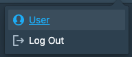
And outputs
 JokeNeverSoke
on 6 Jul 2020
JokeNeverSoke
on 6 Jul 2020
Better support for react router in AnchorButton would be welcome to avoid code hacks...
This use case wasn't addressed by #3061. The original issue mentioned there are other components that would need this as well:
Many components (such as Menu) can take an href prop.
Would love to know if anyone has a good solution for using Blueprint AnchorButtons (or even just Buttons) with react router Link elements.
 locofocos
on 15 Sep 2020
locofocos
on 15 Sep 2020
Better support for react router in AnchorButton would be welcome to avoid code hacks...
This use case wasn't addressed by #3061. The original issue mentioned there are other components that would need this as well:
Many components (such as Menu) can take an href prop.
Would love to know if anyone has a good solution for using Blueprint AnchorButtons (or even just Buttons) with react router Link elements.
Just use <Link to="/user"><span className="bp3-button" role="button">Click</span></Link>
This is why that was not fixed because there are CSS rules in place that are not locked to the A tag that allows you to do this perfectly fine. that is why there is HTML on the documentation shows how the AnchorButton and Button render https://blueprintjs.com/docs/#core/components/button
@JokeNeverSoke stop being so lazy and write your own CSS, it's literally a case of these libraries are there to assist you not do every last thing for you
<Link to="/user" className="MenuLink"><Menu.Item icon="user" text="User" tagName="span" /></Link>
inside your CSS
a.MenuLink{
    color:#FFF;
}
a.MenuLink:active, a.MenuLink:hover, a.MenuLink:visited{
    color:inherit;
}
Related issues
adidahiya
·
3Comments
 ernestofreyreg
·
3Comments
ernestofreyreg
·
3Comments
 vilav
·
3Comments
vilav
·
3Comments
 havesomeleeway
·
3Comments
havesomeleeway
·
3Comments
havesomeleeway
·
3Comments
havesomeleeway
·
3Comments
Most helpful comment
This needs a better solution. In semantic-ui they handle this sort of thing very elegantly by providing an as property on most classes that you can use to pass your own target component. I use this, for example, to render Lists of items using a ReactFlipMove like so:
I suggest providing the same sort of thing here. We would then be able to do
<MenuItem to={href} as={Link} />