Bleachbit: [Issue] The category description automatically scrolls down
Issue
If you start Bleachbit the first thing I see is Chromiums Info Page scrolled down.
It does not look good and I think it is not intended.
This is the case for all Categories which are to "long".
So it is the same case with Google Chrome on my system.
Example
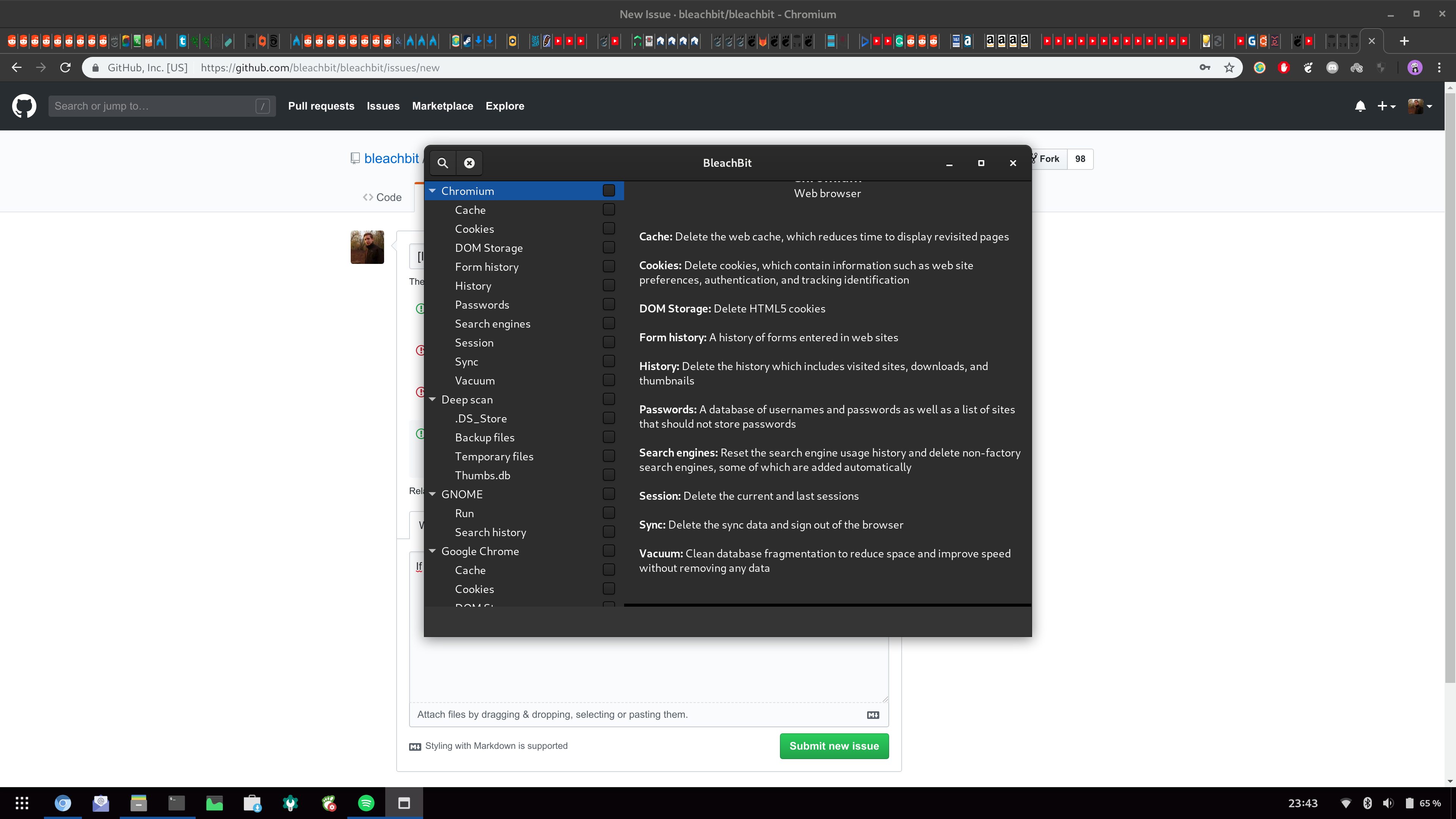
Ending
Thank you so much for adressing this issue in advance and keep up the great work!
 libalis
All 4 comments
OK, so you want it just to scroll to the top?
 az0
on 28 Apr 2019
az0
on 28 Apr 2019
I think it would look much more professional if it would not scroll at all.
It should just stay at the top so if the user wants to read more, he can just scroll down on his own.
This would also fix the weird broken animation bar at the bottom.
Sorry if that sounded too ruff, but I would really appreciate that change.
And thank you so much for even caring.
libalis
on 29 Apr 2019
Fixed.
az0
on 7 Jun 2019
You could test the fix in the newly-released BleachBit 2.3 beta
az0
on 10 Oct 2019
Related issues
 Tobias-B-Besemer
·
5Comments
Tobias-B-Besemer
·
5Comments
 TheJuli
·
4Comments
TheJuli
·
4Comments
 rfithen-yandex-com
·
6Comments
rfithen-yandex-com
·
6Comments
 PranavBhattarai
·
5Comments
PranavBhattarai
·
5Comments
 pdklein88
·
5Comments
pdklein88
·
5Comments