Bforartists: New expanded property UI style
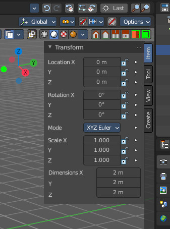
I'm not happy about how much space the labels steals here from the edit boxes. Just not sure how to fix this one here.
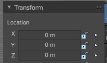
One solution would be to put the label at the top above instead in the first x row, then the x row x with just an X label , closely followed by the edit box. This would give us most space here i guess.
Mockup:
 ReinerBforartists
All 36 comments
I would prefer to use this for all content where you have an x y z component then.
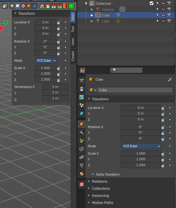
EDIT, the problem is, in the properties editor it looks okay the way it is. Ah, UI design -.-
What do you folks think here?
ReinerBforartists
on 29 Nov 2020
Indeed this issue was mentioned earlier, I like the mock up design, solves the issue and much neater
 iyadahmed
on 29 Nov 2020
iyadahmed
on 29 Nov 2020
I agree - much nicer layout. I'm less concerned about the vertical space
here but we would want to check that it doesn't have unintended
consequences elsewhere.
On Sun, Nov 29, 2020 at 8:23 AM Iyad Ahmed notifications@github.com wrote:
Indeed this issue was mentioned earlier, I like the mock up design, solves
the issue and much neater—
You are receiving this because you are subscribed to this thread.
Reply to this email directly, view it on GitHub
https://github.com/Bforartists/Bforartists/issues/2033#issuecomment-735393547,
or unsubscribe
https://github.com/notifications/unsubscribe-auth/AABQYINEDSHMQ76QX5DNECDSSJDMTANCNFSM4UGPWFCA
.
 seanr
on 29 Nov 2020
seanr
on 29 Nov 2020
Then let's use this layout from the mockup if possible.
ReinerBforartists
on 29 Nov 2020
Never liked the "Location X" then the other Y then Z... I would rather the label, then the XYZ and wide sliders per the mockup. It does add some vertical, but only 3 rows.
 Draise14
on 29 Nov 2020
Draise14
on 29 Nov 2020
So we all agree, yay \o/
ReinerBforartists
on 29 Nov 2020
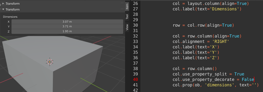
sample code for new design
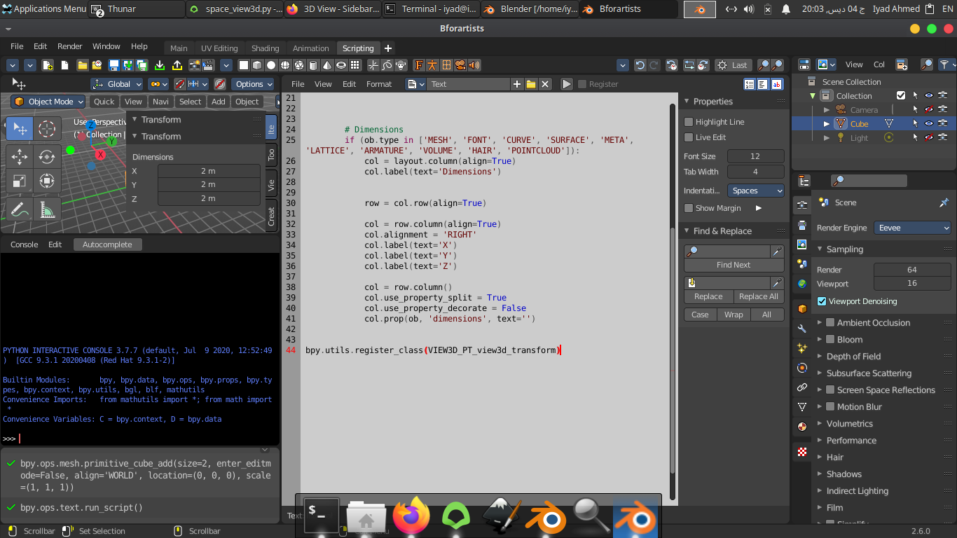
for some reason this looks different in Blender and Bforartists hmmm
iyadahmed
on 4 Dec 2020
What? :D
ReinerBforartists
on 4 Dec 2020
it looks like this, same code, hmmm
iyadahmed
on 4 Dec 2020
I always go the other way around. First column, then row. Maybe that's why.
col = layout.column(align = True)
row = col.row()
row.mycontent
row.myothercontent
And then you could even come much closer with row = col.row(align = True)
ReinerBforartists
on 4 Dec 2020
alright trying now
iyadahmed
on 4 Dec 2020
indeed while trying earlier, right and left alignment seemed to work only with row
iyadahmed
on 4 Dec 2020
So it works now in the way you want it? Great. Whatever works :)
ReinerBforartists
on 4 Dec 2020
unfortunately still not working, but trying to find a workaround
iyadahmed
on 4 Dec 2020
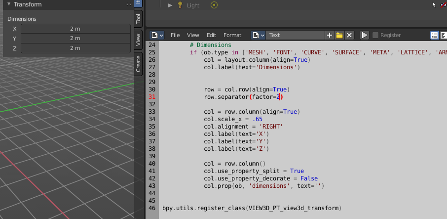
found a workaround
iyadahmed
on 4 Dec 2020
Hm. I personally find it too complicated for this purpose. I could live with the resizing gaps. But whatever works ^^
I still don' t understand why you want to align the content at the right at all. With a row layout the whole content usually fills the whole line.
ReinerBforartists
on 4 Dec 2020
I thought so too, but without align right it doesn't work
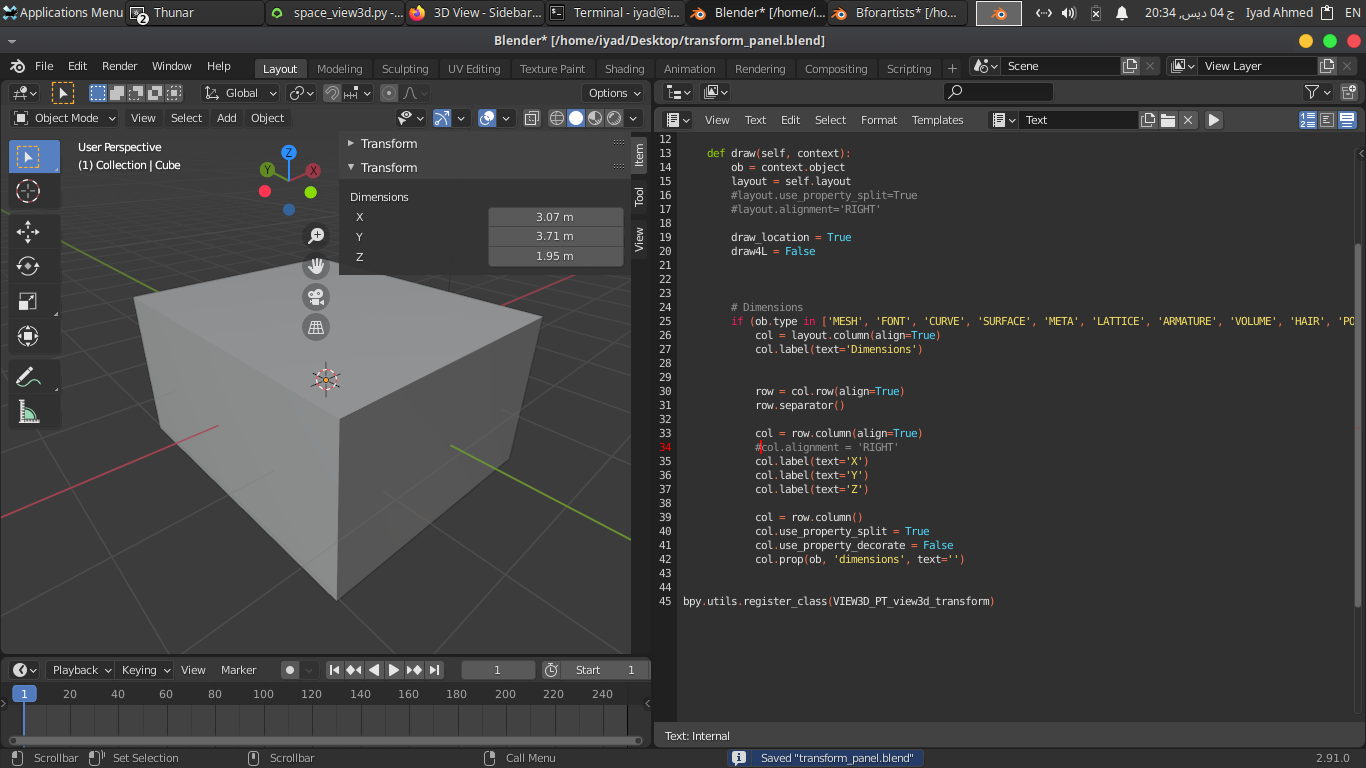
I tried multiple ways before arriving at this, maybe I missed something though, but this works great
iyadahmed
on 4 Dec 2020
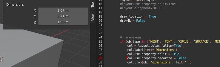
earlier I tried putting " " in prop text, achieves the new style, but doesn't align all the way to left
iyadahmed
on 4 Dec 2020
Ah now i understand. That's the use_property_split that is kidding you here. Use false, and the big gap should vanish :)
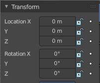
And you miss content here! Don't forget the locks and the decorators! But i guess you are simply not at this point yet :)
ReinerBforartists
on 4 Dec 2020
sure won't forget them, it is just that dimension can't be animated or locked :)
iyadahmed
on 4 Dec 2020
Ah, true ^^
ReinerBforartists
on 4 Dec 2020
Ah now i understand. That's the use_property_split that is kidding you here. Use false, and the big gap should vanish :)
oh right, will try, I suppose set it to false for other than the slider itself, because that would show text inside
iyadahmed
on 4 Dec 2020
That's where set text to "" comes in handy :)
ReinerBforartists
on 4 Dec 2020
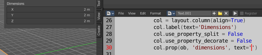
tried but unfortunately shows text inside
iyadahmed
on 4 Dec 2020
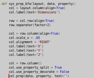
wrote a simple function since we would use this a lot, maybe a better way will be found
iyadahmed
on 4 Dec 2020
That's crazy, it shouldn't O_O
Blender is always good for bad surprises it seems.
ReinerBforartists
on 4 Dec 2020
indeed XD
iyadahmed
on 4 Dec 2020
Wouldn't it be easier to modify the c code then? This one becomes more complicated with every iteration ^^
ReinerBforartists
on 4 Dec 2020
I think so too, but maybe it is still an interesting idea to try
iyadahmed
on 4 Dec 2020
Yes, interesting is the right word :D
Point is, we have xyz dimension boxes in edit, pose and other modes too. And so i see double work here, which might complicate things instead of making it easier.
ReinerBforartists
on 4 Dec 2020
indeed, but the plan is to replace transform panel in all modes but edit and pose, will give a try, everything is going well so far.
iyadahmed
on 4 Dec 2020
indeed, but the plan is to replace transform panel in all modes but edit and pose,
Ah, I think for consistency, if a transform panel changes somewhere, it should change for all modes and instances of that panel. Just to clarify. ;)
Draise14
on 4 Dec 2020
Indeed we should modify C instead, my bad I was thinking about the other issue
iyadahmed
on 4 Dec 2020
One task at a time. This may make some extra work here and there, but is easier to develop, follow and maintain :)
When you try to cross all bridges at once then you might just fall off the bridge. That's at least my experience with it ^^
ReinerBforartists
on 5 Dec 2020
Looks like there is a pull request for this one, but has been sitting there waiting a bit. Is there anything that needs to be reviewed before being approved @ReinerBforartists ?
Draise14
on 7 Jan 2021
It's a draft. And drafts cannot be merged.
ReinerBforartists
on 7 Jan 2021
Related issues
Draise14
·
5Comments
iyadahmed
·
7Comments
 kungfooman
·
6Comments
ReinerBforartists
·
4Comments
ReinerBforartists
·
5Comments
kungfooman
·
6Comments
ReinerBforartists
·
4Comments
ReinerBforartists
·
5Comments
Most helpful comment
One task at a time. This may make some extra work here and there, but is easier to develop, follow and maintain :)
When you try to cross all bridges at once then you might just fall off the bridge. That's at least my experience with it ^^