Bforartists: Fix Modifiers UI design
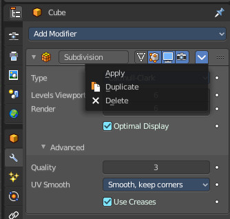
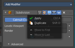
I have just one word here. Crazy. This is no UI design, this is the absence of UI design and any common sense. Apply is now in a sub menu to hide it from the user? Orly? -.-
And oh this crazy middle centered checkboxes. I really hope that i can catch these things. Because i fear that this is C code ...
 ReinerBforartists
All 15 comments
:'3
ReinerBforartists
on 14 Jun 2020
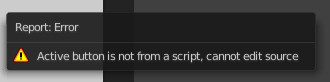
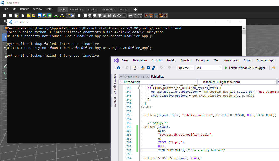
Menu is in source\blender\modifiers\intern\MOD_ui_common.c
ReinerBforartists
on 25 Jul 2020
:'3
On with manual ...
ReinerBforartists
on 25 Jul 2020
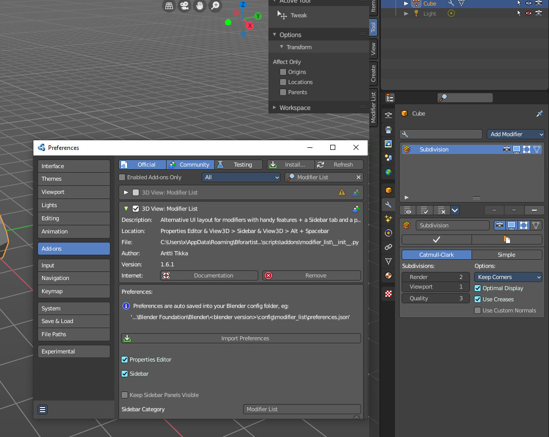
The modifiers list addon does some changes at the modifier UI. Worth a look.
ReinerBforartists
on 16 Nov 2020
hmm this is fixed in LTS?

 iyadahmed
on 22 Dec 2020
iyadahmed
on 22 Dec 2020
It is not fixed, it was never changed in the lts. This change came with Blender 2.90. . Blender 2.83 LTS is the long term version, which keeps the old way for compatibility reason. Blender 2.92 and Bforartists uses this style now.
ReinerBforartists
on 22 Dec 2020
What we should definitely do is to move the Apply button back to the row. It is very often needed. And i had today the misfortune that the hotkey applied the wrong modifier. Hotkey sucks here big time. Duplicate and move can remain in the sub menu. But apply should have a top level ui entry.
ReinerBforartists
on 22 Dec 2020
It is not fixed, it was never changed in the lts. This change came with Blender 2.90. . Blender 2.83 LTS is the long term version, which keeps the old way for compatibility reason. Blender 2.92 and Bforartists uses this style now.
was writing the comment,
What we should definitely do is to move the Apply button back to the row. It is very often needed. And i had today the misfortune that the hotkey applied the wrong modifier. Hotkey sucks here big time. Duplicate and move can remain in the sub menu. But apply should have a top level ui entry.
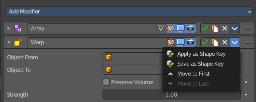
Indeed agree, I was thinking about moving the whole 4 buttons (only keeping move to first/last in the sub menu)
so the current most simple solution is to add these to the header (Apply, Apply as Shapekey, Save as Shapekey, Duplicate)
some are only showed for some nodes, like this (about to move the delete button to the end, maybe sub menu too)

I tried creating another row below the header, but it glitched out and got drawn under the modifier panel UI (each modifier is a panel, and that top bar is a panel header)
I looked at the modifier list addon, it actually replaces the whole UI, so we could rewrite the whole thing.
another solution would be to add the button at the top of the panel for each modifier manually,
there are some other hacky solutions but all failed
iyadahmed
on 22 Dec 2020
what do you think about this?
iyadahmed
on 22 Dec 2020
Duplicate is not really often used, it could imho remain in the menu. But besides that, great solution :)
ReinerBforartists
on 22 Dec 2020
Many thanks :)
I agree, I think we could keep it too, I could ask @Draise14 too
iyadahmed
on 22 Dec 2020
I think he will agree :)
ReinerBforartists
on 22 Dec 2020
I think he will agree :)
Yep just asked, agree on hiding duplicate :)
iyadahmed
on 22 Dec 2020
\o/
DO IT!
ReinerBforartists
on 22 Dec 2020
\o/
DO IT!
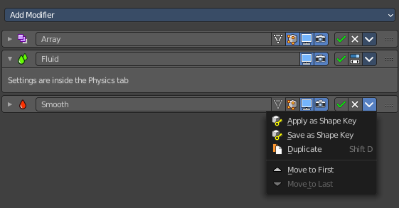
Done :)
did testing, also moved the switch context operator (for physics modifiers) to the new operators row, it even fits nicely as these modifiers don't have a delete button
pushing and pr soon
iyadahmed
on 22 Dec 2020
Related issues
iyadahmed
·
8Comments
 Draise14
·
6Comments
ReinerBforartists
·
6Comments
iyadahmed
·
6Comments
Draise14
·
6Comments
Draise14
·
6Comments
ReinerBforartists
·
6Comments
iyadahmed
·
6Comments
Draise14
·
6Comments