Axe-core: [nested-interactive] fails also for not interactive nested elements
Product: axe-core
Expectation:
To be able to use
<div role="button">
  pass
  <button role="presentation"></button>
</div>
PS: Any way of making the button "not interactive" would be ok for us...
PPS: We tried also added aria-hidden="true" and tabindex="-1" but all failed the test
Actual:
It fails with a violation of nested-interactive.
Motivation:
The div is in reality a custom element to replace an actual button.
However, as we can't extend a native button we need to wrap it.
To still be able to support integration with a native form around we put a "hidden" button in there which gets programmatically pressed when needed.
I added a failing test
https://github.com/dequelabs/axe-core/pull/2905
 daKmoR
All 12 comments
Thanks for the issue. So the issue with the example is that the button is not presentation even with role=presentation. This is because of the role conflict algorithm and that the button is natively focusable so will always be a button. There's actually no way to make a button not interactive (unless you put disabled on it, but that is still technically a button). This means a keyboard user will be able to tab to the inner button, and if the outer button is also focusable that causes two tab stops and will cause lots of confusion, especially for screen readers.
Axe-core has a rule for the role conflict which also throws a violation on the example.
 straker
on 30 Apr 2021
straker
on 30 Apr 2021
thank you for clarifying this 🤗
so it seems the 2 options we have are
1) have the inner button disabled and only enable it...
2) have no inner button and only create it temporarily...
...for the split second when we need to interact with the outer native form
what do you think is better? 🤔
daKmoR
on 30 Apr 2021
It may not be what you want to hear, but I would say option 3 or 4:
- Remove the inner button completely
- Don't make it a custom component
Now I can say this being naive on your reasonings as to why you are warping a button in a custom element. In an ideal scenario, you wouldn't need a custom element that is itself a button but would just have the custom element create the button with all the styling and things you need, and the custom element is more like a button creator.
If you must, the other non-ideal choice is that if the custom element has to be a button itself, then you don't use an inner button and recreate all keyboard and JavaScript event handling on the custom element wrapper that has the role=button. It's more work and prone to accessibility problems if not done correctly.
straker
on 30 Apr 2021
hmmm having the custom element not as a button but only as a wrapper and style container for the native button might actually work. By that, we can still add the more advanced behaviors to the web components - think like a ripple that needs javascript or a bigger click area than the visible button. Maybe the focus ring will get a little bit tricky but worth a try...
we have been thinking about this a lot already...
https://lion-web.netlify.app/components/interaction/button/features/#considerations
probably a little more thinking is needed => will need to check with my colleagues
thank you for your valuable feedback 🙇♂️
daKmoR
on 30 Apr 2021
Glad I could help. I'm going to close this issue and the associated pr. Let us know if you have any more questions.
straker
on 30 Apr 2021
Hey,
I have the same issue with tabindex='-1' and in my case, it makes input not focusable, so the only solution for me is to add hidden attribute to pass this check, but I don't think it should be necessary.
Code before upgrade (simplified):
<button id="list-option-7" role="option" aria-selected="true">
  <input type="checkbox" tabindex="-1" checked />
  <span>Seven</span>
</button>
Solution:
<button id="list-option-7" role="option" aria-selected="true">
  <input type="checkbox" tabindex="-1" style="display: block" hidden checked />
  <span>Seven</span>
</button>
Thanks
Update setting display to block not working, as it passes as focusable. Sorry for confusion
 exah
on 11 May 2021
exah
on 11 May 2021
I'm a bit confused on the purpose of the tabindex=-1 on the input. It may prevent keyboard focus, but it's still interactive and can be checked/unchecked by mouse / touch / screen reader users.
straker
on 11 May 2021
@straker Sorry for the confusion, maybe I simplified the code too much :)
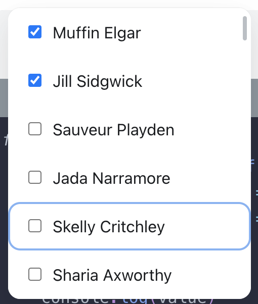
It's a custom component and clicking on the checkbox here makes option selected inside listbox, so it's fine to me that it's still can be interactive by mouse or with touch (option and checkbox states are synced). It is also used as a visual indicator of the option selected state.
This how is it looks:
exah
on 11 May 2021
Interesting. So now that I see what you're doing I think the input shouldn't be there in the fist place. My guess is that you're trying to create a multi-selection listbox similar to the example here https://www.w3.org/TR/2017/WD-wai-aria-practices-1.1-20170628/examples/listbox/listbox.html#ex2_label. Since the input has no accessible name and is not suppose to be focusable itself, then you're probably using it just for the look of a checkbox. So ya, you're going to have to go through a ton of hoops to get that to work without causing problems for screen reader users (by adding hidden) and keyboard users (preventing tab).
It would be better to remove the checkbox input and just add a checked style to the selected option.
[role=option][aria-selected=false]::before,
[role=option]::before {
  /* styles to make it looked unchecked */
}

[role=option][aria-selected=true]::before {
  /* styles to make it looked checked */
}
@straker Yes, you are probably right. Thank you!
exah
on 12 May 2021
@exah I'd very much recommend Steve's suggestion of styling the option, instead of using a "presentational" checkbox. This nested-interactive rule finds things that behave inconsistently. So in some screen readers you will get the element announced, and in others you won't. Putting tabindex="-1" isn't enough to have it be ignored everywhere consistently. Users can still focus elements with tabindex="-1" by tabbing it. Even screen reader users will do this when they touch the screen of their phone. You'd have to disable the input to prevent that, and then put role=none on it to avoid the screen readers that do handle nested interactive elements picking up the checkbox by mistake.
 WilcoFiers
on 12 May 2021
WilcoFiers
on 12 May 2021
Thank you @WilcoFiers, good points!
exah
on 12 May 2021
Related issues
 wKovacs64
·
3Comments
wKovacs64
·
3Comments
 stephenmathieson
·
3Comments
stephenmathieson
·
3Comments
 scribetw
·
4Comments
scribetw
·
4Comments
 NithinGCC
·
7Comments
NithinGCC
·
7Comments
 vytch
·
4Comments
vytch
·
4Comments