Checklist:
- [x] I've searched in the docs and FAQ for my answer: https://bit.ly/argocd-faq.
- [x] I've included steps to reproduce the bug.
- [x] I've pasted the output of
argocd version.
Describe the bug
The summary legend (especially Progressing) overflows the box containing the chart
To Reproduce
- Visit https://cd.apps.argoproj.io/applications?view=summary
- If necessary, zoom in/out to trigger the bug
Expected behavior
Text for a chart shouldn't flow outside the chart's box.
Screenshots
If applicable, add screenshots to help explain your problem.

Version
v1.7.0+10d05cd
Logs
 jsoref
All 5 comments
Hi @jsoref, @jessesuen , I can take this.
 keithchong
on 8 Oct 2020
keithchong
on 8 Oct 2020
This is also reproducible simply by resizing the browser and making its width as small or narrow as possible. This exposes another issue with the layout and the Sync legend overlaps with the Health pie chart.
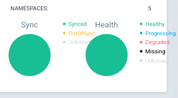
In this case, the pie charts should be in one column, and not two.
keithchong
on 9 Oct 2020
Here is a demo of the proposed new layout. Note that the Summary section on the left side does not take as much space.
Compare it with the current behaviour by going here:
keithchong
on 9 Oct 2020
Thanks for the thumbs up @jsoref. @alexmt, if you like this new layout, I will submit a PR for it.
keithchong
on 9 Oct 2020
Thank you for attaching the proposed layout video. It looks really good.
 alexmt
on 9 Oct 2020
alexmt
on 9 Oct 2020
Related issues
 gregdurham
·
27Comments
gregdurham
·
27Comments
 evrardjp
·
26Comments
evrardjp
·
26Comments
 balchua
·
19Comments
balchua
·
19Comments
 raffaelespazzoli
·
21Comments
raffaelespazzoli
·
21Comments
 phillebaba
·
23Comments
phillebaba
·
23Comments