Arctos: Can we get Loan dropdown box in Loan Search made larger?
Problem:
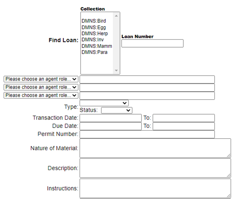
Go to Find Loan https://arctos.database.museum/Loan.cfm?Action=addItems
Go to Find Loan Collection dropdown
Notice it is very tiny and only allows 3 collections to be visible at one time.
The scroll bar is very limited in range and scrolls too quickly past multiple choices.
Solution:
Enlarge dropdown to allow more collections to be visible and to enlarge the scroll bar.
Use template for Create Loan as an example: https://arctos.database.museum/Loan.cfm?Action=newLoan
 campmlc
All 10 comments
very tiny
How big do you want it?
That's a different kind of object - search supports multiple collections, create is single.
 dustymc
on 10 Aug 2020
dustymc
on 10 Aug 2020
The same size as the box I see in Create Loan.
On Mon, Aug 10, 2020, 8:15 AM dustymc notifications@github.com wrote:
- [EXTERNAL]*
very tiny
How big do you want it?
That's a different kind of object - search supports multiple collections,
create is single.—
You are receiving this because you were assigned.
Reply to this email directly, view it on GitHub
https://github.com/ArctosDB/arctos/issues/3012#issuecomment-671381438,
or unsubscribe
https://github.com/notifications/unsubscribe-auth/ADQ7JBBIWE5JALUUYP7VSMTR776I3ANCNFSM4PXCRPRA
.
campmlc
on 10 Aug 2020
You asked for the multiple!
https://github.com/ArctosDB/arctos/issues/2518
??????????????????????????????????????
dustymc
on 10 Aug 2020
Is that a different form? Can't they all be the same size to allow viewing more than 3 collections at a time? No dropdown should be as small as what currently exists in Search Loan.
campmlc
on 11 Aug 2020
We need the same drop-down in both forms for operators who have create loan access and search loan access for multiple collections.
campmlc
on 20 Nov 2020
I think this needs added to an agenda or something; it sounds to me like you're asking for conflicting things, and I can't quite figure out where the miscommunication is.
dustymc
on 20 Nov 2020
This is really an extremely simple request. No underlying data changes,
just UI - not sure how I can explain it any better. Please see images I
enclosed on previous issue. I have access to multiple collections. When I
create a loan, I get a big scroll bar to see a lot of the collections I
have access to. When I try to find a loan, I get a tiny window and scroll
bar. I just need the pick collections window made bigger so I can use it on
my laptop!
On Fri, Nov 20, 2020 at 3:31 PM dustymc notifications@github.com wrote:
- [EXTERNAL]*
I think this needs added to an agenda or something; it sounds to me like
you're asking for conflicting things, and I can't quite figure out where
the miscommunication is.—
You are receiving this because you were assigned.
Reply to this email directly, view it on GitHub
https://github.com/ArctosDB/arctos/issues/3012#issuecomment-731440928,
or unsubscribe
https://github.com/notifications/unsubscribe-auth/ADQ7JBBT6O3QQ2NOJF3KKWLSQ3U47ANCNFSM4PXCRPRA
.
campmlc
on 21 Nov 2020
OK, maybe I get it.
I can do bigger, just let me know how big. It was "whatever your browser wants" I just set it to 10 (in test), which is huge on my screen but whatever.
I can't as easily make it the same as create, which is an entirely different sort of control that serves a different purpose (and your browser decides how big that one is).
dustymc
on 21 Nov 2020
It does look a little funny when you don't have lots of collections like Mariel, but seems like it should help with her problem.
 acdoll
on 21 Nov 2020
acdoll
on 21 Nov 2020
Thank you!! Much better!
campmlc
on 21 Nov 2020
Related issues
dustymc
·
6Comments
 mkoo
·
3Comments
dustymc
·
3Comments
dustymc
·
4Comments
mkoo
·
3Comments
dustymc
·
3Comments
dustymc
·
4Comments
 DerekSikes
·
3Comments
DerekSikes
·
3Comments