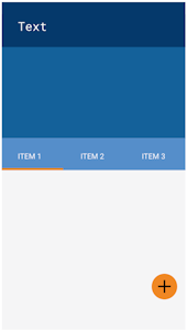
Apps-android-commons: Main screen UI overhaul
Neslihan has started on the UI overhaul at #712 . The main goals of the new UI are:
- to make the 'Upload from gallery' and 'Upload from camera' buttons more obvious (either through the design below or a floating action button)
- to have a separate tab for viewing other Commons images near the user, while the main tab allows them to view their own contributions
- to display notifications to the user when they are near a place that needs photos, or their images are nominated for deletion, or used in an article, etc
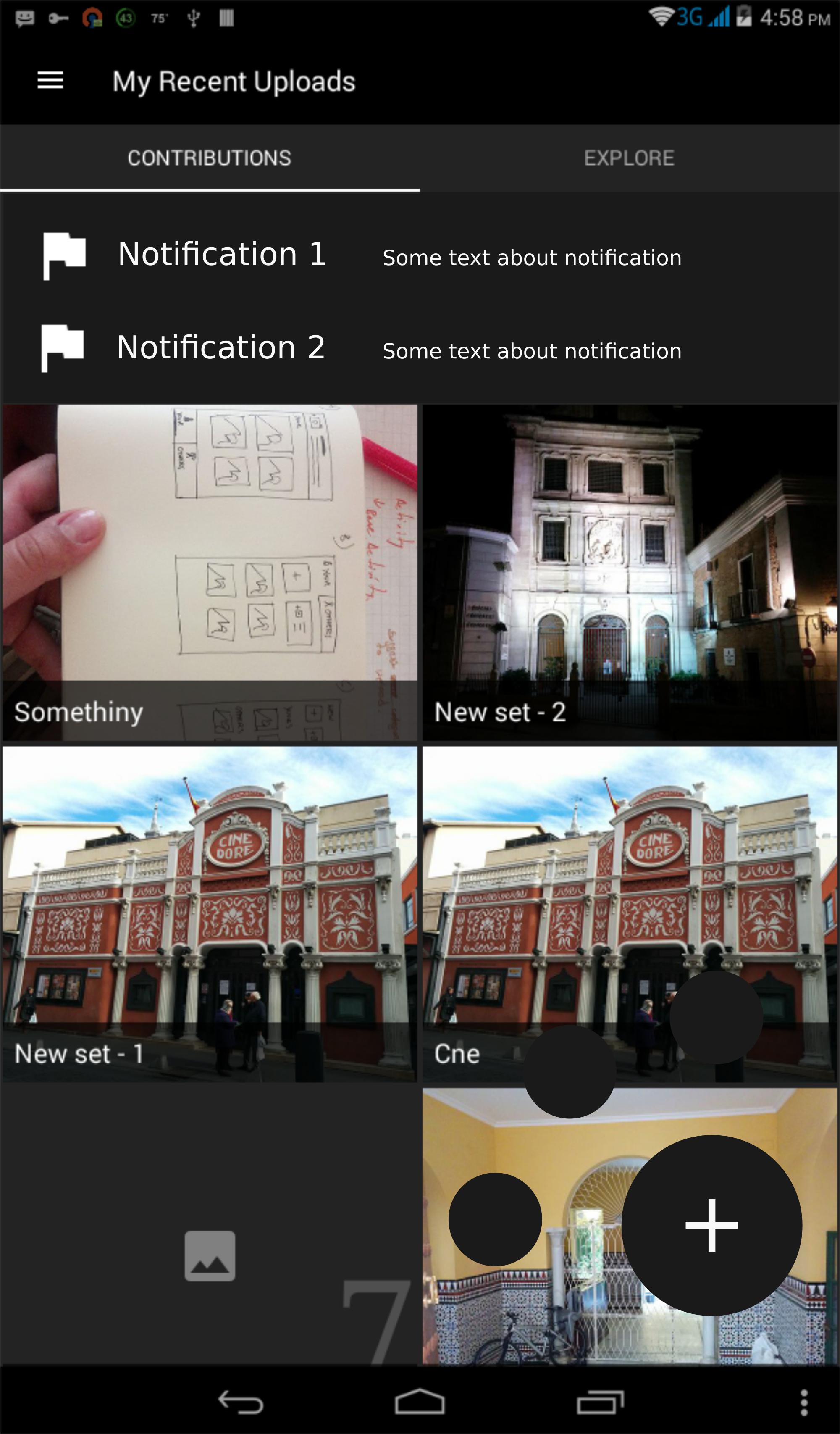
I am copying a screenshot of the main design below, but please refer to her PR for more details. Feedback on the proposed designs are most welcome.
Edit: Removed screenshots because they are outdated, refer to Neslihan's below.
Other questions for discussion:
Re: the tab for "Pictures that other people have uploaded near you":
- Should we store images in database?
- Should we store only image urls in database?
- Should we upload information by location changes? We can add a button to refresh, or we can update it per x km.
- How many photos from nearby places should be displayed initially?
 misaochan
All 64 comments
Also, to add:
When this UI has been implemented, I am guessing we will want to remove the camera and gallery buttons from the action bar. I wonder if it would be a good idea to put "camera" and "gallery" in the nav drawer in that case, probably right below "home"?
That might be redundant, but redundancy of our main feature might not be such a bad thing. :) Also, the nav drawer might get a bit crowded when we do that, so we might have to find a way to separate the 3 main items from the others. Some apps like gmail use a divider between groups of items, which might work for us.
misaochan
on 6 Jun 2017
I also think it is not a bad redundancy. I was a little busy for 2 days (and also tomorrow will be) that's why couldn't add any code to UI thing. My opinion about our questions are:
- Don't store images in db.
- Yes.
- No idea
- 20 photos.
 neslihanturan
on 6 Jun 2017
neslihanturan
on 6 Jun 2017
Don't worry about it. :) We can actually put the UI overhaul into our renewal proposal if needed, so no rush.
My opinions are
- No
- Yes
- Either way is fine with me for displaying the results, but if we are caching the image URLs they need to be associated with a location, otherwise I'm not sure what the point of the cache would be
- I think we could set a default (maybe 50-100?) and let the user choose in Settings
misaochan
on 7 Jun 2017
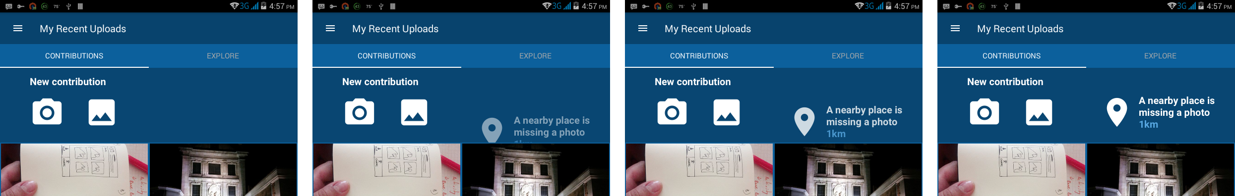
It was suggested to me by Jordan Adler that we use a floating action button for 'Upload' instead. That would solve the issue of users scrolling past the top square and then not being able to easily access upload. But we would need to redesign the top 2 cells in that case.
What do you guys think?
misaochan
on 21 Jun 2017
Also, is it a bad thing to have TWO floating action buttons (gallery and camera)?
misaochan
on 21 Jun 2017
And, how do we make this design work in a landscape orientation?
Also, worth noting that if the renewal is approved, we will be providing two types of notifications - nearby place that needs a picture, as well as account notifications (your photo was deleted etc). Do we want both of them in the same box?
misaochan
on 21 Jun 2017
So such design is easier to implement maybe?
neslihanturan
on 21 Jun 2017
That looks good to me! :) would anyone like to chime in on whether they think the latest mockup is better than the one in the opening post?
Re: the floating action button, the current design is meant to only show the small buttons (upload and gallery) when the + button is tapped, right? I can't decide if that is preferable to having 2 buttons that are visible all the time. The design above looks very elegant IMO but I'm not sure if users will be happy if they have to do one extra tap whenever they want to upload?
misaochan
on 21 Jun 2017
I think extra tab on floating button is even better because it prevents from activity being changed by accidental clicks. Plus I also liked this design.
Plus, on other tab, we can use a floating button to select location from map and explore that location.
neslihanturan
on 21 Jun 2017
Also, uh, a wild idea - what do you guys think if we use Nearby as the second tab instead, and have "contributions from other people near you" in the nav drawer where nearby used to be (possibly titled as "Browse")? We could keep this design (don't worry neslihan!), just swap things around. If we do this, then Nearby would need a FAB for swapping between list and map, and swipe down for refresh.
(I am proposing this because Nearby appears to be our most popular feature)
misaochan
on 21 Jun 2017
Good point re: the accidental clicks, I agree with the single button in that case.
Additional note: I think it might also be a good idea to have the 1st tab say "My contributions" and the action bar say... I dunno, "Wikimedia Commons"? Instead of "My recent uploads", which wouldn't make sense when we're in the second tab.
We also need to think about where we want to display the number of uploads in this UI.
misaochan
on 21 Jun 2017
No... I am not crying. Just there's something in my eye... What can I say, nearby as second tab is better:)
neslihanturan
on 21 Jun 2017
This mockup looks great!
The plus button could reveal several options (camera or gallery) like it is in Google's Calendar app.
My vote too for putting Nearby in the second tab ;-)
 nicolas-raoul
on 22 Jun 2017
nicolas-raoul
on 22 Jun 2017
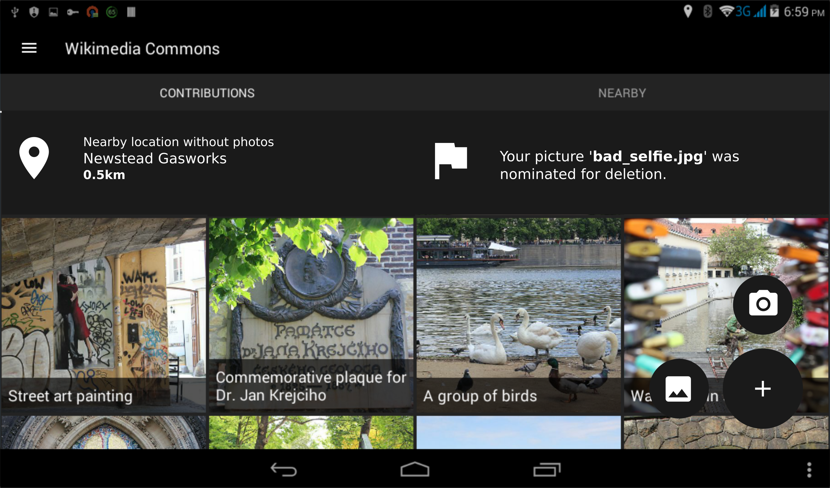
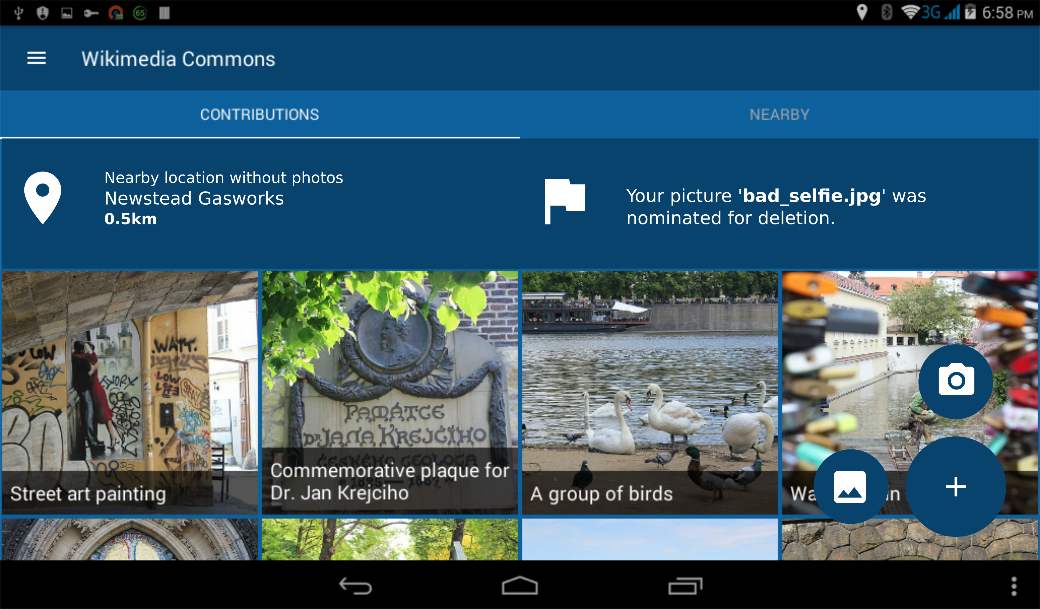
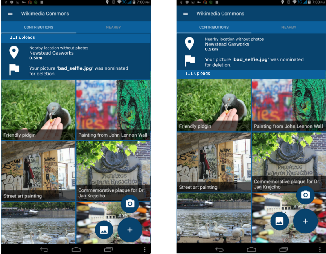
@neslihanturan I would like to include your mockup in the renewal proposal. :) A few requested changes:
- Could we have a gallery and camera icon for the second-tier FABs? I think we only need 2 second-tier buttons, not 3, at the moment
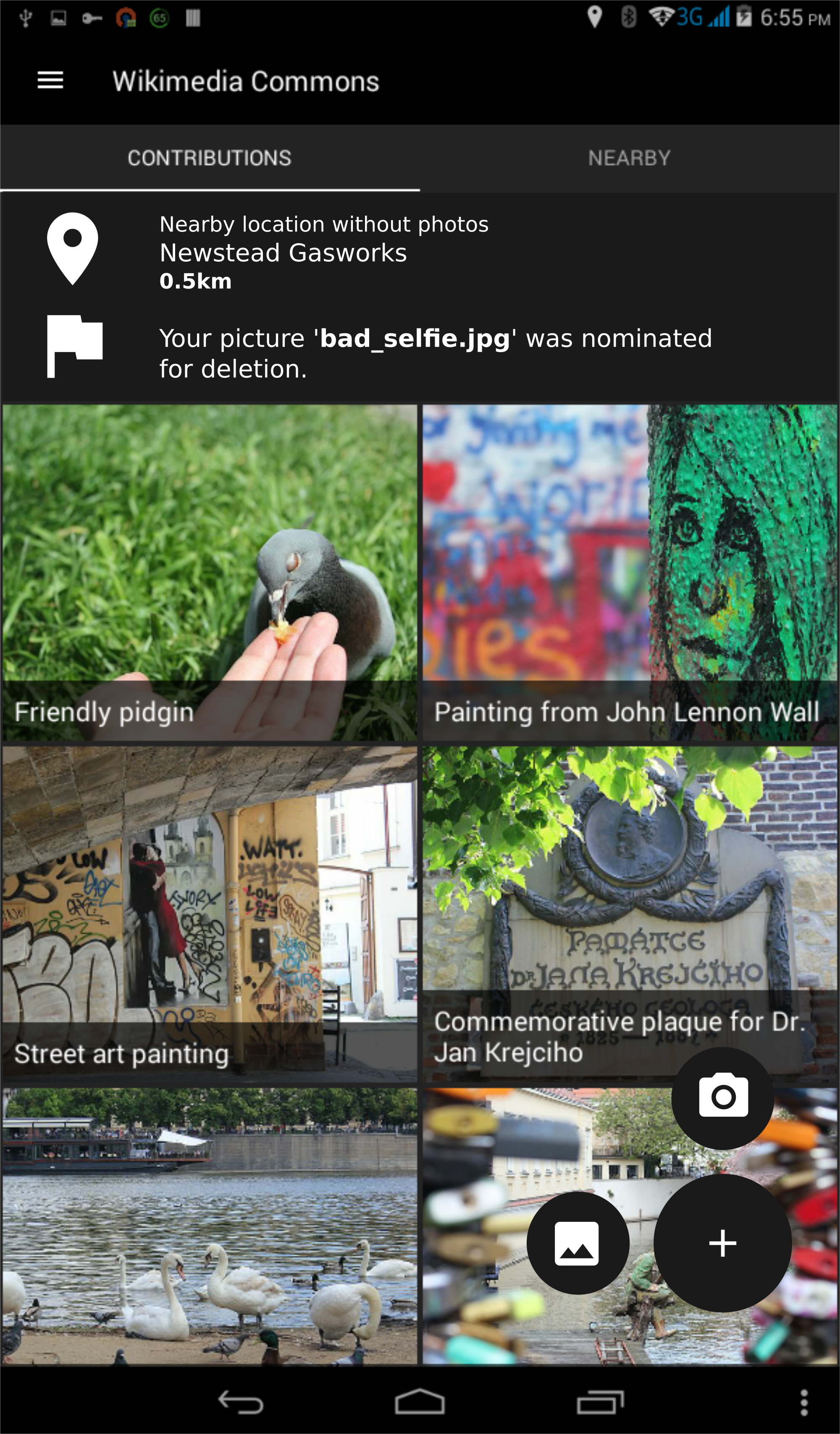
- Could we change the notification text to something more meaningful - e.g. "Nearby location without photos - Newstead Gasworks 0.5km" (or you can put whatever name you want), and "Your picture 'bad_selfie.jpg' was nominated for deletion"
- Could we have "Explore" renamed to "Nearby"
- Change text in action bar to "Wikimedia Commons" (I'm not sure about this, but "My Recent Uploads" definitely wouldn't be appropriate with this new design
Additionally, a mockup for landscape view + day theme colors would be wonderful. :) I'm not sure how to get around the issue of different-height cells in landscape though, so if this can't be done in time for the proposal then no worries.
Thanks!!
misaochan
on 22 Jun 2017
According to the e-mail I just get from @pauginer , we can add an animation when the notification comes up instead of a persistent notification. He sent some mock-ups about our previous design idea (because we just changed our decision) but I think we should implement the same to our new design idea too. Here:
neslihanturan
on 23 Jun 2017
@neslihanturan Would this still work if we wanted to display 2 notifications simultaneously (1 for Nearby and 1 for account)? There will always be a Nearby notification (unless we want to set the radius for notifications really low), so IMO it might work best to always have space for 2 notifications.
misaochan
on 23 Jun 2017
@misaochan here are fixes you noted :)
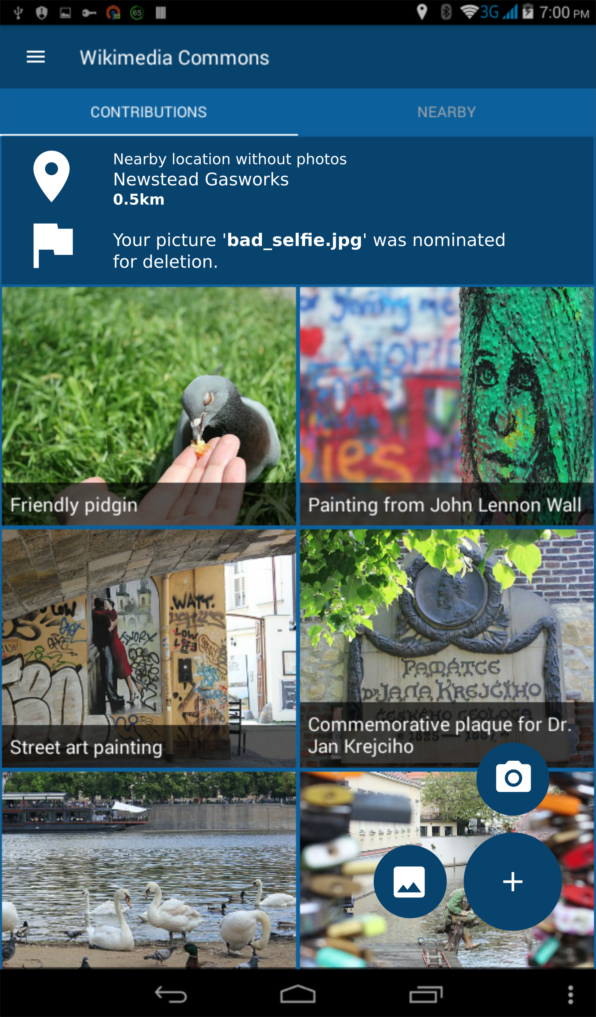
neslihanturan
on 24 Jun 2017
Wonderful, thanks @neslihanturan ! I'll put them in the renewal proposal when I write it next week. :)
misaochan
on 25 Jun 2017
Might be good to have text next to the upload buttons saving "Camera" and "From gallery" - although it might be clear enough already.

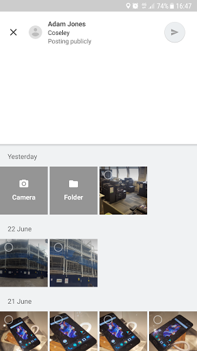
Alternatively, we could handle it a bit like Google Maps does, where when you add a photo by default it shows your gallery and then has a take a picture option from there:
 domdomegg
on 25 Jun 2017
domdomegg
on 25 Jun 2017
@domdomegg we can extend the buttons to up side and add texts of course.
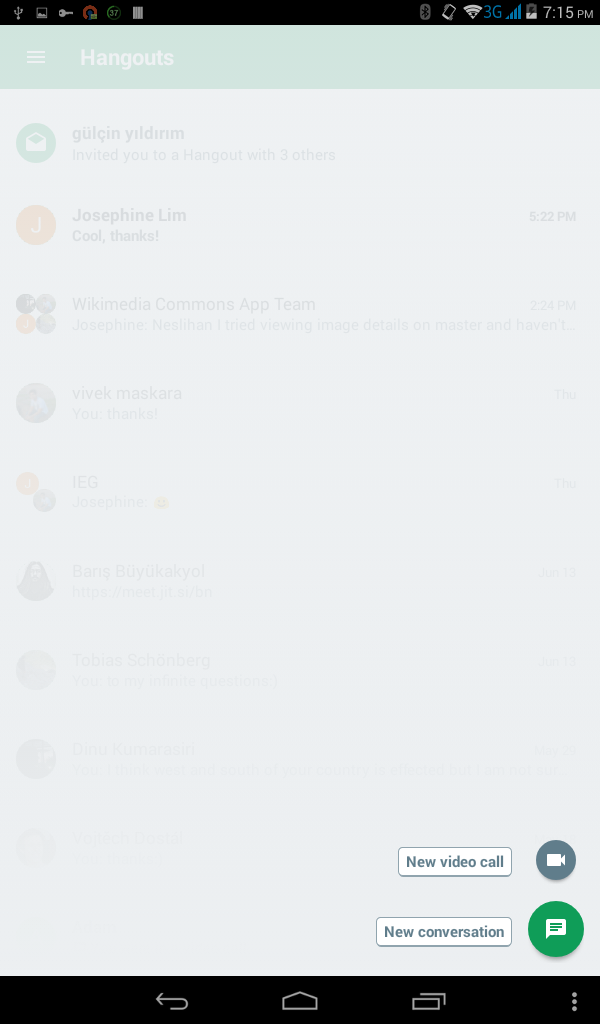
However, I personally don't like when the button with "+" is transformed to another action button on click. For example the button is transformed to "edit" action on your example or "new conversation" on Hangout application.
On accidental clicks, or clicks to discover what does "plus button" do (clicks doesn't aim to operate the actions), after new buttons get appeared, users reflex is click to the plus button again to get rid of them. In this case, when the plus button is not a plus button any more, it redirects you to another operation which is disturbing. By the way, it is only my user experience.
So, I am good with adding texts but I insist for plus button stay as is (maybe just set "minus" instead of plus). Because when new buttons get appeared, it feels me like drop down menu arrow click operation, so it should behave like that too.
neslihanturan
on 25 Jun 2017
I agree that the button shouldn't "transform".
I'm good with either with or without text, though personally I think the icons are clear enough currently. If we ever need to add more 2nd tier buttons that might be less clear, then perhaps texts could be considered at that stage.
misaochan
on 26 Jun 2017
I don't know if input to the design is too late but here is my two cents.
IMO the design is way too complicated. We have a Floating Action Button, a Hamburger menu, AND tabs. This seems like overkill to me. I kind of feel overwhelmed by the proposed design, and as I am someone that has used the app quite a bit, I can't imagine how a new user would feel. My opinion on the hamburger icon has been voiced in #428, and I still believe it is not the best design choice for the app.
Instead of being one to criticise without giving an alternative solution, here would be my take on the design:
Have a bottom navigation with items: home, upload, and nearby. These functions are very easily accessible, being always in sight. Things like Settings, About, Tutorial, Feedback, and Logout can go in the toolbar. They are still easily accessible from every screen but are out of site which is OK as they aren't used that much. All this greatly simplifies the app and makes the UX (and the UI) better due to ease of navigation. Ultimately this reduces it from 3 navigation components (FAB, Hamburger, and tabs) to just 1, the bottom bar.
If you'd like a mockup of this, please say such that I can make one. Or if you just want some clarifications on my thoughts please say.
Thoughts?
 veyndan
on 3 Jul 2017
veyndan
on 3 Jul 2017
First of all I think Josephine plans to add the mock-ups to the report so it would be better if we can choose a design quickly. So I encourage everyone to help this discussion whenever they have time.
As an old fashion user that uses apps very rare, I always prefer to have accessibility to everything from a menu such as hamburger menu. Plus, I think bottom navigation feels like tabs on the bottom, so they should behave like tabs. However, uploading is an "action" (not a place where you want to navigate to, so I think it suppose to be a button), we don't have anything to display when user has selected the upload item. If we only add nearby and home items, then according to documentation we should use tabs instead (because they are only 2). Do you have any other idea to facilitate upload?
On the other hand as far as I remembered, navigation bar is requested (I remember your didn't agree by the way :) ), and applied by @maskaravivek . Then you ( @veyndan ) made it even prettier. I think we should be careful about chancing it, because you already gave your efforts. This kinds of changes of decisions (after implementation) might make team lose motivation.
However, I don't have knowledge of UI and UX and I trust your critics. So, please draw some mock-ups. It is never late to change decision :).
neslihanturan
on 3 Jul 2017
Bottom navigation has become a standardised concept in Android, and shouldn't behave like tabs as per the spec. Many popular apps use this type of navigation now e.g. YouTube, Instagram, Google+ so the user should now how they work and shouldn't except them to act like tabs. Personally I don't think that uploading should be a button even though it is an action. See the Instagram UI for an example of this where you upload an image by clicking on an item in the bottom bar. Having it at the bottom and centred makes it the main focus of the app as well. Therefore there will still be 3 items.
I feel that choosing either yours or my design would require a large rehaul in the UI, but it is important that we choose the correct design (whichever one that is) as rehauls of the UI will only happen rarely.
To be honest I don't know how much time I'll have over the next while to implement the mockup then the design. If everyone's happy with the current design, just go with that. I thought it'd be good to just voice my opinions to get some more input about the design. Maybe if we decide to change the design again in the future I can be a bit more active in the discussion and development.
veyndan
on 3 Jul 2017
I just discovered how Instagram is implemented the upload button. I still think it feels a little weird, but probably most of users will know how it works. And I have two more questions,
- How user will navigate from let's say settings activity to the main screen again?
- Can't we protect the hamburger menu and change the tabs to bottom navigation? So we would prevent from @maskaravivek 's and your work become wasted energy.
neslihanturan
on 3 Jul 2017
The settings activity will just load an activity over whatever screen you are on. When you press the back button on the toolbar, it should just take you back again.
I don't know what @maskaravivek thinks, but personally I don't mind if we scrap whatever work I did on it to remove the hamburger icon.
veyndan
on 3 Jul 2017
Thanks for your thoughts @veyndan , it's always good to get feedback. :)
I personally strongly feel that the hamburger/navigation menu is a huge improvement to the toolbar (and have received similar feedback from a few users). Most Android users that I personally know (even non-technical folks) are familiar and comfortable with using these, and I feel it is much more convenient, intuitive, and elegant-looking than navigating via the toolbar.
I'm on the fence re: bottom navigation vs FAB + tabs. I think the FAB makes the upload action stand out more to the user, but on the other hand it is true that bottom navigation does simplify things.
If @neslihanturan is okay with it, I'm good with having a mock-up of the alternative design posted up for discussion. I would still strongly lean towards keeping the hamburger/navigation menu, but with a mock-up we could look at FAB + tabs vs bottom navigation and decide on the pros and cons. But as she said, it does have to be done fairly quickly, because I intend to have the mockup in the renewal proposal. (An interesting idea could be to have both mock-ups presented in the proposal and let the endorsers vote on the one they prefer, but that still needs the new mockup to be done within the next week or two).
Edit: Also, a few questions re: bottom navigation,
(1) how do we intend to allow for camera vs gallery uploads?
(2) will the bottom navigation persist in the Nearby activity? It seems somewhat superfluous to have "Upload" there, since we intend on implementing uploads from individual nearby items
(3) we intend to use a FAB in Nearby to allow users to switch between the list and map. How will this work with bottom navigation?
misaochan
on 4 Jul 2017
Both the bottom navigation and hamburger menu options look good to me. I haven't followed the whole UI overall discussion but am okay with my code getting scrapped if we end up building something more convenient for our users. :)
Maybe the mockups would help in taking a decision.
 maskaravivek
on 4 Jul 2017
maskaravivek
on 4 Jul 2017
@neslihanturan Are you okay with your latest mockups being published under the CC0 license? (I will upload them to Commons, stating that you released them with permission, and link to them in my renewal proposal)
misaochan
on 7 Jul 2017
Sure
neslihanturan
on 7 Jul 2017
Bottom Nav _vs_ Tabs
The material design spec says there should be 3-5 options if you're going to use bottom navigation. If there are only 2 (contributions and nearby) then we should opt for tabs.
That said, I think it would be easy to come up with a 3rd bottom nav item though - we could collect the notifications and other status messages into an "inbox" -
- upload succeeded - give a link to the wiki content
- upload failed - give the reason
- items nominated for deletion
- nearby locations without photos
- (etc)
Any time I miss a toast message I would have somewhere to go back to. Another benefit of the "inbox" is that it gives a place to deliver timed messages instead of popups (eg asking for feedback on renewal proposal, #791) in a way that users can go back to view them later.
ListView to RecyclerView conversion
The real big-ticket conversion on issue #743 impacts the same code as this new UI. I think the best option would be to create the new UI from scratch using a RecyclerView rather than converting the existing screen and then rewriting for the new UI.
FAB Behavior
Adding the FAB will move the collection of photos 1 click further away from users - 1 tap to open the FAB then a second to select camera or upload.
Has anyone considered having one of the options live on the toolbar and the other take the FAB (with a settings option to pick between upload being the FAB / camera on toolbar _vs_ camera on the FAB and upload on the toolbar). That puts the user's preferred option only a single tap away and keeps the FAB simple.
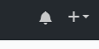
If the FAB is going to act as a menu, I think the FAB should show a "+" initially. On tap it should animate open (showing camera + upload options) and rotate into a "x". Tapping again will cause it to rotate back to a "+" and close the menu.
 psh
on 26 Jul 2017
psh
on 26 Jul 2017
Thanks for the feedback, @psh . :)
The material design spec says there should be 3-5 options if you're going to use bottom navigation. If there are only 2 (contributions and nearby) then we should opt for tabs.
Yeah, this is why I am leaning towards tabs. Having more than 2 items feels rather "busy" to me, like we're overwhelming the user with stuff. The intent of having Contributions and Nearby as the 2 tabs is so that the user can focus on those 2 main things (along with the FAB upload button). Then everything else can go into the nav drawer.
I do like the suggestion of an "inbox" though. I think we might use that for our account notifications. However I was thinking that since the newest notification will always be displayed in the top panel of the main screen, the Inbox can go into the nav drawer. However, if we did need to pick an extra nav item, I would agree with "inbox" being it.
Adding the FAB will move the collection of photos 1 click further away from users - 1 tap to open the FAB then a second to select camera or upload.
Yeah, this was my initial concern as well. However, @neslihanturan did bring up a very good point that having the FAB go directly to upload might make accidental clicks frustrating to the user. I'm still very much on the fence about this though, so would be good to hear more opinions on it if possible. :)
If the FAB is going to act as a menu, I think the FAB should show a "+" initially. On tap it should animate open (showing camera + upload options) and rotate into a "x". Tapping again will cause it to rotate back to a "+" and close the menu.
I agree, this would be good.
misaochan
on 27 Jul 2017
That's surprising you show notifications within the app! I thought the Android's Notifications was the right place for that.
 sivaraam
on 3 Sep 2017
sivaraam
on 3 Sep 2017
Hi @sivaraam ,
Thanks for the feedback. Indeed, I think "notifications" might have been the wrong word to use (but I can't think of a better one). The Android notifications that you mention would be a separate enhancement for a few reasons: (1) the need for a webservice to push the notifications, which might be tricky to implement within the IEG timeframe, and (2) users might not want to receive push notifications for these things, but would still like to see them whenever they open the app. Basically, it fulfills a different function.
When we do implement push notifications, it would most likely be opt-in (or opt-out) and only trigger when the user takes a picture, e.g. #259
misaochan
on 3 Sep 2017
Thanks for the feedback. Indeed, I think "notifications" might have been the wrong word to use (but I can't think of a better one).
You could use Alerts if you like that.
The Android notifications that you mention would be a separate enhancement for a few reasons: (1) the need for a webservice to push the notifications, which might be tricky to implement within the IEG timeframe,
I'm not sure I get you. I have no idea why you need a webservice for this. Currently, you do get the information to notify the user in some way. You could just use Android's NotificationManager to send a notification using that information. You could find a simple example here
(2) users might not want to receive push notifications for these things, but would still like to see them whenever they open the app. Basically, it fulfills a different function.
I don't think users would hate notifications. Android is known for it's notifications (good or bad depends on how we use it). Actually the Wikipedia android app uses notifications to notify the user about a reverted edit (sounds similar to "proposed deletion", doesn't it?). So I thought you could do something similar.
When we do implement push notifications, it would most likely be opt-in (or opt-out) and only trigger when the user takes a picture, e.g. #259
Just to be sure, what do you mean by push notifications? Are you referring to the notifications shown in the notification drawer?
sivaraam
on 3 Sep 2017
To add to my previous comment, I don't think the users would consider the notifications about "proposed deletion" as disturbing by any chance. It's something they might care about. Though, they may consider the notifications about pictures to be annoying if they are shown frequently. I suspect that would never happen. In case you doubt it you may give the user an option to turn off such notifications. Material design has a great guideline for notifications, check it out.
In any case, if you don't like issuing system notifications. You could have a notification icon on the top bar of the app. Tapping on it could present the list of notifications. (Remembering the previous notifications or not is a separate question). The icon could be something like the notification icon of GitHub.
No notifications
Notifications
I guess the user would love this even more as it doesn't disturb him until he wants to see it.
sivaraam
on 3 Sep 2017
Possibly getting off-topic, but Google Maps sends notifications in a very similar vein to ours e.g. POI nearby missing photo, photo was deleted etc. Here's the screenshot from the notification settings page, where each type of notification can be turned on/off individually (there's also a main general toggle to turn all notifications off)
domdomegg
on 3 Sep 2017
Is there a (concept) design document for notifications that should be implemented? A list of some possible examples? That would make this discussion here much easier, because it would define if these are actual notifications one should notified about vs. info bits that are shown sometimes.
 janpio
on 4 Sep 2017
janpio
on 4 Sep 2017
I'm not sure I get you. I have no idea why you need a webservice for this. Currently, you do get the information to notify the user in some way. You could just use Android's NotificationManager to send a notification using that information. You could find a simple example here
If the app isn't currently running, wouldn't you need a service to run the API calls (to find the nearest Place that needs photos) and generate the notifications that the user receives? And similarly for user talk messages? Please feel free to chime in at #79 - we are discussing how to achieve push notifications there. :)
Just to be sure, what do you mean by push notifications? Are you referring to the notifications shown in the notification drawer?
Yes, notifications shown in the notification drawer that can pop up even if the app isn't open.
In any case, if you don't like issuing system notifications. You could have a notification icon on the top bar of the app. Tapping on it could present the list of notifications. (Remembering the previous notifications or not is a separate question). The icon could be something like the notification icon of GitHub.
I think this might be a good idea! I was actually thinking about how to separate the in-app "notifications" for user talk/deletion messages, and "notifications" for the nearest Nearby location - it does feel a bit cluttered for both types to be in the same panel. With this suggestion, I think we could group all of the user talk notifications via the "notification icon" on the action bar, and on the main screen only display the "nearest location without photos". I would still like to keep the latter, because I think it would be very useful if the user opened up the app to upload something and saw that, hey, there's a place that needs photos 100m away, maybe I should go there and take one.
What do the others think? @neslihanturan @nicolas-raoul ?
misaochan
on 4 Sep 2017
Possibly getting off-topic, but Google Maps sends notifications in a very similar vein to ours e.g. POI nearby missing photo, photo was deleted etc. Here's the screenshot from the notification settings page, where each type of notification can be turned on/off individually (there's also a main general toggle to turn all notifications off)
It's not really off-topic, but there is a conversation about opt-in vs opt-out here - #259 :)
Is there a (concept) design document for notifications that should be implemented? A list of some possible examples? That would make this discussion here much easier, because it would define if these are actual notifications one should notified about vs. info bits that are shown sometimes.
I was planning to draft a basic one after IEG approval (because then we would certainly need it prior to implementation), but currently we don't have one.
misaochan
on 4 Sep 2017
Discussing how it looks like (and also how it has to be technically implemented, see https://github.com/commons-app/apps-android-commons/issues/79#issuecomment-326913078) doesn't really make much sense before we don't know what exact problem it should solve and what exact things it would communicate to the user.
Start with the list of things, then you can progress to UI and tech details.
janpio
on 4 Sep 2017
Personally I would not mind all notifications (wiki messages, deletions, nearby, etc) to all use the Android notifications system (assuming nearby is off by default).
nicolas-raoul
on 4 Sep 2017
Discussing how it looks like (and also how it has to be technically implemented, see #79 (comment)) doesn't really make much sense before we don't know what exact problem it should solve and what exact things it would communicate to the user.
Start with the list of things, then you can progress to UI and tech details.
I agree with this in principle, but it is very difficult to do things in such a linear manner with an app that is largely volunteer-based and has no permanent funding. In order to get funding (via grants), we usually need to apply WAY ahead of time and set a schedule (which is where technical feasibility comes in) and show the community mock-ups (which is where "how things look" comes in). Ideally we would be able to do a formal concept design document before even starting with that, but we need the funding before we know what we can or can't do, which is a bit of a chicken-and-egg scenario. Also, things change a lot based on committee/community input, most of which only comes in later on, so if we start off with a formal document, by the time we actually get around to implementation much of it would be obsolete.
For a general idea of what problem we intend to solve with the UI overhaul, would this help? (Copy and pasted from the IEG renewal proposal):
We plan on overhauling the main user interface of the app (#725). Based on user feedback, some concerns regarding the current main screen include:
The upload button (the main focus of the app) is not in a sufficiently obvious and easy-to-reach location
The entirety of the main screen is used for the sole purpose of viewing past contributions (that the user might not be that interested in viewing)
The "Nearby places that need pictures" feature should be more obvious and easy to reach, in consideration of its usefulness and popularity
There is not much interactivity in the app - the user feels like they are operating in a vacuum without much feedback or dynamic interaction
The current UI is not very aesthetically-pleasing - while some changes have been made to conform to Material design, it still retains some of its 'legacy' appearance
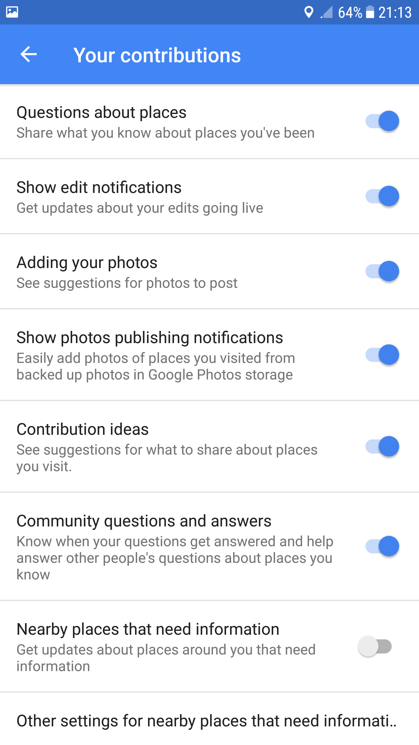
The UI overhaul aims to address these concerns by introducing a completely new look and feel to the main screen of the app. The upload button will now be a floating action button, "Nearby places that need pictures" will be placed in a tab alongside the user's contributions, and there will be a panel to display Commons account notifications and notifications of the place closest to the user that needs pictures.
misaochan
on 4 Sep 2017
@misaochan I wasn't replying to your message in specific (and your note about the list) but to the general discussion about implementation details of notifications (both UI and technical) while nobody even knows what notifications there should/could/may/will be.
janpio
on 4 Sep 2017
Possibly worth clarifying - there isn't actually a need to pick only ONE type of notification. I personally feel that the in-app "notifications" and push notifications (Android system) both serve very different purposes and each have their own uses. IMO push notifications would be most useful for actions and situations where the user isn't in the app but need to be notified at that moment that an action could be taken by them (e.g. when they are close to a location that needs photos). Whereas in-app "notifications" are things that we would like the user to know when they load up the app.
More details on proposed push notifications here: #865
misaochan
on 5 Sep 2017
If the app isn't currently running, wouldn't you need a service to run the API calls (to find the nearest Place that needs photos) and generate the notifications that the user receives? And similarly for user talk messages? Please feel free to chime in at #79 - we are discussing how to achieve push notifications there. :)
You would need a service for that! But that wouldn't stop you from issuing notifications only when the user opens the app. As an example the alpha version of the wikipedia app sends a notification when a newer version is available. That's because it's not in play store, yet.
I would go with @nicolas-raoul with the notifications. It wouldn't be as disturbing as it might seem. Just see the notifications sent by the apps out there in the wild!
I think this might be a good idea! I was actually thinking about how to separate the in-app "notifications" for user talk/deletion messages, and "notifications" for the nearest Nearby location - it does feel a bit cluttered for both types to be in the same panel. With this suggestion, I think we could group all of the user talk notifications via the "notification icon" on the action bar, and on the main screen only display the "nearest location without photos". I would still like to keep the latter, because I think it would be very useful if the user opened up the app to upload something and saw that, hey, there's a place that needs photos 100m away, maybe I should go there and take one.
You could use different colours (contrasting ones probably) to distinguish the different notifications. Brighter ones for the "Nearby locations requiring image" notification. In any case, keep notifications from taking up user's display even when the user is using the app. It would be something that anyone would expect.
In case you like to distinguish the notifications in the notifications view (the one that shows all the notifications) also, you could use a two tabbed view.
sivaraam
on 5 Sep 2017
I had some fun looking at _color_ based on the shade of blue we use in the app -

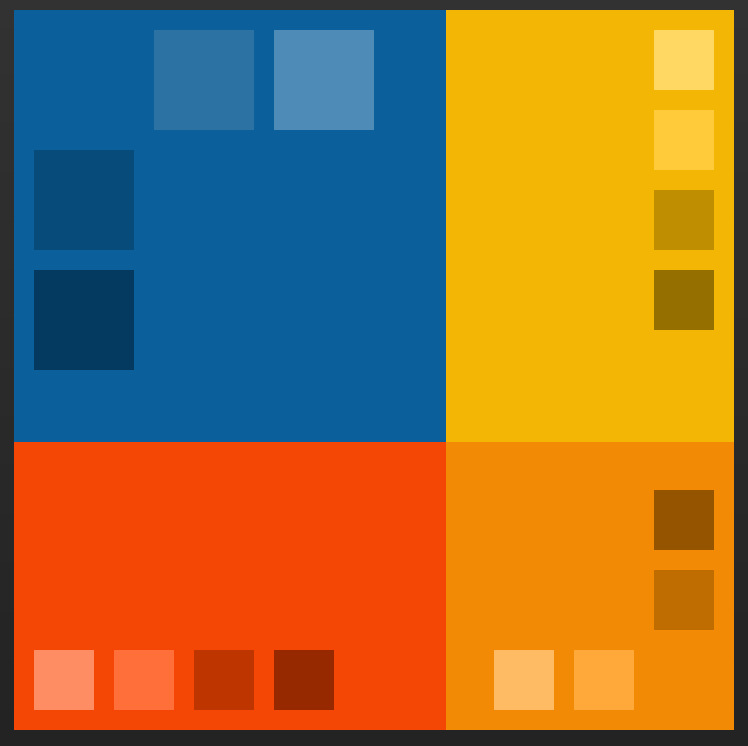
Check it out on Paletton (an online color palette designer) but also, Google's own Color Tool
psh
on 30 Sep 2017
I've been thinking about the notification display a bit...
It seems that this display of notifications (the second item in the blue section on the main screen, as per our mockup) will not be as simple as the first item (nearest location). Should we display the LATEST notification always, even if it's a thanks or a user talk message, or should we display the latest file deletion? And what should we display after the user has already clicked on it? Certainly there would be no point displaying the same message, so do we simply leave that line out if there are no unread notifications? What if the user doesn't click on the notification itself, but rather manually opens the notification activity?
Should we also implement the notifications icon displayed on the toolbar (as per https://github.com/commons-app/apps-android-commons/issues/725#issuecomment-326805278 )?
misaochan
on 15 Mar 2018
You are very right about your concerns @misaochan I am thinking for solution.
neslihanturan
on 15 Mar 2018
For closest nearby marker:
- Even if user click to the indicator and upload photo for nearby place, the point still will be therehttps://github.com/commons-app/apps-android-commons/issues/1409. Until we implement #252 , same point will be displayed to user and this will be annoying.7
- Before loading our map (switching to nearby tab) we won't be able to load nearby places. Even if we decided to load them on activity create, we can't. Because it would be weird requesting location permissions from user while user is looking at contributions list.
- My solution: Displaying closest place indicator and speed up implementation of #252 . To solve loading markers problem, display closest place if location permission is granted. If permission is not granted display a button with text "Display closest location needed photos", when user click to this button request permission. If user gives permission, display the place, if not continue to display the button. But this means that we should listen location changes and update places if user is moving, just during display of constructions. This can be wasting our resources both data and battery.
For notifications:
- Even if we are able to recognize read and unread notifications, since user can also read some notifications from our app (with show more button), the notification will be tagged as "unread" while user read it from app. I don't have a solution for this.
After our latest changes, I have some doubts about this UI implementation team. What do you say?
Besides, what about adding some options for grid style, displaying photos on map, and displaying by categories with a list of categories? Like in Instagram

neslihanturan
on 20 Apr 2018
I agree that this should wait for a bit while we discuss things further. If anyone would like to chime in about the new UI, now's the time! ;)
Responding to @neslihanturan 's points:
Nearby:
- I agree, but #252 is high priority so it is unlikely we will do any new major releases before that is complete.
- I don't think this is impossible. We could request permissions anyway and display an explanation that it is needed to show the nearest location that needs pictures, right? If user declines, then we don't show the nearest place, and load the UI without it.
- I agree with this. However, I don't think it's too bad to listen to location changes while the contributions activity is actually in the foreground. Of course, we must cease onPause.
Notifications:
- How about, for the moment, we just tag everything as "read" once the user accesses the notifications activity? They can see the summaries from there anyway. If there are no new notifications after the last time the user opened notifications activity, then hide that line. However, that does mean that we need to check for notifications on loading Contributions activity. It also indirectly decides what happens when user taps on that line - they should be brought to notifications activity, not to the webview for that specific message.
In the future, implementing a proper "read" system would be a good idea perhaps.
misaochan
on 20 Apr 2018
Nearby:
- Maybe we can listen location less frequently than our map, when it is on contributions tab. Lets say for every 1 minutes. Besides, our query can be stop whenever we find a point (first point will be closes point). This could be more efficient or using data connection.
Note: But I still think it can be better for UX, if we use a button to request latest location and request permission consequently. Otherwise, ie I am an always closed location person, every time I open contributions activity an auto-pop up asking me to share my location would be very annoying.
Notifications:
- Storing last time notifications updated on sharing preferences can be a good solution indeed. If we have a new notification after that date, we can display latest.
neslihanturan
on 20 Apr 2018
Note: But I still think it can be better for UX, if we use a button to request latest location and request permission consequently. Otherwise, ie I am an always closed location person, every time I open contributions activity an auto-pop up asking me to share my location would be very annoying.
I support this :+1:
It's better to ask for the location permission only when we actually need it. The reason for requesting the permission is easily understood by the user when they see the request in the context of the requirement (the Nearby view).
sivaraam
on 21 Apr 2018
Maybe we can listen location less frequently than our map, when it is on contributions tab. Lets say for every 1 minutes.
Sounds good. We could check every 1 min, and onResume. IMO if people want to be guided in real-time to a point, they should go to Nearby. Besides, if they tap on that message, they should be taken to Nearby with the point selected anyway.
Besides, our query can be stop whenever we find a point (first point will be closes point). This could be more efficient or using data connection.
The problem with this is that AFAIK there is no way to get only the "closest" point with our current query - I think currently we get all the points in a certain radius and then sort them, and only then do we know which point is "closest". I agree that your suggestion would be the best in terms of efficiency, but you may need to modify the query. I am not sure if it is doable, or at least easily doable.
Note: But I still think it can be better for UX, if we use a button to request latest location and request permission consequently. Otherwise, ie I am an always closed location person, every time I open contributions activity an auto-pop up asking me to share my location would be very annoying.
This sounds like a good idea to me! :)
misaochan
on 24 Apr 2018
The problem with this is that AFAIK there is no way to get only the "closest" point with our current query - I think currently we get all the points in a certain radius and then sort them, and only then do we know which point is "closest". I agree that your suggestion would be the best in terms of efficiency, but you may need to modify the query. I am not sure if it is doable, or at least easily doable.
Hmm, this implementation will be harder than we thought.
neslihanturan
on 28 Apr 2018
@neslihanturan I think for our minimum viable product, maybe we can just run the Nearby query onResume, and give users the option to remove that display permanently if they dislike it? They can re-enable it in Settings. That may be the best balance between usability and data conservation. Users can turn it on when they want to and turn it off if data is really a concern. Also they need not expect the point to change when they move, it is just a heads-up (like if I loaded the app and saw that there is a point 50m away, I would go to Nearby and check it out, whereas otherwise I might not even have checked Nearby).
This should run in a separate thread so that Contributions doesn't take any longer to load than usual. It is just the "feed" that will be taking time to load.
misaochan
on 29 Apr 2018
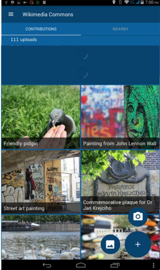
Hi team, while working on this issue, I recognized some details needs to be discussed:
1- Where to put number of uploads? Left picture of right one? My vote for left.
2- What to display while notifications and nearby notifications are getting fetched? Progress bar on empty card view or nothing at all (make views visible when they are loaded, with fancy animations)?
My vote is displaying nothing on loading. Because it looks ugly:
3- Are we planning to make those notifications dismissable? If so, when to redisplay them after they get dismissed once?
For notifications: whenever a new notification comes after dismiss date.
For nearby: whenever e new nearby comes after dismiss date.
For both: should they be dismisable from settings page also?
neslihanturan
on 25 Aug 2018
Thinking about smaller devices, the notification view might leave very little space for the rest of the view. What about having a bell icon with just the count in the top toolbar? Opinions?
maskaravivek
on 25 Aug 2018
Oh huge change after we discussed/agreed and I almost finished implementation? not nice @maskaravivek :D Anyway, can you share some mockups? How should we display nearby then? With small map icon next to bell icon? How we will try to request permission from location disabled users. What will happen when user clicks them?
And if we are not planning to change all these details, what are your opinions to my previous questions 1, 2 and 3?
neslihanturan
on 25 Aug 2018
Maybe _only_ for small screens we can use bell icon with just the count in the top toolbar by the way.
neslihanturan
on 25 Aug 2018
Sorry for the delay in responding @neslihanturan !
- I have a slightly controversial opinion - neither. It feels to me like adding an extra line for number of uploads would be superfluous, and it feels like it breaks the flow of the layout. Rather, in the tab itself, I would say "Contributions (111)".
- I would definitely go with making views only visible after they have loaded. If for whatever reason notifications or GPS etc cannot be fetched, what do you plan to do?
- Very good question/idea! I think that this:
For notifications: whenever a new notification comes after dismiss date.
For nearby: whenever e new nearby comes after dismiss date.
Is a good plan. I also agree that there should be a setting that allows users to turn off notifications.
Maybe only for small screens we can use bell icon with just the count in the top toolbar by the way.
This makes sense. However in that case I would only make user talk notifications count, not Nearby notifications. So just a bell icon with the count for unread user talk notifications on the upper right. I don't think there is any use in having a map icon since Nearby is already easily accessible in the next tab.
Anyone else have any thoughts about this? :) @nicolas-raoul @VojtechDostal @whym ?
misaochan
on 27 Aug 2018
Oh huge change after we discussed/agreed and I almost finished implementation? not nice
Just FYI, this has been proposed already.
Maybe only for small screens we can use bell icon with just the count in the top toolbar by the way.
I would suggest considering one approach (to reduce confusion and complexity). Users might be confused to see different flows for viewing notification for different screen sizes. It's better to choose one approach and go with it.
I would prefer notification icons as it doesn't clutter up the view and takes up less space. Showing notifications in main screen seems to clutter up the view and I feel it to be bit odd. Notification icons like the one GitHub has is well known and don't come in the way of the user.
sivaraam
on 27 Aug 2018
@sivaraam
Oh huge change after we discussed/agreed and I almost finished implementation? not nice
Just FYI, this has been proposed already.
Oh okay, sorry I missed it. But apparently we agreed on some mockups later, and I followed them in implementation. If we sill need to discussion, let's do that as soon as possible.
My questions are:
- Where to put notifications icon?
- How do we display nearby?
- If we will use a neaby icon on toolbar I think it won't be easy to understand, what will happen if I click to place marker on toolbar.
- If we use nearby icon on toolbar, how to request location permission?
- If we use card view for nearby (as in out mockups) then it may look inconsistent. One is on toolbar, one is on cardview.
My idea is, if we want to make it as simple as possible,
- Display notifications icon on toolbar
- Display nearby card view, only if there is a nearby place at lees then 1 km lets say. Otherwise, do not display any card view. This card view will be dismissable, it will be invisible until a new nearby place comes.
How this sound, if we all agree, I will start to implementation.
neslihanturan
on 27 Aug 2018
Display notifications icon on toolbar
Display nearby card view, only if there is a nearby place at lees then 1 km lets say. Otherwise, do not display any card view. This card view will be dismissable, it will be invisible until a new nearby place comes.
This sounds good to me. Actually, for the Nearby card view, it would probably be simpler to just display the nearest Nearby Place whenever ContributionsActivity is loaded, which was the original plan. If the user dismisses it, don't show a new card until the next time they load ContributionsActivity, and have a Setting that allows user to choose to not see any cards at all. However, your plan sounds fine if you are OK with the extra implementation.
The reasons for this change seem to be logical and user-focused, so we can explain in our IEG report why we decided to change the UI from the one proposed in the mockups.
misaochan
on 27 Aug 2018
Related issues
 jidanni
·
3Comments
misaochan
·
3Comments
psh
·
4Comments
nicolas-raoul
·
4Comments
nicolas-raoul
·
3Comments
jidanni
·
3Comments
misaochan
·
3Comments
psh
·
4Comments
nicolas-raoul
·
4Comments
nicolas-raoul
·
3Comments
Most helpful comment
Thanks for your thoughts @veyndan , it's always good to get feedback. :)
I personally strongly feel that the hamburger/navigation menu is a huge improvement to the toolbar (and have received similar feedback from a few users). Most Android users that I personally know (even non-technical folks) are familiar and comfortable with using these, and I feel it is much more convenient, intuitive, and elegant-looking than navigating via the toolbar.
I'm on the fence re: bottom navigation vs FAB + tabs. I think the FAB makes the upload action stand out more to the user, but on the other hand it is true that bottom navigation does simplify things.
If @neslihanturan is okay with it, I'm good with having a mock-up of the alternative design posted up for discussion. I would still strongly lean towards keeping the hamburger/navigation menu, but with a mock-up we could look at FAB + tabs vs bottom navigation and decide on the pros and cons. But as she said, it does have to be done fairly quickly, because I intend to have the mockup in the renewal proposal. (An interesting idea could be to have both mock-ups presented in the proposal and let the endorsers vote on the one they prefer, but that still needs the new mockup to be done within the next week or two).
Edit: Also, a few questions re: bottom navigation,
(1) how do we intend to allow for camera vs gallery uploads?
(2) will the bottom navigation persist in the Nearby activity? It seems somewhat superfluous to have "Upload" there, since we intend on implementing uploads from individual nearby items
(3) we intend to use a FAB in Nearby to allow users to switch between the list and map. How will this work with bottom navigation?