Anysoftkeyboard: New app icon
Created by @1jr
 menny
menny
All 32 comments
Examples:


menny
on 20 Sep 2017
Looks awesome :D
 maverick74
on 20 Sep 2017
maverick74
on 20 Sep 2017
I think so too. But I still need some help from @1jr to be able to incorporate it into the app.
menny
on 20 Sep 2017

 1jr
on 21 Sep 2017
1jr
on 21 Sep 2017
I'm more than willing to help if you tell me what to do. :)
1jr
on 21 Sep 2017
@1jr thanks.
For the first step, I need the background image.
According to https://developer.android.com/guide/practices/ui_guidelines/icon_design_adaptive.html
The background is 108x108dp.
I'll need that for mdpi, hdpi, xhdpi, xxhdpi, xxxhdpi densities:
mdpi | @ 108.00dp | = 108.00px
hdpi | @ 108.00dp | = 162.00px
xhdpi | @ 108.00dp | = 216.00px
xxhdpi | @ 108.00dp | = 324.00px
xxxhdpi | @ 108.00dp | = 432.00px
Or, if you can create an SVG of that background, that should work too, and I can use that for all densities.
menny
on 21 Sep 2017
I think it is best if you can create the two versions (purple and gray).
Thanks!
menny
on 21 Sep 2017
1jr
on 22 Sep 2017
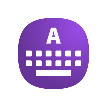
The zip contains two SVGs, one gray and one purple. The foreground and background are separated into different layers.
1jr
on 22 Sep 2017
1jr
on 22 Sep 2017
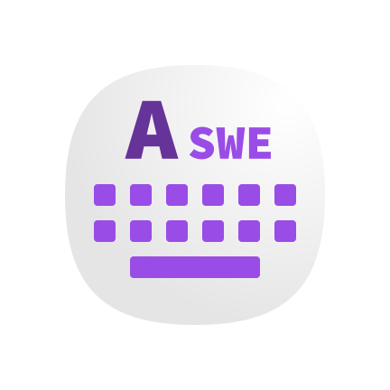
Two more versions. The second gray version doesn't use flags as some languages (like arabic) doesn't have a flag. Instead the ISO three-letter language names are used.
1jr
on 22 Sep 2017

1jr
on 22 Sep 2017
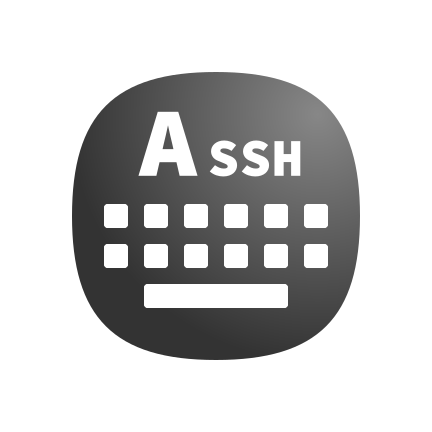
The latest design is easy customizable for other types of addons as well. This is a mockup of the SSH keyboard layout.
1jr
on 22 Sep 2017
I think, it is a good fallback alternative to have the 3-letter-code space, but for most packs/languages a flag will be available and very helpful to recognize for the users. Could you try a version with flag?
 friesenkiwi
on 22 Sep 2017
friesenkiwi
on 22 Sep 2017
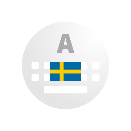
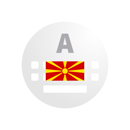
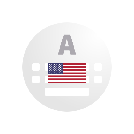
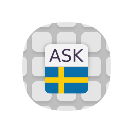
Placing flags without distortion when the borders are flexible is really hard. The only safe Place is in the center. Here are preview versions for Swedish, Macedonian and US-English.
1jr
on 22 Sep 2017
The flags are resized to the height of the keyboard row and centered horizontally. As the colors of the flags are very different from one another the background is painted in shades of gray.
1jr
on 22 Sep 2017
The SVGs for the later version.
V4.zip
1jr
on 30 Oct 2017
@1jr I'm ready to work on the icon now.
A few ideas:
I have to say that I like the background you use at https://github.com/AnySoftKeyboard/AnySoftKeyboard/issues/1125#issuecomment-331126718
I want you to tweak it a bit: instead of having uniform squares, I would like something that is more like a QWERTY keyboard, in the sense that the keys are offset a bit between rows. Something like we have in the current logo (https://github.com/AnySoftKeyboard/AnySoftKeyboard/blob/master/StoreStuff/ask_logo.png). One thing that I don't like in the current logo is that the keys are not the same size.
menny
on 21 Dec 2017
New icon looks real nice.
But I'm confused. Is it "Ask keyboard" or AnySoft keyboard?
 Something2
on 1 Apr 2018
Something2
on 1 Apr 2018
So I had this idea of integrating the name into the keyboard and went ahead to try it out
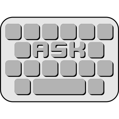
I also tried to make a localized version, by putting a flag where the globe (for switching keyboard layouts) is usually placed
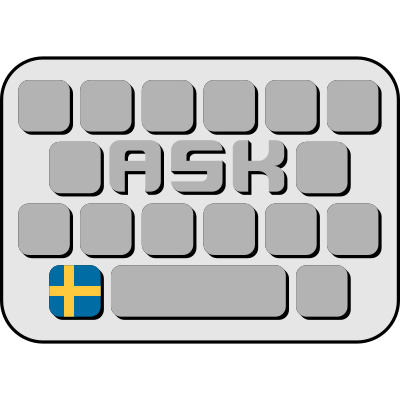
The .svg files are in .
I am no quite happy with it yet, but I think the idea could work. Any thoughts?
 p3732
on 12 Jun 2018
p3732
on 12 Jun 2018
I took some design inspirations from this thread and @1jr's minimalistic designs:
-no '3D' shade
-no outer boundry
-gradient as background

Liking this one a lot more.
p3732
on 13 Jun 2018
I like it too.
On June 13, 2018 4:31:05 PM P3732 notifications@github.com wrote:
I took some design inspirations from this thread and @1jr's minimalistic designs:
-no '3D' shade
-no outer boundry
-gradient as backgroundLiking this one a lot more.—
You are receiving this because you commented.
Reply to this email directly, view it on GitHub, or mute the thread.
Something2
on 13 Jun 2018
@p3732, I like this:

I have a few requests:
1) can you use our accent color for the keys? Or for the ASK letter? The color is #663399
2) In newer versions of Android, we need to use a layer-icon (https://github.com/AnySoftKeyboard/AnySoftKeyboard/blob/master/app/src/main/res/mipmap-anydpi/ic_launcher.xml). Which means we are breaking the icon into background (which can be the gradient), and a foreground. Can you provide me with those?
Thanks! Awesome work.
menny
on 21 Jun 2018
I tried both variants, accent on keys and accent on logo:
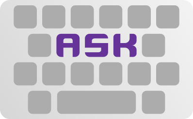
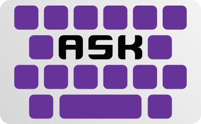
I don't really have a preference with those, but when placing a flag for localisations:
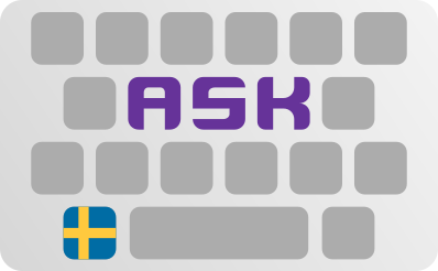
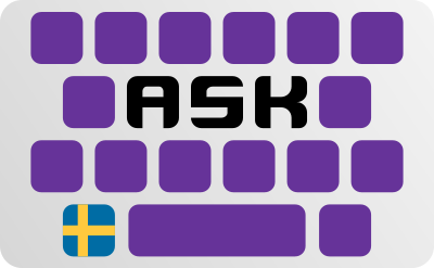
I do prefer the upper, brighter variant.
p3732
on 26 Jun 2018
According to the the icons should be of size 108x108 dp (
) with 18 dp empty on each site. Here are the links to 512x512px images, that can be made into adaptive icons following
:


p3732
on 26 Jun 2018
I prefer the 2nd.
However, i believe the flag will became too small to be noticed on the icon.
Maybe using 2 "key-lines"...
maverick74
on 5 Jul 2018
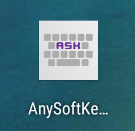
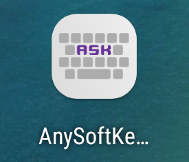
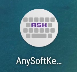
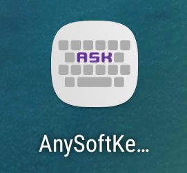
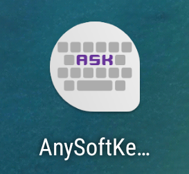
menny
on 20 Oct 2018
@1jr @maverick74 @p3732 thoughts?
menny
on 20 Oct 2018
Hello @menny,
In my opinion this icon works best on the squircle. Can we maybe try to make the content a bit smaller in the other adaptive shapes?
 AnXh3L0
on 20 Oct 2018
AnXh3L0
on 20 Oct 2018
@menny
I like them! I tend to prefer number 4 followed closely by number 2.
How will this work for language packs - the ones with the flags? Do you have any test on that already?
I agree with @AnXh3L0 on number 5. Because the outer shape is not symmetric, I think content should be a bit smaller...
maverick74
on 20 Oct 2018
menny
on 21 Oct 2018
We have a new app icon merged, closing this issue.
Marked as solved.
AnXh3L0
on 22 Oct 2018
Related issues
 ghost
·
5Comments
ghost
·
5Comments
 ingodeutschmann
·
5Comments
ingodeutschmann
·
5Comments
 xmiseggs
·
5Comments
xmiseggs
·
5Comments
 fronki
·
5Comments
fronki
·
5Comments
 bobolea
·
7Comments
bobolea
·
7Comments
Most helpful comment
Examples:


