Antennapod: Decrease header size (podcast info screen) for small screen sizes
Checklist
- [x] I have used the search function to see if someone else has already submitted the same feature request.
- [x] I will only create one feature request per issue.
- [x] I will describe the problem with as much detail as possible.
System info
App version: 2.0.2
App source: Google Play
~Feature~ Improvement description
Problem you may be having, or feature you want: On devices with small screens, the header on the Podcast info screen takes relatively too much space (vis-a-vis the rest of the screen). See for example this screenshot from a 3.7" screen, that @ByteHamster prepared in #4601 (vs my current phone)
L: 480x800px 3.7" / R: 1080×2160px 5.65"
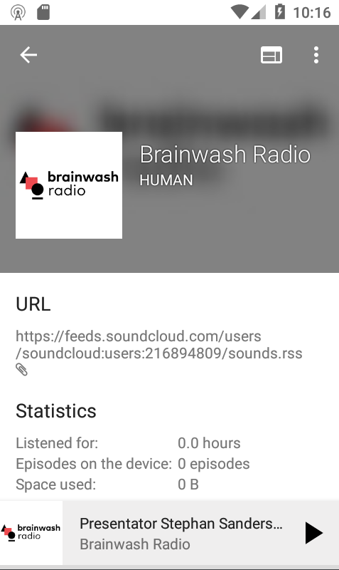
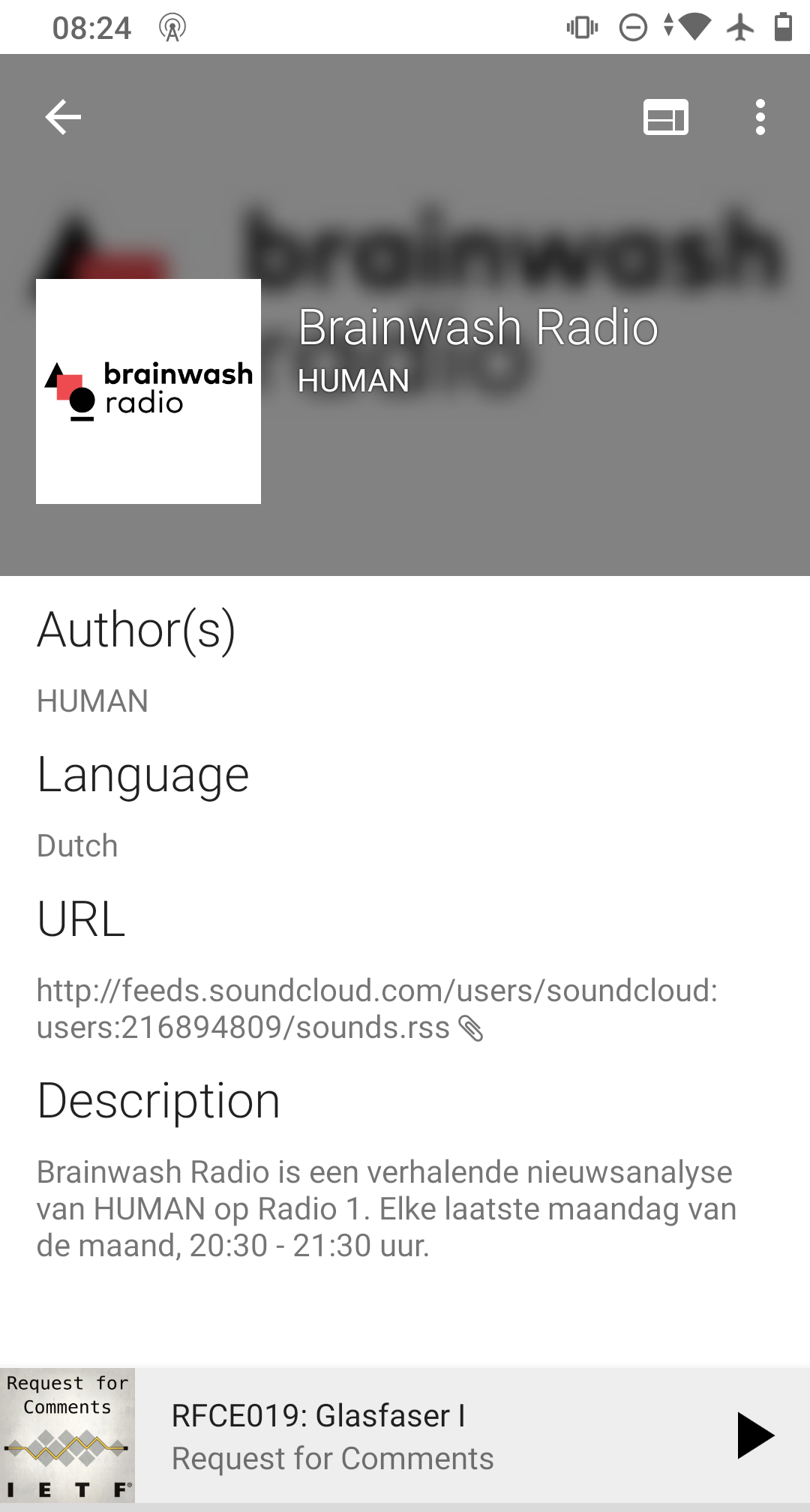
Suggested solution: change the height of the header (with the blurred background) in function of the screen's height. A minimum and a maximum should be built in to not go wild on small or big screens.
The goal should be to preserve (more or less) the same header/rest-of-the-screen ratio across devices
 keunes
All 6 comments
@ByteHamster, do we have info from Google on screen sizes? Like the smallest and biggest screen size/resolution that's still relatively common among our users? (to determine the minimum and maximum)
keunes
on 29 Oct 2020
I think it would be easiest to just use 2 different sizes. That can be done relatively easy using a @dimen resource for the BigBlurryBackground images.
 ByteHamster
on 29 Oct 2020
ByteHamster
on 29 Oct 2020
Working on this. So I need to create a value in dimen for all screen types and use it as the height right ? If yes can you tell the appropriate values for ldpi, hdpi.... xxxhdpi @ByteHamster
 avirajrsingh
on 30 Oct 2020
avirajrsingh
on 30 Oct 2020
Awesome :)
Instead of the -hdpi suffix (which is only about resolution, not size), you can use something like -sw200dp which means smallest screen size is 200dp.
You can find more qualifiers here (table 2).
https://developer.android.com/guide/topics/resources/providing-resources
I don't yet know what modifier works best, so you need to experiment a bit. Keep in mind that AntennaPod does not reload on rotation changes, so I think using smallest width is better than using something like height. This also makes sure that the app looks consistent in portrait and landscape mode.
ByteHamster
on 30 Oct 2020
Now that I added a comparison screen, I'm also wondering if we should increase the blur a bit on these bigger screens. It'll increase readability of the podcast title & author.
keunes
on 30 Oct 2020
The blur radius was already increased in 2.0, I think. If you look at it on a real device instead of the screenshots on a computer, the font size of the title is pretty big and easy to read. This is probably caused by the fact that phone screens start to have the same resolution as computer screens, just with a fraction of the size. I actually like that the image is still pretty recognizable instead of being completely washed out (on a real device - on the screenshot, I agree that the font is a bit hard to read).
ByteHamster
on 30 Oct 2020
Related issues
 maxxo
·
4Comments
maxxo
·
4Comments
 benediktg
·
4Comments
benediktg
·
4Comments
 chaulo
·
4Comments
chaulo
·
4Comments
 Rotzbua
·
4Comments
Rotzbua
·
4Comments
 ggshuini
·
4Comments
ggshuini
·
4Comments
Most helpful comment
The blur radius was already increased in 2.0, I think. If you look at it on a real device instead of the screenshots on a computer, the font size of the title is pretty big and easy to read. This is probably caused by the fact that phone screens start to have the same resolution as computer screens, just with a fraction of the size. I actually like that the image is still pretty recognizable instead of being completely washed out (on a real device - on the screenshot, I agree that the font is a bit hard to read).