Antennapod: Browsing for podcasts by categories and subcategories
Problem you are having:
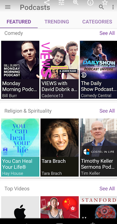
The first screen of AntennaPod is not user friendly for the non-tech person. Compared with other apps, the first screen lacks a discovery process without going to search.
Suggested solution:
- From the first screen, 2 taps to value (or a listen)
- Right now, it takes 4 taps if I wanted to listen to one of the top 8 podcasts.
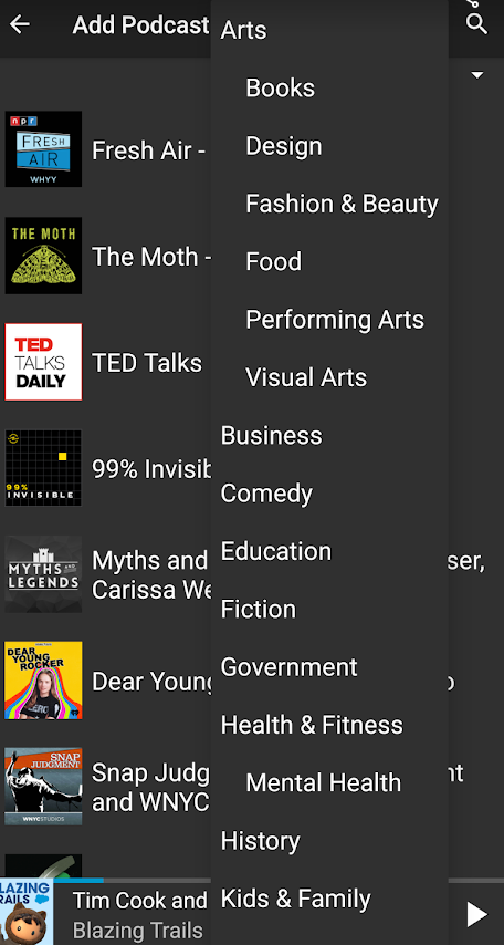
- I suggest that we start adding the top iTunes categories by country and by category, moving the add Podcast by URL to the top right with a '+' button, move advance search also to the top right behind '+' and OPML input back into Settings or behind '+'
1. Categories from gpodder.net should be removed, because the names are misspelled, random and doesn't give AntennaPod a good image. [A]
Screenshots / Drawings / Technical details:
Example from the 'Podcast Player' app from CastBox to get value with 2 taps
1) Open the app
2) A scrolling list of category with a 'more link'
3) Tab and listen immediately for value and preview.
 tonytamsf
All 15 comments
I don't think we should hide the url field. I have tested some podcast apps in the past and never found a way to enter a url manually.
I think for the start, we could rename "discover" to "top podcasts" and then display 2-3 more cards with categories and a "more categories" button.
Displaying the opml import on that page was a feature request. I think we should keep that, too (but we might need to rename or be more clear what it does. Noone knows what opml is). When adding some categories, those things move down to the bottom, so I think it's okay.
The first screen of AntennaPod is not user friendly for the non-tech person
Just to scare you a bit: Have you seen the old "add feed" page before the update last summer? :D #3282
 ByteHamster
on 14 Jan 2020
ByteHamster
on 14 Jan 2020
I really like the idea of having curated featured podcasts but I have no idea how to manage them.
Does iTunes offer something like that?
 txtd
on 14 Jan 2020
txtd
on 14 Jan 2020
@txtd iTunes does offer curated lists by country and genre. For example here is the US ones
Here is the complete list, browsable by human
https://podcasts.apple.com/us/genre/podcasts-arts-food/id1306
https://podcasts.apple.com/de/genre/podcasts-arts-food/id1306
... by country
tonytamsf
on 15 Jan 2020
I think for the start, we could rename "discover" to "top podcasts" and then display 2-3 more cards with categories and a "more categories" button.
I'll take a look at starting here app/src/main/java/de/danoeh/antennapod/discovery/ItunesTopListLoader.java to add more categories.
Displaying the opml import on that page was a feature request. I think we should keep that, too (but we might need to rename or be more clear what it does. Noone knows what opml is). When adding some categories, those things move down to the bottom, so I think it's okay.
The first screen of AntennaPod is not user friendly for the non-tech person
Just to scare you a bit: Have you seen the old "add feed" page before the update last summer? :D #3282
Thanks for adding the Discover tab, I'm still ramping up on Android dev, but I would like to take this one on.
tonytamsf
on 17 Jan 2020
I'm thinking of storing a OPML for each country of the list of categories per country. When the user taps on 'More...' we jump into a tab based navigation to browse top feeds per category
tonytamsf
on 24 Jan 2020
@ByteHamster I'm playing around with having a Spinner in the Add Podcast view, I've been personally using it daily to browser and find new podcast in different Genre.
- I could provide just the top level Genres from https://podcasts.apple.com/us/genre/podcasts/id26
- Or I could include the sub-genres as well, which I personally find much more useful
tonytamsf
on 24 Jan 2020
closing this issue
tonytamsf
on 29 Sep 2020
@tonytamsf why? I think it is a good idea.
Does podcastindex.org have an API for country specific categories?
ByteHamster
on 29 Sep 2020
I think we should keep that, too (but we might need to rename or be more clear what it does. Noone knows what opml is).
What about "Import podcast list (OPML)" ?
 keunes
on 29 Sep 2020
keunes
on 29 Sep 2020
I think this mock works well https://github.com/AntennaPod/AntennaPod/pull/3788#issuecomment-581660227
@ByteHamster what do you think of this format as a OPML feed for categories?
https://github.com/tonytamsf/apple-rss-data-generator/blob/master/opml/us.genre.opml
This is in reference to your comment https://github.com/AntennaPod/AntennaPod/pull/3788#issuecomment-584540280
tonytamsf
on 30 Sep 2020
What about "Import podcast list (OPML)" ?
Sounds good. Could you write a new issue for that, please? Would be a good fit for Hacktoberfest, too :)
I think this mock works well
To be honest, I am still not 100% happy about having to scrape the apple website. If podcastindex.org had an API like that, it would be a lot less painful.
what do you think of this format as a OPML feed for categories?
Does OPML allow nesting to create sub-categories? That would be a great thing to have, given that iTunes has something like that, too.
ByteHamster
on 30 Sep 2020
Sounds good. Could you write a new issue for that, please? Would be a good fit for Hacktoberfest, too :)
Done. Reflecting on it, I think the 'Advanced' title isn't really representative and might scare away users. So in a revamp we might try and get rid of that as well. In fact I preferred the interface that was there for a while with the bigger 'buttons' for some of these 'advanced' options.
To be honest, I am still not 100% happy about having to scrape the apple website. If podcastindex.org had an API like that, it would be a lot less painful.
podcastindex will support categories, both in a 'flat' format and the iTunes hierarchical format. Didn't hear or see anything about countries yet, but languages and categories are already supported. If we want it, we can request it in their repo.
keunes
on 1 Oct 2020
| Does OPML allow nesting to create sub-categories? That would be a great thing to have, given that iTunes has something like that, too.
Yes, I validated the opml with nested categories using an online linter
tonytamsf
on 1 Oct 2020
I think this mock works well
To be honest, I am still not 100% happy about having to scrape the apple website.
Apart from the data source, are you happy with your mock-up? I like it, but I'm wondering if we should not tackle this (easier podcast discovery) with #3952 (add 'home' screen) in one go, so there's consistency and synergy between them.
keunes
on 3 Oct 2020
Reflecting on it, I think the 'Advanced' title isn't really representative and might scare away users. So in a revamp we might try and get rid of that as well. In fact I preferred the interface that was there for a while with the bigger 'buttons' for some of these 'advanced' options.
After reading some user comments (I think it was on Twitter), it looked like users never bothered to press the "advanced search" button and therefore did not discover gpodder. That's why they are all top-level now, not hidden behind a second layer of buttons. I think having a heading is good to separate it from the discovery section but I am happy to hear suggestions for a better word.
Apart from the data source, are you happy with your mock-up?
Yeah, I would say that could be a good start. Does not need to look exactly like that but I like that one can click on a category and directly see podcasts but at the same time also sub-categories to narrow down the results.
To implement, I am thinking about using a class like DiscoveryCategory (name not fixed). That class could then have a method to get sub categories and also a method to get a list of podcasts. The top-most DiscoveryCategory could contain the toplist and all the top-level categories like Arts. That way, the UI is pretty much independent from the actual backend (iTunes, podcastindex, etc).
ByteHamster
on 4 Oct 2020
Related issues
 ggshuini
·
4Comments
keunes
·
4Comments
ggshuini
·
4Comments
keunes
·
4Comments
 ghost
·
4Comments
ghost
·
4Comments
 Rotzbua
·
4Comments
Rotzbua
·
4Comments
 matthiasroos
·
3Comments
matthiasroos
·
3Comments
Most helpful comment
I don't think we should hide the url field. I have tested some podcast apps in the past and never found a way to enter a url manually.
I think for the start, we could rename "discover" to "top podcasts" and then display 2-3 more cards with categories and a "more categories" button.
Displaying the opml import on that page was a feature request. I think we should keep that, too (but we might need to rename or be more clear what it does. Noone knows what opml is). When adding some categories, those things move down to the bottom, so I think it's okay.
Just to scare you a bit: Have you seen the old "add feed" page before the update last summer? :D #3282