Anki-android: Browser grey lines make text hard to parse in night mode and text aligment
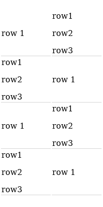
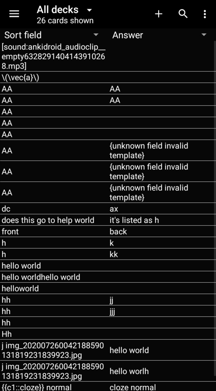
This is an example of the current state:
Its not so bad when its light...
... But Its specially bad when in black mode:
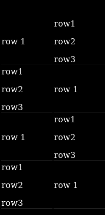
Theres a couple of usability issues here:
- Browser shows a couple of fields. The size is determined by the largest field and the other field is centered vertically
- line is small and light grey. Grey is a bad color for contrast. Contrast is something desirable when visually parsing data
This is a mockup of how it could be better, although im no designer:
Thicker white line top aligned
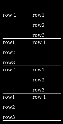
Alternating colors top aligned
Thanks for considering!!
 voidplayer
All 12 comments
Hello 👋, this issue has been opened for more than 2 months with no activity on it. If the issue is still here, please keep in mind that we need community support and help to fix it! Just comment something like _still searching for solutions_ and if you found one, please open a pull request! You have 7 days until this gets closed automatically
![github-actions[bot] picture](https://avatars2.githubusercontent.com/in/15368?v=4&s=40) github-actions[bot]
on 2 Jun 2020
github-actions[bot]
on 2 Jun 2020
Moving off stale - it's useful and would be good as a first issue. I'd like to see this
 david-allison-1
on 2 Jun 2020
david-allison-1
on 2 Jun 2020
Hello 👋, this issue has been opened for more than 2 months with no activity on it. If the issue is still here, please keep in mind that we need community support and help to fix it! Just comment something like _still searching for solutions_ and if you found one, please open a pull request! You have 7 days until this gets closed automatically
github-actions[bot]
on 2 Aug 2020
👋
voidplayer
on 5 Aug 2020
Thanks for your patience @voidplayer
I guess "Be the change you want to see in the world" is the quote of the day (by Arleen Lorrance)
I'll get this looked at today
Can't go with alternating colours as that would obscure the other colours that we already use - will try for the solid white line.
david-allison-1
on 5 Aug 2020
No, thank you for looking at it
Anything should be better than the current thin grey line. Grey is for unimportant things that can be skipped (side notes, copyright,...) not for an item visual limits
I think the horizontal line should be a little thicker than the font. Top alignment of the items to easily find where they start. Maybe even a thin vertical between the 2 fields to help parse them
Thin because they belong together, in contrast with thick where they are separated items
Again, im no designer, i just have eyes
(Meaning im not sure what is the optimal approach to make it look fancy while allowing it to do its job 😬)
voidplayer
on 5 Aug 2020
@voidplayer
First round (before I read the comments), I personally prefer a thinner line, as even a 1dp line seems jarring.
What are your thoughts?
david-allison-1
on 5 Aug 2020
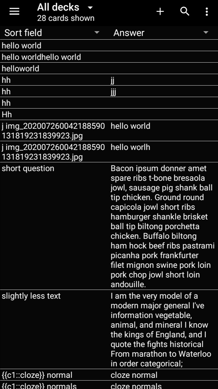
The problem with your test case is that it is very easy to parse already. Almost all fields are 1 line, with little text
I would try it with a real world deck :)
voidplayer
on 5 Aug 2020
Better? Any suggestions for improvements?
david-allison-1
on 5 Aug 2020
i am the very model of a modern major general?😆 (yes, i searched the video and saw the song)
And yes, anything is better than the current one, so very pleased if you just push whatever you can come up with even if it can still be improved in the future :)
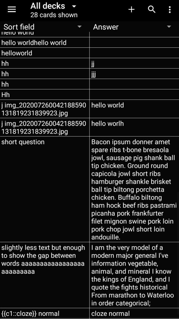
Something is still off. I think is the gap between words being similar sized than the vertical gap between question and answer
When theres lot of text on the same side, the body of the text visually create something similar to a line. But when you mix and match fields that are differently sized, this wall is no more. (look at my first mock up for reference of alternating bigger fields left and right)
I would try an actual line, slightly thinner
Also, i would try to grey very, very slightly the text to see if there is an improvement on reading. My reasoning is that the line helps you put your eyes on the word. Once is there, you can easily keep reading if its what you are looking for or discard and go to the next line if its not, even if the text is slightly greyed
Not sure if it will actually work tho :)
voidplayer
on 5 Aug 2020
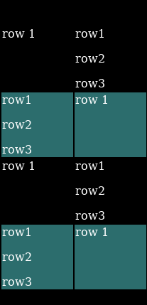
Take 3: added vertical bar, modified margins:
david-allison-1
on 5 Aug 2020
I like it thanks! :D
voidplayer
on 5 Aug 2020
Related issues
 Acelya-9028
·
4Comments
Acelya-9028
·
4Comments
 SimonePols
·
3Comments
SimonePols
·
3Comments
 tingsu
·
5Comments
tingsu
·
5Comments
 hanpingchinese
·
5Comments
hanpingchinese
·
5Comments
 littlefoodt
·
4Comments
littlefoodt
·
4Comments