Our sidebar gives the impression as if the app is not yet ready, this is because of the huge white space in the middle.
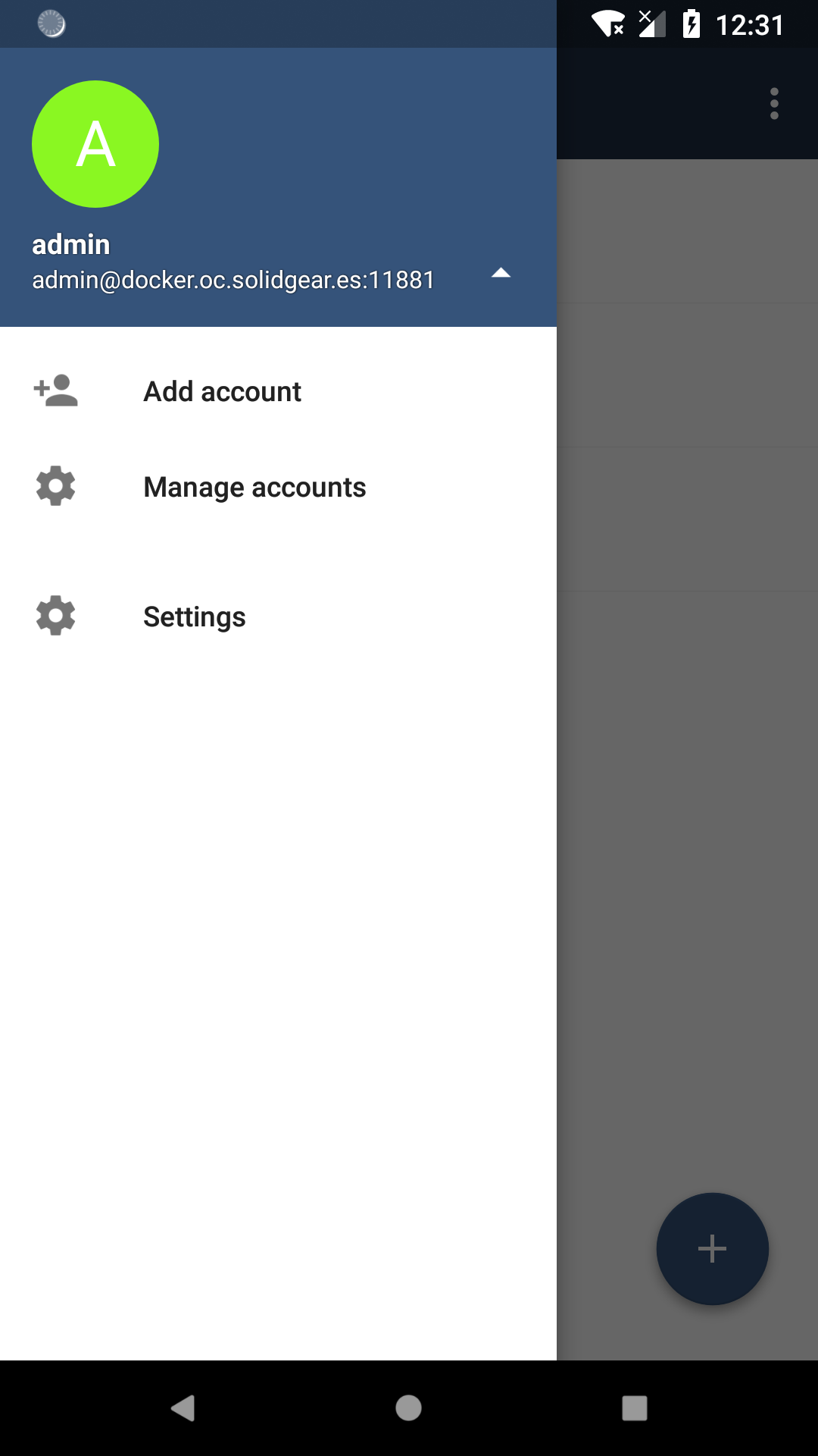
So I suggest something like this here. It can also be combinded with #737 . However it does not have to be like this, but we should get rid of that white area.
 theScrabi
All 12 comments
@theScrabi Great! I like the new design and I have a question, what is expected to be shown when pressing the arrow located on the right of the account? The list of accounts? If so, we might have too much space there if there's just a couple of accounts configured.
 davigonz
on 2 May 2018
davigonz
on 2 May 2018
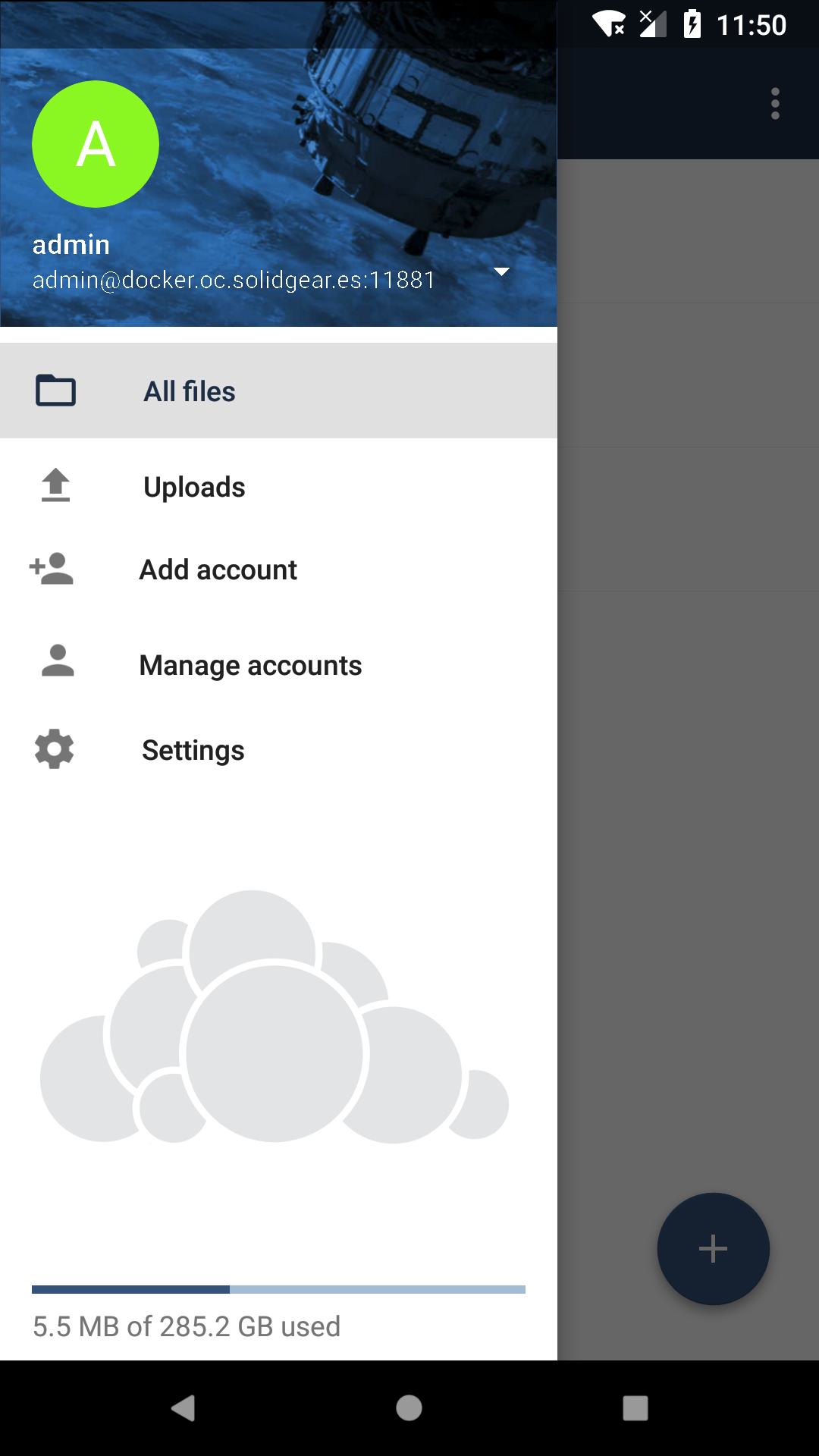
@theScrabi What a beauty! 😍
P.S. Don't forget branded clients. /cc @ChrisEdS
 michaelstingl
on 2 May 2018
michaelstingl
on 2 May 2018
@jvillafanez do we already feature such an icon like the gray cloud for the branded clients?
theScrabi
on 3 May 2018
Love the idea! I think best practise is to set two more options in ownBrander for the new sidebar.
One for the background image and one for the logo. Maybe we can implement a option for transparency as well. With our grey ownCloud logo everything is looking fine, but this works not for every customer.
@michaelstingl What do you think?
 ChrisEdS
on 3 May 2018
ChrisEdS
on 3 May 2018
We could maybe show the name of the app instead of a logo if a customer does not add a gray logo.
And for the the header just show a color if header is not set.
theScrabi
on 3 May 2018
Things to be branded:
- Background image in the top of the drawer
- ownCloud logo on background
- (n2h) background color on the main drawer section.
Question:
The white triangle at the right of the URL. Right now it opens the account options, but in your suggestion such options are in the main. What will i see when i tap on the triangle?
 jesmrec
on 3 May 2018
jesmrec
on 3 May 2018
(n2h) background color on the main drawer section.
That color is already brandeable
The white triangle at the right of the URL. Right now it opens the account options, but in your suggestion such options are in the main. What will i see when i tap on the triangle?
+1, I have the same question
davigonz
on 3 May 2018
@jvillafanez do we already feature such an icon like the gray cloud for the branded clients?
Not really. The only usable icon might be the logo icon (300px x 149px or 200px x 99px), but I'm not sure where is being used exactly and if we can really use it for this case.
I guess we'll need to include a new one, so include the file format (I guess .png, but just in case is different) as well as the size we want to ask for and the sizes of the images we need to generate (if any)
 jvillafanez
on 3 May 2018
jvillafanez
on 3 May 2018
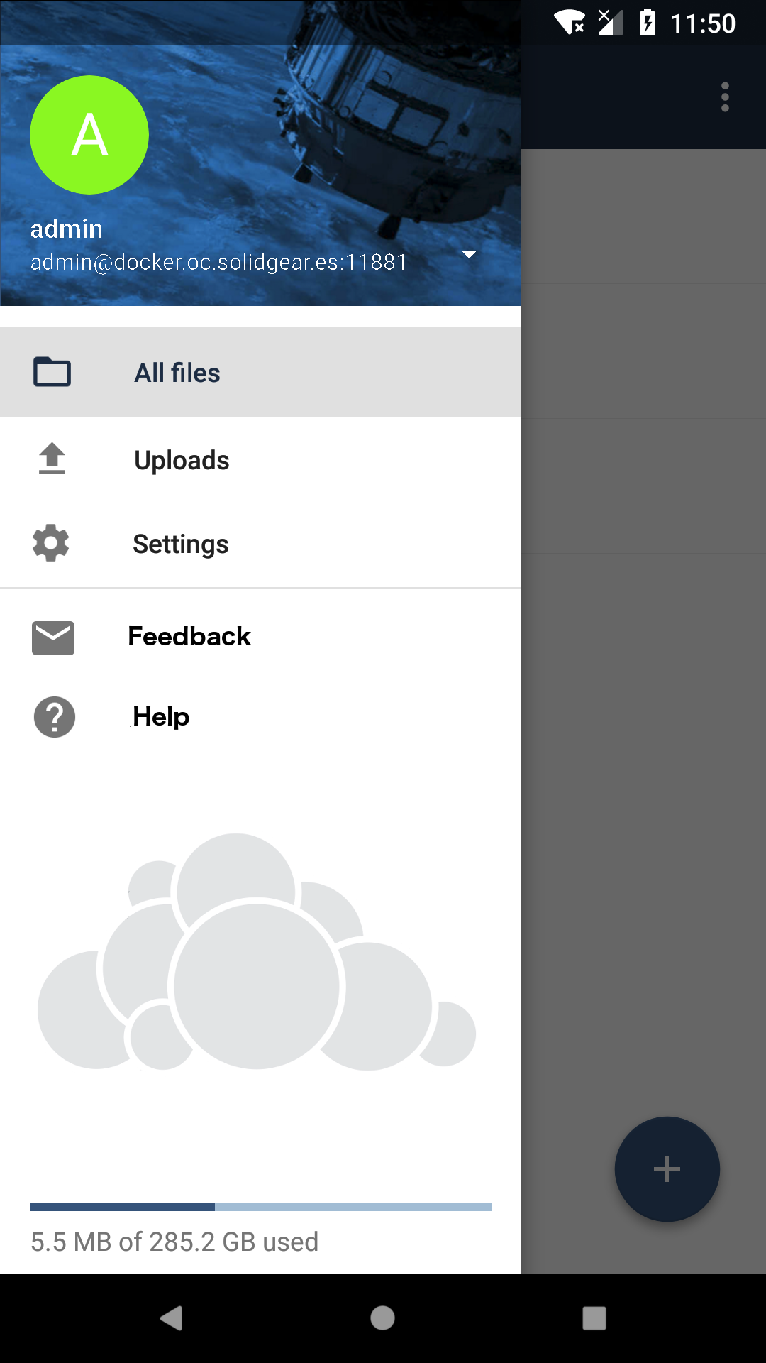
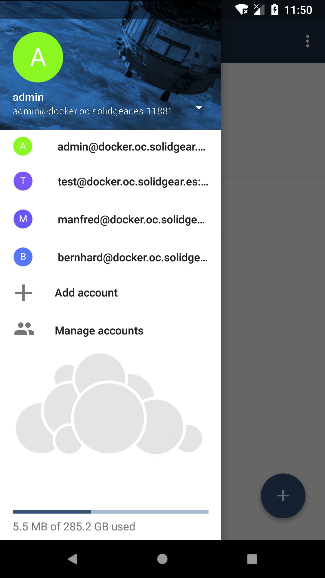
After having a discussion about UX and UI here is our second iteration:
Not enlarged --- Enlarged
theScrabi
on 4 May 2018
i guess Feedback and Help are the same in settings view, and the visibility have to be branded as well.
Other option to include (only an idea if there is enough room, or for future), is adding a link to the rate dialog.
jesmrec
on 4 May 2018
So I've re based with the quota changes. However I have several problems now.
- quota does not show up in landscape mode.
- quota shows a not resolved template string if no quota was yet detected.
theScrabi
on 21 May 2018
- quota shows a not resolved template string if no quota was yet detected.
I will have a look at this
Edited: fixed and included in BUG & IMPROVEMENTS of https://github.com/owncloud/android/pull/2215#issue-185973126
davigonz
on 21 May 2018
Related issues
jesmrec
·
4Comments
jesmrec
·
7Comments
 Nowaker
·
3Comments
michaelstingl
·
4Comments
Nowaker
·
3Comments
michaelstingl
·
4Comments
 davivel
·
4Comments
davivel
·
4Comments
Most helpful comment
After having a discussion about UX and UI here is our second iteration:
Not enlarged --- Enlarged