Amphtml: amp-carousel: slide height calculation is off on desktop
We implemented a caption that is sticked to the bottom of a carousel slide. On desktop browsers there is a visible gap between the end of 'carousel-slide' and the 'amp-carousel'.
How do we reproduce the issue?
- Open Chrome or Safari Desktop
- Navigate to http://www.bento.de/gefuehle/seitensprung-frauen-betruegen-haeufiger-maenner-die-nicht-im-haushalt-helfen-1007973/amp/
- Inspect the slideshow
What browsers are affected?
So far Chrome on Windows and OSX and Safari on OSX
Which AMP version is affected?
Version 1478801557976
 eike-hass
All 16 comments
//cc @dvoytenko
 sebastianbenz
on 18 Nov 2016
sebastianbenz
on 18 Nov 2016
/to @camelburrito
 dvoytenko
on 18 Nov 2016
dvoytenko
on 18 Nov 2016
@eike-hass - the gap is because of the margin bottom in your css (or i am not understanding what the problem is :) )
.carousel {
    margin-bottom: 20px;
}
I tried putting a border on the amp-carousel and it looks fine to me (no gaps)
 camelburrito
on 18 Nov 2016
camelburrito
on 18 Nov 2016
@camelburrito this is what i see: http://imgur.com/a/UCb8Q. Does it look the same to you?
eike-hass
on 18 Nov 2016
no :)

camelburrito
on 18 Nov 2016
@eike-hass - I finally got some time to dig into this ,
I replicated this issue on JS bin,
http://jsbin.com/sosocot/10
This looks like a windows - chrome bug
Chrome thinks that the scrollbar is still present (visible on the screen) and hence moves the slide-item above it, in reality the scrollbar is hidden using the 20px padding on -amp-slides-container
A work-around for this would be to add a overflow:hidden to the amp-carousel-slide class or
your carousel-slide class this makes the ui look fixed.
Ill keep working on a permanent fix (which will not affect the workaround suggested above).
camelburrito
on 30 Dec 2016
I have filed a chrome bug here -https://bugs.chromium.org/p/chromium/issues/detail?id=678054
camelburrito
on 3 Jan 2017
@camelburrito thank you very much. We will give the css fix a spin
eike-hass
on 4 Jan 2017
@camelburrito Should we just add this style to slides ourselves if this would affect a wide range of situations. Chrome bug or not, but if we can address it ourselves, that would be a good idea.
dvoytenko
on 4 Jan 2017
@eike-hass i made the css fix in AMP - you should see it live in 2 weeks
camelburrito
on 5 Jan 2017
I don't see this issue fixed, not even on
https://ampbyexample.com/advanced/image_galleries_with_amp-carousel/
I'm using windows chrome 32 bit 56.0.2924.87
This is the workaround I used on my code:
.-amp-slides-container { overflow: hidden !important; }
 danielocdh
on 15 Feb 2017
danielocdh
on 15 Feb 2017
Hi,
Sorry for reopening this. I noticed that overflow: hidden hides the scrollbar, but consequentially, this disables a swipe from happening on mobile enabled browsers.
Is there a workaround for this while still hiding the ugly 20px padding? Thank you.
 trenzterra
on 24 Sep 2017
trenzterra
on 24 Sep 2017
Thanks for reporting- can you tell me which device /platform/browser?
camelburrito
on 24 Sep 2017
Try to put
example:
<amp-carousel id="imageSlides" layout="responsive" width="1280" height="600" type="slides" loop autoplay delay="10000">
    <div>
        <amp-img src="https://unsplash.it/1280/600?image=1037" layout="fill"></amp-img>
    </div>
    <div>
        <amp-img src="https://unsplash.it/1280/600?image=1038" layout="fill"></amp-img>
    </div>
    <div>
        <amp-img src="https://unsplash.it/1280/600?image=1039" layout="fill"></amp-img>
    </div>
</amp-carousel>
 mhgufron
on 30 Jan 2018
mhgufron
on 30 Jan 2018
Hi, adding .i-amphtml-slides-container {height: auto !important;} fixes the issue but makes the page not valid. I wonder why there is height: 100%!important; in /extensions/amp-caruosel/0.1/amp-carousel.css:1 in the first place? For upscaling smaller-than-container images?
 MarkkiPiho
on 26 Feb 2018
MarkkiPiho
on 26 Feb 2018
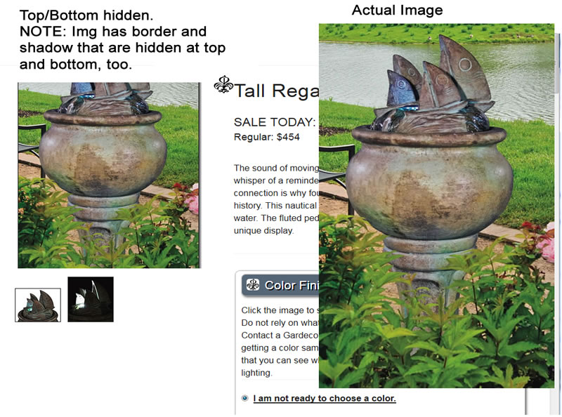
The top and bottom of the image is being hidden - it seems if the image is taller than wide.
I tried @MarkkiPiho' solution which moved the image down so the top can be seen, but it is still hidden at the bottom. And, it doesn't validate because of the "!important" tag.
See attached image of the page (without MarkkiPiho's css) and the actual image ON THE RIGHT.
The cropped image is to the left.
 IamAlta
on 1 Apr 2018
IamAlta
on 1 Apr 2018
Related issues
 aghassemi
·
3Comments
aghassemi
·
3Comments
 gmajoulet
·
3Comments
gmajoulet
·
3Comments
 mkhatib
·
3Comments
mkhatib
·
3Comments
 samanthamorco
·
3Comments
samanthamorco
·
3Comments
 westonruter
·
3Comments
westonruter
·
3Comments