Amp-wp: CTA button is only initially centered, needing re-centering after adding text
Bug Description
Something doesn't seem quite right about the CTA block: the button is apparently aligned to the center only prior to text populating it, meaning that as soon as soon as you supply text the button is off center. It doesn't seem ideal to require the user to manually re-center after supplying text. There may also be issues here with responsiveness.
Also, the URL field needs some border when not focused as right now it is dangling in the phantom zone.
Expected Behaviour
Steps to reproduce
- Go to '...'
- Click on '....'
- Scroll down to '....'
- See error
_Do not alter or remove anything below. The following sections will be managed by moderators only._
Acceptance criteria
- After positioning the CTA in the editor, it should be in the same position in the preview and live mode
- By default, the button should be positioned 5% left as the other blocks.
- The button should look similar in the FE and in the editor, e.g. if it goes over the edge in the editor, then the part over the edge shouldn't be visible in the FE either.
Implementation brief
QA testing instructions
- Add a CTA block
- Add some text inside
- Drag the block to different positions, e.g. left / center / right
- With each position and text verify that the editor view and FE view would look similar.
Demo
Changelog entry
- Improved positioning of CTA blocks in the editor and their layout on the frontend
 westonruter
All 19 comments
The cause for the "bug" is the ability to drag the button: https://github.com/ampproject/amp-wp/issues/2781
It's positioned with absolute and the default value makes it look like it's centered. Perhaps centering the CTA button (or making it look centered) with the default text is not the best idea then?
Maybe just setting the left value to 5% (as in case of other blocks) would be a more clear option.
 miina
on 24 Sep 2019
miina
on 24 Sep 2019
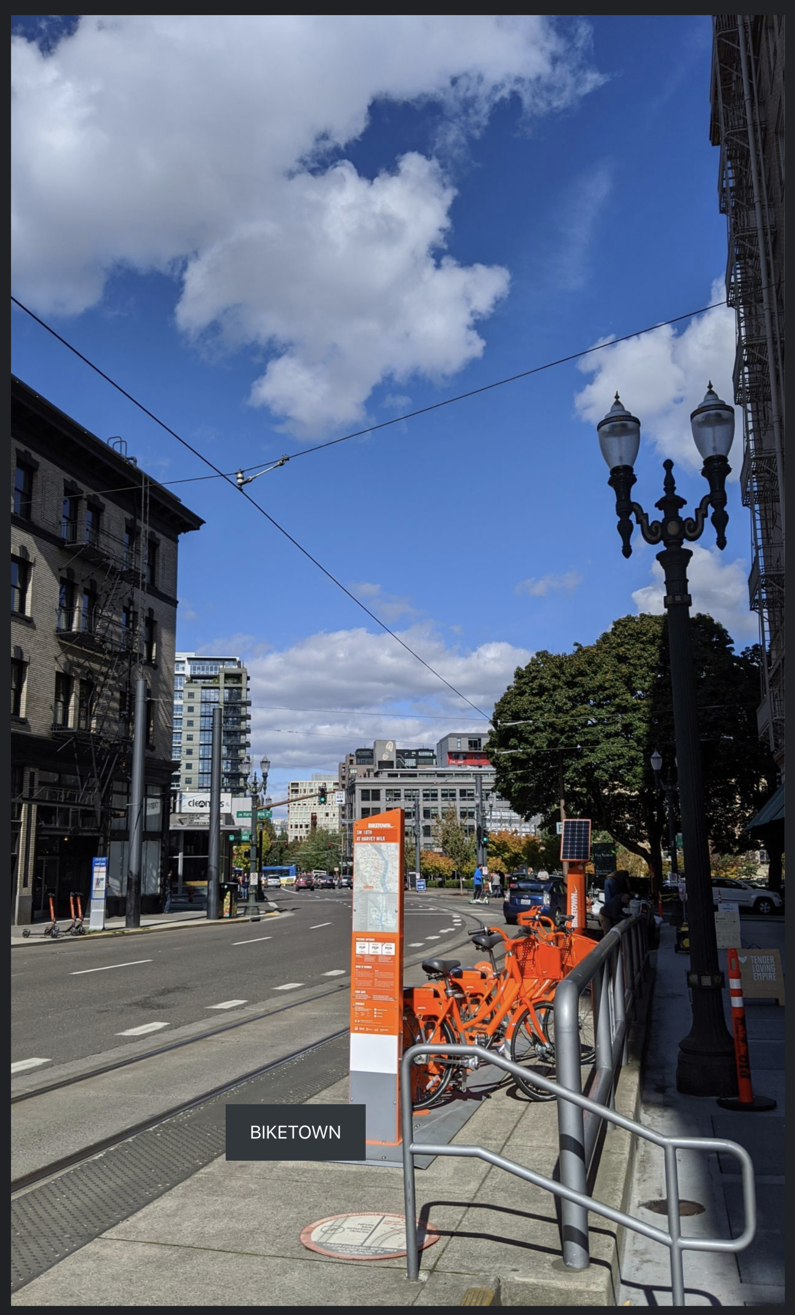
Some more examples of this can be seen in https://story-test-wordpress-amp.pantheonsite.io/stories/today-in-pdx/
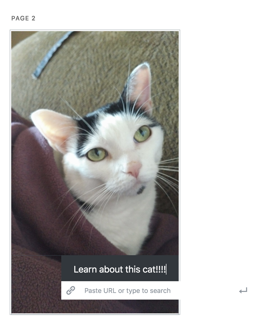
In the editor I thought I centered the CTA button:
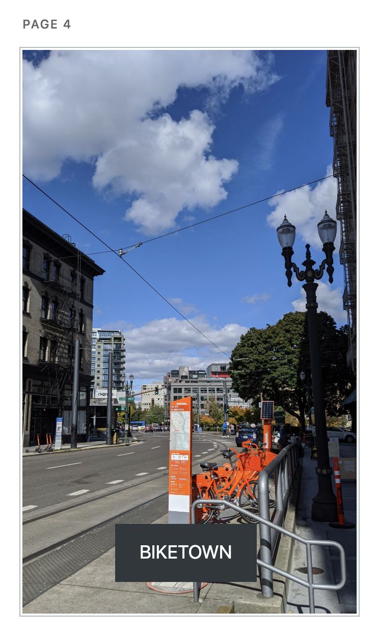
But when viewing the story it's clear I did not:
This is in desktop.
It looks better in Pixel 2 mobile emulation:
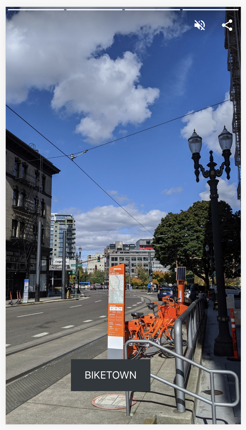
So it seems to be an issue with the responsive positioning.
westonruter
on 30 Sep 2019
Thanks for the additional details, will look into this.
miina
on 1 Oct 2019
Looks like the positioning itself is responsive (e.g. 15% left on both cases), however, since the width of the button depends on the text content only then it doesn't really work like this since the text size isn't responsive. And maybe it shouldn't be, otherwise, the text might look huge in some cases. Although perhaps it would be a case only for landscape?
One option for the landscape could be adding a wrapper around the CTA button which would have a maximum width of a smaller device and thus keeping the positioning base on that, too.
For the smaller devices, we could still try making the font size responsive as well.
Not sure. Thoughts?
cc @swissspidy
miina
on 1 Oct 2019
Summary from discussion with @swissspidy:
- Let's add resizing for the CTA button as well so that it would be responsive.
- Consider font size responsiveness, too.
- Considering landscape mode, let's add maximum width to the CTA block (if it's not ideal for the landscape then we can enhance later in a follow-up issue)
- Replace the CTA button with an inner Button block (cc @spacedmonkey)
miina
on 4 Oct 2019
Perhaps we could do this in two steps. Improve responsiveness first, then switch to an inner blocks implementation with resizing, dragging, etc. We'd probably want to restrict the core/button block usage to the CTA block only.
 swissspidy
on 4 Oct 2019
swissspidy
on 4 Oct 2019
Dragging is already working which kind of creates the responsiveness problem. Being able to resize the button would nicely fix that issue.
It's true that changing it drastically might be out of scope for this bug though.
An alternative could be:
- Calculating the width of the button dynamically in the editor and saving that value. E.g if the button is 65% of the width in the editor, then saving 65% as the width.
- The same for height.
- Both of these without any UI.
- Adding a limiter for landscape.
- Making font size more responsive.
This might be a better first step to avoid deprecation, although, we might need it anyway for the changed width/height values.
Thoughts?
miina
on 4 Oct 2019
Closed within #3453
miina
on 11 Oct 2019
Front-end Preview positioning is off
Editor:
FE:

 csossi
on 17 Oct 2019
csossi
on 17 Oct 2019
@jauyong, as this doesn't have clear AC nor Test Instructions, I feel we're talking about different things. Can you move this back to definition to have it clarified?
 barklund
on 17 Oct 2019
barklund
on 17 Oct 2019
Hey @ThierryA @amedina ,
Per the above, can we discuss this ticket. I'm still trying to figure out the flow / process for this project so let me know how you want to do this e.g. async, setup a meeting, wait for our next grooming...
Thanks.
 jauyong
on 17 Oct 2019
jauyong
on 17 Oct 2019
Hey @jauyong, the best is to ask your question on the ticket mentioning us if it needs our attention. Based on the question, we will be able to answer or point you to the right person. If you are not quite sure when it should be dealt with, feel free to bring it up to @kmyram or in one of the meetings.
 ThierryA
on 17 Oct 2019
ThierryA
on 17 Oct 2019
I think the issue here is that this ticket has been created before we switched processes. Also, it's a bug report for a feature that might not have had a clear AC before.
I'll try to get up to speed here.
swissspidy
on 18 Oct 2019
Thanks @swissspidy . I added a couple AC based on Weston's original comments for now. And again I'm still figuring out the correct process to make things efficient so your guidance is always more than welcome.
jauyong
on 18 Oct 2019
Updated the AC-s based on our sync today, will move this back to In Progress to finish it up.
miina
on 21 Oct 2019
This was discussed again in our new weekly design review. We came back to the idea of automatically centering the CTA block if, and only if, the block hasn't been moved already.
3582 is a good solution in the interim. This proposed new behavior would go into a future release, so I'll create a new issue for it etc.
swissspidy
on 22 Oct 2019
What about a block setting of "Center automatically" instead, to make things more understandable as to why something is happening?
But okay, let's see how the users react to the suggested option.
miina
on 22 Oct 2019
@miina Good idea. We can flesh out details there 👍
swissspidy
on 22 Oct 2019
Verified in QA
csossi
on 22 Oct 2019
Related issues
westonruter
·
32Comments
 postphotos
·
30Comments
postphotos
·
30Comments
 spacedmonkey
·
30Comments
spacedmonkey
·
30Comments
 Ipstenu
·
32Comments
Ipstenu
·
32Comments
 alcurrie
·
29Comments
alcurrie
·
29Comments
Most helpful comment
This was discussed again in our new weekly design review. We came back to the idea of automatically centering the CTA block if, and only if, the block hasn't been moved already.
3582 is a good solution in the interim. This proposed new behavior would go into a future release, so I'll create a new issue for it etc.