Altair: Adding Legend in Selective Lines Chart based on Color and Thickness
Hi,
I have been trying to create Line chart with selectively highlighting few lines. Although I got success in that by using layering but not able to figure out how to plot legend in this case.
Help appreciated !
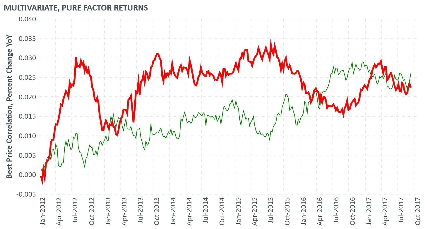
base = alt.Chart(result1,title='Multivariate, pure factor returns'.upper()).encode(
      x=alt.X('date_str:T', scale=alt.Scale(domain=['2011-12-31','2017-10-31']),
      axis=alt.Axis(title=''.upper(),format=("%b-%Y"))),
)

chart=alt.layer(
    base.mark_line(color='blue',strokeWidth=0.5).encode(y='Best Price Correlation'),
    base.mark_line(color='red').encode(y='Percent Change YoY')
)

chart

Format for result1 is as below

And how not to include y axis titles ?
 ashutosh29
All 8 comments
You have wide-form data; in order to create a legend you'll need to convert it to long-form and use a color encoding. See details here: https://altair-viz.github.io/user_guide/data.html#long-form-vs-wide-form-data
 jakevdp
on 4 Apr 2019
jakevdp
on 4 Apr 2019
@ashutosh29
Hi there,
It seems that you are looking to make a line chart with specific colors for each line, and a legend. If that is correct, you may be able to extend from this example:
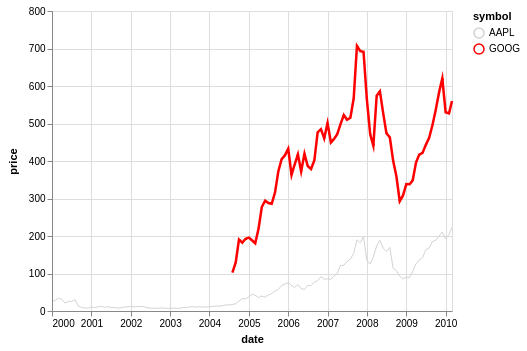
import altair as alt
from vega_datasets import data

source = data.stocks()

alt.Chart(source).mark_line().encode(
    x='date',
    y='price',
    color=alt.Color('symbol', scale=alt.Scale(range=['red', 'lightgray'], domain=['AAPL', 'GOOG']))
)

 Alcampopiano
on 4 Apr 2019
Alcampopiano
on 4 Apr 2019
To remove the y-axis title, use an encoding like this:
y=alt.Y('field name', title=None)
@jakevdp and @Alcampopiano thanks for your prompt response !
I understand that longitudinal data format should be used.
Still, how to assign desired line thickness to a particular line among all selectively.
I have seen one example here
https://altair-viz.github.io/gallery/multiline_highlight.html
But this is interactive.
I would like something like below with _legend(that could be solved with Longitudinal format)_ & _selective colors (as mentioned in @Alcampopiano comment)_ but still how to assign selective thickness:
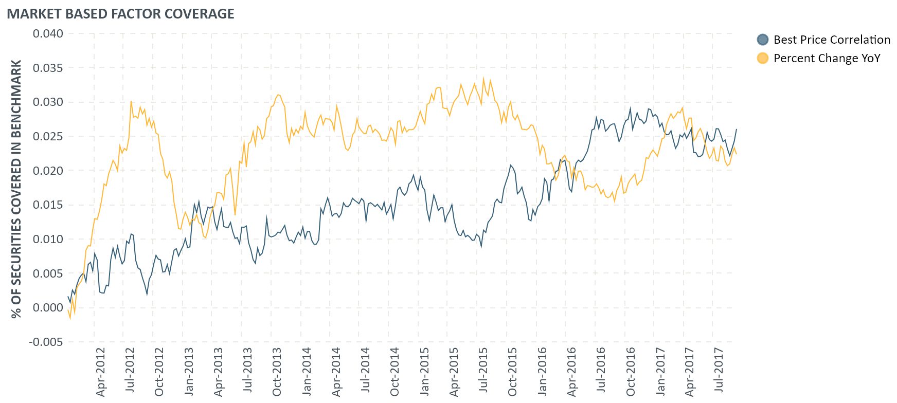
As above steps, mentioned by @jakevdp & @Alcampopiano , give below but same thickness to every line
ashutosh29
on 5 Apr 2019
Here is one idea that makes use of the size encoding channel.
import altair as alt
from vega_datasets import data
source = data.stocks()
alt.Chart(source).mark_line().encode(
x='date',
y='price',
size=alt.Size('symbol', legend=None),
color=alt.Color('symbol', scale=alt.Scale(range=['lightgray', 'red'], domain=['AAPL', 'GOOG']))
)
Alcampopiano
on 5 Apr 2019
Wondeful, thanks a lot !
ashutosh29
on 5 Apr 2019
@ashutosh29
Hi there,
It seems that you are looking to make a line chart with specific colors for each line, and a legend. If that is correct, you may be able to extend from this example:
import altair as alt
from vega_datasets import data

source = data.stocks()

alt.Chart(source).mark_line().encode(
    x='date',
    y='price',
    color=alt.Color('symbol', scale=alt.Scale(range=['red', 'lightgray'], domain=['AAPL', 'GOOG']))
)
I spent quite a while looking for a way to define colors explicitly for values to be presented.
In the case above selecting 'AAPL' to be 'red' and 'GOOG' to be 'lightgray'. Seems pretty basic but took me a while to track down. Thanks so much!
Is this somewhere in the docs / SO that I happened to miss?
 baereilon
on 7 Jun 2020
baereilon
on 7 Jun 2020
Is this somewhere in the docs / SO that I happened to miss?
Custom color scales are documented here: https://altair-viz.github.io/user_guide/customization.html#color-domain-and-range
jakevdp
on 7 Jun 2020
Related issues
 hugo-pires
·
19Comments
hugo-pires
·
19Comments
 mroswell
·
54Comments
mroswell
·
54Comments
 lzamparo
·
39Comments
lzamparo
·
39Comments
 XaviFar
·
19Comments
XaviFar
·
19Comments
 choldgraf
·
20Comments
choldgraf
·
20Comments
Most helpful comment
@ashutosh29
Hi there,
It seems that you are looking to make a line chart with specific colors for each line, and a legend. If that is correct, you may be able to extend from this example: