Altair: Grouped bar chart: Remove X values for which Y values are null
Hi,
In a grouped bar chart, is it possible to remove X values for which there are no Y values in a certain group?
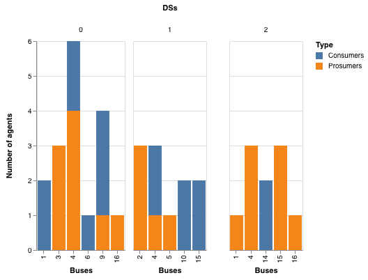
I am plotting the number of prosumers and consumers on different buses in three different distribution systems. Each distribution system (a group on a bar chart) has different buses, and I don't want to show the ones that are not there. Is there a property that would allow me to mask the X values for which Y is 0 or Null/NaN? ..or should I use a completely different plotting?
I have a very basic chart code:
alt.Chart(merged_df).mark_bar().encode(

y=alt.Y('Number of agents:Q'),

x=alt.X('Buses:N'),

column=alt.Column('DSs:N') ,

color=alt.Color('Type:N'))

Thanks!
 selmaca
All 6 comments
You can do this by using a facet chart (rather than a facet encoding) and setting the x-scales to independent:
alt.Chart(merged_df).mark_bar().encode(
y=alt.Y('Number of agents:Q'),
x=alt.X('Buses:N'),
color=alt.Color('Type:N'),
).facet(
column=alt.Column('DSs:N'),
).resolve_scale(
x='independent'
)
 jakevdp
on 22 Nov 2018
jakevdp
on 22 Nov 2018
Hi Jake,
Thanks, but that code gives me exactly the same chart as in the original post.
Any idea why setting x='independent' seems to do nothing?
selmaca
on 26 Nov 2018
If you could include a reproducible example of what you tried, I may be able to answer your question. Otherwise, it's just guesswork :smile:
jakevdp
on 26 Nov 2018
Here is what I tried. As you can see, empty columns in each chart are hidden:
import altair as alt
import numpy as np
import pandas as pd

np.random.seed(0)

merged_df = pd.DataFrame({
    'Number of agents': np.random.randint(1, 4, 20),
    'Buses': np.random.randint(1, 17, 20),
    'DSs': np.random.randint(0, 3, 20),
    'Type': np.random.choice(['Consumers', 'Prosumers'], 20)
})

alt.Chart(merged_df).mark_bar().encode(
  y=alt.Y('Number of agents:Q'),
  x=alt.X('Buses:O'),
  color=alt.Color('Type:N'),
).facet(
  column=alt.Column('DSs:N'),
).resolve_scale(
  x='independent'
)
jakevdp
on 26 Nov 2018
Hi Jake,
Sorry! I just made a test dataframe with the same data and it worked perfectly!
I realized that the masking of the original dataframe was not working properly, but now, everything is fixed.
thanks for the help!
selmaca
on 27 Nov 2018
Great!
jakevdp
on 27 Nov 2018
Related issues
 DentonGentry
·
3Comments
DentonGentry
·
3Comments
 pabloinsente
·
3Comments
pabloinsente
·
3Comments
 nielsmde
·
4Comments
nielsmde
·
4Comments
 galloramiro
·
3Comments
galloramiro
·
3Comments
 firasm
·
3Comments
firasm
·
3Comments
Most helpful comment
Here is what I tried. As you can see, empty columns in each chart are hidden: