Almanac.httparchive.org: Improve dropdown button focus state
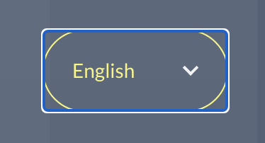
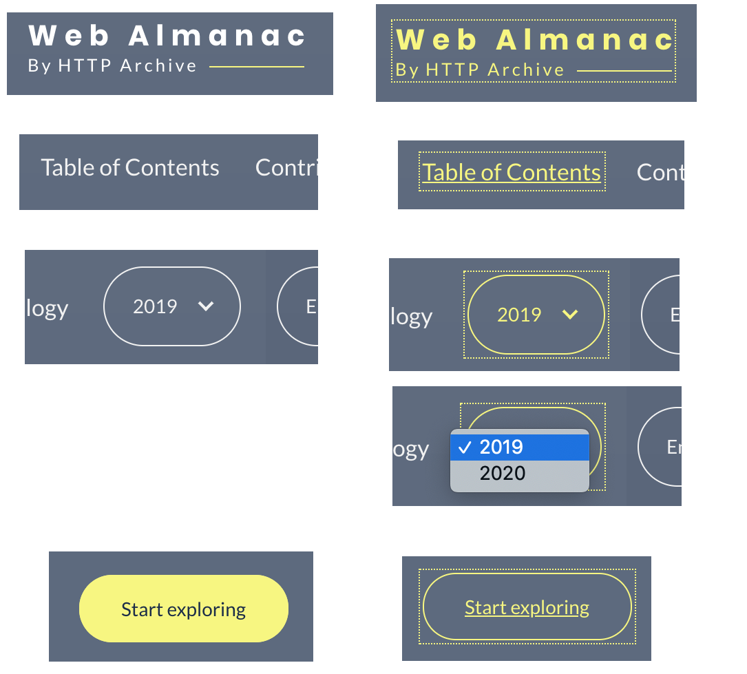
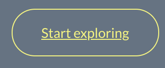
When the language switcher is focused, the border and text turn yellow, and there is also a blue/white outline:
As long as the element changes appearance to yellow when focused, I don't think we need the outline.
One other minor style improvement might be to also change the dropdown arrow to yellow when focused. Playing with this in devtools, I'm not sure how easy this is given that the arrow is styled as an ::after pseudo-element on the dropdown's parent element. Open to ideas.
cc @HTTPArchive/developers
 rviscomi
All 19 comments
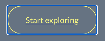
When the language switcher is focused, the border and text turn yellow, and there is also a blue/white outline:
As long as the element changes appearance to yellow when focused, I don't think we need the outline.
Hmmm... this is a Chrome specific thing (I believe they changed it recently). If you look at Firefox and Safari, they don't do this (though neither has been good with focus states IMHO!). I weary to change focus states as presume Chrome knows better than us, and this recent change has gone down well in accessibility community.
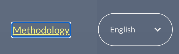
It's also a bigger issue than just the select:
I presume the square, rather than rounded corners is what's making it especially jarring for you on the select? Unfortunately there's no way of changing that at present without removing or re-implementing the whole focus state manually - which would look odd in non-Chrome browsers with different focus styling.
One other minor style improvement might be to also change the dropdown arrow to yellow when focused. Playing with this in devtools, I'm not sure how easy this is given that the arrow is styled as an
::afterpseudo-element on the dropdown's parent element. Open to ideas.
Very easy, by changing this:
.language-switcher:hover,
.year-switcher:hover {
  color: #F7F779;
}
to this:
.language-switcher:hover,
.year-switcher:hover,
.language-switcher::after:hover,
.year-switcher::after:hover {
  color: #F7F779;
}
Will include in pull request for #815 if not one else has tackled before then.
 bazzadp
on 22 Jun 2020
bazzadp
on 22 Jun 2020
Indeed, the focus outline styles changed with the latest Chrome. Usually, as you already know, we can remove the default focus styles only when we provide an alternative.
AFAIK, right now we're not using a different :focus style, so I wouldn't remove the defaults yet.
The native select is wrapped within another elem .language-switcher in order to be able to use that pseudo-element as a dropdown arrow. I did use :focus-within as a progressive enhancement to replicate the focus style on the native select element.
Besides toggling :focus explicitly on the select in DevTools' "Force element state", I wasn't able to replicate the "white dropdown arrow" when focusing on this custom select, neither with the Tab key nor with the mouse. Can you give more details on how you encountered this behavior?
 catalinred
on 22 Jun 2020
catalinred
on 22 Jun 2020
Yeah I can't repeat it now either on production. But am sure I could earlier.... Odd. Either that or my eyes were playing tricks on me!
bazzadp
on 22 Jun 2020
I think the fix for this is:
.language-switcher:focus-within,
.year-switcher:focus-within,
.language-switcher select:focus,
.year-switcher select:focus {
  border-color: #f7f779;
  color: #f7f779;
  outline: none;
}
Where the outline is disabled entirely. I think the border color change is sufficient.
rviscomi
on 12 Jul 2020
I think that's a fine change for those using the mouse, but less than ideal for keyboard users as when you tab into it as its very subtle change and, given our colour-scheme, it doesn't really differentiate the focused item unless you happen to notice it change.
And when you compare keyboard focus for the logo:

Other text:

And the buttons:
All follow the same convention so with this change, the selects now look out of place with your suggested change.
You could make the focus style more obvious (e.g. blue colour), but with different browsers doing different things, it's going to be a tough call (impossible?) to not make it look consistent.
I'm guessing your main issue with this is that you see it on mouse click as well, whereas the other states you don't see this focus state on the other items as once you click on something, you navigate away? Personally it doesn't bother me - my focus (pardon the pun!) is on the drop down contents at that point.
Only doing your solution on :hover mostly solves your problem for mouse without ruining the keyboard experience:
.language-switcher:focus-within,
.year-switcher:focus-within,
.language-switcher select:focus,
.year-switcher select:focus {
  border-color: #f7f779;
  color: #f7f779;
}

.language-switcher select:hover,
.year-switcher select:hover {
  outline: none;
}
Now you only see the ugly blue thing if you open the menu, then click away without selecting an item. Not ideal but should address the majority of use cases.
However I presume it only works on desktop and this is also an issue on mobile Chrome? Don't have an Android phone to test but guessing would still be an issue there?
Which brings me to my next point - Safari does this properly:
And the reason that Chrome doesn't is due to this very old bug: https://bugs.chromium.org/p/chromium/issues/detail?id=81556. Guessing that won't be solved any time soon given it was opening 9 years ago, unless the recent focus change upsets more people like it seems to with you and that forces Chrome into action.
So, in summary, I don't think we should change this to be honest. But I certainly won't stop you submitting your fix if it really is upsetting you - been there and can understand! I just think it's better for accessibility to leave as is, and not seeing the big deal with it at present to be honest.
bazzadp
on 12 Jul 2020
By complete coincidence I just came across :focus-visible tonight, which is another way to solve this: https://css-tricks.com/almanac/selectors/f/focus-visible/
Unfortunately not available in Chrome yet, but there has been recent activity on it: https://bugs.chromium.org/p/chromium/issues/detail?id=817199
bazzadp
on 13 Jul 2020
All follow the same convention so with this change, the selects now look out of place with your suggested change.
That's true. I would suggest removing the outline from all of them. Outline is the default UA styling in the absence of any other custom styles, but since we do specify focus states for all of our UI I think it's redundant, and worse, clashing with our design visually.
its very subtle change and, given our colour-scheme, it doesn't really differentiate the focused item unless you happen to notice it change.
IMO white-to-yellow is sufficiently noticeable. If more differentiation is needed, I'd be supportive of exploring new options that fit in with our design. The default blue/white outline that we currently have is quite harsh in the context of the rest of our styles.
rviscomi
on 13 Jul 2020
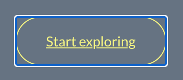
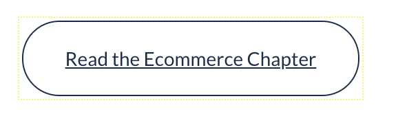
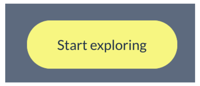
I'd rather explore other options. The focus ring isn't just about changing the color when you move, but also clearer differentiating it from other items. Color alone doesn't do that for us as, without the focus-ring, the focus-ed year select looks the same as the Start Exploring button.
What do you think about just making it a yellow focus ring?
:focus {
  outline: #f7f779 dotted 1px;
  outline-offset: 2px;
}
bazzadp
on 13 Jul 2020
Released some versions to allow us to test:
- Current production - blue ring on focus
- Test Version 1 - removes focus ring entirely from header, footer and buttons
- Test Version 2 - leaves focus ring but makes it dotted yellow
bazzadp
on 14 Jul 2020
As long as the element changes appearance to yellow when focused, I don't think we need the outline.
I would fail this under WCAG SC 1.4.1 Use of Color, as color alone is not enough to indicate state change. A good alternative to this would be to more obviously adjust the visual presentation. Inverting the hollow treatment to be filled might be a good approach.
I would also advise not removing default focus indicators unless the focus state is heavily apparent. Thin dotted outlines are oftentimes not sufficient for low vision users.
 ericwbailey
on 14 Jul 2020
ericwbailey
on 14 Jul 2020
Yeah that was my concern. Though do get the concern around the blue focus ring in Chrome not being a great fit for our brand colours, so I was OK with changing it to yellow. Could go with either solid and/or increase the width of the outline to address any concerns with that if being too easily missed.
However, I've also spotted it's very faint on white backgrounds:
this is why sticking with tried and tested browser defaults are a good thing! 😀
Inverting the hollow treatment to be filled might be a good approach.
Can you explain what you mean by this? We invert the colours on the "Start Exploring" button on the home page on focus for example, but not on the select drop downs. However when tabbing to the controls if they are off-screen, you miss this colour change. Try it by tabbing through the home page now.
bazzadp
on 14 Jul 2020
Sure thing. I think this treatment would be effective:
I think the treatment would be applicable for select drop-downs as well, in that you're visually indicating that the control has received focus and the down-facing chevron indicates the presence of dropdown functionality. There'd also be a nice little nod for cognitive accessibility concerns, in that the focus state would be more internally consistent for interactive elements.
ericwbailey
on 14 Jul 2020
Sorry still confused.
So on the site at the moment we have:
Unfocused:
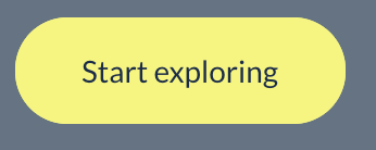
Hover:
Tab-focused:
So we already have what you are suggesting? Though admittedly don't have this as strongly in the Year and Language selectors where we only change the border colour so should definitely do something there if removing the focus ring.
Anyway, that is why @rviscomi is advocating dropping the blue ring - as we already have a visual indicator (and strong one for button, though weaker one for selects). Though I'm less convinced because, as I say, if you start in header, then tab to this button it's off screen initially so you don't see the change in colour. So think we need a focus ring as well.
bazzadp
on 14 Jul 2020
Also we alternate the colours, which is potentially a little confusing. So next button is this:
Unfocused:
Hover:
Tab focused:
bazzadp
on 14 Jul 2020
@bazzadp pardon the D&D terminology, but this kind of gets into a RAW (rules as written) vs RAI (Rules as intended) debate, and I'm personally a Rules as Intended person.
The reason the focus ring is important, is it makes it much easier to navigate a site using ONLY the keyboard... which is the experience most a11y devices end up emulating. So as long as when you tab through the site and can clearly see where you are each step of the way, that's what matters.
 obto
on 14 Jul 2020
obto
on 14 Jul 2020
Yes I totally agree that is what we are all aiming for. However, we're in some dispute as to whether the removing the focus ring still allows you to "clearly see where you are each step of the way" so asking for others expert opinion here. My vote is to keep it.
bazzadp
on 14 Jul 2020
+1 to keeping it.
ericwbailey
on 15 Jul 2020
+1. It may not look the prettiest, but it does help make it a bit more obvious where you are.
obto
on 15 Jul 2020
This was fixed with #1214 by using focus-visible - now only get focus ring on keyboard navigation and not on click.
Currently available in Chrome Canary and coming to a Chrome stable in October. Firefox has it with prefix (that we don't support) and Igalia are crowdfunding for Safari.
bazzadp
on 21 Sep 2020
Related issues
rviscomi
·
3Comments
rviscomi
·
5Comments
rviscomi
·
5Comments
rviscomi
·
5Comments
rviscomi
·
5Comments
Most helpful comment
+1 to keeping it.