Addons-frontend: Collections edit buttons style inconsistencies
On the edit collections page the buttons sometimes have outline and a blue focus style - not sure if this means this isn't using a shared button component since buttons elsewhere don't have both.
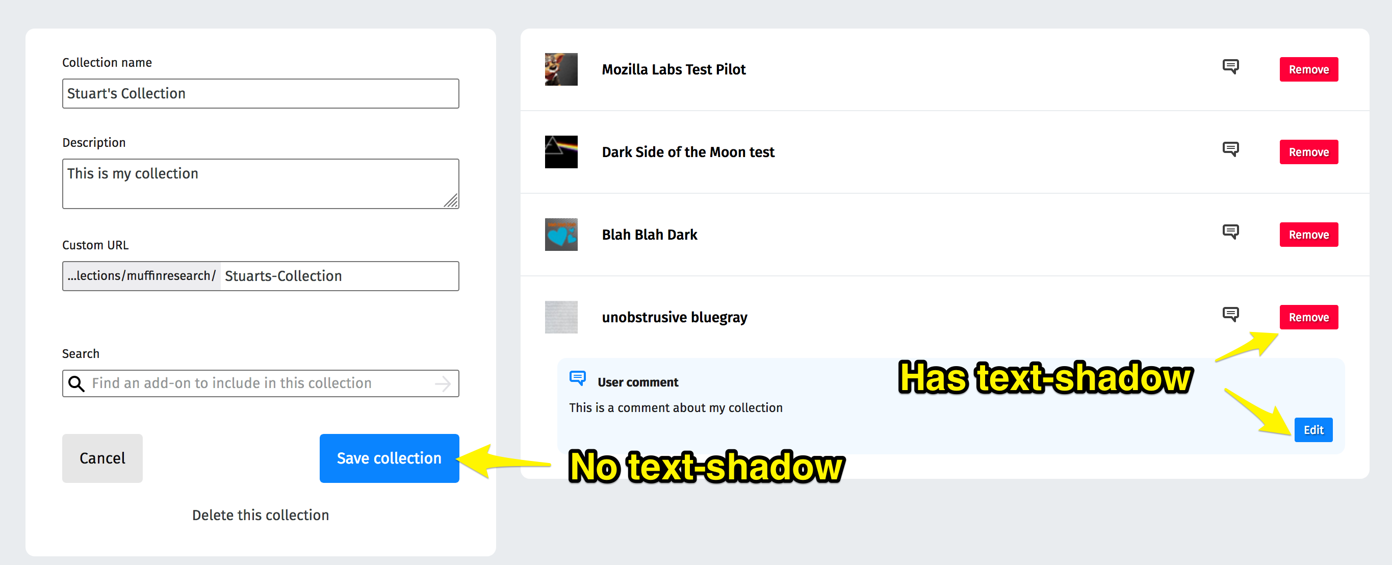
There's also an inconsistency with text-shadow being used in some places and not in others. I would have thought they should be consistent.
 muffinresearch
All 8 comments
Hi, I'd like to take up the issue.
 arnavvats
on 8 May 2019
arnavvats
on 8 May 2019
@arnavvats go for it!
 willdurand
on 8 May 2019
willdurand
on 8 May 2019
Mentor: @willdurand
 jvillalobos
on 15 May 2019
jvillalobos
on 15 May 2019
Hey @arnavvats, how's it going with this?
 caitmuenster
on 29 May 2019
caitmuenster
on 29 May 2019
Hey @willdurand. Can I take it up, since @arnavvats isn't active?
 PunitGr
on 2 Jun 2019
PunitGr
on 2 Jun 2019
@willdurand Hey, I've opened a PR. Please take a look at it.
Also, I wasn't able to reproduce the issue with buttons outline. The UI has also changed w.r.t to the screenshot provided above.
Please let me know if it required any more changes.
Cheers
PunitGr
on 3 Jun 2019
There's also an inconsistency with text-shadow being used in some places and not in others.
This was done on purpose for accessibility. Please make sure we are following these guidelines to ensure usability of the micro buttons when the text shadow gets removed: https://github.com/FirefoxUX/photon/issues/264#issuecomment-364927535
 kumar303
on 3 Jun 2019
kumar303
on 3 Jun 2019
@willdurand I verified this on AMO dev - FF67 (Win10)
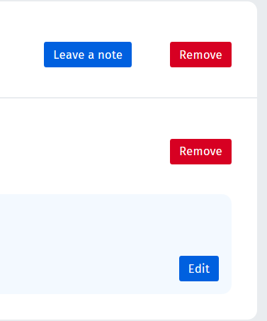
That's how it appeared before

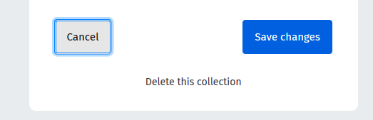
The text-shadow has been removed
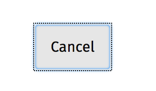
@muffinresearch I could not reproduce the outline +blue focus style issue for the "Cancel" button either on Win10, I used the Tab key for navigation.
 ioanarusiczki
on 5 Jun 2019
ioanarusiczki
on 5 Jun 2019
Related issues
 AlexandraMoga
·
5Comments
AlexandraMoga
·
5Comments
 SeanPrashad
·
6Comments
SeanPrashad
·
6Comments
 ValentinaPC
·
4Comments
ioanarusiczki
·
5Comments
ioanarusiczki
·
3Comments
ValentinaPC
·
4Comments
ioanarusiczki
·
5Comments
ioanarusiczki
·
3Comments