Addons-frontend: Change install switch to install button on AMO
According to our user research the install switch performs very poorly so we should disable it and use the fallback InstallButton everywhere on AMO for now. In the future we'll want to improve the button, but switching to it for MVP.
 tofumatt
All 7 comments
To be clear to QA/others:
- this will prevent the ability to uninstall an add-on from the page
- this will not show if an add-on is installed
- this will allow clicking on the "Add to Firefox" button on an add-on already installed
These issues will be addressed in the future.
tofumatt
on 18 Oct 2017
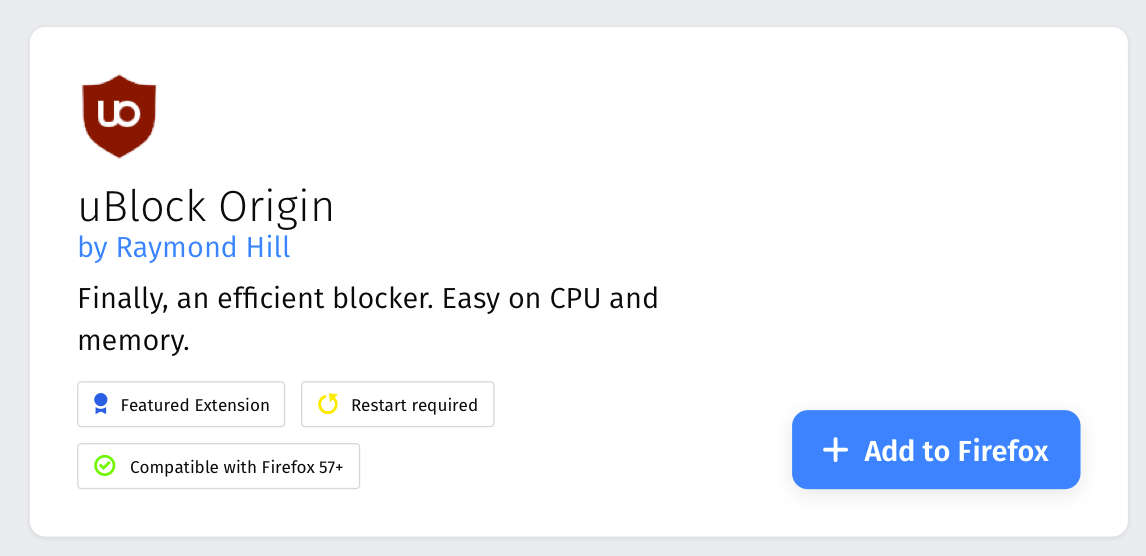
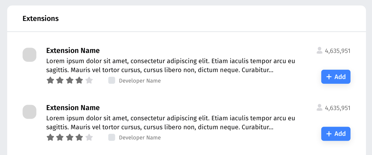
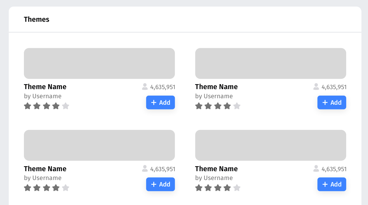
Examples:
 pwalm
on 18 Oct 2017
pwalm
on 18 Oct 2017
After talk with tofumatt on IRC, I will mark this as verified since the install switch is not present anymore. The rest of things described in the attached screenshots will be implemented later in another issues :

 vcarciu
on 19 Oct 2017
vcarciu
on 19 Oct 2017
Mocks for the buttons:
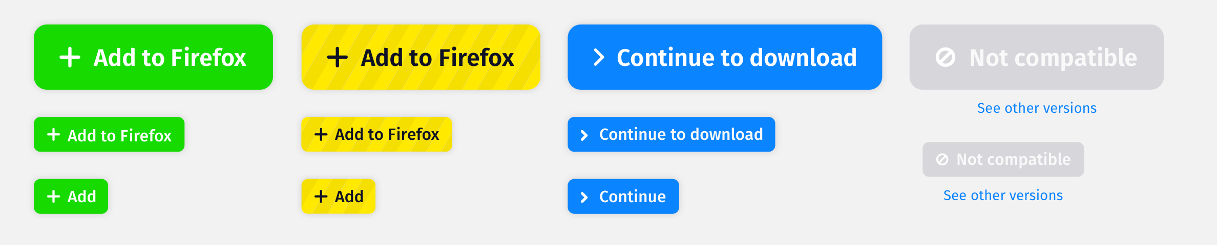
Can we get these implemented asap? I will provide proper specs. Oh, the green button might change to blue.
pwalm
on 21 Oct 2017
… the green button might change to blue.
If it will remain green, then black text might be better. (The white on green of e.g. a 'Comment' button in GitHub is OK, partly because the text is heavier and the green is darker. The green in the mock-up is relatively pale.)
FWIW I do prefer a green, to a blue, for addition.
In the fourth column of the mock-up: the white on pale grey is probably not good for accessibility.
 grahamperrin
on 26 Oct 2017
grahamperrin
on 26 Oct 2017
@pwalm could you file a separate issue for https://github.com/mozilla/addons-frontend/issues/3557#issuecomment-338340569 ?
 kumar303
on 26 Oct 2017
kumar303
on 26 Oct 2017
@kumar303 Yep, absolutely (with greater detail)
pwalm
on 27 Oct 2017
Related issues
 ioanarusiczki
·
5Comments
ioanarusiczki
·
5Comments
 AlexandraMoga
·
5Comments
AlexandraMoga
·
5Comments
 bobsilverberg
·
4Comments
ioanarusiczki
·
5Comments
ioanarusiczki
·
5Comments
bobsilverberg
·
4Comments
ioanarusiczki
·
5Comments
ioanarusiczki
·
5Comments