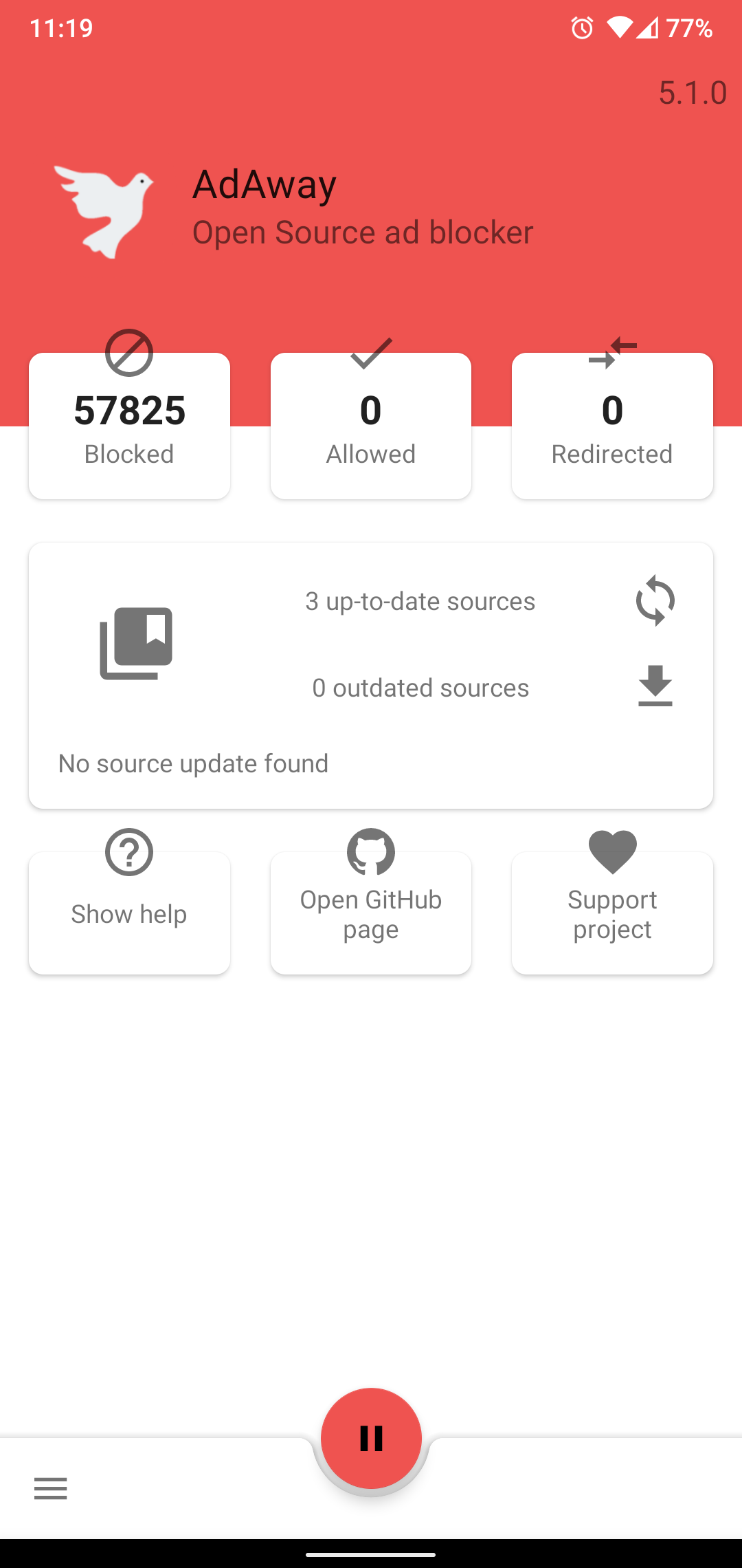
Icons breaking out of cards, they should not be doing that. Cards are meant to contain other views. Not have said view leaking out. This gets worse with the color differences, making the icons hard to look at.
Text for up-to-date / out-of-date sources are not aligned in a specific direction.
 Doomsdayrs
All 17 comments
It gets worse with the up-to-date status because the "No source update found" is left aligned, unlike the text in the middle
Doomsdayrs
on 15 Nov 2020
The new UI is weird and useless :(


 andreymal
on 16 Nov 2020
andreymal
on 16 Nov 2020
UI feels like it is on a RC, not a proper release
Doomsdayrs
on 16 Nov 2020
The button for update/download should be one large, red, button like it was before. This is the main function of Adaway, and as such should be easy use and find visually. The gray makes it seem inactive, kind of like a styling element similar to the box icons above for Blocked/Allowed/Redirected. Had me a bit confused
I can also confirm the issues with the welcome screen shown above (using Xiaomi Redmi 4X, LineageOS 16)
 chk1
on 19 Nov 2020
chk1
on 19 Nov 2020
UI feels like it is on a RC, not a proper release
Where were you during the last year and half during the RC?
The new UI is weird and useless :(
Thanks, stay on V4.
The button for update/download should be one large, red, button like it was before. This is the main function of Adaway, and as such should be easy use and find visually. The gray makes it seem inactive, kind of like a styling element similar to the box icons above for Blocked/Allowed/Redirected. Had me a bit confused
Most of the time, the application will automatically update the hosts file in background for you.
It will always be more efficient if the app does it by itself rather than encouraging the user to press the download button. That is why the button is not promoted.
Could you at least give the language which cause the issues and the dpi and font settings you use?
 PerfectSlayer
on 19 Nov 2020
PerfectSlayer
on 19 Nov 2020
Where were you during the last year and half during the RC?
A year and a half and no one fixed such a glaring issue?
Doomsdayrs
on 19 Nov 2020
It will always be more efficient if the app does it by itself rather than encouraging the user to press the download button. That is why the button is not promoted.
I agree that makes sense. Could you maybe highlight the corresponding button(s) if an update was found or downloaded (or if the user is entering the app from the notification)? Like a guideline, "here's what you tap on next to complete the update"
Could you at least give the language which cause the issues and the dpi and font settings you use?
I'm using the German locale, according to gsmarea the Redmi 4X has "720 x 1280 pixels, 16:9 ratio (~294 ppi density)" (I don't know what that translates to for app development)
Screenshots of the welcome screen:
https://user-images.githubusercontent.com/828496/99707106-4cff5a00-2a9c-11eb-9d31-aa2c6e8d6c40.png
https://user-images.githubusercontent.com/828496/99707109-4d97f080-2a9c-11eb-856d-7eb3effae46f.png
https://user-images.githubusercontent.com/828496/99707111-4e308700-2a9c-11eb-983a-c2cfbc8f3ed6.png
chk1
on 19 Nov 2020
A year and a half and no one fixed such a glaring issue?
Help yourself... https://github.com/AdAway/AdAway/blob/master/CONTRIBUTING.md
I agree that makes sense. Could you maybe highlight the corresponding button(s) if an update was found or downloaded (or if the user is entering the app from the notification)? Like a guideline, "here's what you tap on next to complete the update"
That's an interesting idea! I will have a look at it. Changing the tint or alpha could give a good result.
I'm using the German locale, according to gsmarea the Redmi 4X has "720 x 1280 pixels, 16:9 ratio (~294 ppi density)" (I don't know what that translates to for app development)
That's enough, I am able to reproduce this settings in the emulator to reproduce the issue. Layout is not my strong skill so it will take times.. I already spend 2h without any progress 😓
PerfectSlayer
on 21 Nov 2020
Two more hours of work and I am having a hell of trouble to get everything working.
Cards does have the same size, nothing aligned, it's a nightmare. I really need some help here... 😭
By the way, it's a duplicate of #2078
PerfectSlayer
on 22 Nov 2020
I went for help on Twitter but I got no luck. I added 4 more hours to finally get some progress.
I encourage you to test it to check if it works well for you.
Just backup your settings from preferences then uninstall the ap and clear data and finally test a dev build from CI.
PerfectSlayer
on 23 Nov 2020
Here is the link of the APK coming from the commit build: https://github.com/AdAway/AdAway/suites/1546192693/artifacts/27574204
Please note it is not signed 😉
PerfectSlayer
on 23 Nov 2020
I signed the build and tried it out, this looks a lot better 😃
There are still some quirks in the welcome screen (root vs. vpn-based cards cut off on bottom, heart on donate screen cut off at the top), but I saw your posts about layout problems, unfortunately I'm not familiar with layouting on Android myself and no big help :(
chk1
on 23 Nov 2020
root vs. vpn-based cards cut off on bottom, heart on donate screen cut off at the top
Feel free to post screenshots, I didn't get those issue with the UI emulator ^^'
PerfectSlayer
on 23 Nov 2020
Screenshots of dev build:
https://user-images.githubusercontent.com/828496/99978511-52afb500-2da6-11eb-8671-9d817435a2c9.png
https://user-images.githubusercontent.com/828496/99978513-53484b80-2da6-11eb-8720-c1d28c6c7bd5.png
chk1
on 23 Nov 2020
I am trying the new layout validator in order to help me testing the UI.
Sadly, all seems fine:
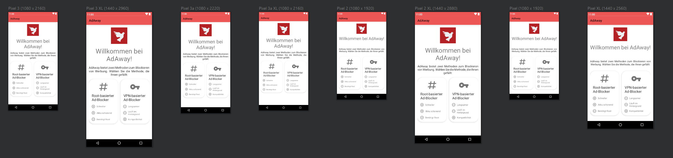
I am wondering if your locale does not try to add too much detail in the translation? I mean, if I keep allowing the font or UI element to be smaller, it wont be accessible to anyone and the UI will loose it semantic (how to structure information according text size and layout).
I am not a German speaker but do you think the German locale string can be shorten to be more simple/direct rather than trying to literally translate the English locale?
PerfectSlayer
on 5 Dec 2020
I think one problem with the layout validator is that it doesn't show the screen as it is on the device, your screens are missing the three dots at the bottom (would likely interfere with at least (from left to right in your screenshot) the Pixel 2, Pixel and Pixel XL)
I configured a 720x1280 device emulator, this is how it looks for me (similar to my real phone):
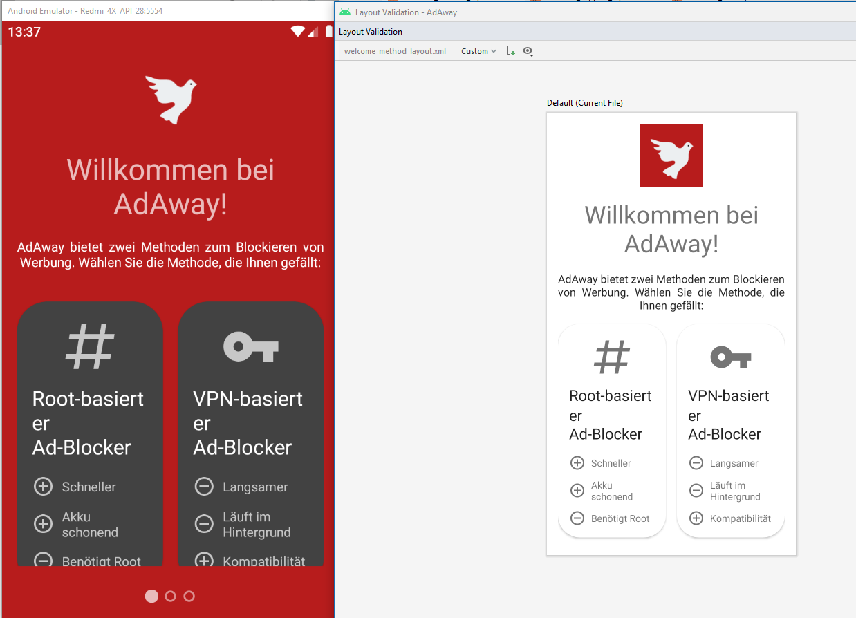
Regarding the German translations, I think these parts (marked green) can be removed as they are redundant
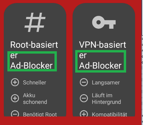
Root-basierter Adblocker -> Root-basiert ("Root based")
VPN-basierter Adblocker -> VPN-basiert ("VPN based")
This should save one line, I don't know how well this works in other languages
I'll have to think about the other screens
chk1
on 5 Dec 2020
I think one problem with the layout validator is that it doesn't show the screen as it is on the device, your screens are missing the three dots at the bottom (would likely interfere with at least (from left to right in your screenshot) the Pixel 2, Pixel and Pixel XL)
The ViewPager2 of the parent layout does not support preview with tools attribute to set the child view... I can't really do better.
You're free to edit the locale file if the text fits better! From source code with a PR or from transifex platform. Whatever is easier for you!
PerfectSlayer
on 5 Dec 2020
Related issues
 Sadi58
·
4Comments
Sadi58
·
4Comments
 dragozo
·
7Comments
dragozo
·
7Comments
 timea-techgirl
·
5Comments
timea-techgirl
·
5Comments
 superlex
·
5Comments
superlex
·
5Comments
 zgfg
·
10Comments
zgfg
·
10Comments
Most helpful comment
Help yourself... https://github.com/AdAway/AdAway/blob/master/CONTRIBUTING.md
That's an interesting idea! I will have a look at it. Changing the tint or alpha could give a good result.
That's enough, I am able to reproduce this settings in the emulator to reproduce the issue. Layout is not my strong skill so it will take times.. I already spend 2h without any progress 😓