Adapt_framework: Framework - Adapt does not trigger device resize on iOS orientation change
Subject of the issue
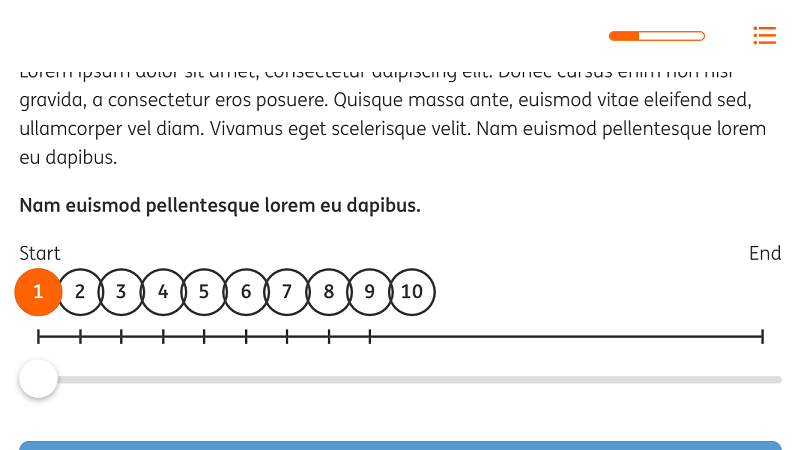
This issue is noticeably present in the Slider plugin if the user views the Slider in portrait mode and then switches to landscape, the numbers bunch up on the left hand side. This doesn't occur if the component is initially viewed in landscape; it appears to be triggered by switching orientation.
Your environment
- v5.3.0 FW, v0.10.3 AT
Expected behaviour
Adapt triggered device resize on iOS orientation change which, in turn, causes the slider numbers and notches to expand to fill the space when the user rotates their device.
 guywillis
All 13 comments
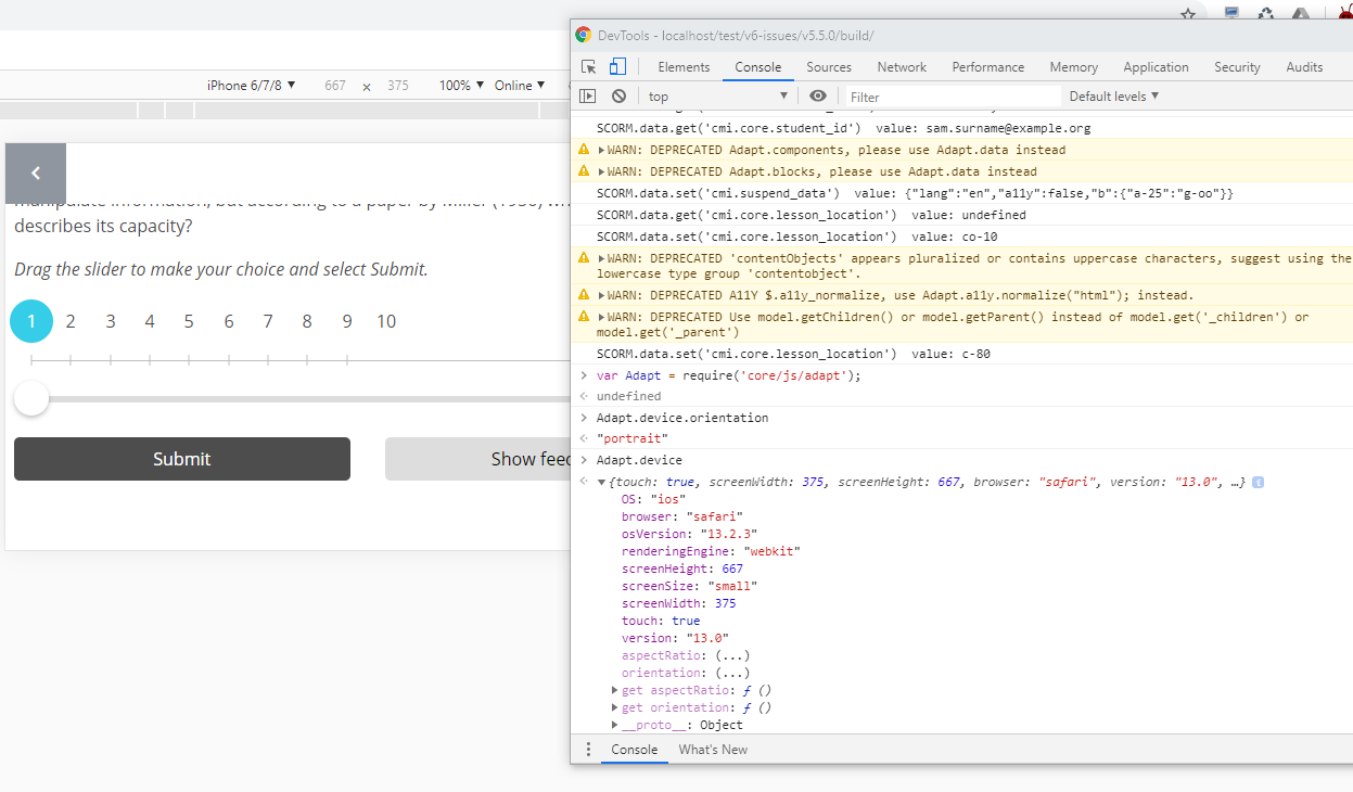
Adapt currently reports normalised widths and heights on iOS, removing the orientation, such that the screen portrait width and height are always reported.
I'm not sure, but I think that code was meant to do the opposite, in that iOS always reported a static width and height based on the portrait screen and that it had to be corrected with the orientation?
Has iOS screen.width and screen.height changed to be orientation aware or has this code always been broken?
https://ryanve.com/lab/dimensions/#device
Device size is static and does not change when the page is resized or rotated
P.S. I don't have an apple device so I'm going to need someone with iOS to help fix this.
 oliverfoster
on 15 May 2020
oliverfoster
on 15 May 2020
Just got here via discovering what (I'm assuming is) the same issue but with the adapt-hide extension
@oliverfoster happy to help with debugging this on iPad - if I can actually persuade my Mac to let me do so...!
Would help to get some pointers as to what to look for (or can screen share Mac via Teams)
 moloko
on 20 Oct 2020
moloko
on 20 Oct 2020
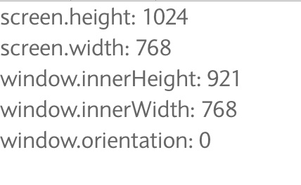
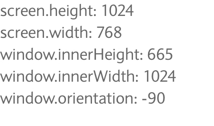
You'll just need to make a small standalone html5 site with our viewport metatag, which reports the values of screen.height, screen.width, window.innerHeight, window.innerWidth and window.orientation, then screen print the results as you rotate the device.
oliverfoster
on 21 Oct 2020
@oliverfoster here you go...
Portrait:
Landscape:
moloko
on 23 Oct 2020
Damn. So that says that the status quo still stands. We need the results of Adapt.device.screenHeight and Adapt.device.screenWidth now. So that code will need to be run inside Adapt.
oliverfoster
on 23 Oct 2020
Yeah no problem!
In landscape orientation I get:
screenHeight: 768
screenWidth: 1024
In portrait, it's:
screenHeight: 1024
screenWidth: 768
moloko
on 23 Oct 2020
I can only think this:
https://stackoverflow.com/a/25322717
And this:
https://stackoverflow.com/a/58974855
Might be worth trying the new mediaMatch function?
oliverfoster
on 23 Oct 2020
I dunno, I have to confess I'm not entirely clear on the specifics of the problem - I can see that screen.height and screen.width are clearly not much use but all the others I've tried appear to be showing changes based on orientation? Maybe one to pick up on the Monday call?
moloko
on 24 Oct 2020
Yup. The code all looks good. So I'm thinking that window.orientation isn't changing fast enough as suggested in that thread and so it's misreporting.
oliverfoster
on 24 Oct 2020
need ios device for this, can someone volunteer please
oliverfoster
on 7 Jun 2021
@oliverfoster we have brought this into our Sprint, I will start working on this soon.
 eleanor-heath
on 9 Jun 2021
eleanor-heath
on 9 Jun 2021
Just in case you need them, there are many different ways to calculate and listen for orientation changes.
window.mediaMatch
screen.orientation
window.addEventListener('deviceorientation')
I'm not sure which is more relevant for iOS these days.
iOS used to have weird behaviour around screen.height and screen.width with regards to screen.orientation where the screen size values wouldn't rotate with the device orientation, they are always portrait, and so the values had to be flipped depending on the screen.orientation value.
oliverfoster
on 9 Jun 2021
This cannot be replicated.
eleanor-heath
on 10 Jun 2021
Related issues
 BillGilmoreLP
·
6Comments
BillGilmoreLP
·
6Comments
 simondate
·
5Comments
simondate
·
5Comments
 canstudios-nicolaw
·
3Comments
canstudios-nicolaw
·
3Comments
 joe-replin
·
5Comments
moloko
·
4Comments
joe-replin
·
5Comments
moloko
·
4Comments