Zola: The feature comparison table should use ✓ and ✗ instead of ✔ and ✕.
Instead of using ✔ (U+2714 : HEAVY CHECK MARK) and ✕ (U+2715 : MULTIPLICATION X) in the feature comparison table we should use ✓ (U+2713 : CHECK MARK) and ✗ (U+2717 : BALLOT X).
This will look better everywhere, and in my tests significantly better for Firefox and Safari.
 bdjnk
bdjnk
All 18 comments
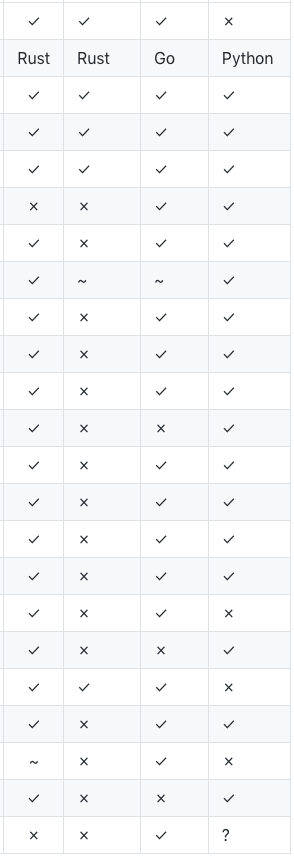
Here's a before (left) and after (right) for Firefox.

bdjnk
on 28 Nov 2018
Could it be your system font?
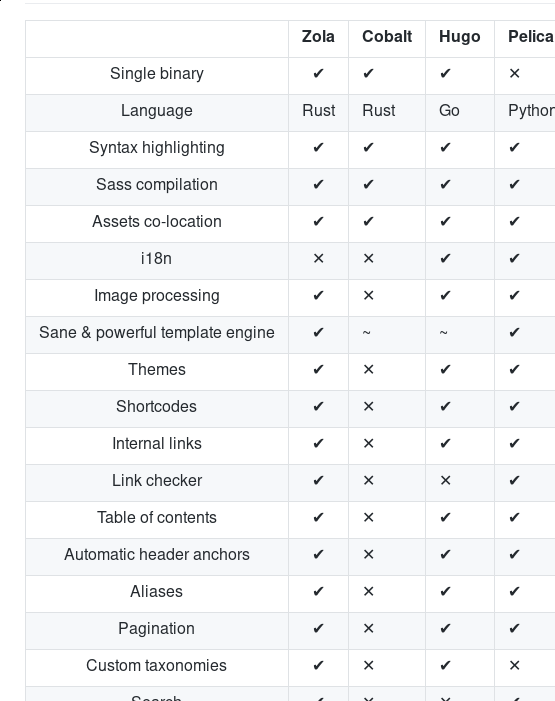
It looks the same on chrome/firefox for me
 Keats
on 28 Nov 2018
Keats
on 28 Nov 2018
FWIW mine looks the same as @bdjnk's example - I'm using MacOS and I don't believe I would have an override font. Mine looks like theirs on Safari, FF Nightly, and Chrome.
 piedoom
on 28 Nov 2018
piedoom
on 28 Nov 2018
Not that I want to encourage a 'Mine looks like $PERSON' thread here, but mine _does_ look like @Keats 's.
Are both of you using macOS? It's possible this is just how macOS renders those icons by default.
That being said, if you want to fix it, and it still looks fine on other platforms, I see no reason why a patch couldn't be submitted. One of the great things about OSS.
 RealOrangeOne
on 28 Nov 2018
RealOrangeOne
on 28 Nov 2018
I'm personally not bothered by it, just thought I'd share in case the information was useful. It's likely just how Macs render.
piedoom
on 28 Nov 2018
Interesting. It must indeed be MacOS, which I have on my work computer. Now that I'm back home on my Linux machine it looks like what you have @Keats. And unfortunately the change makes it slightly worse, causing it to look like this.
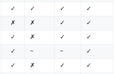
Using ⨯ (U+2A2F : VECTOR OR CROSS PRODUCT) instead looks decent on Linux. I'll take a look tomorrow on MacOS.
bdjnk
on 28 Nov 2018
The x looks a bit bad on Linux yeah :(
Keats
on 29 Nov 2018
Well, ⨯ (U+2A2F : VECTOR OR CROSS PRODUCT) is far too small on MacOS, but ✕ (U+2715 : MULTIPLICATION X) looks good with ✓ (U+2713 : CHECK MARK). And as I recall that combination also looked decent on Linux.
bdjnk
on 29 Nov 2018
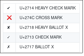
Somehow no one’s mentioned U+274C CROSS MARK, which is semantically the best one to use in conjunction with U+2714 HEAVY CHECK MARK because of emoji.
Here’s the full table of semantically reasonable options:
| ✔ | U+2714 HEAVY CHECK MARK |
| ❌ | U+274C CROSS MARK |
| ✘ | U+2718 HEAVY BALLOT X |
| ✓ | U+2713 CHECK MARK |
| ✗ | U+2717 BALLOT X |
The first two are emoji (Heavy Check Mark, Cross Mark), the rest aren’t. (Everything’s weird; you’d think U+2718 would have been the one to match U+2714, just like U+2717 is U+2713’s match—but no, emoji went and did its own crazy thing.)
On Windows, the first two look ideal as a pair; the check mark is green, the cross is red, they’re the same size, and style, &c. Similar on Google, reasonable on Samsung (a slightly weak, red tick). Apple’s tick is weird, and all the rest are black or muted colours.
At this point I suggest two more alternatives:
<img src="yes.svg" alt="Yes">,<img src="no.svg" alt="No">,<img src="partial.svg" alt="Partial">(decide for yourselves what the images will be).“Yes”, “No”, “Partially”, &c.
I recommend using images with descriptive alt text.
 chris-morgan
on 1 Dec 2018
chris-morgan
on 1 Dec 2018
Yeah I think unicode is not going to work out for all platforms :(
Images are probably the best bet.
Keats
on 1 Dec 2018
Here are three small SVG files that I just wrote:


What do you reckon?
chris-morgan
on 1 Dec 2018
Looks very good to me!
Keats
on 1 Dec 2018
@chris-morgan any chance you can do a PR?
Keats
on 3 Dec 2018
Yep, shall do.
chris-morgan
on 3 Dec 2018
@chris-morgan I know you are working on comparison table improvements. I also created a branch fixing the issue, using octicon (github icon) svgs.
bdjnk
on 6 Jan 2019
I like @bdjnk approach of keeping it in markdown the most, can you do a PR?
Keats
on 17 Jan 2019
There were very good reasons why I went full HTML. For maximum utility, Markdown tables really just don’t work.
chris-morgan
on 18 Jan 2019
@chris-morgan Do you mean having the first column as th?
Keats
on 9 Feb 2019
Related issues
 codesections
·
5Comments
Keats
·
7Comments
codesections
·
5Comments
Keats
·
7Comments
 sternj
·
6Comments
sternj
·
6Comments
 kurji
·
6Comments
kurji
·
6Comments
 svenstaro
·
5Comments
svenstaro
·
5Comments
Most helpful comment
Here are three small SVG files that I just wrote:
What do you reckon?