Zim-desktop-wiki: Request for new icon and offering help
I really enjoy Zim desktop wiki and I would like to help but I'm a designer not a programmer
What if we could have a new icon for Zim desktop wiki? One with less elements in order to improve readability at smaller sizes and as a plus to help recognize the software, be in the that in the system tray, dash, dock etc.
So this is something I could help with.
Here is a first quick draft/concept to start the ball rolling. I just tried to focused on the initial Z (related to typing, typography, etc) together with the idea of connecting the dots (diagrams, links, pages, tags). I tried to upload the svg but it seems GitHub does not allow uploads of that format via issues.

Thanks for all your work!!
 ppsilva
All 7 comments
it would be great to get some feedback and also to know what would be the best way to progress with it. For example should we keep discuss in this thread and iterating from there by adding comments etc or perhaps create a new branch for this? Let me know :)
ppsilva
on 24 May 2019
Thanks for the offer but for the moment I'm happy with the icon that we
have. I'm open to improvements but I would like to stick very close to the
current one.
An other area where as a designer you might have is about is the layout and
styling of the application itself. Since theming in gtk3 is driven by css
it might be feasible to try your hand at pushing the GUI elements.
Regards,
Jaap
Op vr 24 mei 2019 17:19 schreef ppsilva notifications@github.com:
it would be great to get some feedback and also to know what would be the
best way to progress with it. For example should we keep discuss in this
thread and iterating from there by adding comments etc or perhaps create a
new branch for this? Let me know :)—
You are receiving this because you are subscribed to this thread.
Reply to this email directly, view it on GitHub
https://github.com/zim-desktop-wiki/zim-desktop-wiki/issues/855?email_source=notifications&email_token=AAJQYHW37SZOCFPSDCHIYNLPXABQ7A5CNFSM4HPOGX2KYY3PNVWWK3TUL52HS4DFVREXG43VMVBW63LNMVXHJKTDN5WW2ZLOORPWSZGODWFWJ5Y#issuecomment-495674615,
or mute the thread
https://github.com/notifications/unsubscribe-auth/AAJQYHRXNWH3E5QPHUWDM4LPXABQ7ANCNFSM4HPOGX2A
.
 jaap-karssenberg
on 24 May 2019
jaap-karssenberg
on 24 May 2019
sure, I understand. So maybe if I have time I can think about some small tweaks that would improve it while maintaining the overall design.
That would be really interesting :) and I am really comfortable with css. I just never styled a GTK app by myself (meaning I never did the setup, I just worried about css, colors, svgs. etc)
Oh and BTW thanks for all your work :)
ppsilva
on 26 May 2019

here is something we could maybe use at small sizes but yeah I'm not really happy with it :(, but it was what I manage while trying to keep as much as I could from the current icon. I will take a look at how to style GTK apps (setup/build for Zim etc) once I have time. I'll communicate back in a week or two :+1:
ppsilva
on 26 May 2019
While I also think that the current Zim icon could be simplified to look more modern and scalable, improving the layout and styling would be more important. A good starting point could be tweaking the path and bookmarks bar, especially their height in comparison to the sidebar (see content and tags tab), as shown here. The bottom (status?) bar could also be tweaked.
 sojusnik
on 3 Jun 2019
sojusnik
on 3 Jun 2019
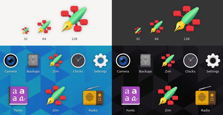
I took a shot at making Zim's icon adhere to the new style of GNOME icons.
 zappedfish
on 3 Nov 2019
zappedfish
on 3 Nov 2019
@zappedfish did you get any feedback from @jaap-karssenberg regarding your design concept? Totally love your icon and would love to see it soon as the default one!
sojusnik
on 1 Feb 2020
Related issues
sojusnik
·
8Comments
 Self-Perfection
·
5Comments
Self-Perfection
·
5Comments
 kbrenneman
·
4Comments
kbrenneman
·
4Comments
 CharlesNepote
·
6Comments
CharlesNepote
·
6Comments
 mehdisadeghi
·
4Comments
mehdisadeghi
·
4Comments
Most helpful comment
I took a shot at making Zim's icon adhere to the new style of GNOME icons.