Zettlr: [ENHANCEMENT] All About the New Icon Set (Bugs, Enhancements, Design Issues)
Bonsoir,
I'll just open one collective issue again for anything that'll likely come up with the next beta so that @Wieke doesn't have to search through the issue list.
Short background:
In issue #719 we had a discussion about new icons, because the current ones — WebHostingHub Glyphs — are certainly not sufficient (+ potentially unmaintained). That's where Wieke stepped in and started a very fruitful discussion that has resulted in us choosing the Clarity Icon Set which was suggested by @mhyfritz. This resulted subsequently in PR #751, which was successfully merged in order to include the icons in the new beta to be released with the 1.7 release.
We decided upon implementing the Icon set with some minor details still unresolved in order to gather feedback by the community and keep this running in parallel with the development of the rest of the app. I'll be releasing the next beta version this evening, and from then on whenever you spot an icon that we forgot to replace, or some other design issues, please drop them in here to keep the issue list clean and, as I mentioned, help each other in order to have a stable and well-looking 1.7 release!
So far from me, I'd like to already thank @Wieke for their engagement and help in this. In total, while being a huge of a workload, I am very happy with how the community is coming closer together in preparation for a — if I may say so — lightyear-leap next release that finally breathes the spirit of a good and healthy community!
 nathanlesage
All 25 comments
Let me start real quick with the minor things I've noticed so far:
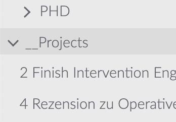
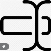
I really like the new chevrons of the file list, but I noticed they're a little bit off. I had the same problem while initially implementing the former icon set because the right and down-chevrons are not monospaced, so a little bit of margin-wizardry is needed to align them in both positions!
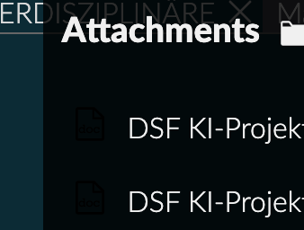
Somehow the new attachment icons are not visible, but this has to do with them not switching alongside the theme (in the light theme they're perfectly visible)
Then: Somehow the background behind the sorting icons is gone, but as is visible here we might want to keep it to make the sorter more visible (I'm not sure however how the corresponding CSS class for the background was called — maybe have a look in the old codebase?)
Besides just two small questions:
- What about the export icon? I personally would think that a box with an upward arrow pointing out of the app would be a better fit, BUT I use macOS so I'm biased to the share-button that iOS and macOS are making use of. So if the current icon fits better for Windows/Linux, disregard this one!
- Concerning the reset icon in the preferences section: I grew accustomed to the "Delete"-icon, albeit I see that semantically the current circular arrow makes much more sense — so keep it?
That's all from me, and thanks again for all the work so far! :)
nathanlesage
on 13 May 2020
Additionally, the console is throwing two errors at startup:
/Applications/Zettlr…il/load-icons.js:23 Uncaught (in promise) TypeError: x.isDirectory is not a function
    at /Applications/Zettlr…il/load-icons.js:23
    at Array.map (<anonymous>)
    at /Applications/Zettlr…il/load-icons.js:22
… and:
Uncaught TypeError: Cannot read property 'replace' of undefined
    at ZettlrAttachments.refresh (/Applications/Zettlr…r-attachments.js:89)
    at ZettlrRenderer.setCurrentDir (/Applications/Zettlr…tlr-renderer.js:620)
    at ZettlrRendererIPC.handleEvent (/Applications/Zettlr…-rendereripc.js:303)
    at ZettlrRendererIPC.dispatch (/Applications/Zettlr…-rendereripc.js:202)
    at EventEmitter.<anonymous> (/Applications/Zettlr…r-rendereripc.js:72)
    at EventEmitter.emit (events.js:210)
    at Object.onMessage (init.ts:50)
@Wieke Concerning the latter error: Apparently sometimes (?) the Icon loader doesn't seem to find the file-ext-icon, as this here seems to return undefined:
clarityIcons.get('file-ext')
I'll try to understand the logic and see what is happening there, but in case you know something, feel free to drop a comment!
nathanlesage
on 14 May 2020
Well file-ext is a custom icon, so if the custom icon loader fails for some reason it's to be expected that clarity can't find it.
I've been able to reproduce the x.isDirectory is not a function problem. For some reason when I run the build version (the appimage in the release folder), not the development version (npm run start), a different version of the filesystem module is being used. Specifically one where the fs.promises.readdir function ignores the withFileType option. And when using that option the function is supposed to return a dirent object (which has functions like isDirectory) rather than a simple string.
Could it be the case that the build version uses an older version of node? The withFileType option was apparently introduced in v10.20.1 (going by the node docs). If this is the cause, and updating the node version used is not feasible, I can always rewrite the loader to not rely on this option.
 Wieke
on 14 May 2020
Wieke
on 14 May 2020
For some reason when I run the build version (the appimage in the release folder), not the development version (npm run start), a different version of the filesystem module is being used.
What the …? o.O
Could it be the case that the build version uses an older version of node?
Good question. Normally, both dev and build should use the same electron version, and having the same electron version (i.e. the one specified in package.json) should also include always the same v8, chrome and node-versions, as they're baked into the same binary. But luckily we can double check that: The About-dialog now spits out those version numbers, so you can cross-check.
My version directly taken off the dev-branch is using Node.js v12.13.0. And so should normally the built installers (as building the app only means to take the source-directory, zip it into an ASAR and stuff it into the binary …)
Just cross-checked: The DMG build also contains exactly the same versions
nathanlesage
on 14 May 2020
Ah I think I found the problem. Reading /tmp with withFileTypes: true yields Dirent objects in the app-image version but reading the app.asar archive does not. Apparently the withFileTypes option is not supported for asar archives. There's even an open issue about it. And given that this issue is over half a year old I think our best course of action is to rewrite the loader to avoid withFileTypes.
Wieke
on 14 May 2020
Perfect, glad we now know why! :)
nathanlesage
on 14 May 2020
Alright rewrote the function. Now it doesn't use withFileTypes but it does use async/await (like you suggested in the pr).
Wieke
on 14 May 2020
Perfect — and I think extensions and other file related stuff should be done using path either way, at least that's pretty stable so far!
P.S.: There are helper files to determine if it's a file or a directory … (I'd use isDirectory because the isFile-function also checks if the extension is "supported" by Zettlr)
nathanlesage
on 14 May 2020
Neat, so far I just used fs.stat directly. And yeah you should use path, if only so you don't have to deal with path separator inconsistencies between operating systems.
isFile-function also checks if the extension is "supported" by Zettlr
You sure? The helper at ./source/common/util/is-file.js doesn't.
Wieke
on 14 May 2020
if only so you don't have to deal with path separator inconsistencies between operating systems.
I could write an opera about that …
You sure? The helper at ./source/common/util/is-file.js doesn't.
Nevermind 🤭
nathanlesage
on 14 May 2020
Fixed the dark-mode problem with the file attachment icon and the sorter background.
I'm looking at the chevron alignment issue but I'm not really seeing what is off about them exactly, what about them should be aligned with what.
And I figured out what is going on here:
Uncaught TypeError: Cannot read property 'replace' of undefined
    at ZettlrAttachments.refresh (/Applications/Zettlr…r-attachments.js:89)
    at ZettlrRenderer.setCurrentDir (/Applications/Zettlr…tlr-renderer.js:620)
    at ZettlrRendererIPC.handleEvent (/Applications/Zettlr…-rendereripc.js:303)
    at ZettlrRendererIPC.dispatch (/Applications/Zettlr…-rendereripc.js:202)
    at EventEmitter.<anonymous> (/Applications/Zettlr…r-rendereripc.js:72)
    at EventEmitter.emit (events.js:210)
    at Object.onMessage (init.ts:50)
There's a race condition going on here. At some point before the icons are being loaded (well before the setTimeout with icon loader is being called) the init function dispatches a get-paths to the ipc (well it calls a setTimeout with a function that dispatches that event) but because a lot of it is happening asynchronously it can apparently happen that the get-paths even handler calls refresh on the attachments before the icons are loaded. I'm not familiar enough with the design to really say what a good solution would be here but I'm seeing three ways of solving this:
- Early exit in
attachment.refreshso it silently aborts if the icons aren't loaded yet. - Replace the dispatch of
get-pathswithload icons then dispatch get-paths - Make loading of icons synchronous and call it at the start of init.
Wieke
on 14 May 2020
I'm not really seeing what is off about them exactly, what about them should be aligned with what.
Without being qualified, they "seem" off to the bottom to me (i.e. the closed chevrons look somewhat too "low") — but I couldn't name you any specifics, it's marginal (and maybe borderline-OCD kicking in here on my side).
but because a lot of it is happening asynchronously it can apparently happen that the get-paths even handler calls refresh on the attachments before the icons are loaded.
This is something that's becoming more and more of a problem — I had to, for instance, preload theme files as otherwise an ugly artifact would happen on first load. I think the main problem is that the get-paths-call is shoveling about 2Megabytes of data onto the IPC pipe which obviously blocks both processes, but I have no good idea of how to handle this … but this is something we might want to look at (but not in this issue)
How about a fourth option to the three proposed: simply proceed without the icons on first load …? I'm not sure how much this would affect the user experience at this point so I'm not sure of the saliency of this proposal …
nathanlesage
on 14 May 2020
Without being qualified, they "seem" off to the bottom to me (i.e. the closed chevrons look somewhat too "low") — but I couldn't name you any specifics, it's marginal (and maybe borderline-OCD kicking in here on my side).
Ah yeah they're definitively not vertically centred relative to the parent (it's more noticeable if you hover over the line), I didn't mind because it made it look more centred relative to the text (probably in part because all my file/directory names are all lower case). Would this be better?
(I also just noticed that file tree still has some old icons. Files and dead directories, though I'm not sure what the latter is yet.)
How about a fourth option to the three proposed: simply proceed without the icons on first load …?
So doing clarityIcons.get('file-ext') || '' basically? That would work. And the user is unlikely to ever notice since attachment.refresh is called as soon as the icons are loaded anyway.
Wieke
on 14 May 2020
I also just noticed that file tree still has some old icons.
Concerning files, you're referring to the icons in combined sidebar mode, right? Well, if we could manage to use some less "fat" icon here this would be perfect … somehow I never liked that block-optics icon there …
Concerning dead directories: Something I still need to re-implement. basically root directories that have not been found — was an old feature request for people who have their stuff on a USB stick. I've been using a broken chain icon. You could right-click these to re-scan for them, and if they were found, they would load.
And the user is unlikely to ever notice since attachment.refresh is called as soon as the icons are loaded anyway.
Sounds perfect!
nathanlesage
on 15 May 2020
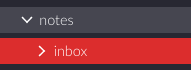
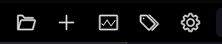
Regarding the visual look: now it is hard to find the "new note" button among others, they all look the same. I suggest doing what every other tool does: either super-highlighting the "new note" button, or moving it lower, overlaid over the file list, for example.
It really was the only button on the toolbar I have been using. That and the search bar.
 Zverik
on 15 May 2020
Zverik
on 15 May 2020
Yeah I don't use the toolbar all that often either. Mostly I just use the right-click menu in the sidebar. Couple of quick attempts at highlighting;
Original:


Solid:


Primary theme color:


Solid and primary theme color:


I like the solid version best because it makes it stand out among the other icons but not among the ui as a whole.
Wieke
on 15 May 2020
How about getting back to the plus…? Maybe this visual cue is now the default association for creating a new note in Zettlr and that's why we have difficulties identifying it …?
nathanlesage
on 15 May 2020
Plus:

Wieke
on 15 May 2020
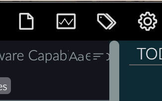
The difficulty currently comes from all icons being essentially the same: a thin contour of varying shapes, most of them being near-rectangles:

Compared to before, with icons having varying styles and thickness and shapes:

Now I have even less motive to use the toolbar, since that would mean staring into the icons, reading descriptions, and trying not to miss among similar shapes. Each of these icons are great individually, but UI design is also about how elements work together.
I would still suggest either making a smaller toolbar with just "New note" and "Search", other buttons available through the menu or with keyboard shortcuts. Zettlr is about typing, so why not rely more on the keyboard? Alternatively, we could have a separate big or highlighed "New note" button. See how other apps that I have treat the content button:
Slack
Github
Telegram
Tweetdeck
Jira
Confluence
Zverik
on 15 May 2020
Zettlr is about typing, so why not rely more on the keyboard?
Don't forget that Zettlr is also aimed at people who still rely on Word. There's no use in having Zettlr if we leave these people behind, because _then_ we could really just go and close down as there are a lot of other Markdown editors fulfilling this promise as well. But yes, better UX is indeed in dire need.
The point concerning a more visible "Create"-button is indeed something we should think about, yet the question is how to do it.
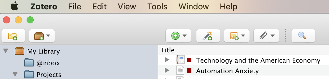
Maybe for reference: I personally took a lot of inspiration from Zotero (back then including a button to open the preferences, which is gone in the newer version):
nathanlesage
on 15 May 2020
Most of the icons have a solid variant. And there are other icons that might be appropriate for a "new file" button. So there are some possibilities there.


And if similarity among icons is a problem we could also change some of the other icons.


And maybe reordering some of the buttons might help? I could see an alternate clustering where the things related to files (open, new, rename, remove, export), productivity (stats, pomodoro, word count) and navigation (search, tags, toc) are put together.
Wieke
on 15 May 2020
And maybe reordering some of the buttons might help?
I'm open to these things as well. The idea behind the current toolbar was more or less random; I created three groups:
- Non-file-related (and global) actions
- File-related actions
- Miscellaneous
The difficulty with throwing together everything file-related is that the context may be mixed up (new file related to the current directory, whereas the rename-button relates to the active file).
In the end I think this is a strand of discussion that boils down to a whole new conception of the user interface, for which we should definitely make some considerations as to the target group, what we would like to achieve with the toolbar and the like.
Generally, I'd say the target group for the toolbar specifically are people coming over from Word, so that they expect certain things to be there. What they won't find, obviously, is all this formatting rubbish, however, a certain amount should be there. Question is: Should we keep it layered under that one button or should we "spread out" everything a little bit? Then, we could reiterate if keeping all or dropping some of the general buttons to the left of the toolbar. For instance, do we really need a preferences button? In general, people on macOS will certainly be quicker in pressing Cmd+,, however the question is how many Windows users will realise they can reach the settings by pressing Ctrl+,? Then: What about the cool meta stuff such as writing statistics and the tag cloud — should we keep them there? Should we add additional "meta" functions in there? Maybe drop the "Open directory" and "New file" buttons completely?
(After all, I think "Open Directory" is only really necessary on first setup of the app; you don't need it afterwards, or? And concerning the New File button, maybe we should really put this somewhere else? Then we'd have space to fill this up with more "Meta" functionality)
One first take might be the following (but just from the top of my head based on above descriptions):
- Meta
Open DirectoryNew File- Statistics
- Tag Cloud
Preferences- Readability
- Search Bar
- File-Related
- Export
RenameDeleteFormat- [X] Paragraph Format _(Header 1–6)_
- [X] Bold
- [X] Emphasis
- [X] Strikethrough
- [X] Link
- [X] Image
- [X] Footnote
- [X] Itemized List
- [X] Numbered List
- [X] Task List
- [X] Table
Table of Contents- Find in File
Readability ModeWord Count
- Miscellaneous
- Pomodoro
- Table of Contents _which in this set up would be migrated into the sidebar as has been demanded several times — but then we'd need a different icon for the sidebar…?_
- Sidebar
The marked task list items could then be collapsed into a single toolbar button on smaller screens; this only requires a media query.
Why I deleted the word count with no replacement is that I'm currently thinking of adding a small status bar at the bottom of the app, which would both be in line with UX expectations and would give us more space to add more "word processing" features (I'm currently thinking of displaying simultaneously word count, character count, cursor position, a quick language switcher which will be especially important for people like me writing in two different languages, so that the quotes and the dictionaries match up correctly)
And what I also just realised is that we might be able to borrow from other apps as well, which would place a very small amount (max. 3) of super necessary buttons into the editor itself (see, e.g. Bear).
But, wrapping up, I think this is a completely new discussion, what do you think? Should we aim at putting this in 1.7 or keep it to another discussion and migrate this in 1.8 or 1.9?
nathanlesage
on 15 May 2020
Need to get stuck on Clarity icons? Can't mix with Bootstrap?
This is much more pretty and clear.

The "share" button is not a real "share" is more like a converter, so i think this will be much more clear.

The "rename" also looks like a creation button, but will be hard to find an alternative, maybe something like this:

Or this:
And the "table of contents" icon mus be like this? Because i think he did't load?

 henrique9i
on 15 May 2020
henrique9i
on 15 May 2020
In preparation for 1.7 and due to some inactivity I'm going to close this issue right now — but of course we can always tweak the icons, the toolbar, etc! But now as at least the bugs are fixed and we got a reliable new solution. :) Happy for the upcoming release!
nathanlesage
on 25 Jun 2020
Related issues
 Noisecommander
·
3Comments
Noisecommander
·
3Comments
 danieltomasz
·
5Comments
danieltomasz
·
5Comments
danieltomasz
·
5Comments
danieltomasz
·
5Comments
 volt4ire
·
4Comments
volt4ire
·
4Comments
 Alopex4
·
4Comments
Alopex4
·
4Comments