I really like the new design of the webpage. A few suggestions/comments:
- The initial page is a bit empty and doesn't give much insight into how zettlr looks / works. For example, compare it to the landing page of https://code.visualstudio.com/. I would propose to add a screenshot to left as for the visual studio page, or move everything up a bit and add a screenshot that overflows to the second page a bit as in https://junolab.org/.
- I miss a bit the presentation of "standard" features. You make a pretty good statement of why Zettlr is special, but I think one should also mention that is on par with other markdown editors. For example, I really like the "The beauty of writing" screenshot in https://bear.app/: it shows you what features it provides, and how the markdown looks like in the editor.
- In my opinion, the multiple translations of Zettlr is placed a bit to prominently (I find the other features more important)
- Although I'm pretty happy to see the JabRef icon placed that prominently, I would actually suggest to replace these icons (or make them way smaller) by a screenshot of how citing in zettlr looks like.
- Zettelkasten is no longer mentioned?
I know (website) design is a very subjective topic, but maybe you can take these points as input. If you need further inspiration, have a look at https://github.com/JabRef/www.jabref.org/issues/98 where I collected a few pages that I liked.
 tobiasdiez
All 17 comments
Hey, thanks a lot for the feedback! I must confess that a lot of subconscious and very subjective decisions made it into the relaunch. Mostly, I felt the relaunch was necessary because the old Bootstrap-style page which was almost three years old felt "meh" and a lot of rubbish has made it there which I don't need anymore.
A lot of the points you make do make sense, but these are obviously more of a discussion, so let me answer them each:
The initial page is a bit empty and doesn't give much insight into how zettlr looks / works. For example, compare it to the landing page of https://code.visualstudio.com/. I would propose to add a screenshot to left as for the visual studio page, or move everything up a bit and add a screenshot that overflows to the second page a bit as in https://junolab.org/.
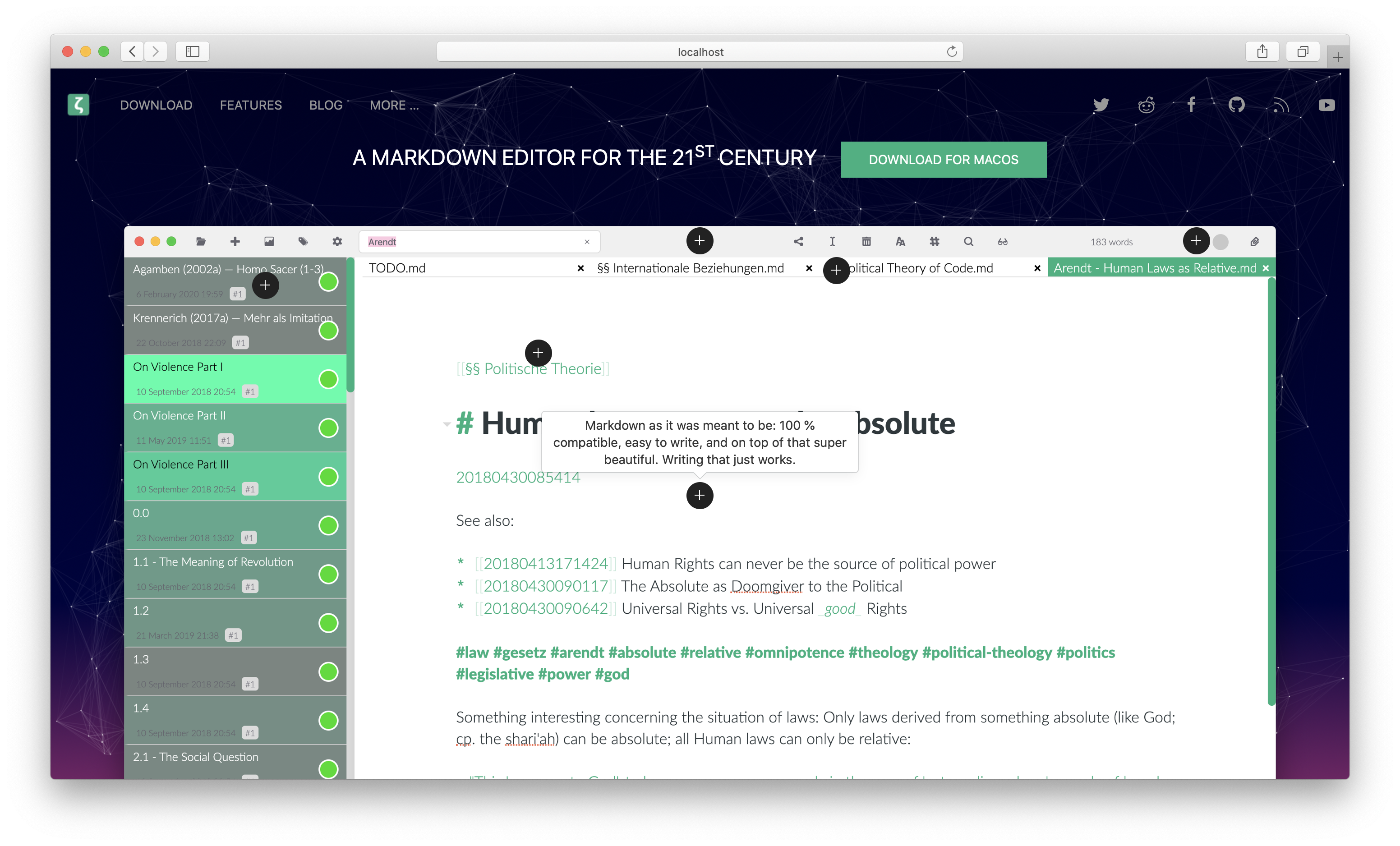
I decided to remove the screenshot on top because out of two reasons: The first one is that I'm not really proud of the current looks of the app (but it might be that I'm too shy here!), but, secondly and more importantly, I did not find any design where a screenshot looked good on the landing page and decided to go for this "app-less" landing page. I have the feeling that an experienced graphics designer should have a look at the page to see what would look good!
I miss a bit the presentation of "standard" features. You make a pretty good statement of why Zettlr is special, but I think one should also mention that is on par with other markdown editors. For example, I really like the "The beauty of writing" screenshot in https://bear.app/: it shows you what features it provides, and how the markdown looks like in the editor.
This is actually a good thought I did not have! But then the question would be, what features should we mention, and what should we leave out? A friend already told me that the amount of features presented shouldn't grow too much (and the features are way too dense according to him — purely visually), so we might need to collect an amount of features that should be displayed there. What do you (and others who lurk here :P) think?
In my opinion, the multiple translations of Zettlr is placed a bit to prominently (I find the other features more important)
Good point. Actually, I couldn't even tell you why I placed them that prominently; but I'm pretty sure it's because while I implemented that feature list, some translations took off and I was way too proud at that moment :D
Although I'm pretty happy to see the JabRef icon placed that prominently, I would actually suggest to replace these icons (or make them way smaller) by a screenshot of how citing in zettlr looks like.
Yeah, good point. I wanted to give some more exposure to Zotero, JabRef and CSL (especially CSL, as it's more of a "business-2-business solution" which most users won't ever see), but having a screenshot is better from the users' perspective. This prompts me to think that we, more generally, need a collection of screenshots to draw from. What are your thoughts?
Zettelkasten is no longer mentioned?
I absolutely did not realise this :D However, the question would of course be how to display it nicely …
And finally, to your list of inspirational pages, you certainly did a lot of research, so thank you for that! A lot of these pages look pretty good, so they're certainly worth a visit.
Wrapping up: I think the main points, if I read them correctly, boil down to me having some subconscious rejection of finding ways to display the features of Zettlr within the app itself, so it seems to effectively boil down to the work of having to create nice, high-res screenshots of the app … maybe after the next iteration, when the FSAL is implemented …?
 nathanlesage
on 30 Apr 2020
nathanlesage
on 30 Apr 2020
I agree with you on every point, but especially on the part in brackets of this sentence here
The first one is that I'm not really proud of the current looks of the app (but it might be that I'm too shy here!)
I think Zettlr is looking really good.
Based on the thoughts I had for the redesign of JabRef, here are some points that I find important in a website for an app:
- Main objective: You need to convince people that they should download and install the app.
- For this, you need to give a) an impression of what the app can do and b) separate yourself from similar programs.
- (animated) screenshots are one of the best ways to address this, as this gives a pretty good impression of how the feature pans out in real (for example, you can write that you have good support for references, but this could mean many many things like editing of references, autocompleting for citing, download of pdfs, etc).
Being a relatively recent user, these were my main points why I tried Zettlr instead of another app (these are of course motivated by my particular use case of taking mathematical notes while still using LaTeX for the main research documents).
- Markdown based note taking app (plain-text files instead of vendor-locked in file format)
- Preview-markdown system (not sure how you call this, i.e. the markdown is still there but you hide it and push it into the background so that you can focus on the text)
- Math LaTeX support (otherwise useless for me)
- Academic features like good support for citations (which integrate very well with my bibtex-focus workflow)
- Free & open source
From my experience, also the following features are special/important reasons why people might use Zettlr over other similar apps:
- Zettelkasten support
- Easy export to pdf / other file formats (pandoc)
So, in a few words, I view Zettlr as a markdown editor that covers writing and note taking, and is specially suited in an academic environment.
Maybe its worthwile to ask on Twitter/Forum which features users like the most, and then concentrate on these features on the website?
tobiasdiez
on 1 May 2020
Maybe its worthwile to ask on Twitter/Forum which features users like the most, and then concentrate on these features on the website?
Absolutely, I mean I did that one poll which turned out that a lot of people deem the Zettelkasten-functionality equally important as the purely writing aspect. I also plan to do a user survey in a few weeks (once I've fleshed out the questions to ask; survey design can be a pain sometimes).
In general this sounds really good, and I think I just need to take my time to prepare all of this. A lot of your points really show the right direction, and I think I just need them through.
So far, we have these changes, if I read you correctly:
- We need a screenshot of some kind immediately at the top of the page. The remaining question then would be to find some fitting file to display, a nice theme, maybe look how we can beautify this more so that it looks appealing!
- Find features to present there. So far the candidates are:
- It can do Markdown
- WYSIWYM (this semi-previewy-thingy)
- Math & general LaTeX support (albeit I'm currently thinking how about we make it way more explicit that Zettlr is a toolbox where you can choose any tool you like and combine them? In a way, my aim has been, and I think I succeeded, to provide a bunch of tools that can automate certain things, and allow you to only use those you want while ignoring the rest — opinions?)
- The academic aspect (which is something given the current developments we should press on much, much harder)
- FOSS (which I wouldn't pack into the feature section but prominently above that)
- Zettelkasten
- Export options
- What I just remembered is we need to think like a potential new user would. What would these people look out for? In marketing speech that would be called "user stories"
Especially for point 3, we would need to flesh out where the users are. And I think this is something we can already answer:
- Students who need something free of charge that can help them during their graduation
- Teachers/professors who need something to compete in "Publish or Perish"
- Authors who need to organize a huge amount of text and tend to be somewhat messy
- Curious people in general
And then we also need to understand where they are coming from, which in most cases is:
- Non-Technical background
- Word and word processing in general
- Other Markdown apps that cost too much/have other nuisances
And then we need to know how to bridge the _from_ to _to_-gap for these users, that is:
- Non-technical --> Zettlr works out of the box + everything is accessible via a GUI, so no strange tweaking required
- Word --> Zettlr basically takes all the workflow settings from these programs and maps them (e.g. Ctrl+K inserts a link in both programs, the footnote insertion shortcuts have been taken from word, etc.), additionally it attempts to make it look as much as these word processors as possible without incorporating any of the problematic things (that's why there is a toolbar and that's why there will be a statusbar at some point)
- Other Markdown apps --> Here we need to put the emphasis on what Zettlr does _differently_
… while writing all of this I'm starting to think what might be a good idea would actually be a three-parted starting page, color-coded so that we can address all of them at once …? Only problem would be that it's super easy to get messy with this … mh …
All in all I think what makes Zettlr really stick out is this conscious attempt to bridge the gap from word processors, and we might want to put emphasis on that
nathanlesage
on 2 May 2020
Good points! As Zettlr is quite versatile, one idea could be to illustrate the main features first and then at the end have a section with further links describing the above user stories in more detail, i.e.
- for writers
- for notetaking
- for academic research
- for ...
A bit similar to here https://www.altmetric.com/audience/
tobiasdiez
on 2 May 2020
This is a good idea! This way we would even have landing pages for different audiences which we might even spread around!
This leaves us with the "main features" which we'd need to decide upon …
nathanlesage
on 2 May 2020
I just played with the landing page a little bit and tried to implement one of the more comprehensive solutions:
nathanlesage
on 7 May 2020
That looks nice!
Maybe experiment ab bit with the location of the "download" button (under the first line or under the screen shot maybe?)
tobiasdiez
on 7 May 2020
Good idea, a friend also mentioned that the image should fit on the page. But apparently it's a good idea overall. So next we should think about a good screenshot that encompasses most of the important features without looking cluttered! So if you have any ideas, please feel free :)
nathanlesage
on 7 May 2020
In my opinion, it's ok if the image is too long for the page. Then the user is invited to scroll down, which is what you want anyway. Maybe decrease the overall size a bit so that the background gets a bit of space to breath.
The screenshot in itself is ok in my opinion. Maybe replace the hotspot search by a normal project view (you can make a dot at the searchbar, and add a screenshot for the hotspot feature in the main body). I would also add a picture to the markdown, so that people see that's supported as well.
tobiasdiez
on 8 May 2020
you can make a dot at the searchbar, and add a screenshot for the hotspot feature in the main body
Good idea!
I would also add a picture to the markdown, so that people see that's supported as well.
What exactly do you mean by this?
nathanlesage
on 8 May 2020
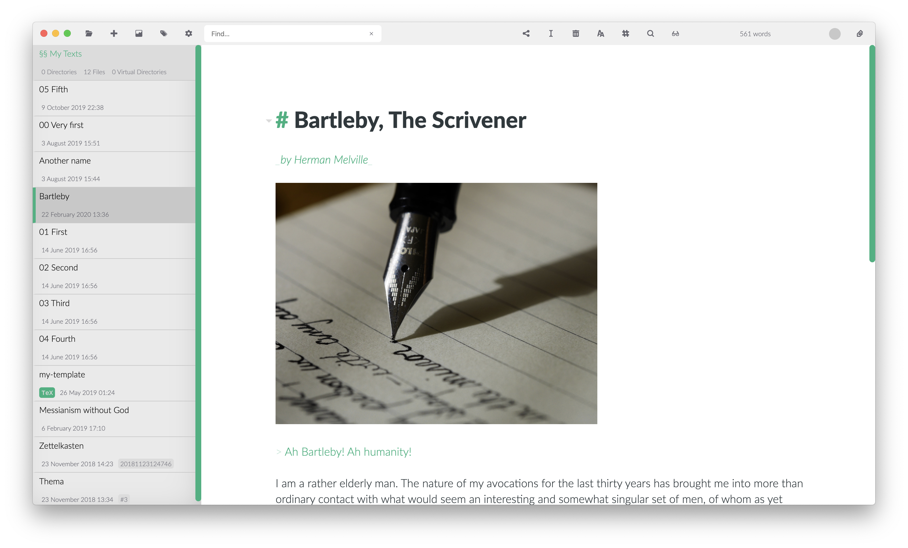
I was suggesting that the markdown displayed in srceenshot may contain a picture, similar to the image of the pencil the current screenshot:
tobiasdiez
on 8 May 2020
Ahhh, yeah, sure!
nathanlesage
on 8 May 2020
This picture is very nice, and adding shadows is necessary xD
Maybe this is anecdotal evidence, but I only just now discovered again that there is more than landing page in the new site, and I used it at least twice to download Zettlr (after reinstalling systems in April). When I visited it following your twitter posts I probably scrolled down but the other times when I wanted to downlad only I didnt noticed the rest ...
On Apple page, they solved the discoverability by giving the screens rectangular shape, and the rectangle is smaller than the browser window so the user is prone to browsing down...
And you removed the direct mentioning of Zettelkasten on the page, I remember I found Zettlr really long ago by looking for Zettelkasten app...
 danieltomasz
on 15 May 2020
danieltomasz
on 15 May 2020
Also the video maybe should be exposed as embedded with the nice preview shot
(@nathanlesage I really like your channel on youtube, it's worth exposing too, I think ;)
(I also didn't click into that link until now)
When you will ship next 1.7 release try to put a link to some google form with a question about UX and from what source they discovered the app, if they like your page, if they want to help even if they cannot code et cetera (I could help with that maybe if you think it is worth it, but you don't have time)
danieltomasz
on 15 May 2020
I could help with that maybe if you think it is worth it, but you don't have time
I've already prepared something: survey.zettlr.com =D
However, I haven't gotten very far in thinking of proper questions 🙄
nathanlesage
on 15 May 2020
As I've revamped everything once again I'm closing this here
nathanlesage
on 31 May 2020
Looks really nice. Good job!
tobiasdiez
on 31 May 2020
Related issues
 volt4ire
·
4Comments
volt4ire
·
4Comments
 carregal
·
5Comments
carregal
·
5Comments
 tupio
·
3Comments
tupio
·
3Comments
 grst
·
4Comments
grst
·
4Comments
 tedesmac
·
5Comments
tedesmac
·
5Comments
Most helpful comment
As I've revamped everything once again I'm closing this here