Zettlr: Search and name changing suggestions

Hi, Probably overstepping the mark here a little. I'm a digital designer and strategist, I love using zettlr for research. I've been using it for a while, and there are a few design niggles that got me thinking and I have mocked up a slight change to the GUI.
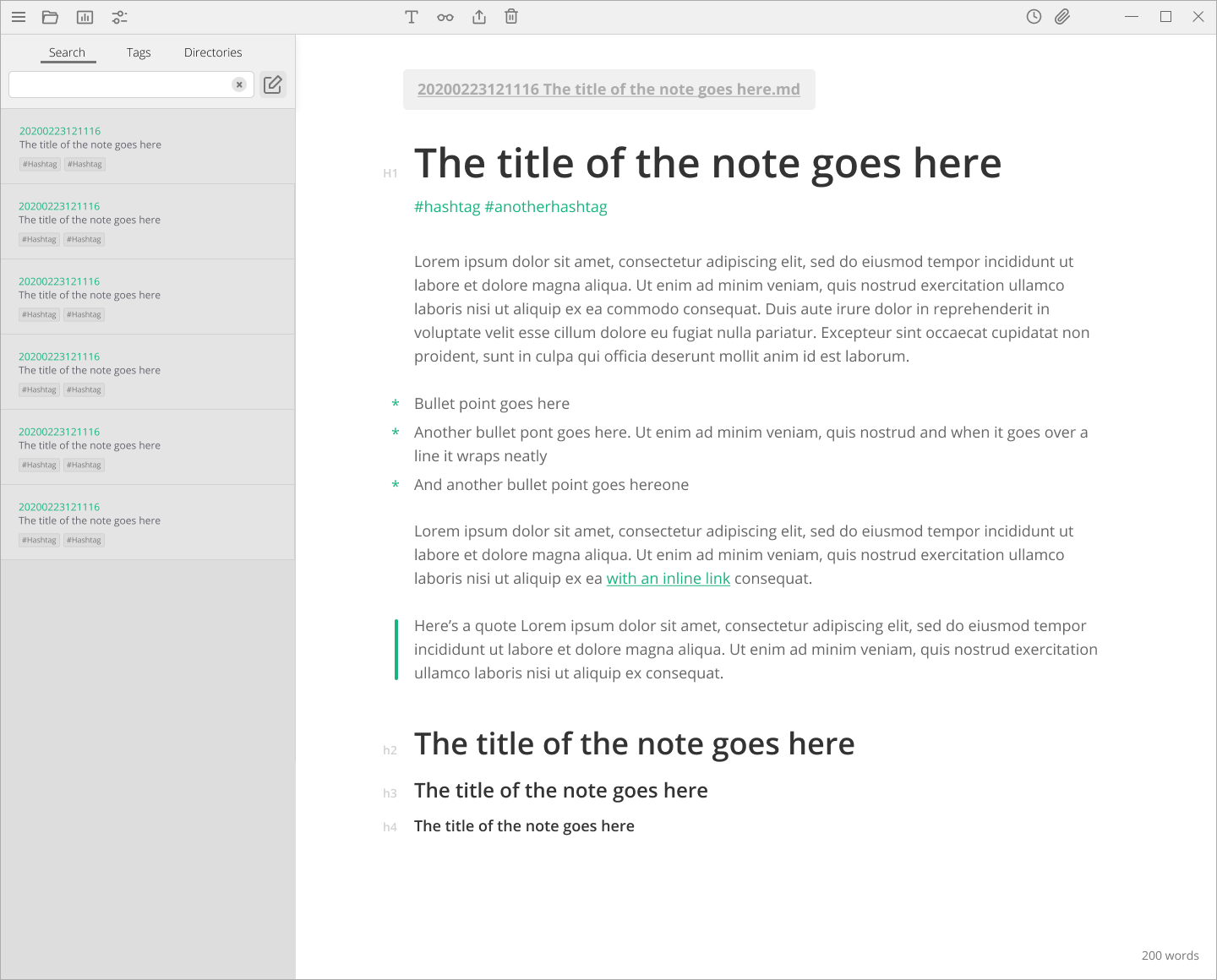
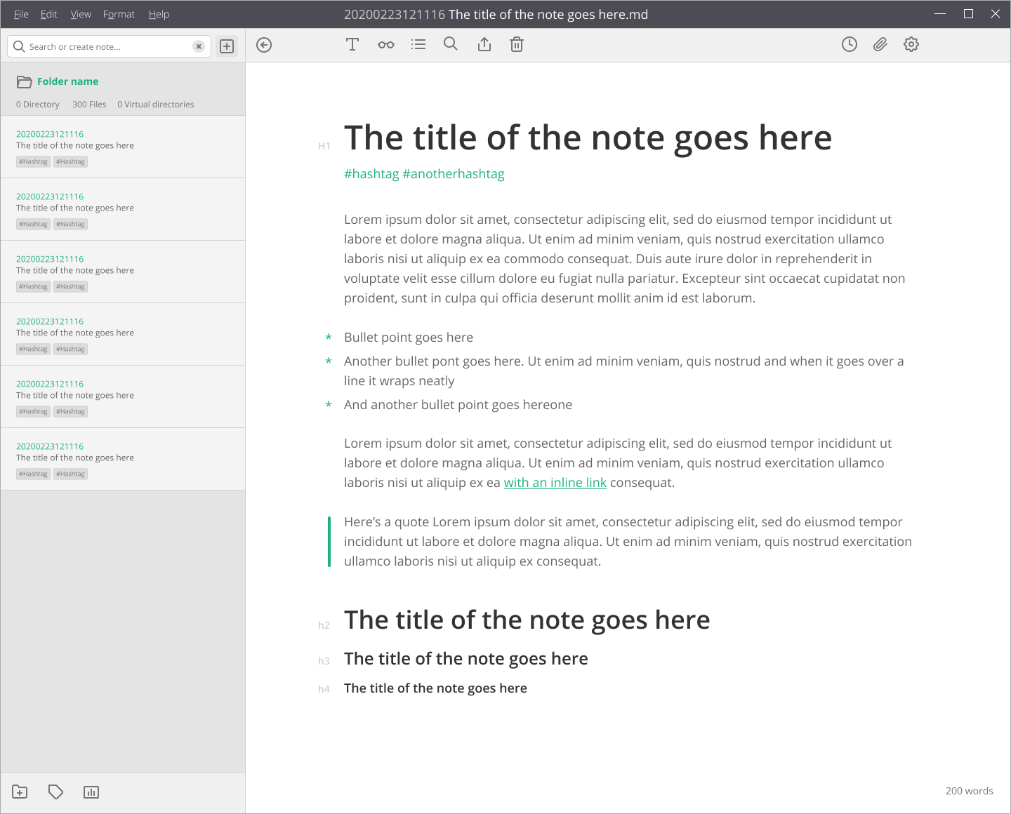
I often change the names of my zettles after I create them, because I am terrible at spelling, and also they evolve as the nites change, bu the little preview for changing them isn't large enough to show the full name, and I often accidentally don't save the name change. So I though having a dedicated area that showed the name of your file so you could use it has a header, and change it easily would work well.
I also though more explicitly linking the search to the side panel would be clearer, and also allow you to add a new zettle quickly if you don't find any results you are looking for.
Anyway I know you are probably very busy with functionality. But I couldn't help myself, so I designed it up.
 callanrowe
All 30 comments
I'm a digital designer and strategist
omg yes, the app needs a redesign so hard, which means:
Probably overstepping the mark here a little.
Not. At. All.
I also though more explicitly linking the search to the side panel would be clearer, and also allow you to add a new zettle quickly if you don't find any results you are looking for.
Yes.
So I though having a dedicated area that showed the name of your file so you could use it has a header, and change it easily would work well.
Sounds like a good idea to me!
If you would like to, please play around with the whole GUI, I was beginning a refactor of the CSS (again) either way, so during the year, adding more and more design fixes would probably be perfect. Integrating the global search into the file list has been demanded a lot, and I start to think that it's pretty good myself. I only haven't gotten into precisely this: the design of it, and how to make it work. Concerning the header, I was about to think "maybe a status bar like Word", but this might actually be a better idea.
So, to cut a long story short: If you'd like to, please think of how such a header could work, and I'll gladly implement it!
 nathanlesage
on 24 Feb 2020
nathanlesage
on 24 Feb 2020
Oh amazing. Well if your interested I'd be more than happy to give the header a refresh. I work in figma which makes collaboration pretty easy. Do you have any design files that exist for the current GUI? If not I can replicate easily enough.
callanrowe
on 25 Feb 2020
Awesome! :)
I've not worked with figma, so if that app uses some custom files, I'm afraid not. What I can offer you is the templates and the LESS files:
- https://github.com/Zettlr/Zettlr/tree/master/resources/templates
- https://github.com/Zettlr/Zettlr/tree/master/resources/less
- https://github.com/Zettlr/Zettlr/tree/master/resources/vue
But apart from that, I don't have anything, because it's really been going trial & error until now :/ I was thinking about rewriting the whole GUI in Vue, which might make it easier to design (right?), but currently it's a mix of everything …
nathanlesage
on 25 Feb 2020
I was thinking about rewriting the _whole_ GUI in Vue, which might make it easier to design (right?), but currently it's a mix of everything …
Have you heard of tailwindcss? If you are already using a component framework, your ui components are going to be tightly coupled with the css anyway. Might as well specify the css in the ui component while you're at it and save time.
 Ziinc
on 25 Feb 2020
Ziinc
on 25 Feb 2020
Figma is basically google docs for design. It doesn't generate any of the code or anything, so you'll need to build it in whatever framework you choose. But it's a good way to collaboratively design. I've created a new doc with a layout and some slight tweaks to the type styling https://www.figma.com/file/R8735L91rMn3YMZ8vOt1pX/Zettlr?node-id=3%3A2
callanrowe
on 26 Feb 2020
so you'll need to build it in whatever framework you choose.
Alright, so if there is no framework, it's no use? Because currently only the sidebar is based on vue, the rest is plain, vanilla, JS.
nathanlesage
on 26 Feb 2020
@nathanlesage it is only used for design exploration and wireframing. The actual logic can be implemented in other ways.
@callanrowe having the search bar in such a close proximity with the current directory browser has led to me mistaking more than once that I had a missing file/wrong directory (when it was actually the search messing with the directory view).
I think the directory area shouldn't be touched, since it represents the current state of the directory. The search results should be rendered elsewhere.
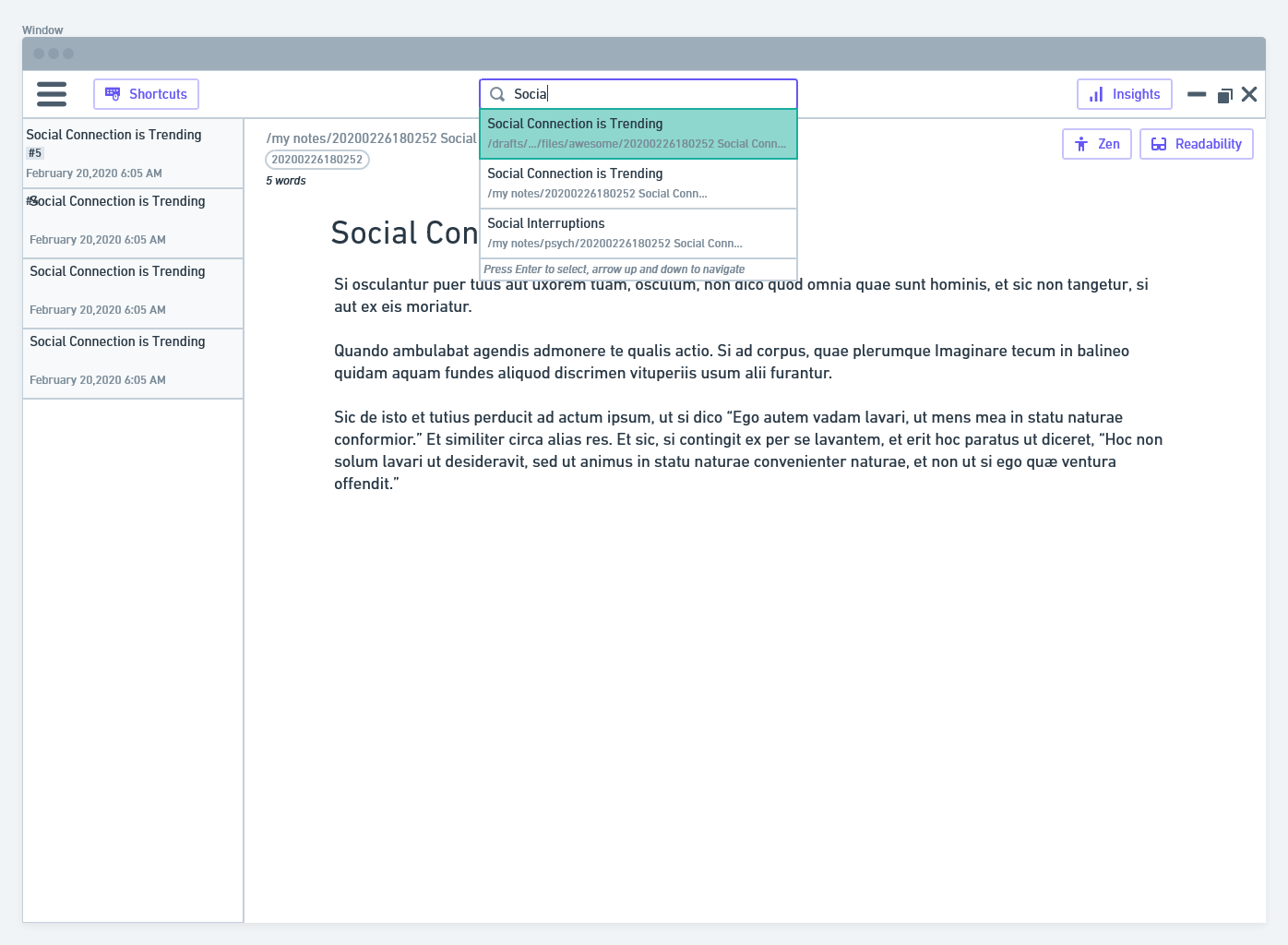
I've attached some lo-fi mockups to convey what I mean. Inspiration taken from Mac's app search and VSCode's filename search.
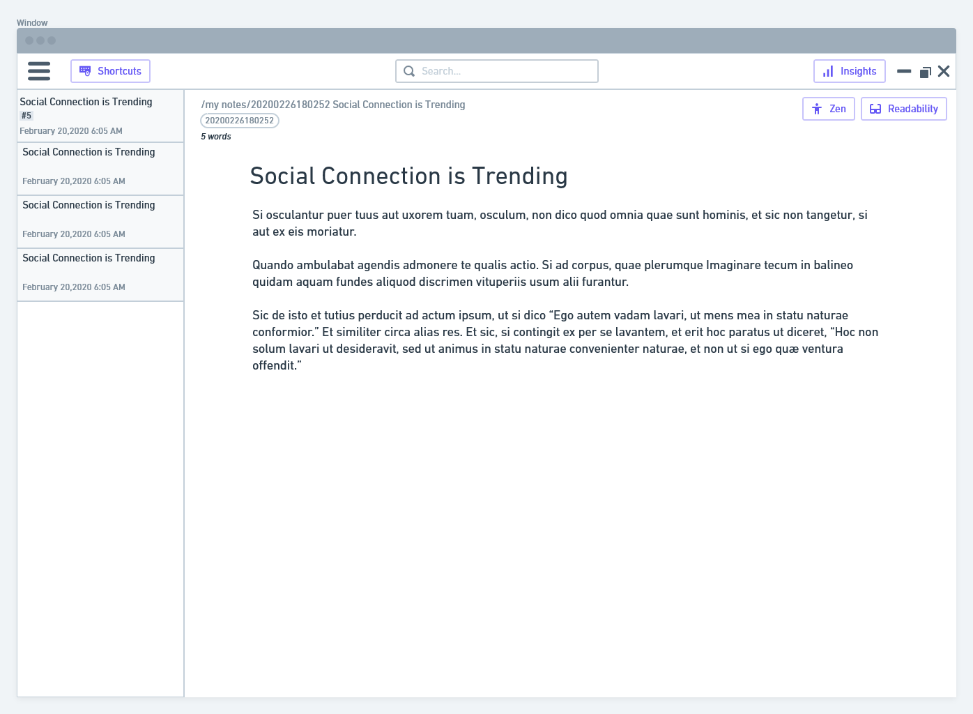
The results are then showed directly to the user (with perhaps an translucent backdrop) on focus:
Some other adjustments I made:
- removing ids from the directory (does not provide any value to show)
- added folder breadcrumb in filename display (similar to Google drive's current folder display). Helps to give user a sense of where the file is
- shifted stats, attachments, references, graphs all into a common sidebar called "Insights"
- added editing-related options (zen, readability) to the editor area.
- added labels to buttons, to make things more understandable to the user faster. Probably can toggle labels in settings.
I agree with you shifting all the non-necessary options to the hamburger menu, these options are all not used on a regular basis.
Ziinc
on 26 Feb 2020
I don't have all too much time, but some initial thoughts on your ideas:
- I agree that the search bar should be positioned on top of the directories, because this will increase the mental coupling by users for seeing that the search results will be displayed there and only relate to the directory. (Concerning "me mistaking more than once that I had a missing file/wrong directory (when it was actually the search messing with the directory view" -> this is why there's a heatmap with different colours, so this will not change; so a "no" to this statement: "The search results should be rendered elsewhere.")
- Concerning the mockups: On Figma these look a bit cleaner, but I would strongly disagree with a hamburger menu; it's currently just a workaround for the menu on Windows and Linux, and it will be removed once a better idea is in. And there should be no too close alignment either to a specific platform (such as macos) or another app is not really helpful.
Maybe to re-iterate some prior points on the philosophy of Zettlr:
- It does not follow every design trend from web apps, as these have proven to be extremely bad concerning UX design.
- It is aimed at non-technical users who are used to Microsoft Word. Zettlr is a bridge for academics from Office to Markdown. All of the above screenshots either make the app look a little bit plastic, or "too modern" for many people, so this cannot be the way to go.
- We must deliberately question many things in current apps, because a lot of these apps are super weird, as they try to do things differently without asking the fundamental question of whether this will help users. It forces some "cool" new design ideas onto people without testing how they work.
TL;DR: Think more conservative, as much as I hate to say this! 😃
nathanlesage
on 26 Feb 2020
Yep, agree.
I think the icons/ items in the header bar probably need a bit of thought. I was focusing more on the relationship between search and sidebar for now. I'll have a bit more of a play on the weekend. Feel free to add any thoughts or comments into the figma link directly
callanrowe
on 26 Feb 2020
I think the icons/ items in the header bar probably need a bit of thought.
Absolutely, I think a new symbol font (or SVG images) is pretty much necessary. Even I myself have a hard time to find the ToC and the formatting toolbar, because the icons are not as accessible as they should be. And one would assume, having built the whole tool, at least I wouldn't have difficulties …
I was focusing more on the relationship between search and sidebar for now.
I did not want to suggest that this is not something we need to think about :) I was just a little bit nervous, because I think that the heatmap search is actually better than having the search results appear the way as, e.g. in mac's search or VSCode.
Maybe to elaborate a little bit more on what I hope to achieve with a better GUI: Most services today tend to hide as much as possible, only showing "relevancy", but the problem is that no algorithm can possibly decide for you what you personally deem relevant — for instance, this is why the search algorithm in Zettlr never excludes files, even if they only have one single match of the search terms. This is because this one file where most search terms did not match, may be the most relevant. If we switch to displaying search results directly beneath the search field, most users won't scroll down and therefore may miss notes (especially with regard to Zettelkasten) that might be important. Using the directory bar to display the search results therefore has some important benefits: First, it shows users "Okay, here's the same directory, but this time it excludes all files where NO search terms matched, and it also colors them according to how much they correspond with your search terms". This makes it easier to understand the search results (after all, a search is nothing else than a more sophisticated filtering mechanism). Secondly, by doing it in the directory list, it encourages users to actually scroll down, because the most important files are not by default sorted on top. This gives all files an equal leverage (because, after all, many important files might not be "relevant" according to search because they do not contain, e.g. "markdown tips" but "these are tips for mark up languages").
In the end, everything boils down to "make it easy for people to do tasks with Zettlr, but never try to patronize them by saying 'No, I'm pretty sure you don't need these or these files'", so basically have the user think more than in other apps :D
nathanlesage
on 27 Feb 2020
Yep, absolutely agree with moving to keep the full results in the directory bar. The designs I did in figma keep this pattern.
I think there are a couple of design problems to solve here, and maybe we should keep them separate
Making the search work harder for us, the search bar is something you should be using all the time if you are looking for unexpected connections between notes, getting used to browsing through all the possible related notes should be easy and intuitive.
Making it easier to rename files on the fly, making it more apparent which note you are in
Cleaning up the icons and header bar. What do we need quick access to? Are the current icons descriptive enough? Do they conceptually relate to each other? Is there a better solution than a hamburger on PC?
By splitting out these goals we can be more pointed with rounds of feedback. And we can explore mixing and matching different options
callanrowe
on 28 Feb 2020
@callanrowe I concur, the three points you made are pretty much the gist of what needs to be done!
nathanlesage
on 28 Feb 2020
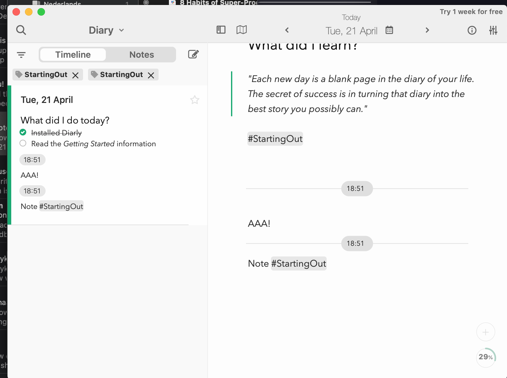
Here's a bit more exploration, don't get too hung up on the icon design itself just yet. More logic and placement. These are all in the figma file too so you can jump in there to make specific comments.
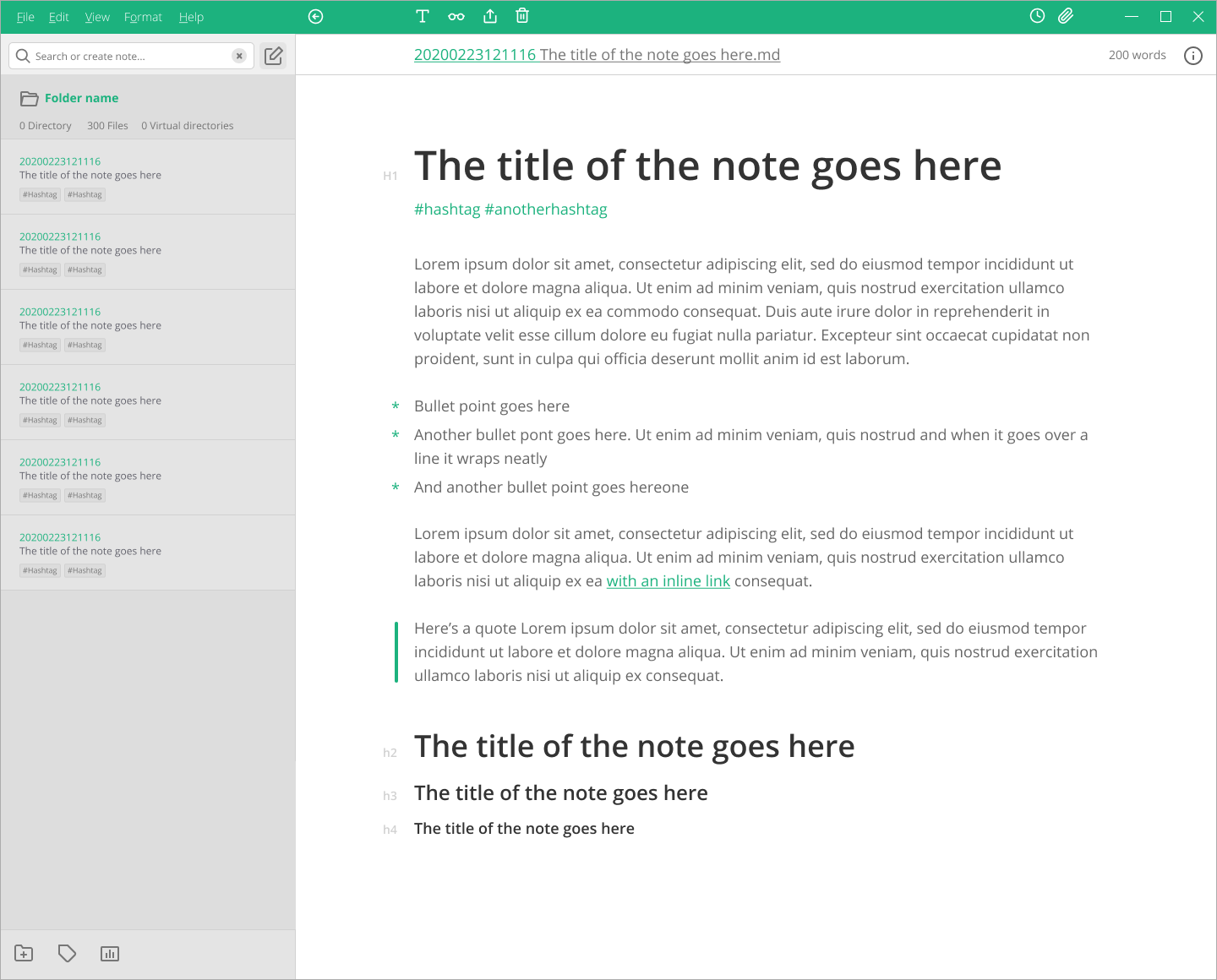
Bringing File, edit etc into the header for PC design. On Mac you could just lose that whole bar. Note specific controls are within the note frame and search is in the directory, would function pretty similarly to what is there at the moment
Using the header pannel to show the file name, you could edit by clicking. Note specific controls are in the menu at the top right of the note. Search lets you switch between searching the current directory, browsing or searching tags, or changing your directory
Similar to 2 but with icons in the header. Change the name of the file at the top of the note by clicking on it. Icons similar to the current settings however grouped a little more to show what they relate to
Let me know what you think :)
callanrowe
on 29 Feb 2020
I'm in favor of things of all of them, but think a combination might make sense :D
For instance, I think for Windows and Linux the menu bar back where you'd expect it is necessary, but also I don't wanna lose the toolbar completely; and the idea with the header as in version 1 doesn't look too bad either! The only thing I'm in question about is to have three tabs on top of the file list
nathanlesage
on 29 Feb 2020
Here's a version that combines the icons and the File menu. My thoughts is that is maybe a little busy. I think I prefer the note controls being within the note itself. I've also added a back button. That's something that is missing from the current design that I'm often reaching for
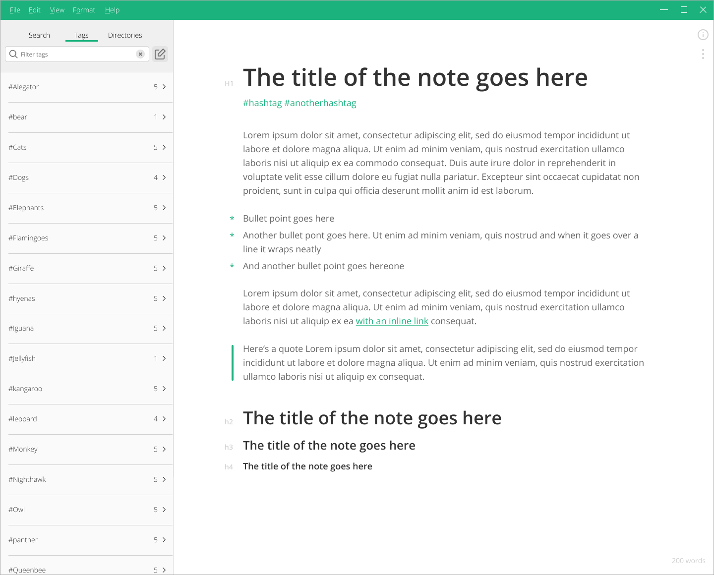
Thought I might show you what I was thinking in terms of tags.

or
And here is a mac mockup to show you what it might look like with no toolbar. I like how clean it feels.
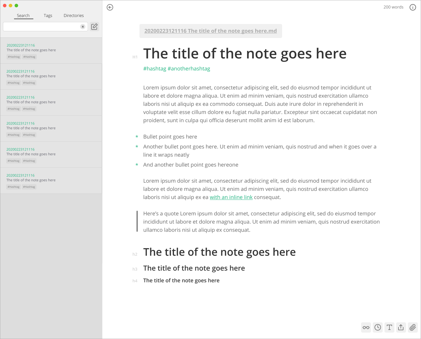
My preference would be a header bar with File etc menus on PC, with the note controls within the note pane (also these controls would be available within other menus), and no header bar on mac since the File menus are on OS.
callanrowe
on 1 Mar 2020
It's definitely getting somewhere, but I would like to keep the toolbar. Why? Because as Zettlr is aimed especially at people used to Word, they'll instantly search for some action buttons at the top. I try to keep the design strictly aligned with more "traditional" design approaches, not because some minimalism wouldn't be cool, but because many users will have difficulties with more modern designs. After all, Zettlr's battling against Word, and that's hard with modern designs :D
nathanlesage
on 1 Mar 2020
In that case, I think we go with something like this. Clearer grouping on the icons, a clearer association between the directory and notes. And a pretty classic (word processor like) layout. I'm still into the idea of the tabs for search, tags, and directory, but happy either way
callanrowe
on 1 Mar 2020
Yes, something along the lines of this! Concerning the tabs, they're definitely worth considering, but I mean it wouldn't hurt to do some A/B-testing on these … I also plan to start a survey with the users to ask them for their opinion. This will help pinpoint central issues clearer.
nathanlesage
on 1 Mar 2020
Yeah great. Maybe we do 2-3 options then. And isolate the directory and the header when testing. Might be worth throwing concept in for testing that breaks the toolbar pattern to see how people react. Did you have a survey platform in mind?
callanrowe
on 1 Mar 2020
Not yet, and preparing such a survey will take some time, including pre-testing; and as I'm currently hopelessly overworked, I don't know when … plus there's still that looming refactoring upcoming
nathanlesage
on 2 Mar 2020
Ok, let me know how you'd like me to progress. Or if you want to put it on hold. If you like I can probably help with the survey design.
callanrowe
on 5 Mar 2020
If you would like to help in this regard, preparing first ideas for what one might ask users concerning the GUI would indeed be of great help! So first questions, ideas for possible answers etc. etc, then we can work together on this to make it happen!
nathanlesage
on 5 Mar 2020
About filename generation process, i was thinking to a couple of new features which could be very interesting.
- New variables: %h1 under "zettelkasten/advanced" tab.
Explanation:
With this you can auto generate a file name with the first H1 header content found in the current document.
Example:
"%id - %h1" ---> "currentdate - first h1 header title.md"
- Create a new file with the name inside the search field.
Explanation:
If i'm currently writing a note and i decide to make a link to another note (which doesn't exist yet), i will type [[(ctrl+L to generate new id) - somename]]. If i press ctrl or alt and click on the link, the focus will goes to the search panel: at this point nothing is displayed becouse that file doesn't exist yet; a right click on the name in the search (or some other shortcut) to quickly and directly create a new file with that name, ready to be edited.
 graphixillusion
on 7 Mar 2020
graphixillusion
on 7 Mar 2020
Concerning an h1-variable this sounds like an interesting idea to ponder upon! Never thought of it yet, but it does make sense!
Concerning the second thought: This is pretty close to many other Markdown editors, am I right? Someone mentioned I should place the autocompleted filenames _below_ that field, which would also enable me to add the "create"-option right there, so that it would look like this:
| my new filename          | <-- The search field
+--------------------------+
| Create "my new filename" | <-- Select this option with Arrow Down + Enter
| another new filename     | <-- Two Arrow down to scroll through matched notes
| my new matched file      |
+--------------------------+
I am playing with different apps and Diarly have a nice idea
clicking tags could add it to list of filters that filter active zetels.
Also should be possible to add the intersection of multiple tags through search bar;
Possible behaviour: when person start search with # zettlr should interpret it as a tag and use it to filter zettels in the sidebar; the user could see active tags
In the mockup above active (for filtering) tags would be below search and above notes in sidebar
Naturaly puting multiple tags to search could give the same results, but this give maybe more flexibility
In this moment users could only use one tag for filtering using tag cloud
My idea also could be implemented using tag cloud (which is now present in the app) but only when allowing user to choose more than one tag from the cloud (similarly to Zotero tag cloud)
I remember (maybe wrongly) that a similar option was in Sublime_ZK too
I don't know if this is doable with a current code but with this could be an inspiration.
 danieltomasz
on 22 Apr 2020
danieltomasz
on 22 Apr 2020
Additionaly, the autogenerated table of content could be displayed on the right, along with attachments and references, link to parts of the note
EDIT: After posting it I don't think it is that much good idea as before, because when the note has many references, it will be too much clutter
danieltomasz
on 22 Apr 2020
Another possibility regarding the attachments sidebar — apart from choosing a new name, as it doesn't only display the related files — would be to implement tabs — one for the files, one for references, and then we could add one for the auto-generated TOC!
nathanlesage
on 22 Apr 2020
This issue has been automatically marked as stale because it has not had recent activity. It will be closed if no further activity occurs. Thank you for your contributions.
![stale[bot] picture](https://avatars3.githubusercontent.com/in/1724?v=4&s=40) stale[bot]
on 21 Jun 2020
stale[bot]
on 21 Jun 2020
This issue has been automatically marked as stale because it has not had recent activity. It will be closed if no further activity occurs. Thank you for your contributions.
stale[bot]
on 21 Aug 2020
This issue has been automatically closed due to inactivity. If you believe that this issue is relevant for many users and should not be closed, feel free to comment so that the admins will be notified.
stale[bot]
on 28 Aug 2020
Related issues
 Kangie
·
4Comments
danieltomasz
·
5Comments
Kangie
·
4Comments
danieltomasz
·
5Comments
 tedesmac
·
5Comments
tedesmac
·
5Comments
 Noisecommander
·
3Comments
Noisecommander
·
3Comments
 akavel
·
5Comments
akavel
·
5Comments
Most helpful comment
Another possibility regarding the attachments sidebar — apart from choosing a new name, as it doesn't only display the related files — would be to implement tabs — one for the files, one for references, and then we could add one for the auto-generated TOC!